DANCE WITHOUT PAIN
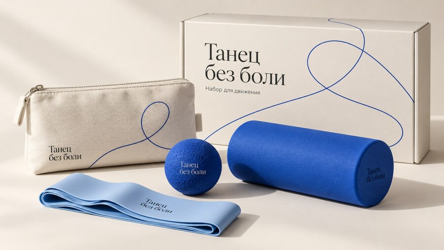
«Dance Without Pain”—a brand concept for dancer accessories. The project combines items for warm-up and self-massage into a compact set and develops a comprehensive system of packaging, advertising, and brand identity assets around it.
ORIGINAL PROJECT
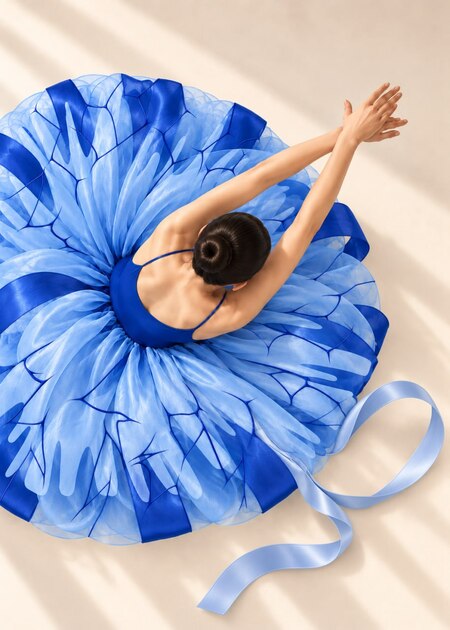
The foundation was a course project for the «Dance Without Pain» store, which focused on caring for dancers. Its visual language drew inspiration from the imagery of Edgar Degas' ballerinas, blue hues, and the graphics of movement. The initial work developed a logo, illustrations, and brand collateral.
REDESIGN
In the new version, the store receives its own product line. The name, blue color, and connection to dance remain. The complex composition of silhouette and sharp lines is replaced by a legible wordmark and a free trajectory of movement.
The new system unifies the product, packaging, merchandise, retail space, and advertising communication.
A pause is also part of the dance.
CALL FOR APPLICATIONS TO THE MOVEMENT
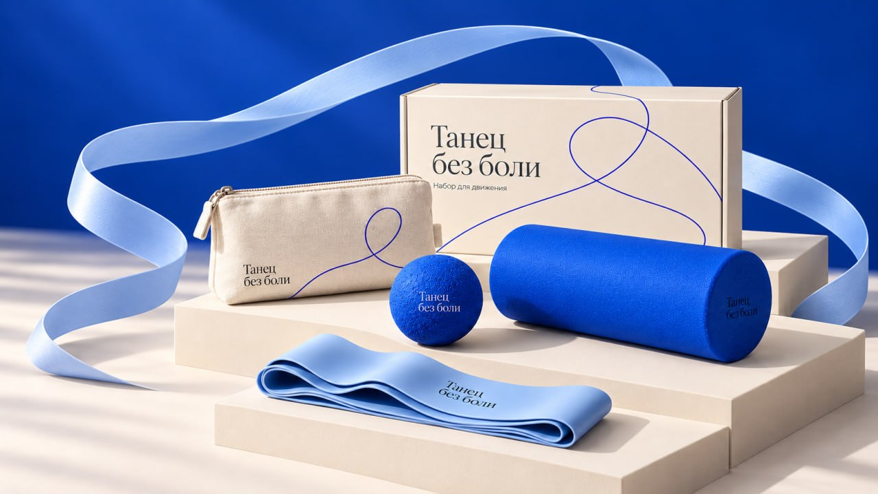
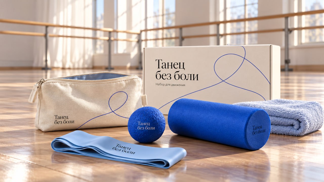
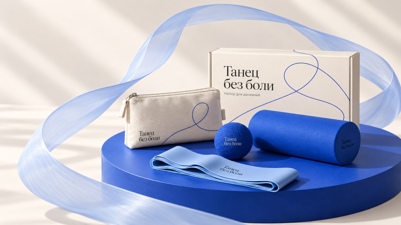
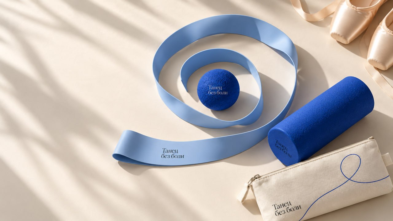
The brand’s first product combines a massage ball, an elastic band, and a compact roller. The fabric sleeve allows items to be stored together and carried to classes.The project is aimed at students of dance schools, as well as amateur and professional dancers. Potential sales channels include the school’s own online store and partnerships with dance studios.
KEY VISUALS
IDENTITY
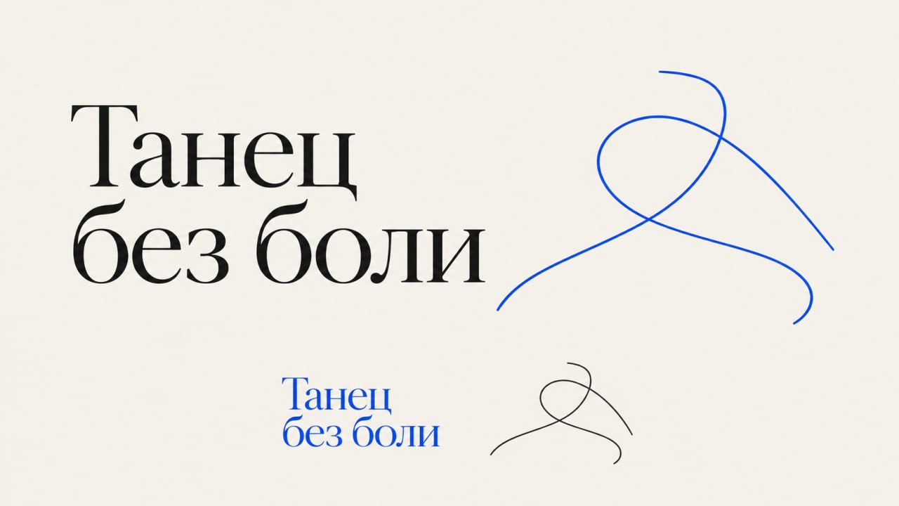
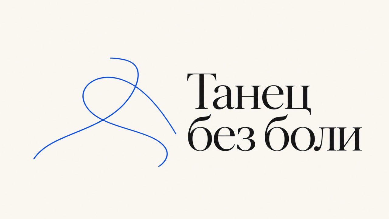

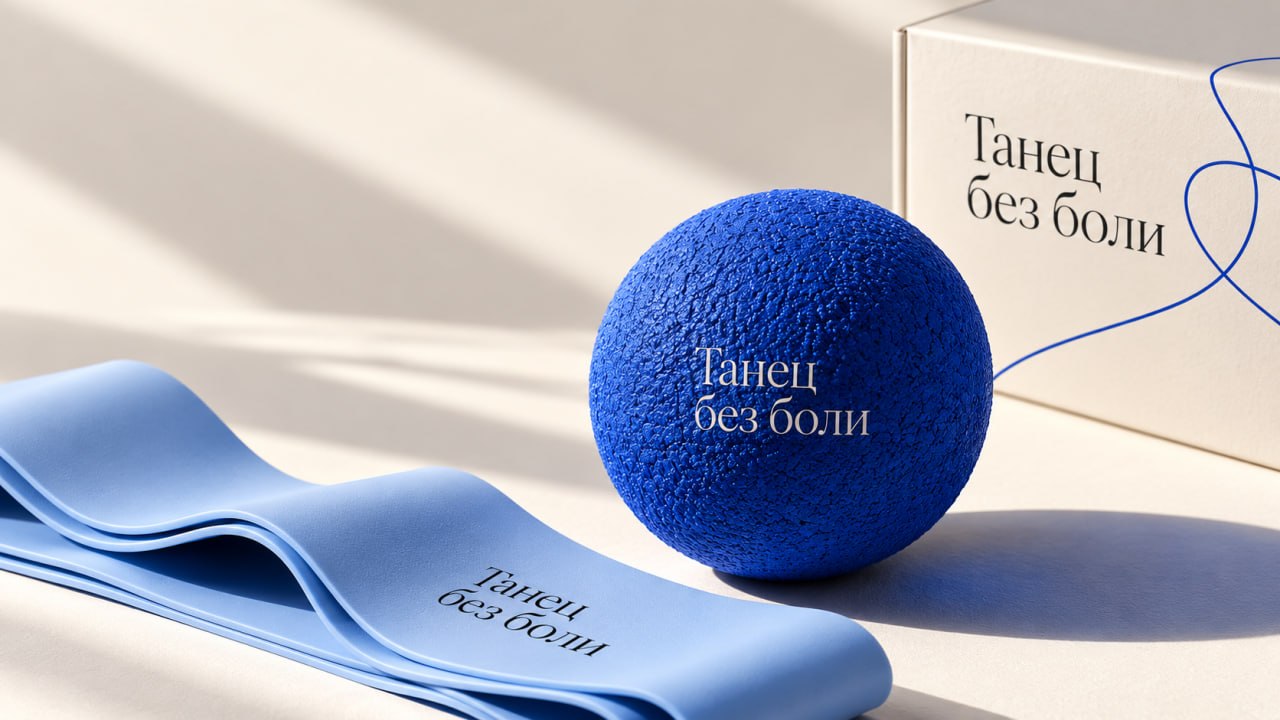
The logotype, featuring a contrasting serif typeface, connects the brand to the culture of dance. The free-flowing blue line resembles the trajectory of movement and serves as the primary graphic element.
On packaging, clothing, and within the space, the line scales and shifts position while maintaining its overall character.