/. Original Project
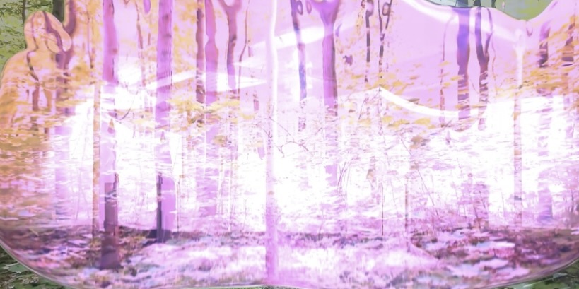
Photo from the original project «Technogenesis»
I completed this project as part of the fourth module of my first year. Our assignment in the curatorial disciplines was to create two manifestos, one of which was based on the work of a favorite artist. In the first module, I chose Mariko Mori, a contemporary Japanese multimedia artist, because I am deeply drawn to both the visual and conceptual components of her work.The core idea of my manifesto is to demonstrate how the digital nature in Mariko Mori’s work continues into the material—the familiar to us—becoming closer to new technological forms of life.
In the original project, I also created three print variations for scarves. I used the following prompt in krea.ai: 3 images with abstract, light forms, pink forest alien aesthetic. based on my photo references. do it in low quality.
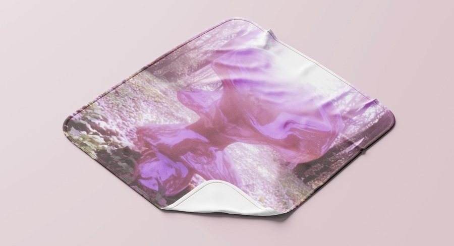
Photo of the scarf based on the original «Technogenesis» project
// New Project
In this new project, I will redesign «Technogenesis» and create a brand identity for a small startup by utilizing neural network technologies.
Concept
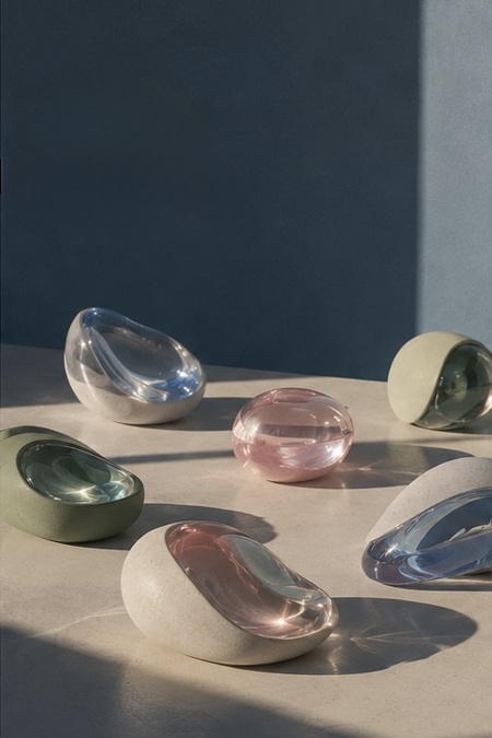
«NEO-MORI» Project — a conceptual brand of collectible interior objects that explore the boundary between the digital, technological, and biological, and the material.
Imagine that in the future, new life forms have emerged. They are neither purely natural nor entirely artificial; their forms resemble something extraterrestrial.
Our brand releases «artifacts» that look as though they have arrived from this hypothetical ecosystem.
This is not a literal imitation of nature, nor is it conventional high-tech with metallic casings—it is poetic technologicality: light, mother-of-pearl, translucent surfaces, soft organic silhouettes, and the feeling of unknown life.
You are not buying a design; you are buying our vision of the future.
Identity
Logo
logo
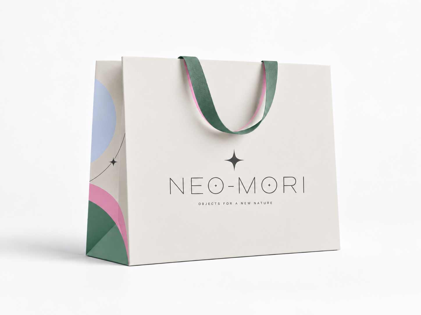
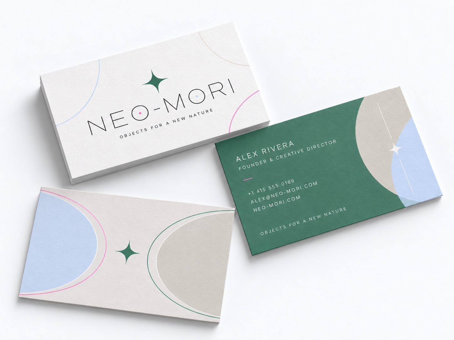
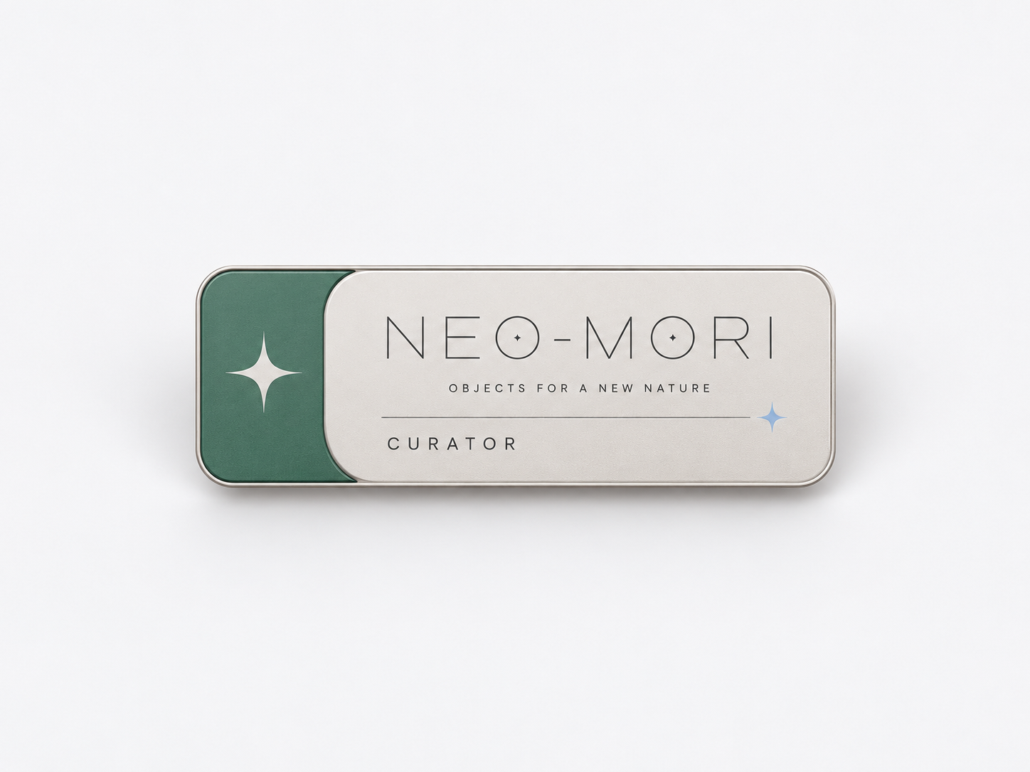
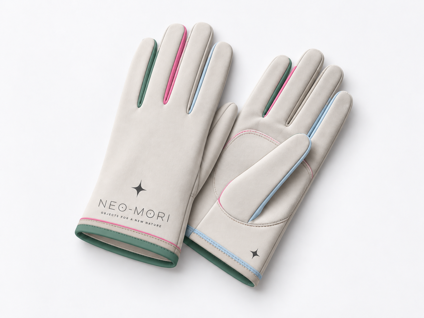
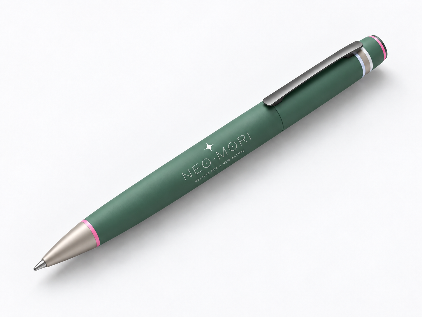
The NEO-MORI logo embodies the concept of harmonious coexistence between nature and technology. Its visual language is built upon geometric precision, minimalism, and futuristic aesthetics.Fine lines, generous letter spacing, and concise forms evoke a sense of lightness, weightlessness, and technological purity.The key graphic element is a four-ray symbol that resembles a light impulse or an emerging life form. Its integration with the typographic forms unifies the graphic and textual components of the logo.The logo’s restrained geometry provides a contrast to the fluid, organic shapes of the collectible objects, underscoring the brand’s core idea—the emergence of a new nature at the boundary of digital and material worlds.
The «Neo-Mori» logo is not a specific typeface, but a unique image generated by artificial intelligence. The brand’s typography aims to emulate the visual aesthetic of the logo.
A complete list of all tools used, the sequence in which they were applied, the prompts, and links to all models utilized.
Typography
For large headings, the safest option to echo the overall character of the logo is the geometric and clean font Montserrat (thin 100) https://fonts.google.com/specimen/Montserrat?For subheadings, the font Manrope (medium 500) stands out due to its weight while remaining strict https://fonts.google.com/specimen/Manrope?For the body text, the same Manrope font is used, but in its classic version (regular 400) https://fonts.google.com/specimen/Manrope?For marking objects, the font Jura (medium 500)—which is more futuristic and unique, featuring characteristic technical forms—is utilized https://fonts.google.com/specimen/Jura?
*A complete list of all tools used, the sequence of their application, the prompts, and links to all models utilized
Brand Colors
While developing the «Technogenesis» project concept, I initially leaned toward bolder, more arresting colors. However, after collaborating with artificial intelligence, I concluded that it was better to revert to the palette that Mariko Mori herself used for her installations. This decision stems from the fact that the «Neo-Mori» brand aims to cultivate an image of a new, organic nature that resonates specifically with the human experience.
Color Descriptions:
1. Sage Tech (#4F8D74) — «Digital Moss»
This is the color of moss covered in a thin film of condensate or matte plastic. It represents part of the «forest, ” yet feels modern. It forms the foundation of the „new ecosystem.“ This is a color of stability, growth, and organic elements that have adapted to the future.
Ideal for body text or label backgrounds.
2. ️Void Pearl (#F2F2F5) — „Misty Void“
This evokes morning fog, frosted glass, or the surface of a pearl.
It is a color that creates a feeling of air and space. Unlike pure white, which can be harsh, it gently envelops objects.
Against this backdrop, the „artifacts“ will appear like jewels suspended in weightlessness.
3. Neo-Rose Pulse (#F472B6) — „Biological Impulse“
This represents the internal glow of an organism, a dawn in an alien forest, the energy of life.
This color is the brand’s heart; it will sell the concept of a „new life form.“
Suitable for accents, buttons, internal object glows, or holographic sheens.
4. Warm Sand Tech (#D6D3CD) — „Tactile Earth“
This recalls smooth stone, dry sand, unfinished concrete, or leather.
The color grounds the vibrant rose and green tones, adding nobility and naturalism to the brand. It connects the digital dream with physical reality.
Perfect for packaging, boxes, or secondary interface elements.
5. Ether Blue (#CADAF4) — „Ethereal Light“
This is the sky before a storm, the glow of a screen, ice, or optical glass.
The color adds depth and the sensation that an object is crafted from light or energy rather than matter.
It will look wonderful paired with Neo-Rose Pulse.
*a complete list of all tools used, the sequence of their application, prompts, as well as links to all models utilized
Speakers
Визитка
*a complete list of all tools used, the sequence of their application, the prompts, as well as links to all models used
Product Key Concepts (5)