About the Project
As part of the course focused on artificial intelligence, I decided to take my first-year project and redesign it for the final project.
Concept
«Frida and Fauna» is the concept for an exotic animal rehabilitation center, whose visual identity is inspired by the work of the Mexican artist Frida Kahlo. The project merges motifs of nature, corporeality, and restoration, reinterpreting them within the context of modern veterinary care. The core idea is to create a recognizable and emotionally expressive brand that pairs a professional approach to animal rehabilitation with artistic imagery.
Logo Redesign
The updated logo is rooted in the original monogram «FF, ” which unites the center’s name with the project’s characteristic imagery: a monkey and Frida Kahlo’s monobrow.
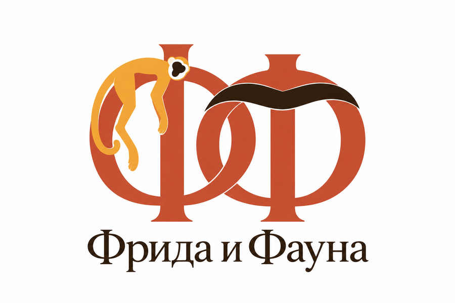
Updated Logo
During the redesign, the original compositional idea was preserved, but the proportions, graphic elements, and typography were refined. This allowed the mark to become more cohesive and adaptable for various brand applications.
Signature Palette
The color palette is based on natural hues associated with Mexican aesthetics and the artistic world of Frida Kahlo. It includes terracotta, ochre, olive, and dark brown. Unlike the previous palette, the overall combination appears more balanced due to the updated shade of green.
Typography and Media
The typographic system is built on the combination of an expressive serif typeface and concise auxiliary text. The contrast between these elements allows the brand’s artistic character to be maintained without compromising information readability.The signature graphics develop the motifs of the original project: symmetrical compositions, animal silhouettes, botanical forms, and branching lines reminiscent of roots and blood vessels. These elements connect the themes of nature, life, and renewal.
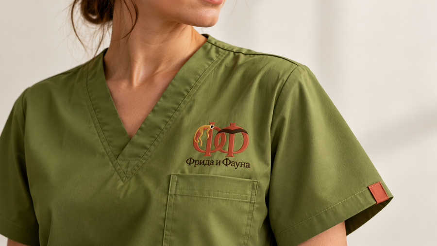
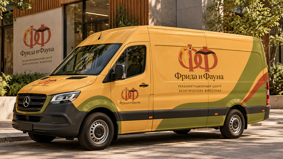
Examples of speakers
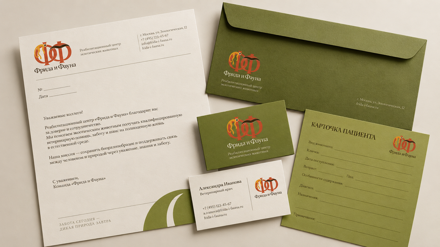
The brand identity has been adapted for the daily operations of the rehabilitation center. We have developed letterheads, business cards, envelopes, and patient cards, all unified by a consistent color and typography system.Olive green was chosen as the primary color for the materials, evoking a sense of calm and trust. The minimalist design emphasizes the medical purpose of the materials, while the brand monogram ensures visual recognition.
Interior and Exterior
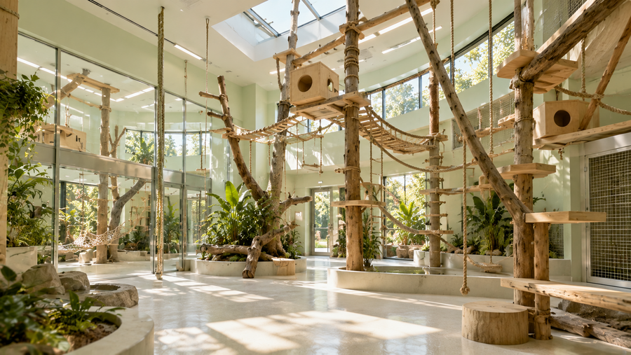
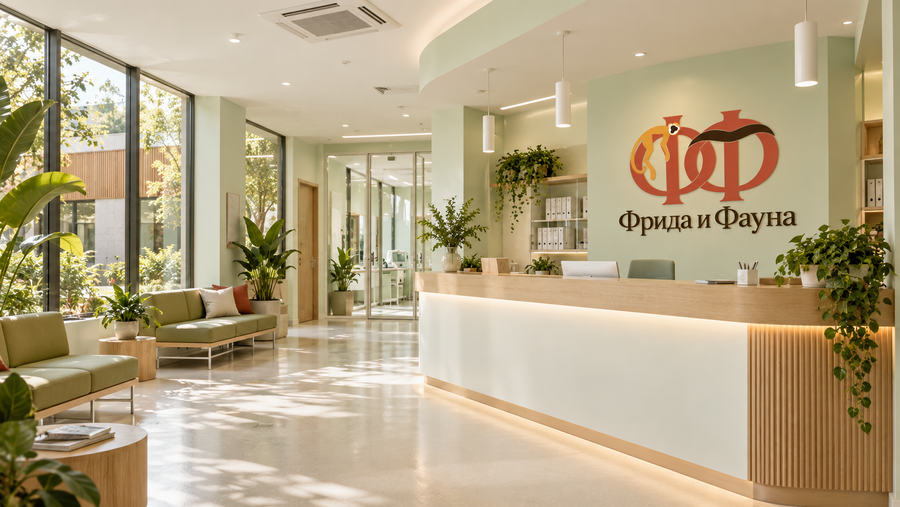
The interior concept integrates four functional zones: a reception area, a veterinary examination room, a recovery ward, and a rehabilitation enclosure for primates. Each space was designed with its specific function and spatial organization requirements in mind.The foundation of the interiors is a light green color palette, complemented by white surfaces and natural materials. This approach allows for the creation of a professional medical environment without a feeling of visual coldness.
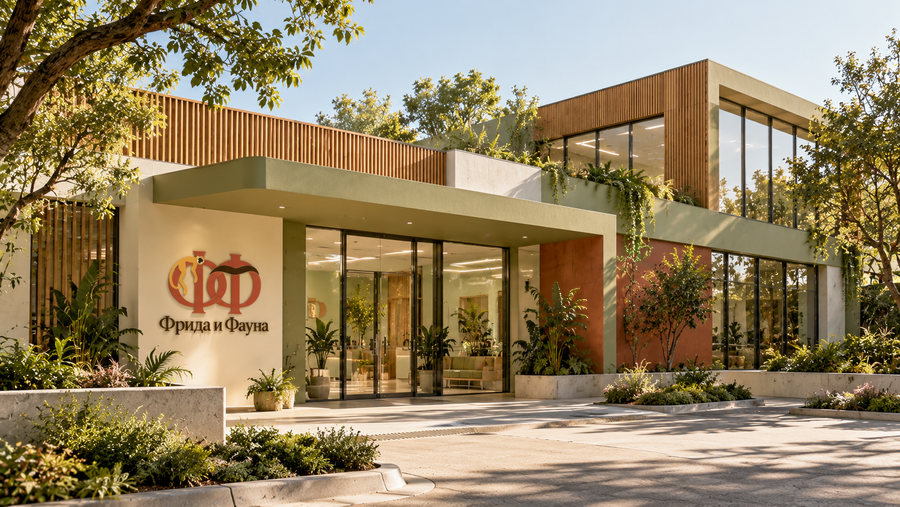
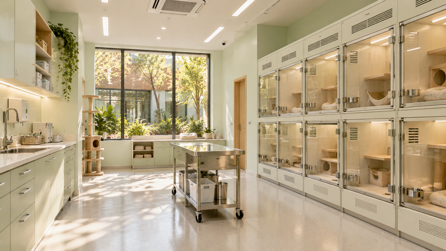
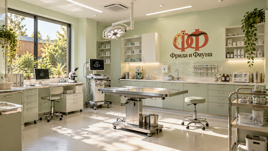
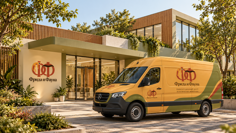
The architectural concept of the center is based on blending the functionality of a modern veterinary clinic with natural materials. Bright facades, natural wood, large windows, and restrained brand accents create an open and welcoming image for the facility. The landscaped grounds, greenery, and convenient access area support the idea of a calm environment focused on animal recovery.
Key visuals, branded merchandise, and apparel
The signature product line includes vitamin supplements in cardboard tubes, a textile collar patterned with ape silhouettes, and dry food in flexible packaging. The product’s visual system is based on a cohesive color palette, logo, and recognizable graphic elements.
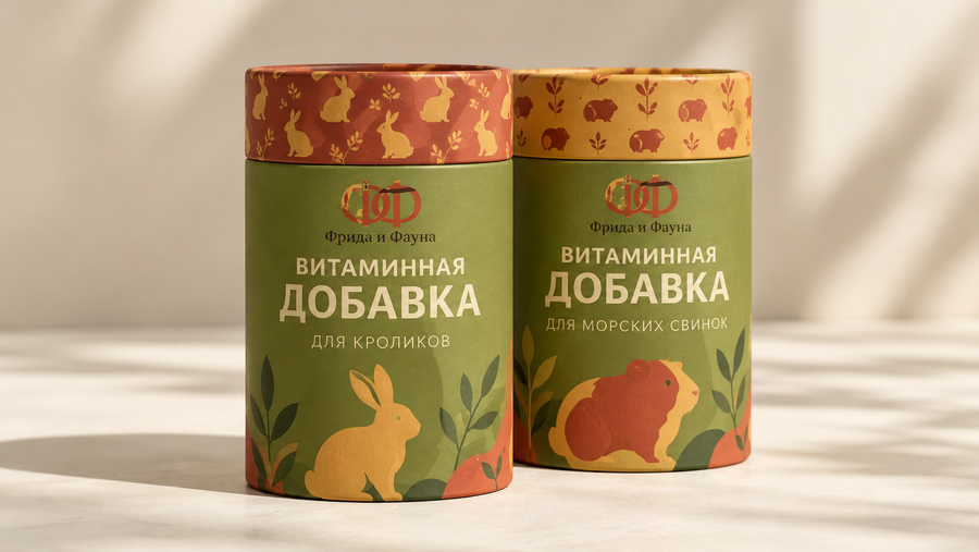
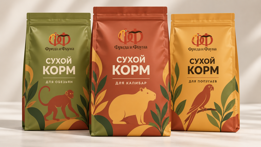
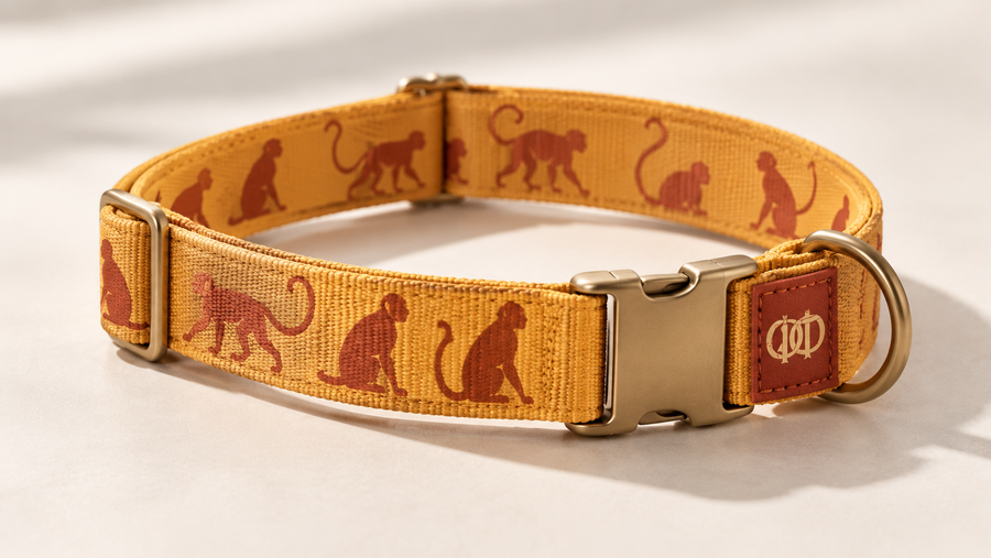
Each subject explores a different way to apply identity: from packaging design to textile patterns. The line is presented as a concept of products related to pet care.
Promotional Materials
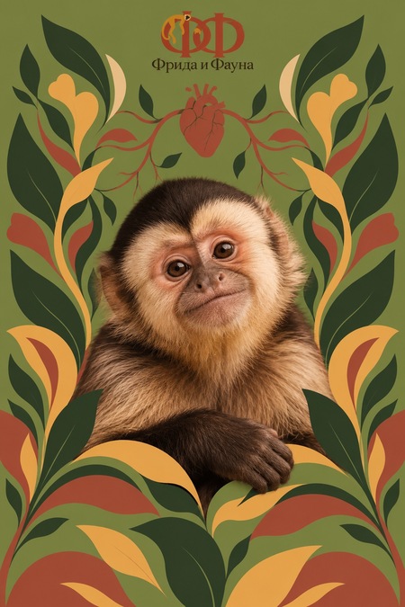
The advertising campaign consists of three posters unified by a combination of photorealistic monkey portraits and flat graphic design. The visual style references the original authorial images, which were inspired by the work of Frida Kahlo.
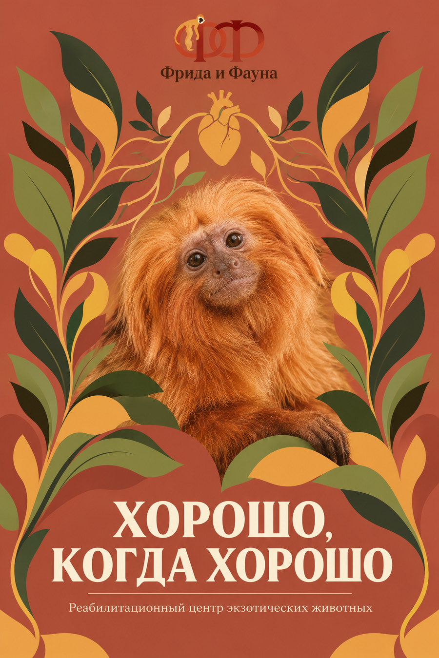
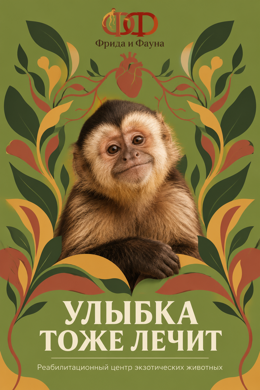
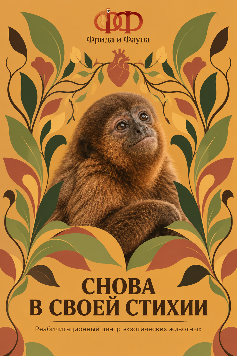
Each poster is built around a signature color and its own slogan: «A smile also heals, ” „It feels good when things are good, ” and „Back in their element.“ The light irony in the animals’ expressions softens the serious medical subject matter, making the communication warmer, more emotional, and more memorable.
Generation Process