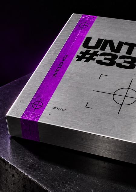
UNTITLED #33 — a concept for an independent techno label, which grew out of a rave project in the Berlin subway. The label combines events, collectible music releases, and merchandise.
The foundation was my project, «Metro Techno-Rave, ” which I started in my first year. It already included the title UNTITLED #33, a crosshair symbol, a purple-yellow palette, and a packaged CD. These elements served as the starting point for the redesign. https://portfolio.hse.ru/Project/303565
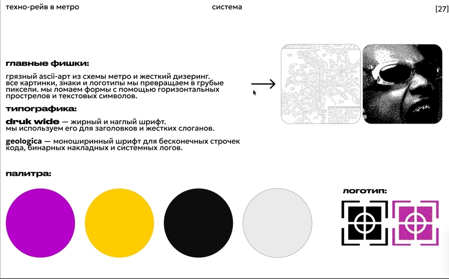
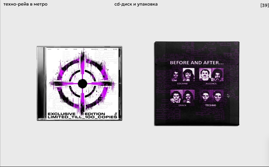
In the original work, the identity accompanied a separate rave. In the new version, it unifies the label’s products and space. The name, target, and signal colors have been retained. To these have been added metallic packaging, the release number U33/001, and a unified marking system.
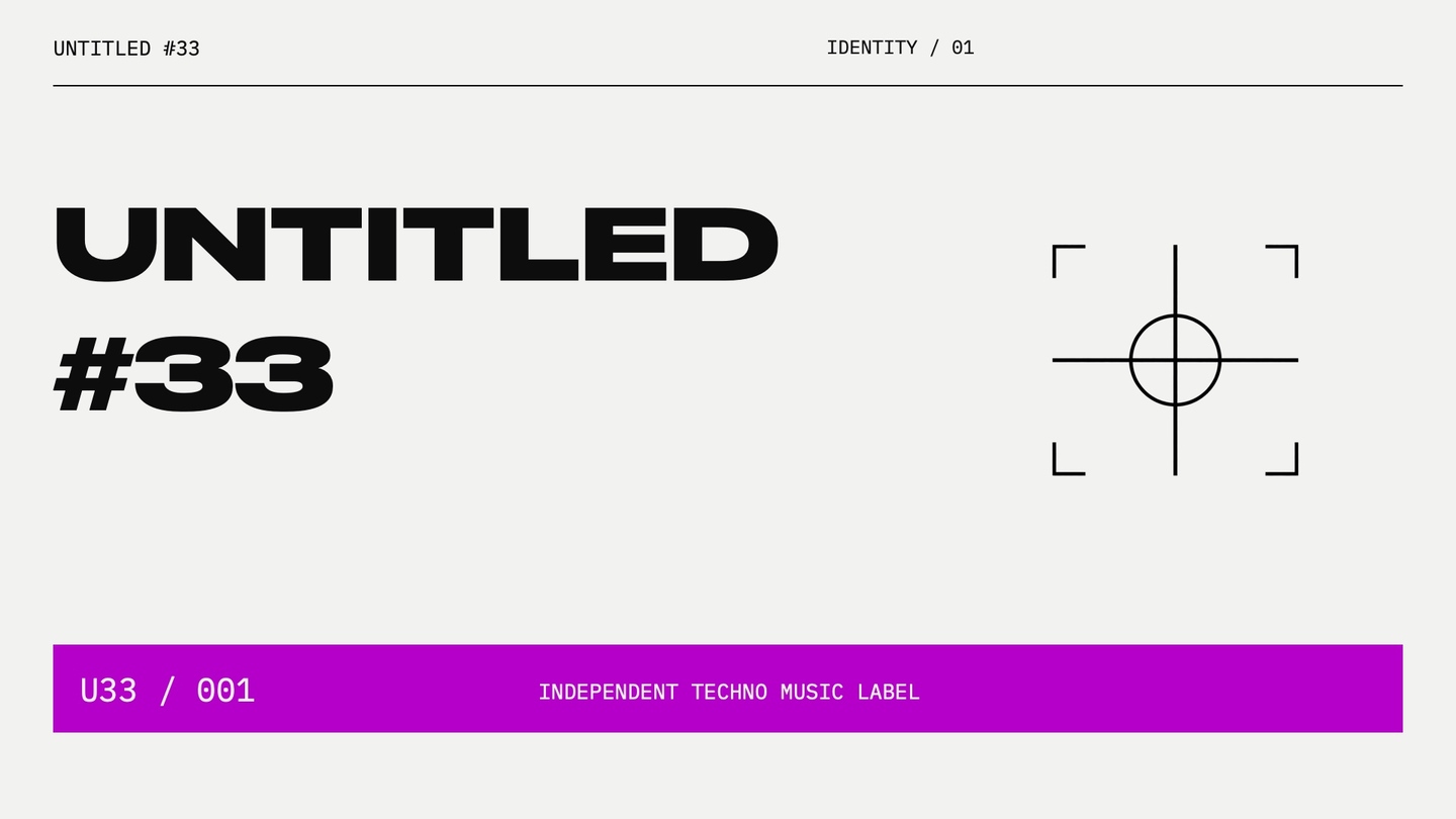
Logo and Mark
The verbal component of UNTITLED #33 is rendered in the broad, dense Druk Wide Cyr font. The sights link the new label with the original project. The combination of the name, symbol, and release number is repeated across packaging, apparel, accessories, and in the retail space.
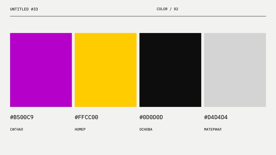
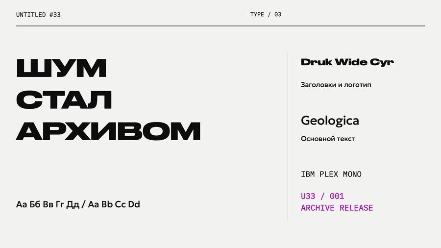
Design System
U33 / 001 Release
Inside the metal box, there is a CD of the set recording, a foldable poster, and an access card for the digital version. A purple stripe ties the packaging to the identity, while yellow labeling highlights a specific edition. The open set displays the composition of the new product.
Subterranean Context
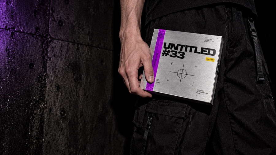
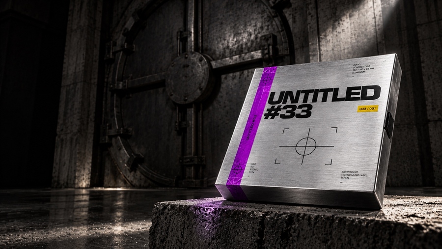
The concrete and steel door return the product to the environment of the original rave. The low camera angle renders the architecture monumental, while the directional light highlights a small booth. A calm space is left on the left for advertising typography.
One release—a series of repetitions
Several identical boxes create a rhythm of silver planes, purple plugs, and yellow markers. This shot presents the product as part of a small run. The prompt specifies a consistent packaging shape and the repetition of a single release.
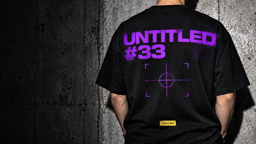
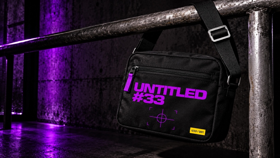
The metal capsule for earplugs continues the theme of aluminum packaging. A small logo, a purple stripe, and a yellow mark maintain recognizability even in a small format. Next to it, earplugs and the unscrewed cap are shown to clarify the object’s function.
Shop and Listening Area
Within the label’s space, you can select releases, listen to music, and view merchandise. Concrete, steel shelving, and a metal stand reinforce the brand’s industrial character. The purple logo and the yellow navigation line connect the interior design with the packaging.
Advertising Series
Three posters utilize pre-existing key visuals: a product on a steel door, a box in a hand, and a series of packaging designs. The headings SOUND BELOW, KEEP THE SIGNAL, and ARCHIVE 001 are set separately. This allows for the maintenance of text legibility while enabling changes to the advertising message without needing to regenerate the photograph.
Product Master
The first image was generated from a text prompt with no visual reference. It features an aluminum CD box, large typography, a reticle symbol, a purple seal, and a yellow mark. The angle, harsh lighting, dark background, and metallic texture were described separately. This resulting shot became the master image for the series.
[2] One reference for the series