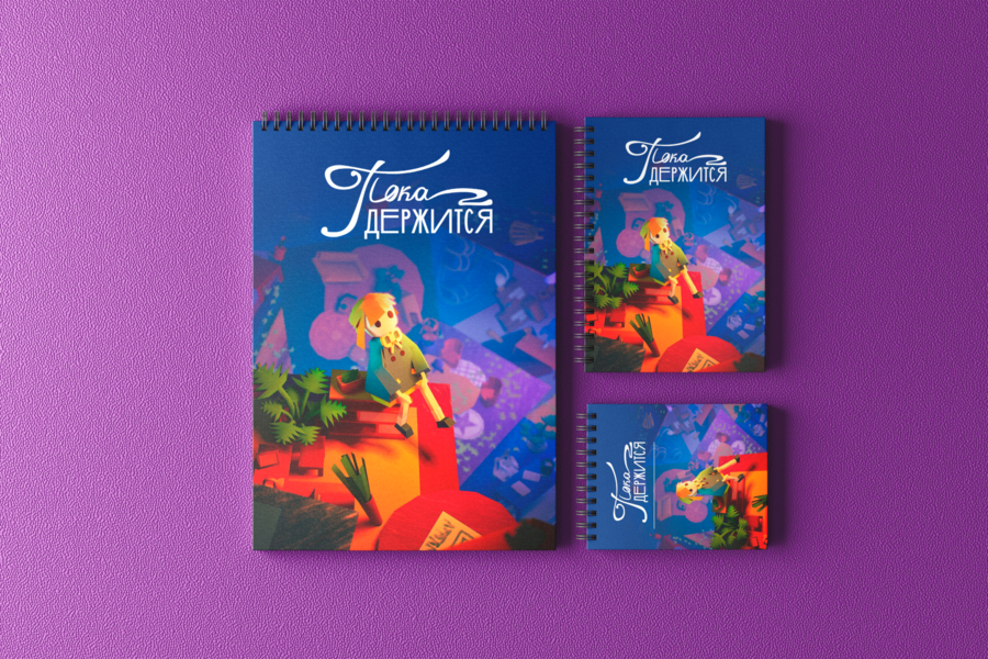
Мой старый проект — игра про людей с хроническими заболевание и время, которым приходится распорягаться вдвойне эффективно, чтобы успевать жить наравне со здоровыми людьми.
Новый проект развивает эту тему. Пока держится — бренд ежедневников для людей с проблемами со здоровьем.
Примеры продукта
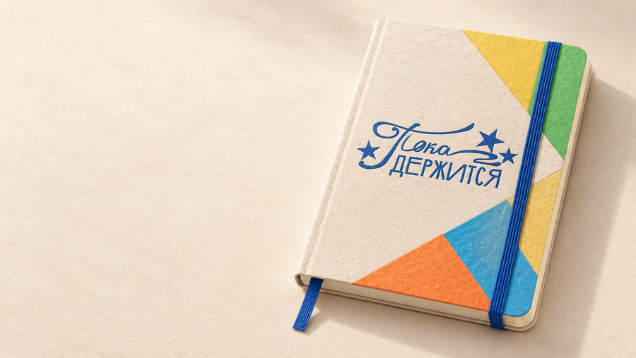
Create a realistic advertising product photograph of one undated A5 planner based on the attached reference. Preserve the cream textured cover, the original blue «Пока держится» logo centered on the cover, the blue elastic closure near the right edge, the blue ribbon bookmark, rounded corners, and geometric elements in blue, yellow, orange, and green. Do not alter the logo’s letterforms.
The planner lies diagonally on a light wooden desk beside a cream plaster wall. Three-quarter overhead view, with the entire planner and bookmark inside the frame. Soft morning light from the left, natural shadow to the right. Clearly visible paper fibers, cover edges, and layers of cream pages. Physically plausible construction, with a flexible cover made from thick matte cardstock. Landscape 3:2. No additional objects, text, or watermarks.
Create a realistic product photograph of the «Пока держится» planner opened to a weekly planning spread. Use the approved planner as the reference for its construction and design. A5 format, cream pages, flexible textured cover, and rounded corners. The blue elastic closure is pulled behind the right cover and remains partly visible along the side. A blue fabric bookmark extends from the bottom. Physically plausible binding and a natural curve in the pages near the spine.
Left page: the heading «Моя неделя», a blank date field «с __ по __», and seven spacious rows labeled «ПН», «ВТ», «СР», «ЧТ», «ПТ», «СБ», «ВС».
Right page: three spacious writing sections. «Здоровье» with a green corner accent and the prompts «Забота о себе» and «Время на отдых». «Близкие» with a yellow accent and the prompts «Друзья» and «Семья». «Работа» with a blue accent and the prompt «Главное на неделю». At the bottom, include a line labeled «Что меня порадовало». At the bottom of the left page, place «Мой баланс» beside three small empty circles outlined in blue, green, and yellow.
Keep all printed page text in Russian. Use thin rules, neat blue Cyrillic sans-serif typography, and plenty of blank writing space. Small colored geometric elements appear only in the outer page corners. No dense tables, handwritten entries, or medical advice. The entire planner rests on a warm light-gray paper background. Three-quarter overhead view, soft lighting from the left, and natural shadows. Landscape 3:2. No pens, additional objects, or text outside the pages.
Create a realistic overhead product photograph showing the unboxing of the «Пока держится» planner. On the left, place one closed planner matching the reference: cream textured cover, original blue logo, blue elastic closure and bookmark, and colored geometric elements.
On the right, place an open, flat cream cardstock mailing envelope sized to fit an A5 planner. Thin yellow tissue paper is visible inside. Below it, place a removed blue paper bellyband and three thin bookmarks in blue, yellow, and green. The envelope features the original blue logo; the bellyband features the same logo in cream.
Warm cream paper background, soft light from the left, and natural contact shadows. Physically plausible flaps, folds, and packaging thickness. Keep the objects neatly separated and fully inside the frame. Clearly distinguish the textures of cardstock, paper, and the fabric elastic. Landscape 3:2. No second planner, pens, additional text, or watermarks.
Create a realistic advertising photograph of a woman holding the «Пока держится» planner based on the attached reference. Preserve the product design: cream textured cover, original blue logo, blue elastic closure and bookmark, colored geometric elements, and rounded corners.
The woman wears a loose cream linen shirt and dark gray trousers and walks through a quiet, sunlit courtyard. Crop from the shoulders to the upper thighs, keeping her face outside the frame. She naturally holds the closed planner against her hip with one hand, with the front cover facing the camera and clearly visible. Maintain accurate A5 proportions relative to her hand. Anatomically correct hands and a natural grip. Softly blurred light-colored architecture and greenery in the background. Warm daylight, shallow depth of field, with the product in sharp focus. Landscape 3:2. No bags, additional objects, or advertising text.
Мерч
Premium realistic stationery BRAND MERCH collection photograph, landscape 16:9, one composed flat lay on warm light-gray paper. Exactly THREE merch objects, fully visible with space between: a natural cream cotton TOTE BAG on left with blue handles and a large asymmetrical printed blue green yellow orange folded-paper geometric composition plus the original centered BLUE «Пока ДЕРЖИТСЯ» logo; an ivory matte cylindrical reusable WATER BOTTLE at upper right with blue cap, small original blue logo and orange yellow angular printed wrap; a cream canvas ZIP POUCH at lower right with blue zipper, green orange corner panels, original blue logo. Faithfully copy original logo lettering and stars from reference, no new font for logo. NO notebook in photo, no props, no captions or slogans, only original logo on objects. Real screenprinted cotton weave, matte powder-coated bottle, clear seams, manufacturing believable. Soft left studio light, shadows right. Same restrained tactile brand palette as reference. Entire collection fills frame beautifully without crowding.
Промо / афиши
Reference is the APPROVED planner: preserve its exact cream textured cover, centered blue original calligraphic logo with stars, blue elastic, blue bookmark, angular green yellow orange blue panels, rounded corners. Campaign motif: a square of thin blue/orange/yellow/green paper with ONE turned-up corner, crisp diagonal fold, soft natural shadow, warm cream negative space. Palette F5EBD3, 237CB0, FFCC45, 58B75B, 78207F. Russian slogan only «Сложится по-твоему». Original logo only, no other text, credits, prices or watermarks. Real premium advertising design, quiet clear hierarchy. Output landscape 16:9 full frame photographic mockup, one purposeful composition, not a collage. KEY VISUAL 1: photograph of one large horizontal roadside BILLBOARD on a clean contemporary concrete urban facade under soft daylight, front three-quarter perspective, no people or vehicles. Billboard design: warm cream field, enormous folded blue paper square at left creating diagonal upward sweep with yellow underside, exact approved planner at right, blue original logo at upper left and slogan in large elegant blue Cyrillic sans serif.
Reference is the APPROVED planner: preserve its exact cream textured cover, centered blue original calligraphic logo with stars, blue elastic, blue bookmark, angular green yellow orange blue panels, rounded corners. Campaign motif: a square of thin blue/orange/yellow/green paper with ONE turned-up corner, crisp diagonal fold, soft natural shadow, warm cream negative space. Palette F78221, 58B75B, 78207F. Russian slogan only «Сложится по-твоему». Original logo only, no other text, credits, prices or watermarks. Real premium advertising design, quiet clear hierarchy. Output landscape 16:9 full frame photographic mockup, one purposeful composition, not a collage. KEY VISUAL 2: real outdoor CITYLIGHT / BUS SHELTER advertising lightbox, portrait format inside landscape 16:9 photograph of modern minimal glass bus shelter. One illuminated poster dominates right two thirds. Poster composition distinctly different from billboard: huge YELLOW paper square folded diagonally revealing BLUE underside forms a rising sunlike corner at TOP of poster, original blue logo centered in cream middle, slogan «Сложится по-твоему» on two lines, approved planner small near bottom with green and orange paper accents. Graphic remains clearly folded square not sun icon. Soft overcast daylight, quiet urban stone pavement, empty shelter, no people, no buses. Flat clean premium photographic mocku
Landscape 16:9 photorealistic mockup of TWO identical seasonal promotional POSTERS in a stationery shop window, one main poster large in frame, second partly visible behind glass at side. Independent seasonal poster for brand «Пока ДЕРЖИТСЯ», not main campaign: dominant solid #78207F background, small original CREAM logo faithfully copied from reference at upper center, one big elegant YELLOW sans-serif Russian slogan «Начни с чистого листа» occupying middle, a quiet constellation of small yellow five-point stars around a single cream blank sheet of paper floating below. NO planner, no notebook, no folded colored squares, no blue elastic motif. This is a standalone new-beginning promo using secondary brand palette, not a repeat of the main key visuals. Only logo and slogan, no discount numbers, dates, captions or body text. Real printed matte stock, realistic restrained window reflections, no other shop signage or people. Product presentation quality, clean hierarchy.
Пространство
Photorealistic interior design image of a small contemporary STATIONERY POP-UP SHOP for the brand «Пока ДЕРЖИТСЯ», landscape 16:9, architectural wide-angle photograph in soft daylight, no people. Warm cream plaster and birch plywood interior, central cream angular display island whose corner bends upward like a folded paper sheet, blue edge line like elastic, quiet green yellow orange triangular cabinet panels. On rear cream wall place exact original BLUE calligraphic logo with stars copied from reference, faithful lettering. A small curated number of the approved A5 cream planners with blue elastic and geometric cover displayed neatly on shelf and island. One tote and a small stationery shelf. Tactile sustainable-looking paper and wood but make no written sustainability claims. Minimal premium shop, realistic scale and buildable retail furniture, warm-gray floor, gentle shadows. Only visible text is original logo, no prices, no store labels, no other signs. The folded corner motif links the spatial design to the campaign.
Обложка
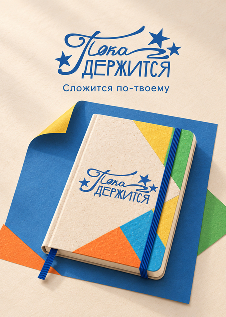
Create a portrait project cover for «Пока держится», with a target resolution of 1140 × 1600 pixels. Use the attached planner image as the exact product reference.
The background is warm cream textured paper. Place the large original blue «Пока держится» logo at the top, preserving its letterforms and stars. Below it, place the slogan «Сложится по-твоему» in a clean, understated blue Cyrillic sans-serif typeface. Keep both the logo and slogan in Russian.
In the lower two-thirds of the composition, show one planner floating slightly at a diagonal, viewed from a three-quarter angle. Preserve its blue elastic closure, bookmark, cream cover, and colored corner elements. Behind the planner, place one large blue paper square with a folded corner revealing a yellow underside, accompanied by small green and orange accents. Soft natural shadow and studio lighting from the left. Keep the entire planner and bookmark inside the frame. Leave approximately 80-pixel safe margins. A clear composition that remains readable as a thumbnail. Only the logo and slogan, with no other text or watermarks.
Айдентика