TOY VENDETTA — a puzzle-platformer concept with stealth elements. The protagonist is a self-taught vandal with a singular obsession: to hack the vending machines and free all the world’s toys from their captivity.
The location recreates underground street art spaces with a cyberpunk sensibility.
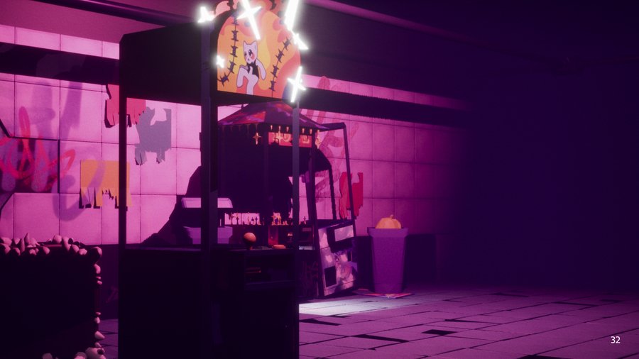
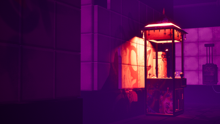
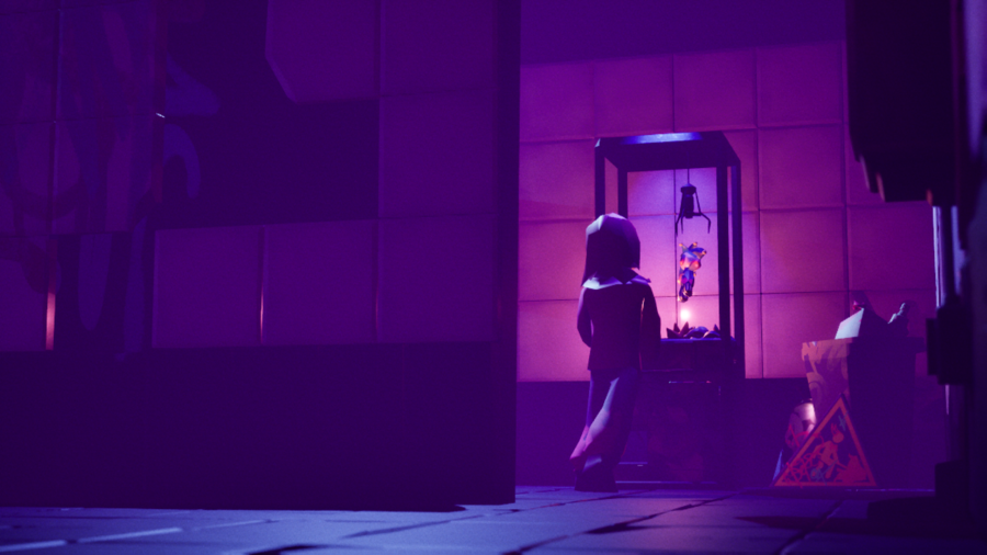
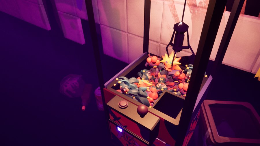
The pitch unifies the narrative, gameplay mechanics, and visual identity of the project. Therefore, it becomes the central element of the rebranding effort.
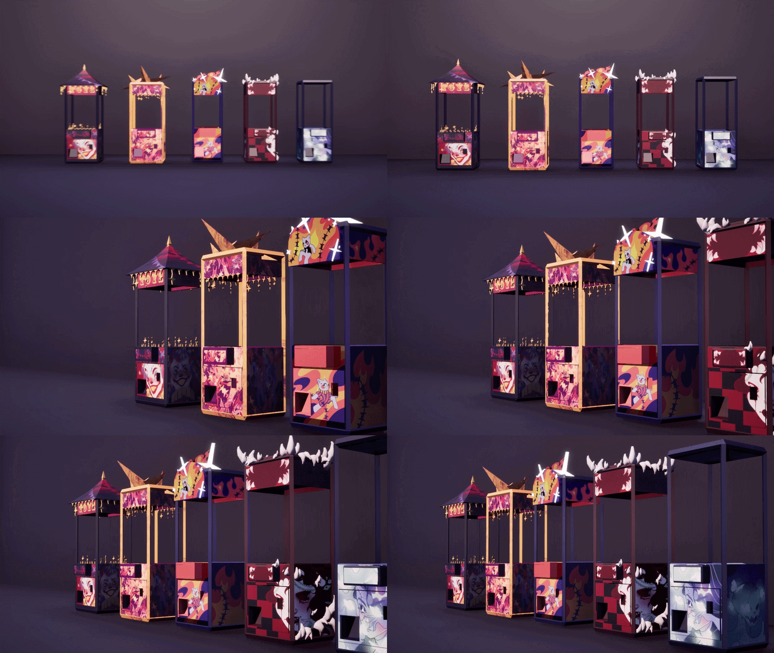
The entire rebranding was created in ChatGPT using a single source prompt: it included the project criteria, presentation guidelines, and my commentary. The specific prompts used for the neural network will be provided below the images.
Description
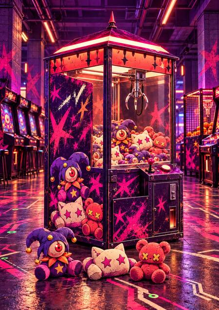
PLAY FREE — the brand concept for arcade games and a covered moon park based on the game TOY VENDETTA.
The product line includes a claw machine, arcade games, a strength tester, basketball, and pinball.
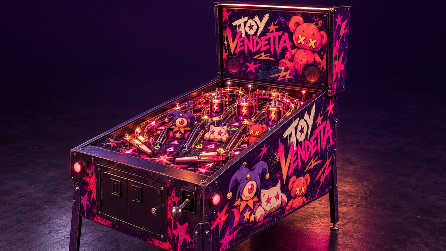
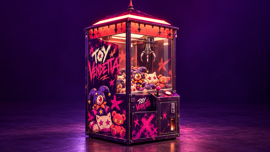
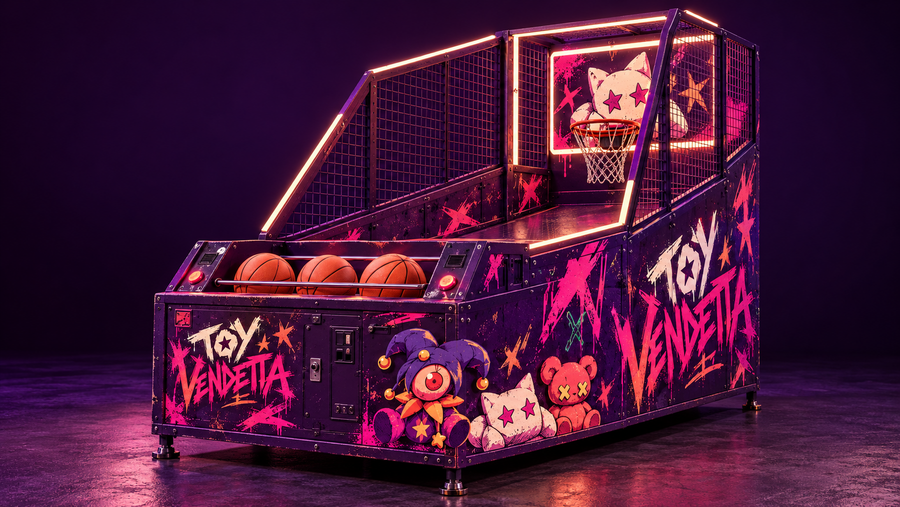
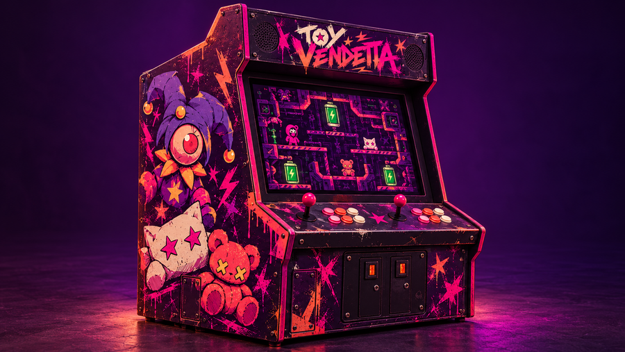
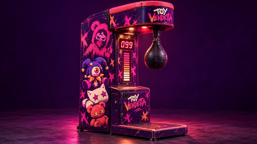
The display case, screen, pear shape, ring, and game board feature distinct designs, yet they maintain a unified palette, graffiti style, and character team. Merchandise and promotional materials extend this system beyond the game area.
The game conflict persists in the image of freeing the toys and develops in the physical space.
Identity
The name TOY VENDETTA remains. The new wordmark features angular, handwritten plasticity and graffiti texture. The secondary mark is a three-fingered crane within an open electrical circuit.
Working color palette for subsequent layout: dark eggplant
, violet </h3 id="7433A4">, pink
, coral </h3 id="FF865A">, cream
. Green </h3 id="7EE58A"> is used as an accent, like a glowing contact point.
The logo and accent lettering are custom letterforms, not a standardized typeface. For body text and navigation, Inter Regular and Semibold are recommended; zone numbers should use a large, bold grotesque font. In the generated image, the letter samples are raster visualizations, not font files.
Key Visuals and promotional materials
Crane
Toy Team
Pink Bear
Chain Break
Hacking Journal