What is «Pre-Production»?
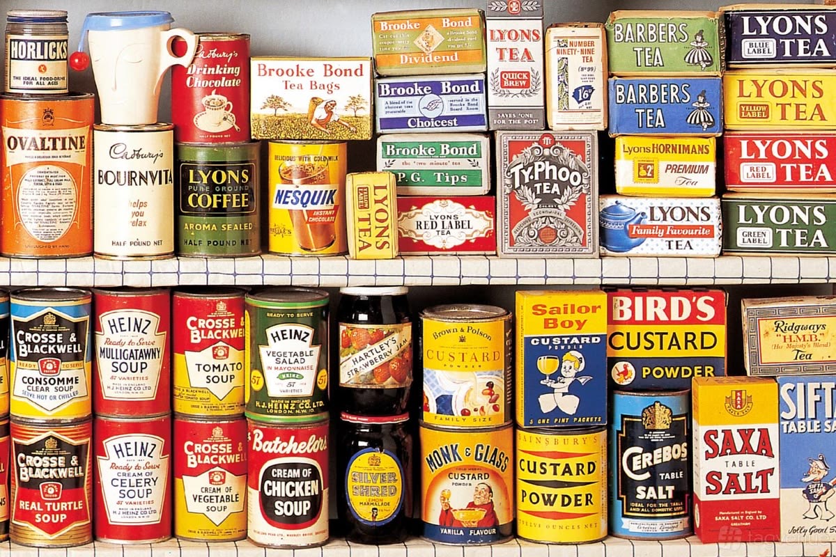
«To the Packaging» is a media outlet focused on the history of packaging, graphic design, and the visual culture of goods. We investigate everyday items: chocolate, tea, beverages, cosmetics, household products, and groceries. We are interested not only in what is inside the packaging but also in why it looks the way it does. Each article examines packaging as a visual document of its time—its color, form, typography, illustrations, materials, and labeling.
Packaging is not merely a wrapper for a product. It is a story of the time, culture, and people who created it.
Media Goal
GOAL
To illustrate the history of graphic design through familiar objects.
«Before the Packaging» helps to understand how and why product appearances changed and what these shifts reveal about the cultures of different eras.
MEDIA ADDRESSES THREE CHALLENGES:
01 — GATHERING
Preserving the visual narrative of packaging and sourcing rare archival materials.
02 — EXPLAINING
Narrating why colors, fonts, shapes, illustrations, and logos changed.
03 — CULTIVATING PERCEPTION
Teaching students to notice design solutions in the most ordinary objects.
WHY THIS IS IMPORTANT?
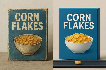
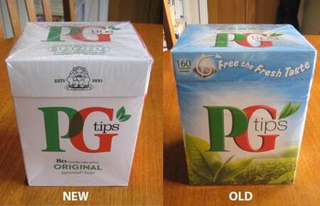
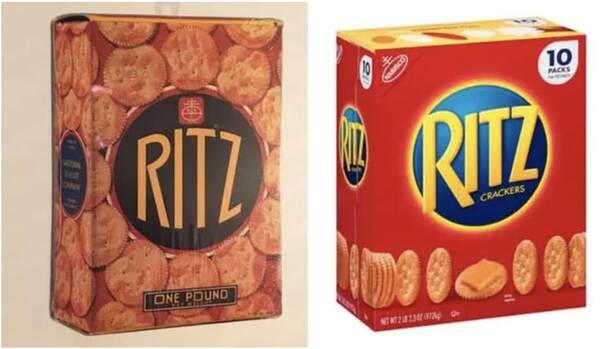
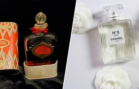
We see dozens of packages every day, but we rarely stop to wonder why they look the way they do. The color of the box, the shape of the bottle, the typeface on the label, and the product image seem natural. But in reality, behind every such decision lies a specific era, technology, and perception of what should appear beautiful, high-quality, and contemporary. By comparing the old and new packaging of a single product, one can see how: — consumer tastes have changed; — production technologies have evolved; — advertising strategies have shifted; — graphic design has developed; — perceptions of beauty have transformed. Therefore, packaging becomes a way to study history through everyday objects.
MEDIA THEMES
BROAD TOPIC
Design and Visual Culture
The history of graphic design, advertising, branding, and the material environment.
SEGMENT
The History of Consumer Packaging
How products looked in the past and how their visual image has evolved over time.
NARROW TOPIC
How the packaging of familiar goods has changed and what these shifts reveal about the era.
We examine specific objects and compare their appearance across different periods.
LIMITATIONS
«Before Packaging» does not cover all aspects of design.
The media focus—packaging as the intersection of design, history, and daily culture.
WHAT WILL WE EXPLORE?
PRODUCTS
Food
Chocolate · tea · candies · dairy · beverages
Beauty
Perfumery · creams · soap · cosmetics
Household Goods
Detergents · cleaning supplies · home items
Everyday Life
What people buy and see every day.
WE ARE INTERESTED IN:
Form → material → color → typography → illustration → logo → context
EDITORIAL SECTIONS
01. BEFORE / AFTER
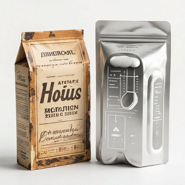
We compare the packaging of a single product across different years.
Example:
«How has chocolate design changed over 50 years?»
02. THINGS WITH A STORY
Every object—a story.
Example:
«Where did this label come from?»
03. LABEL ANALYSIS
We study typography, color, composition, and illustration.
Example:
«Why were old labels so detailed?»
04. ARCHIVAL SHELF
Collections of rare and unusual packaging.
Example:
«10 packages that look surprisingly modern today.»
MORE SECTIONS
05. DESIGN OF OUR TIME
Why a specific era generated precisely this visual language.
06. WHERE DID IT GO?
We explore packaging elements that were once familiar but have disappeared today.
07. PACKAGING SPEAKS
How color, typeface, or imagery can communicate about a product and its intended audience.
08. ONE BRAND—VARIOUS ERAS
We examine how a single visual identity evolved alongside the brand.
COMPETITORS
THE DIELINE
Media on contemporary packaging and branding design.
Strength: a large volume of professional case studies.
Weakness for our audience: the main focus is on modern design, not the history of packaging.
PACKAGING OF THE WORLD
A massive database of packaging projects from all over the world.
Strength: an enormous collection of visual references.
Weakness: it is more of a project catalog than a research-focused media platform.