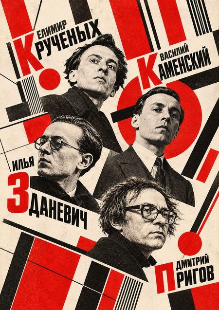
This work is dedicated to a fundamental shift in the theory and practice of the book, which occurred in the first third of the 20th century and underwent systemic re-evaluation in the Neo-Avant-garde and Conceptualism of the 1970s and 1980s.The subject of analysis is the transformation of type—from a technical tool for conveying verbal text to an autonomous plastic, graphic, and pictorial object.Using the works of Alexei Kruchenykh, Velimir Khlebnikov, Vasily Kamensky, Ilya Zdanevich (Ilyazda), and Dmitry Alexandrovich Prigov, we examine how the printed sheet evolved from a «transparent container of meaning» into an autonomous, space-dynamic work of visual art.
CONTENTS
1. Introduction2. Lithographed Book and Handwritten Rebel Aesthetics 2.1. Corporeality and Kinetics of the Manual Gesture 2.2. Visual Representation of the Mind 2.3. Synthesis with Woodcuts and Archaism3. Reinforced Concrete Poems: Visual and Spatial Typography 3.1. Abolition of Linearity and Syntactic Line 3.2. Type Size as Scaling of Space and Acoustics 3.3. Materiality of the Medium: Wallpaper as a Social and Visual Gesture4. The Type-Set Shift of Ilyazda and the Alphabetic Orchestra 4.1. Theory and Practice of the «Typographic Shift» 4.2. Visual Notation of Voice5. Neo-Avant-Garde and Conceptualism: Dmitry Alexandrovich Prigov and the Evolution of the Letter 5.1. The Typewriter as a Medium and Monospaced Grid 5.2. The «Stichogram» Visual Method 5.3. Desemantization and Objectification of Ideologemes6. Comparative Analysis of Method Evolution7. Conclusion8. Bibliography9. Image Sources
1. INTRODUCTION
In the classical European tradition of typography, the book page was conceived of as a neutral conduit for text. The British typographer Beatrice Ward articulated this concept in the famous metaphor of the «crystal glass»: a perfectly composed typeface must be transparent, like clear glass, allowing the reader to absorb the verbal content without visual distortions, glare, or distractions.
Typeface, point size, leading, and line spacing were governed by utilitarian rules for centuries, striving to completely neutralize the physical, material nature of the sign.
Russian Futurism of the 1910s executed a radical, revolutionary gesture, declaring war on this «invisible» typography. The Futurists—Alexei Kruchenykh, Velimir Khlebnikov, Vasily Kamensky, Ilya Zdanevich—viewed neat typesetting as a violent standardization that tamed the natural energy of the human voice, emotional affect, and visual thinking. In the programmatic manifestos of the era—“The Word as Such» (1913) and «The Letter as Such» (1913)—they proclaimed a rejection of interpreting the letter as a subordinate, abstract symbol of sound.
The cover of the famous manifesto by Kazimir Malevich, Alexei Kruchenykh, and Velimir Khlebnikov: «The Word Itself» (1913)
The letterform gained its own weight, density, temperature, texture, and spatial parameters. Text began to be perceived not as a phonetic recording of speech, but as a dense physical substance, a plastic material, and the book page became akin to a painterly canvas, an architectural blueprint, or a montage plane.
Within this research, four key stages and methods of this transformation are identified:
1. Lithographic book (A. Kruchenykh, M. Larionov, N. Goncharova, O. Rozanova, K. Malevich) — the return of the manual gesture and corporeality through lubok, collage, and zaum.
2. Spatially-constructive typography (V. Kamensky) — the deconstruction of the syntactic line and the creation of «reinforced concrete» visual maps.
3. Score-setting shift (I. Zdanevich / Ilyazd) — transforming metal letters into a sonic and ornamental visual orchestra.
4. Conceptualist deconstruction (D. A. Prigov) — the use of the typewriter, rigid grids, and spatial figures to de-semanticize ideological language.
2. LITHOGRAPHED BOOK AND THE MANUSCRIPT REBEL AESTHETIC
The futurists' initial response to the standardization of type setting was a complete rejection of the printing press as an institution. Between 1912 and 1914, Alexey Kruchenykh, collaborating with avant-garde artists Mikhail Larionov, Natalia Goncharova, Olga Rozanova, and Kazimir Malevich, began publishing small-edition lithographic collections («Pomada, ” „Ancient Love, ” „Mirskontsa, ” „Vzorval, ” „Duck’s Nest…“).
Instead of using standard metal type cases, the text was handwritten with special ink or lithographic pencil directly onto the lithographic stone, and subsequently printed on inexpensive paper—sometimes wrapping or tissue paper.
Alexey Kruchenykh Cover of the collection «Lipstick» (1913)
2.1. Embodiment and the Kinetics of Hand Gesture
The lithographic method allowed Futurists to reintroduce the individual kinetics of the human hand into the printed publication. In the manuscript book, the letter is not confined within the standard rectangle cast from metal type. It changes its size, slant, width, and thickness right during the process of «writing-drawing.»
The handwritten script of Kruchenykh and Rozanova demonstrates the author’s emotional affect. Splatters, ink washes, accidental smudges, corrections, and paper texture cease to be printing flaws. They become full-fledged elements of the composition, capturing the poet’s and artist’s immediate psychophysical state at the moment of creation.
2.2. Visual Representation of Intelligence
The emergence of jargon («zaumi»)—a language that moved beyond the confines of logical thought and everyday vocabulary—demanded a radically new visual form. The famous poem by Alexey Kruchenykh:
Gibberish
Alexey Kruchyonykh
Hand-lettered in the collection «Lipstick» (1913). A metal typographic font would have inevitably lent these new phonetic sounds an academic, ordered appearance, «grooming» their aggressive physiology.
Lithography, however, allowed the visceral essence of the jargon to be conveyed: the angular, encroaching letters of «dyr bul shchil» vividly demonstrate the grating, the rupture, and the physical effort involved in pronouncing these sounds.
MENTAL SOUND (Acoustics) $\rightarrow$ MANUAL PRESS/KLaxon (Kinetics) $\rightarrow$ LITHOGRAPHIC PRINT (Image)
2.3. Synthesis with Woodcut and Archaism
Futurist lithographic books deliberately referenced archaic forms of folk culture: Russian lubok prints, handwritten Old Believer manuscripts, hagiographic collections, and street signs. In the works of Olga Rozanova and Natalia Goncharova, the boundary between typeface and illustration completely dissolves. The letter sprouts into an image, and the contour of the drawing transforms into a typographic sign.
NATALIA GONCHAROVA Cover for the collection by A. Kruchyonykh and V. Khlebnikov «Mirskonts.» 1912. Collage. From the collection Of the State Museum V. V. Mayakovsky
3. CONCRETE POEMS: VISUAL AND SPATIAL TYPOGRAPHY
Vasily Kamensky—poet, aviator, and one of the leaders of Russian Futurism—chose a different path to overcome the traditional book. Where Kruchenykh moved away from the printing press toward handwritten drawing, Kamensky attempted to hack the metal typesetting from within, compelling it to function according to the laws of architecture and aerodynamics.
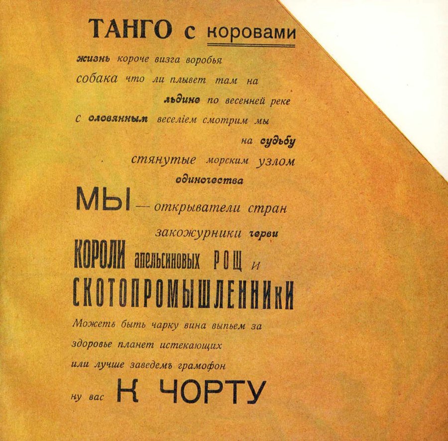
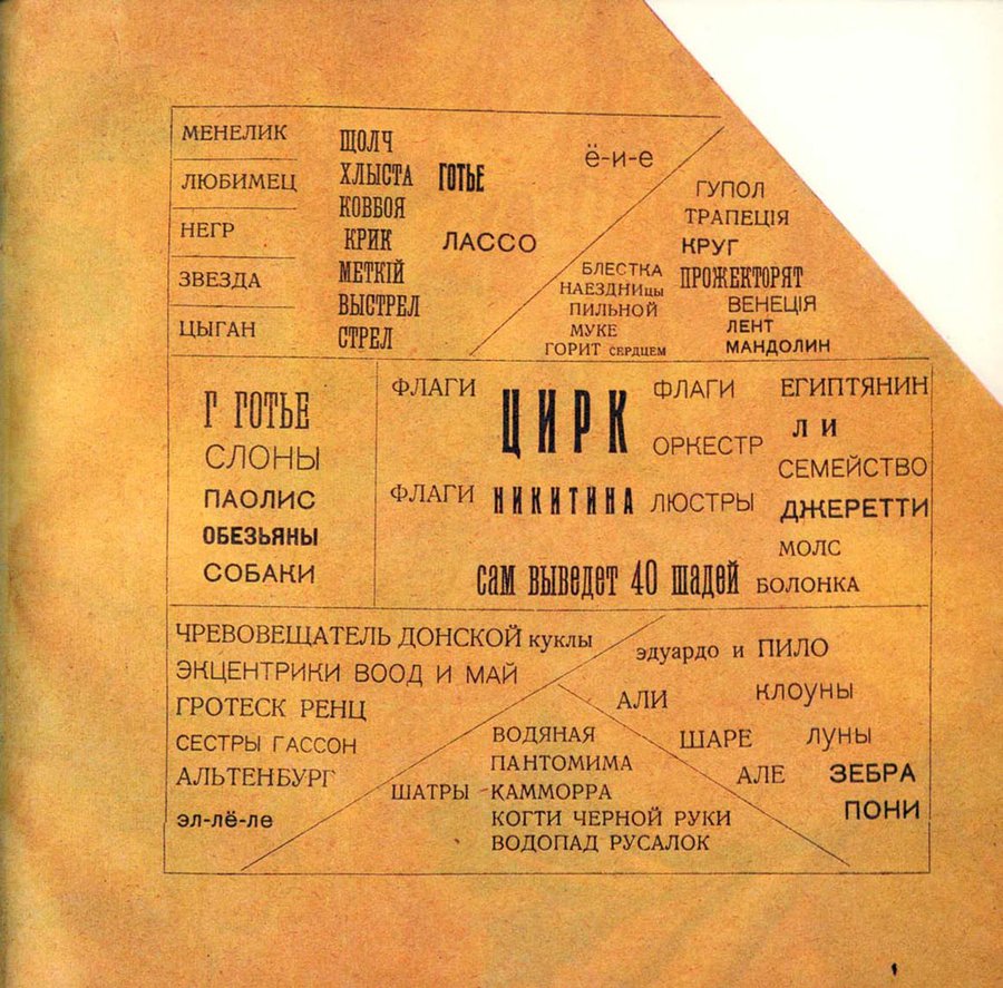
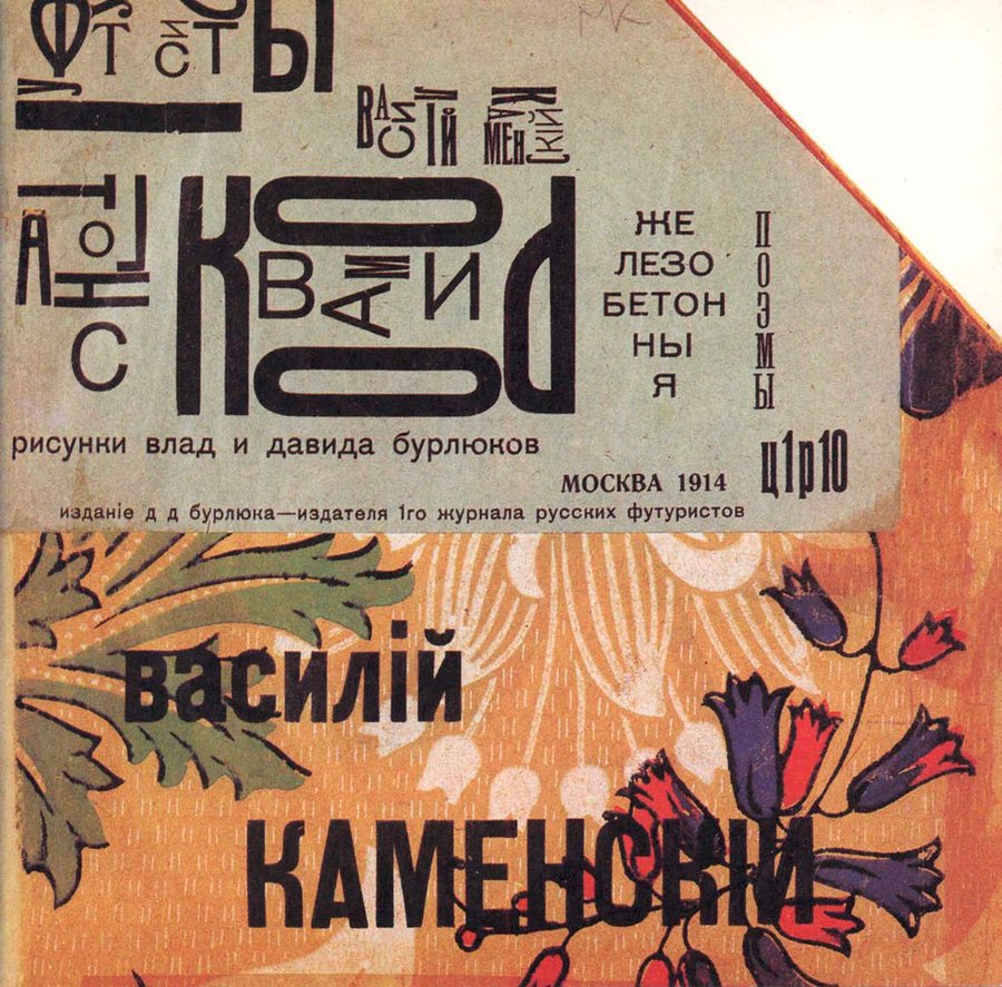
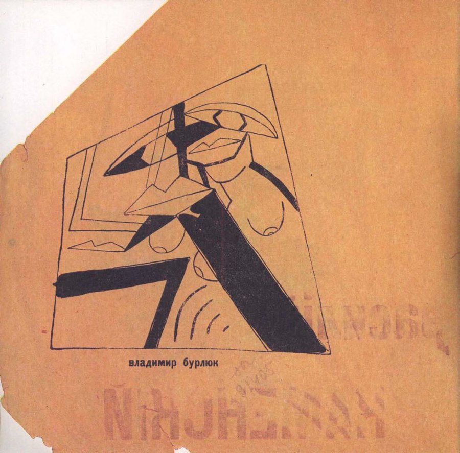
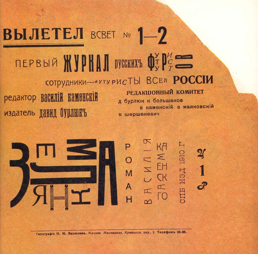
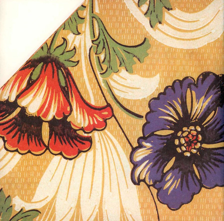
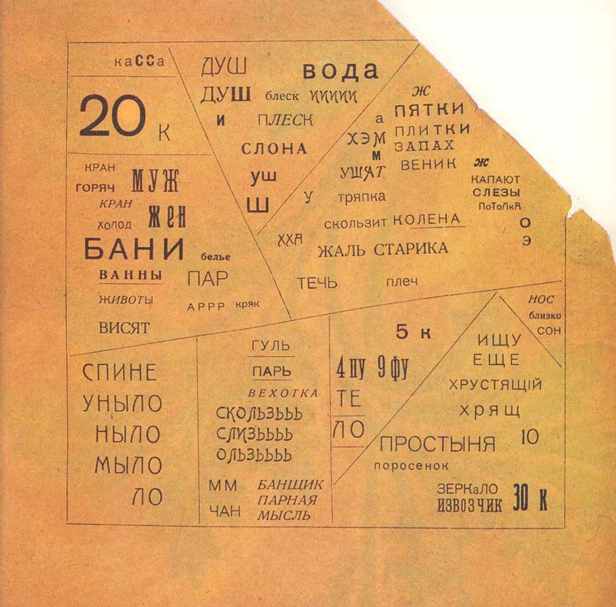
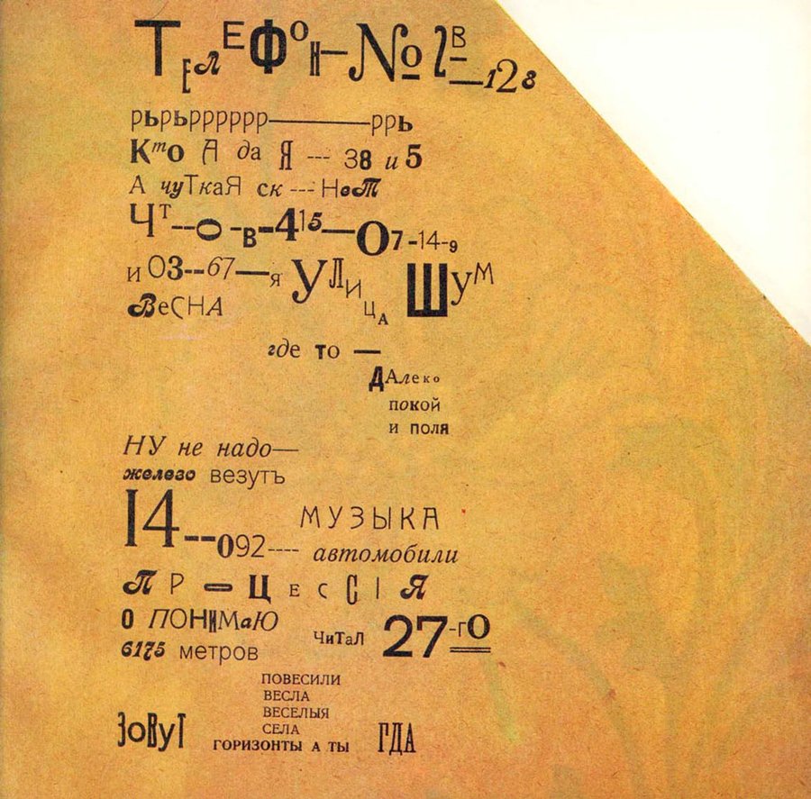
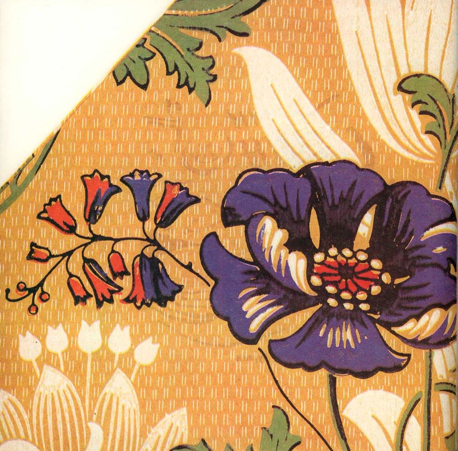
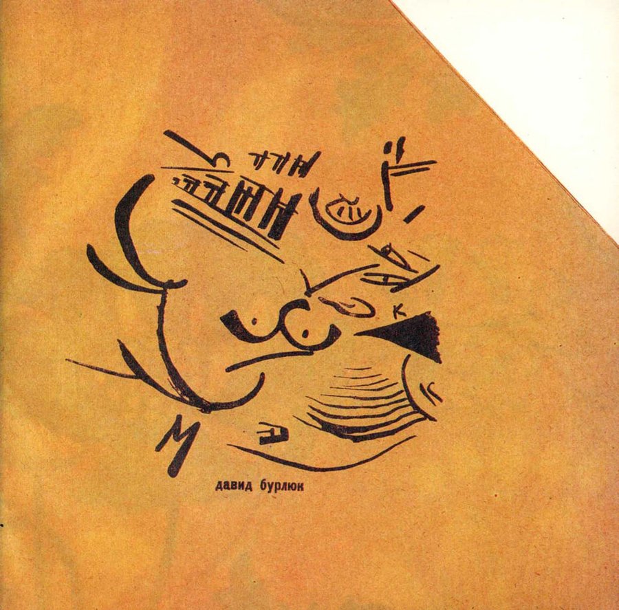
Vasily Kamensky «Tango with Cows» (1914)
In 1914, Kamensky published his famous collection, «Tango with Cows. Reinforced Concrete Poems.» The book was printed in a printing house, but it defied all the rules of typography: it was shaped like a pentagon with a clipped upper corner and printed on the reverse side of colored embossed wallpaper.
3.1. Abandonment of Linearity and Syntactic String
In «Reinforced Concrete Epics» («Paris,» «Constantinople,» «Flight,» «S.I. Shchukin’s Palace»), Kamensky completely abolishes the conventional line moving from left to right and top to bottom. The page is divided into sectors, polyphonic blocks, and triangles by diagonal and vertical lines. The reader is no longer oriented toward linear, sequential reading. Their gaze skims across the page in all directions, encompassing the entire composition at once—much like a viewer observes a Cubist painting or views a city map from a bird’s-eye perspective.