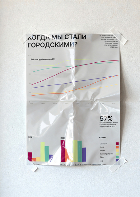
Topic: When Did We Become Urban?
This project is dedicated to urbanization—one of the primary processes that has reshaped the structure of modern society. We are accustomed to viewing cities as a natural habitat, yet much of human history occurred outside of urban centers. To visualize this, we selected data on the changing percentage of the population living in urbanized territories between 1950 and 2025. This time frame allows us to observe not a single state, but the entire process of transitioning from a predominantly rural population to a modern urban society. The project’s goal is to render this massive demographic process comprehensible through a simple visual narrative. The infographic enables us to simultaneously view global dynamics and compare the rates of urbanization across different nations. The value of this visualization is that abstract percentages are transformed into a clear picture of how the lifestyles of billions of people have changed.
Source Data
The project is based on the open dataset «Share of population living in urbanized areas, 10,000 BCE to 2025» from Our World in Data. For visualization, data covering the years 1950–2025 were selected for six comparison entities: the world, India, China, the United States, Brazil, and the United Kingdom. This metric reflects the percentage of the population residing in urbanized territories. The data source is HYDE 2025 (History Database of the Global Environment), with minor processing applied by Our World in Data. The data was updated on June 8, 2026. It is important to note that the historical values are reconstructions and models, meaning they are less precise for earlier periods. However, the scale of change allows the data to be used for analyzing the overall dynamics of urbanization.
Infographic
The main medium for the project is a vertical A1 poster. At the center of the composition is a line graph illustrating the change in the proportion of urban population from 1950 to 2025. Six lines allow for a comparison of global dynamics with examples from individual countries. The main visual focus is the change in the scale of the process over time: the graph lines transform into a kind of «map of humanity’s movement» from an agrarian to an urban way of life. Additional numerical accents help convey key values without the need to analyze the entire graph. The color coding remains consistent for each country throughout the entire infographic.
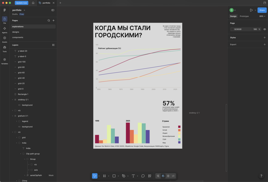
Infographic Creation
Mockups
Project Work
- Data Collection
The data was sourced from the open dataset Our World in Data and imported in CSV format.
2. Processing
In Google Colab, using Python and the pandas library, the necessary countries and the 1950–2025 period were selected, the table structure was verified, and a separate dataset was prepared for visualization.
3. Chart Construction
The initial visualization was created in RAWGraphs. Line and bar charts were used.
4. Graphic Design
The resulting SVG file was transferred into Figma. There, the typography, color palette, composition, labels, and the poster’s visual hierarchy were adjusted.
5. The final poster was placed into mockups.