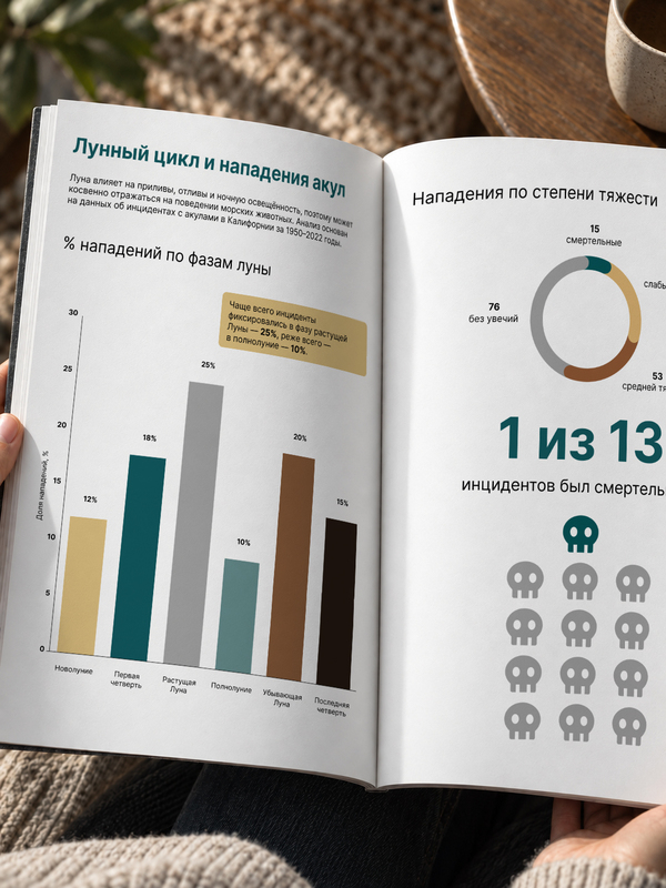
The image of the shark in popular culture is almost always associated with danger: an open mouth, fangs, blood, and dark water. But beneath this image lie numerous factors that can influence the behavior of marine animals—depth, light exposure, tides, and even the phase of the moon.The moon is directly linked to high and low tides and changes the level of natural nocturnal illumination. I became curious whether the trace of this cycle can be found in statistics of actual human-shark encounters.
Is it possible to find a correlation between the moon phase and the frequency of recorded shark attacks?
The project was based on a dataset of shark incidents off the coast of California from 1950 to 2022. In addition to the date and circumstances of the event, the dataset specifies the shark species, the severity of the injuries, and the lunar phase at the time of the incident.The goal of the research is to examine the distribution of attacks relative to the lunar cycle while simultaneously providing context: which sharks appear most frequently in the sample, how severe the consequences were, and what proportion of cases were fatal.
Stylistic Solution
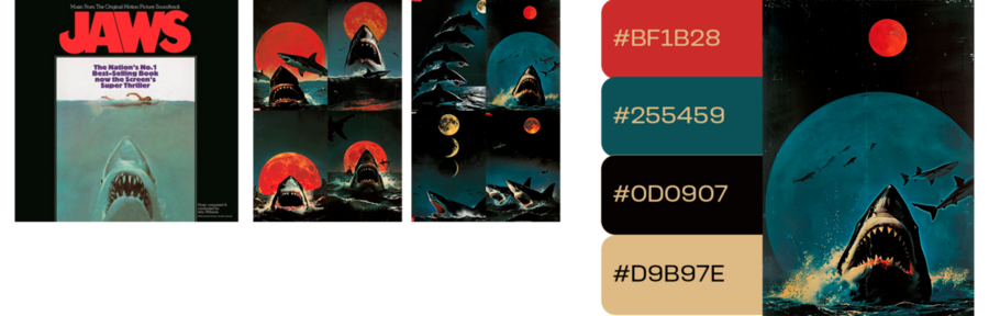
As visual references, I drew inspiration from movie posters about sharks. These posters are characterized by dramatic treatments, prominent fangs, contrasting marine hues—from deep blue to cyan—and red or white accents.
However, I did not want to literally replicate a bloody horror aesthetic. The core of my research focused on the lunar cycle and the connection between the marine environment and the behavior of its inhabitants; therefore, the project’s visual language became calmer and slightly mystical.
The palette includes sandy tones, cool turquoise, gray, dark brown, and near-black. These colors simultaneously evoke water, the night sky, moonlight, and the natural environment without transforming the research into a horror film poster.
Visualization
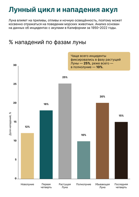
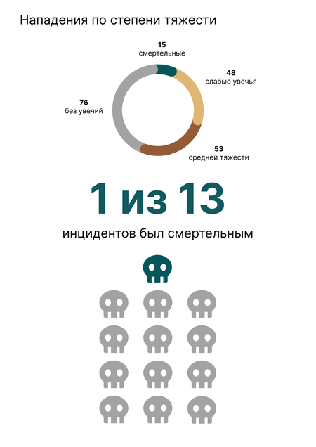
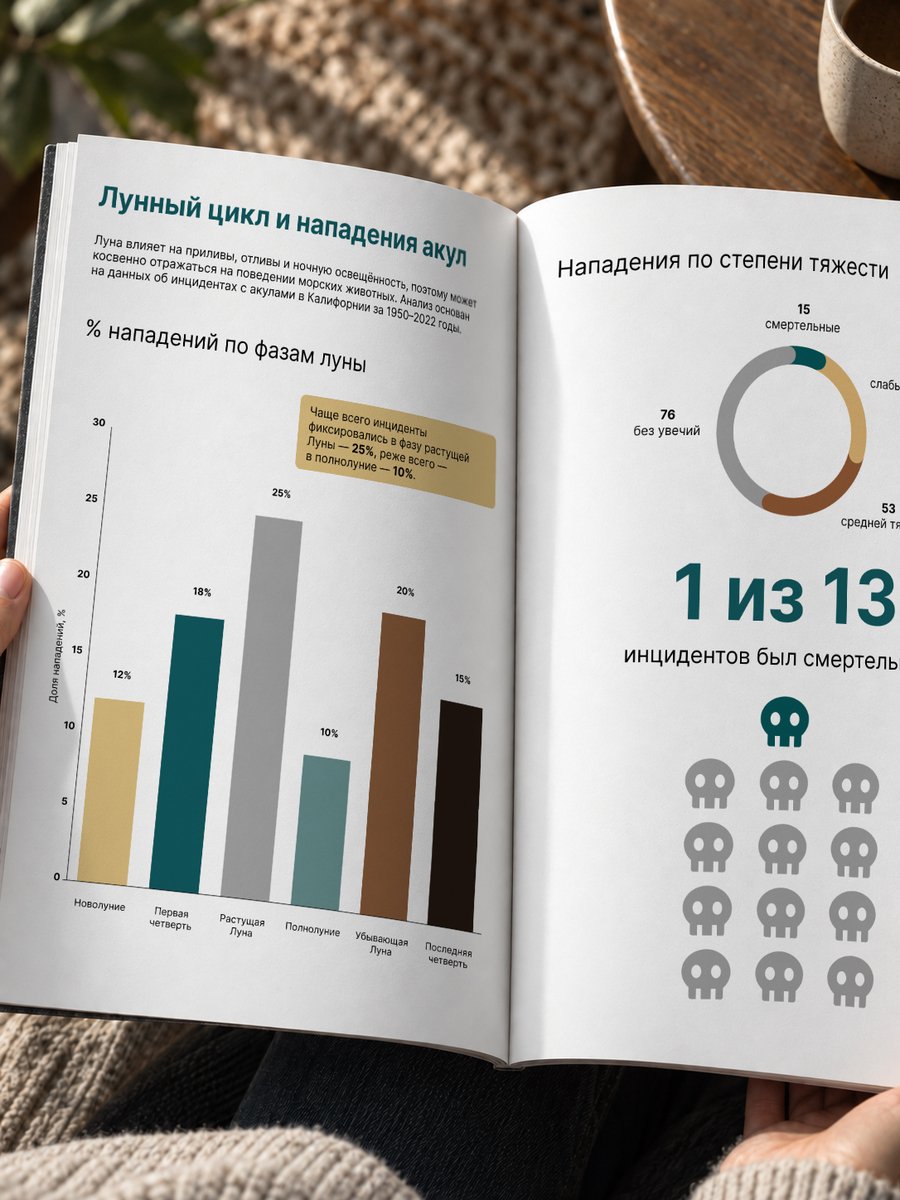
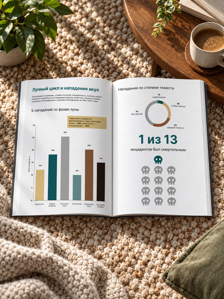
The primary visualization is the distribution of registered incidents by lunar phase. Within the surveyed sample, the highest proportion occurs during the waxing moon phase—25%—while the lowest is during the full moon—10%.The main chart is supplemented by several contextual visualizations that illustrate the severity of the attacks' consequences and the proportion of fatalities.
Workflow
First, I analyzed the shark incident dataset in Google Colab using Python and pandas: I isolated the relevant parameters, compared moon phases, shark species, and the severity of the consequences, and constructed initial charts. Then, I transferred the data to Datawrapper, where I refined the chart types, proportions, labels, and scales, and redesigned some of the visualizations into a more readable format.The finished charts were brought into Figma, where I aligned them with a unified visual system: I revised the color palette, typography, labels, and composition. Based on these visualizations, I assembled a magazine spread, in which the main chart tracking moon phases became the central element, and the supplementary charts function as contextual blocks to unfold the research systematically.In the final stage, I placed the spread into magazine mockups to test how the infographic functions within a real editorial context: at print page scale, across the fold, and when reading two adjacent columns sequentially.
Tools
Google Colab / Python / pandas — Data analysis and data processingDatawrapper — chart creation and configurationFigma — styling, composition, and adaptive layoutsPhotoshop / mockup templates — final presentation on mediaChat GPT — copywriting, code