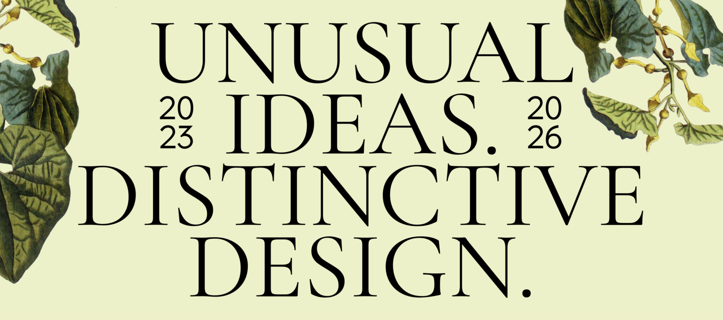
I explore the stories, cultures, and visual codes behind various subjects, transforming research and concepts into distinctive visual experiences. Working across digital, editorial, and graphic design, I’m interested in how ideas take shape through typography, imagery, and visual systems.
I’m looking to join a design team that values curiosity, experimentation, and concept-driven work.
Green Pharma — Web Design
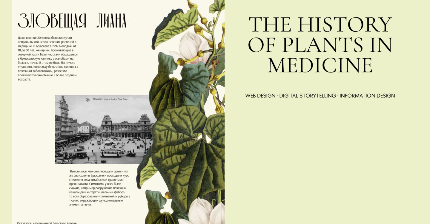
THE CHALLENGE
How can the history of pharmacology and the use of plants in medicine become an engaging digital experience?
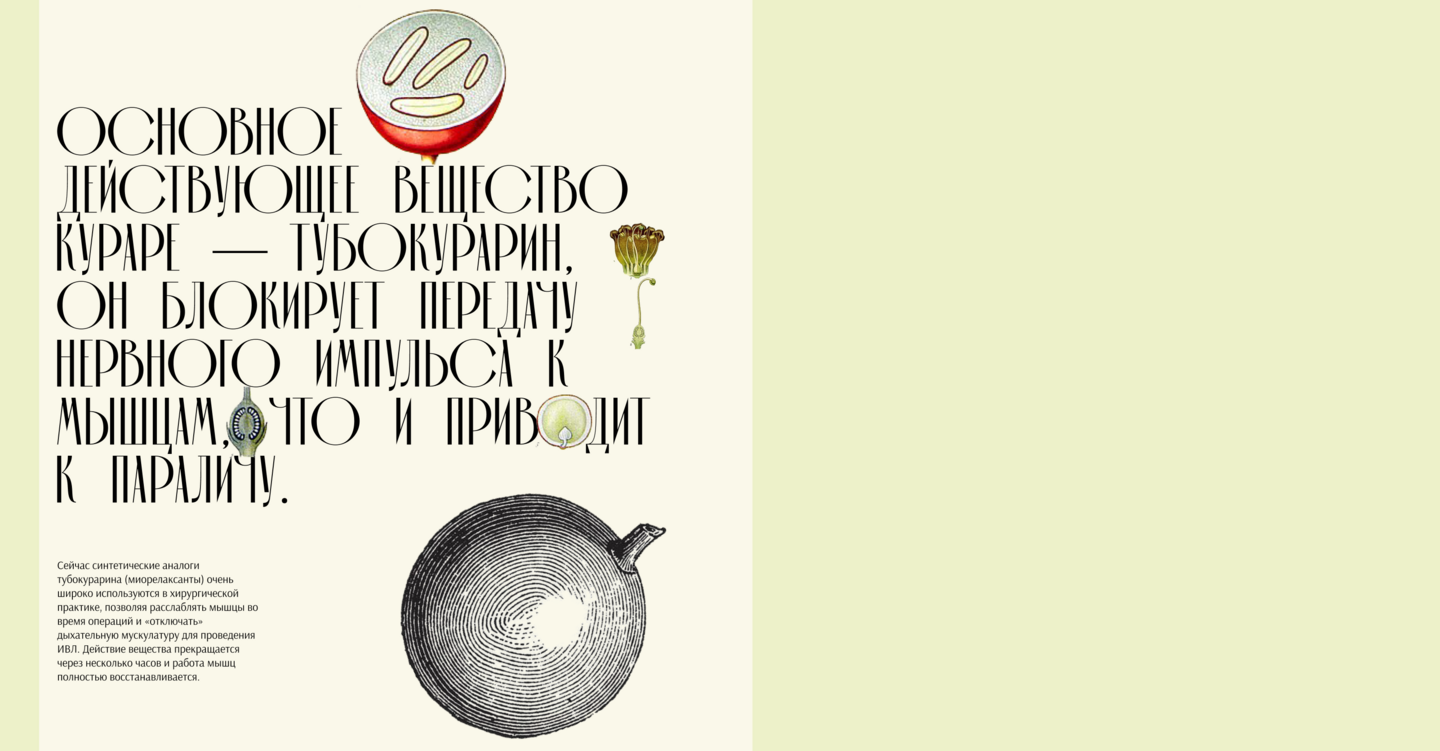
THE CONCEPT
The project explores the relationship between nature, scientific knowledge, and the history of medicine. Botanical imagery and references to historical scientific publications form the foundation of its visual language.
THE VISUAL APPROACH
A dark background, detailed botanical illustrations, and expressive typography establish the atmosphere of a historical botanical archive. The visual contrast bridges the historical subject matter with a contemporary web format.
THE OUTCOME
A landing page that presents the history of medicinal plants through a distinctive visual concept and an editorial approach to digital storytelling.
A24 — Editorial Design
THE CHALLENGE
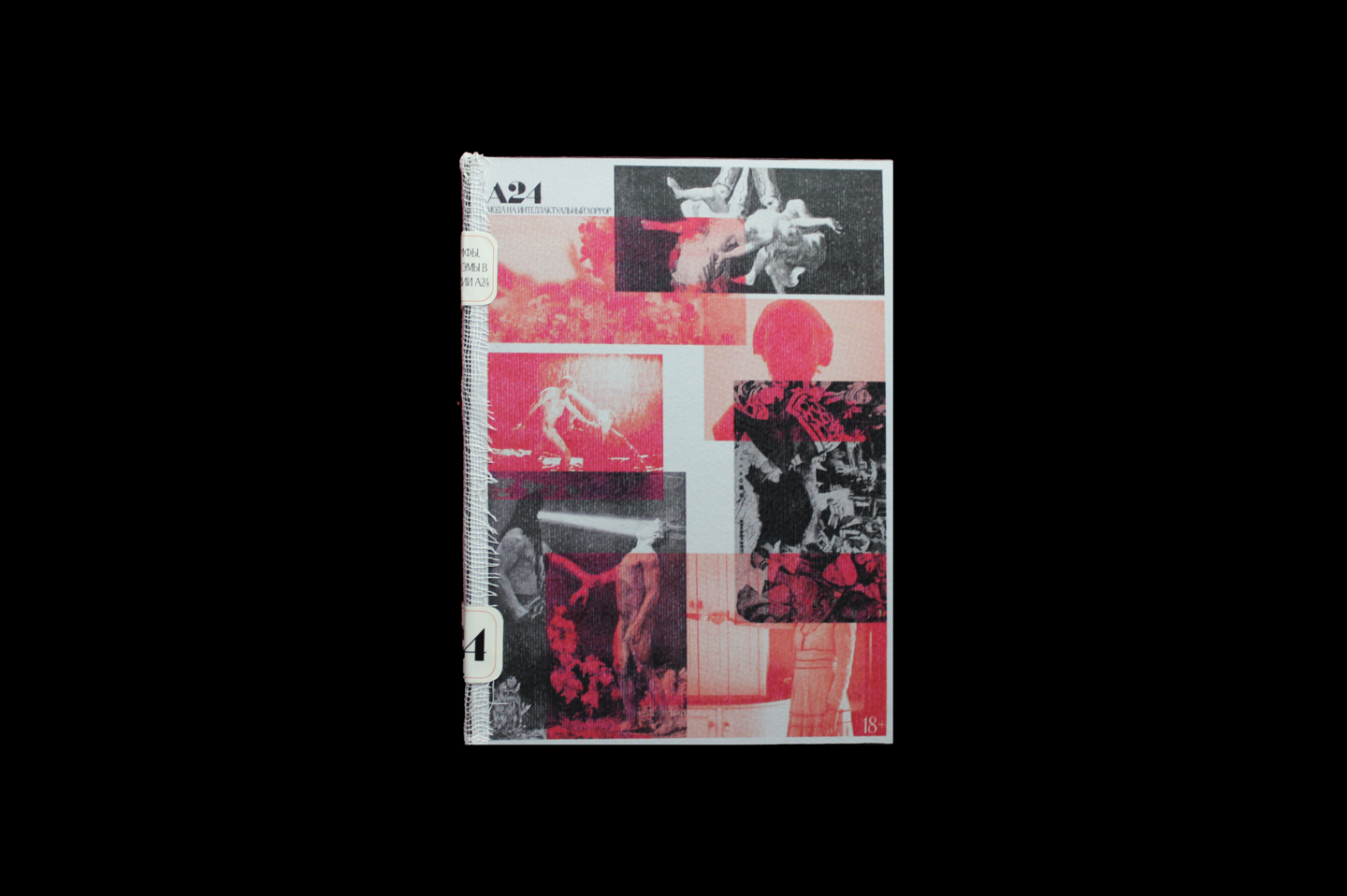
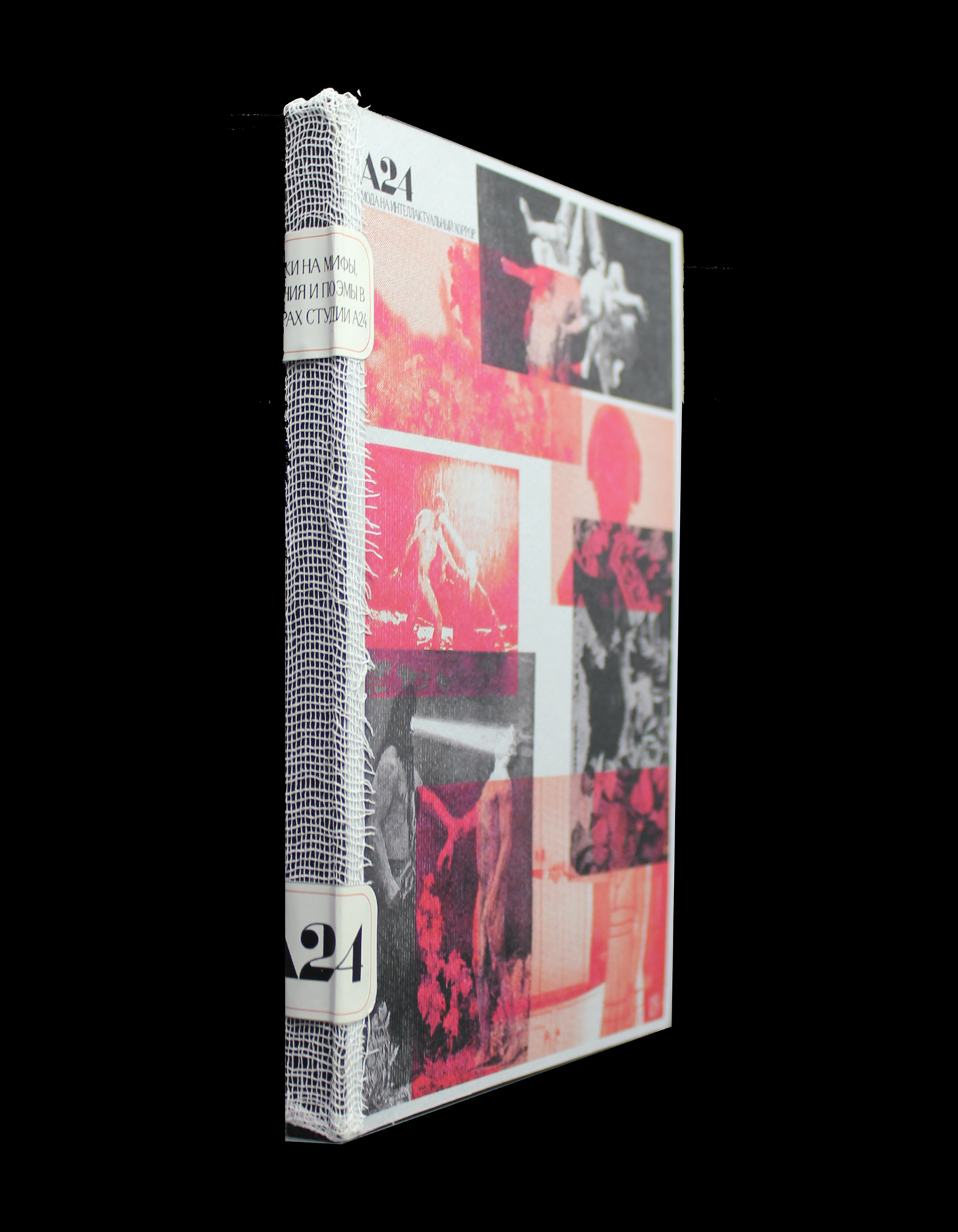
How can the atmosphere and visual language of contemporary intellectual horror be translated into a printed publication?
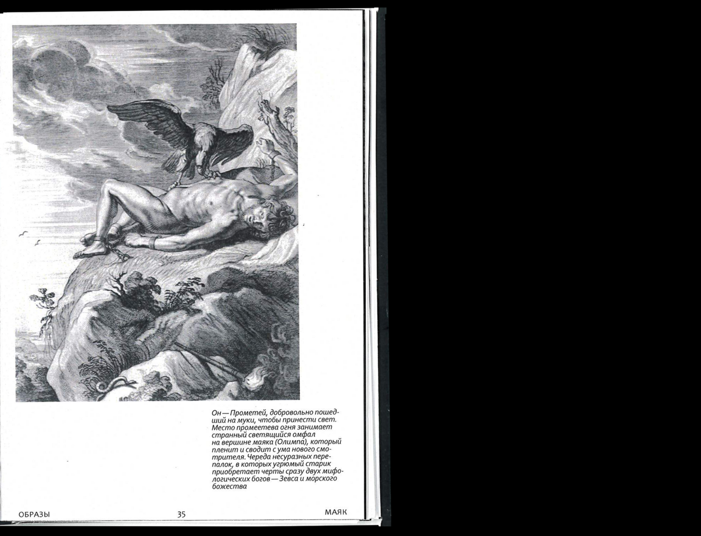
THE CONCEPT
The book explores A24 films through the aesthetics of psychological tension, ambiguity, and unconventional storytelling.
THE VISUAL APPROACH
A collage-based composition integrates film stills, contrasting imagery, and expressive typography. A restricted palette of red, pink, black, and white crafts a visual language that mirrors the genre’s unsettling atmosphere.
THE OUTCOME
An experimental editorial publication that unites film imagery, visual research, and a distinctive approach to printed storytelling.
Shakal — Typeface Design
THE CHALLENGE
How can the visual imperfections of early internet culture form the foundation of a typeface?
THE VISUAL APPROACH
Elongated letterforms, condensed proportions, and disrupted readability create a distinctive typographic character. The typeface explores the tension between functional communication and deliberate visual distortion.
THE OUTCOME
An experimental typeface that transforms the imperfections of digital media into a visual tool for expressive typography and graphic compositions.
LET’S MAKE SOMETHING DISTINCTIVE.
I am seeking opportunities to collaborate with a design team, contribute ideas, and develop my practice across various areas of visual communication.
Interested in working together?
CONTACT
Email: [datius2004@gmail.com]
Portfolio: [@nuruhouricom]