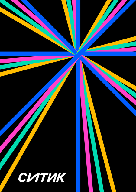
How many stories can one car hold?
Every day, thousands of people move through the same streets, yet each person has a unique route, goal, and story. For some, the journey becomes a spontaneous adventure; for others, it’s a way to handle important matters, a special event, or simply the drive home.
Citytic is an experimental youth initiative of CityDrive that transforms the diversity of personal journeys into a visual language.
Target Audience and Their Values
People for whom a car is not a permanent possession but a temporary way to gain a certain experience or freedom of movement.It is crucial to maintain the emotional need for trust in the auto service; we do not want to lose that trust for the sake of experimental graphics.
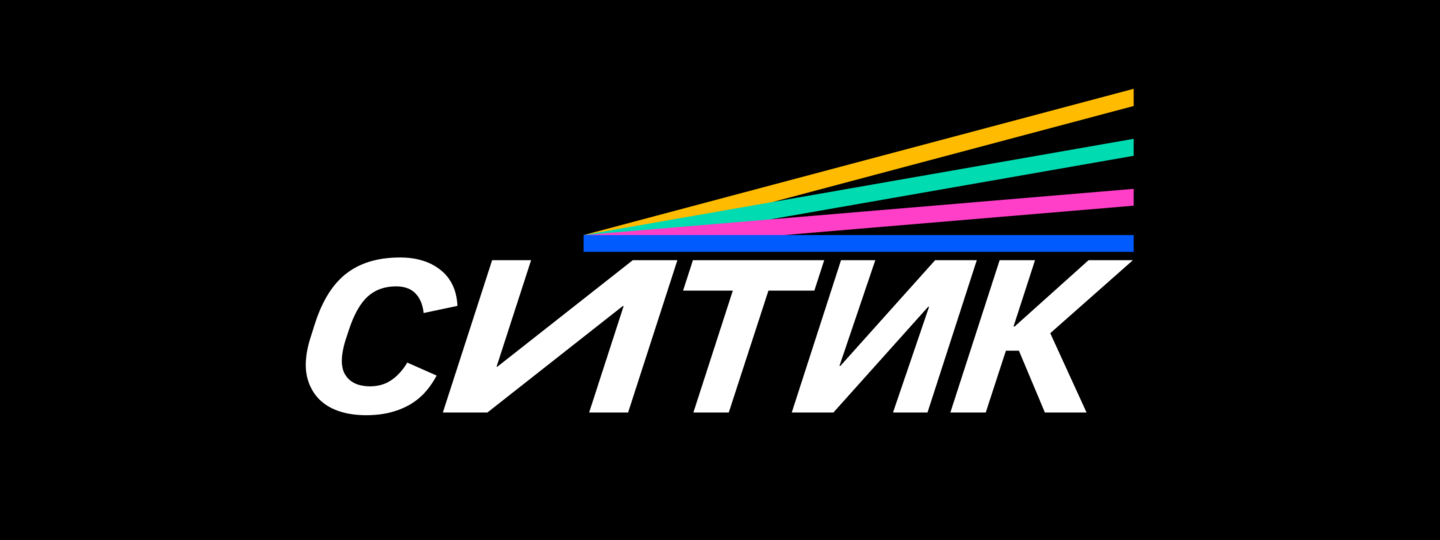
The Concept of the «CITIC» Logo
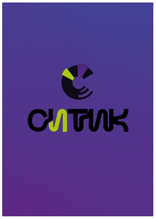
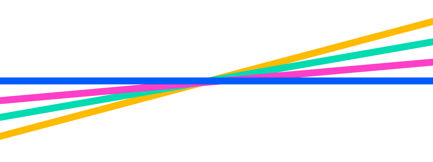
The logo is built upon a combination of typography and a dynamic graphic element—intersecting colored trajectories.
At the heart of the symbol lies the idea of diverse journeys and personal stories that converge within one city. Each line symbolizes a unique character of travel, and their intersections reflect the multifaceted nature of urban experience.
Rays are also unintentionally formed from the direct lines of CITIKA, which alludes to the CITIDRIVE identity.
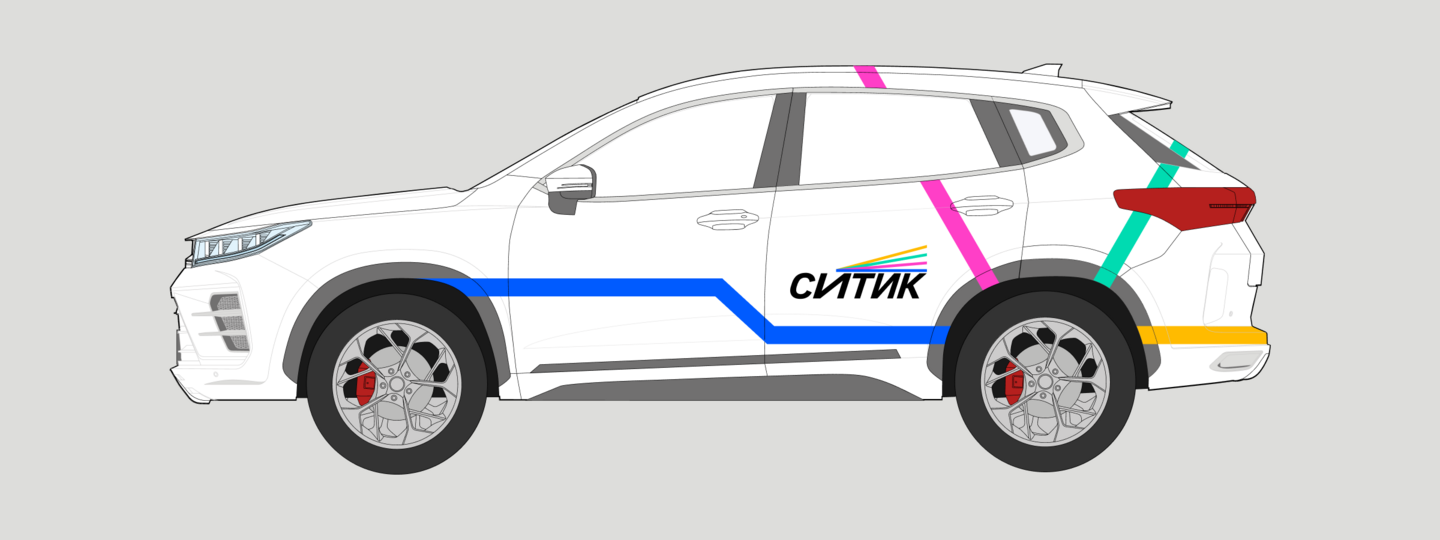
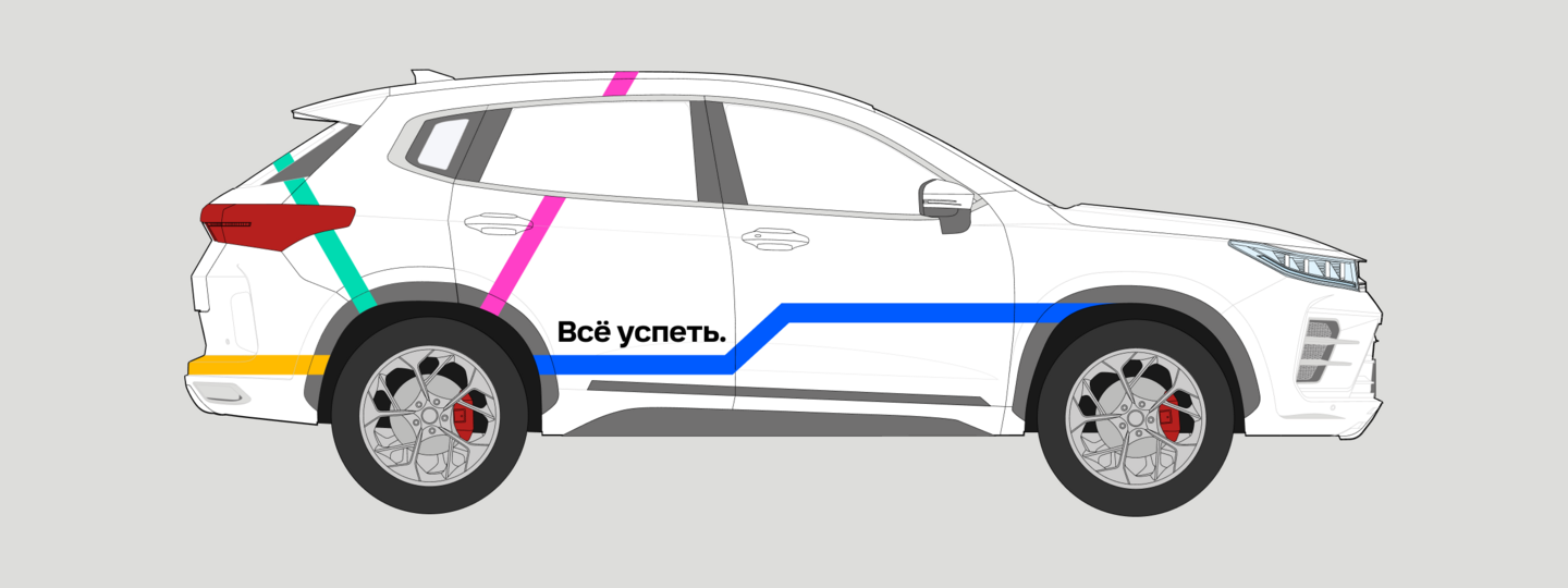
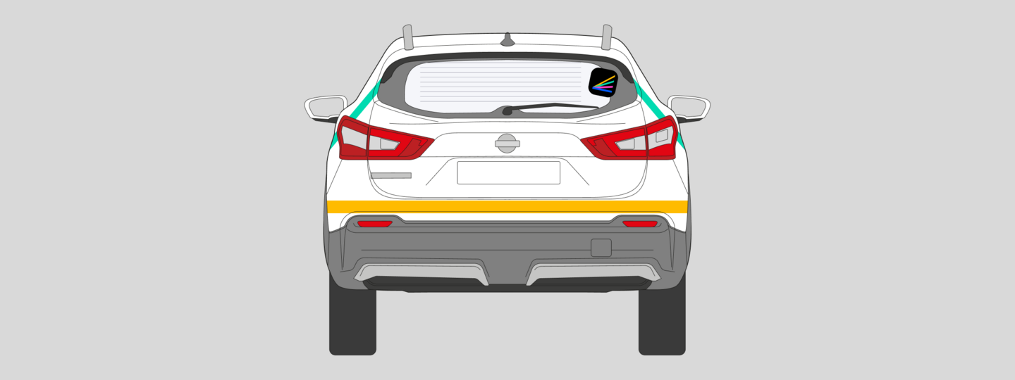
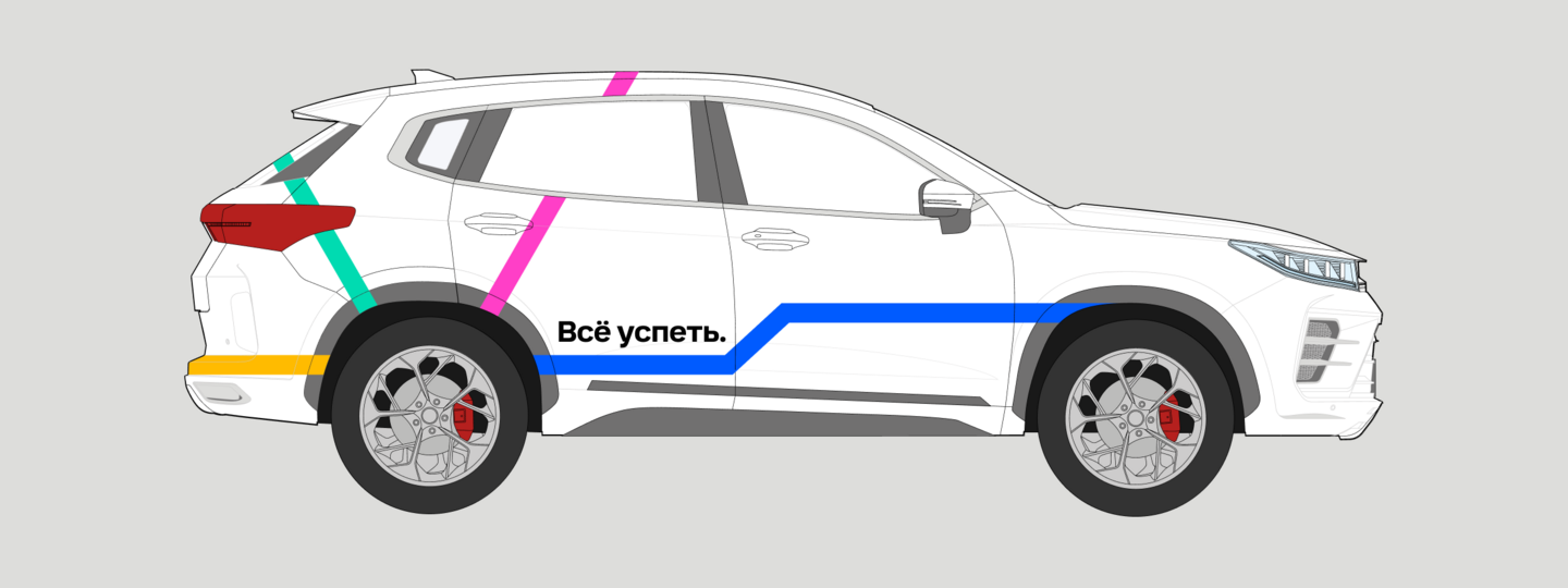
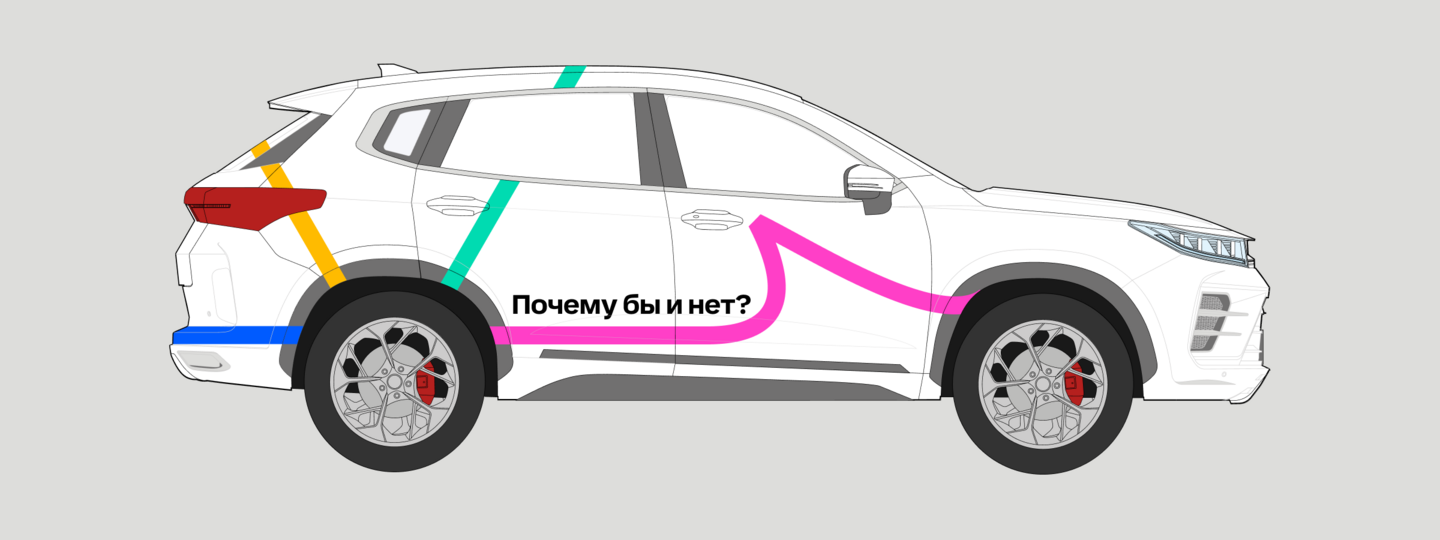
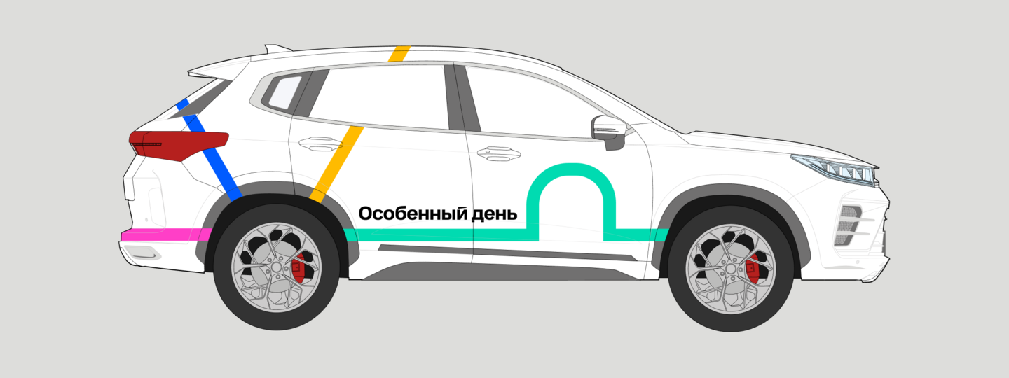
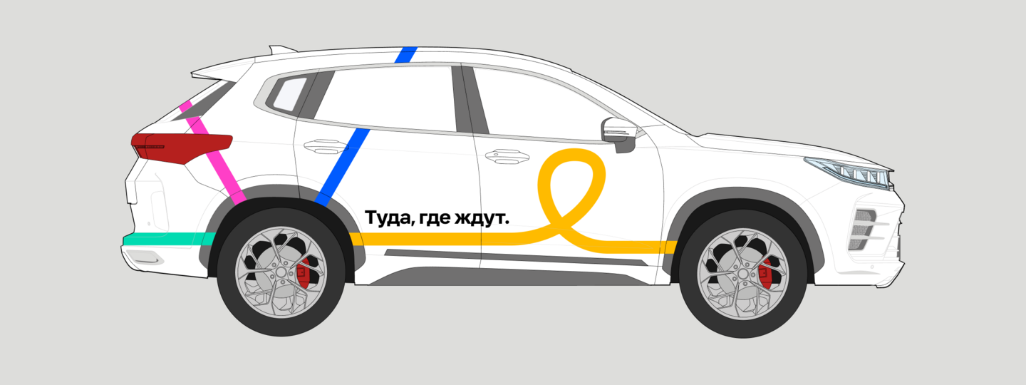
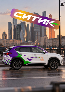
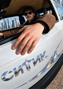
As the corporate identity evolves, the line elements extend beyond the logo to become foundational components of the overall identity. These elements can be used across all physical and digital media.
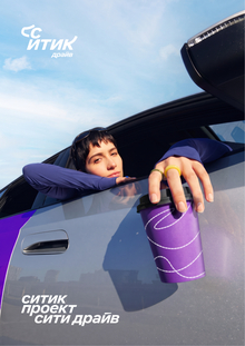
«CITIC» doesn’t try to be youthful through slang, memes, or overly expressive graphics. It becomes relatable to a younger audience through recognizable life situations, sincerity, and freedom of choice.
Guidelines for Line Usage
1. Lines must be continuous
2. Uniform in thickness relative to each other
3. Each «trajectory» has its own color
4. Curves differ depending on the type of «trajectory»
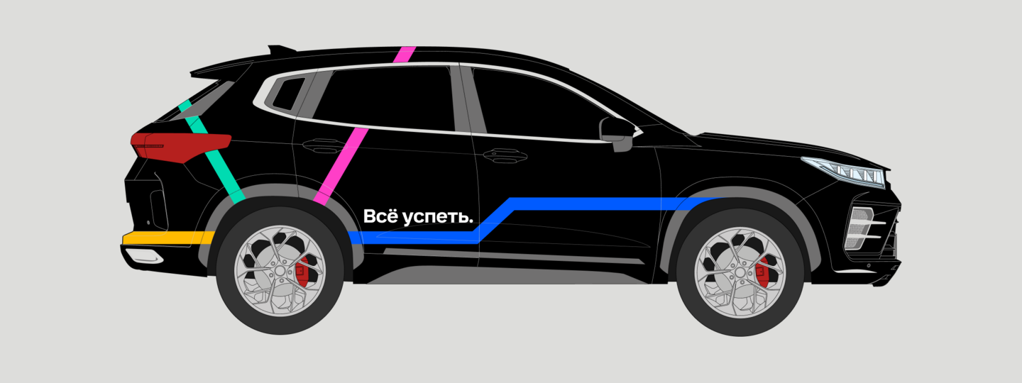
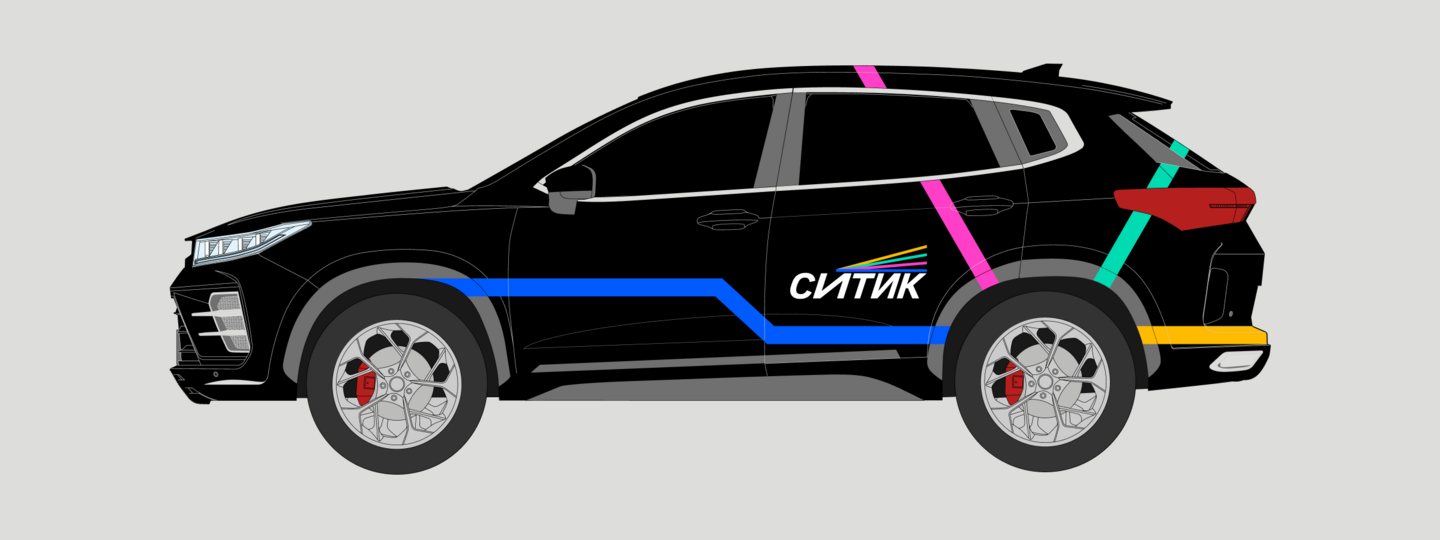
The line colors were taken from the supplementary colors in the CITIDRIVE brand book.
Route Encoding
The foundation of the «Sitika» graphic system rests on four types of journeys, each coded by its own color and line character.
Spontaneous — pink, with unexpected directional changes and a slightly angular quality.
Purposeful — blue, clear without curves, reflecting intentional movement.
Special — turquoise, accentual, and expressive, highlighting a significant moment.
Home — yellow, smooth, tranquil, and looped, symbolizing return.
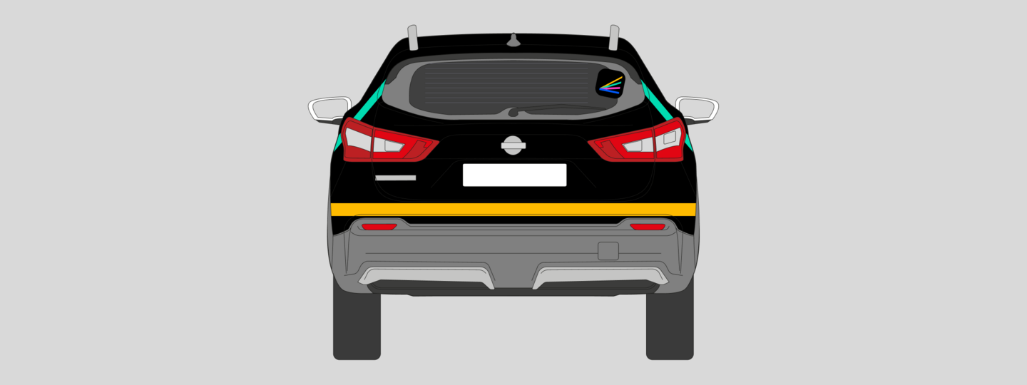
The lines can intersect, continue, and extend beyond the boundaries of the carriers, forming a flexible visual system. Their interaction reflects the brand’s core idea: different routes and personal histories coexist within the space of one city.