Concept
The city is in constant motion. Every day, its residents choose new routes, change plans, and see familiar places from a new perspective. These movements create the rhythm of urban life.
Sitik is an experimental youth initiative of CityDrive, dedicated to the freedom of movement and the energy of the city.
The core of the identity is the visual embodiment of speed. Slanted shapes, contrasting colors, and rhythmic graphics convey the dynamism of movement and form a recognizable brand character.
Logo

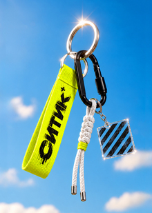
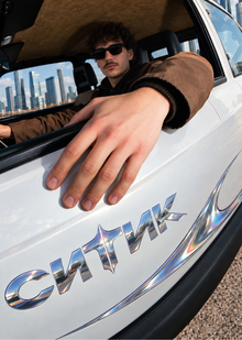
The Citytec logo is built upon inclined geometric typography. The direction of the letters creates a sense of acceleration and sets the dynamic tone for the entire visual system.
Integrated into the letter «K» is an elongated four-pointed star—a reinterpreted corporate «Spark» from CityDrive. Its form resembles the light trail generated during high-speed motion.
This element maintains a connection to the main brand’s identity and has become one of Citytec’s key symbols.
Graphic Elements

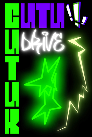
The graphic system is based on two core motifs: the tire tread and a spark.
The image of the tire tread has been simplified into a slanted geometric module. Its repetition creates rhythm and visual direction.
When combined with the spark, the module forms a signature pattern inspired by movement trails.
These elements can be scaled, combined, and used individually. This approach allows the graphic to adapt to various formats and surfaces while maintaining the integrity of the identity.

Color Palette
The core of the color system is comprised of CityDrive’s signature purple and green. Additional ochre and pink hues expand the palette, allowing for more diverse color combinations. Gradients convey a sense of movement and state change. Smooth transitions create a layered color effect, amplifying the dynamism of graphic compositions.
Car Wrapping
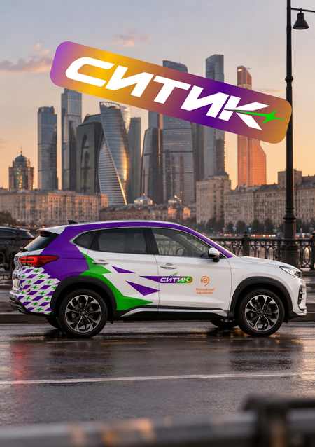
The car wrap continues the visual principles of the Citic identity. The primary graphic element is concentrated on the rear of the body. A purple stripe runs along the roofline and transitions onto the rear pillar. Large green shapes establish a sense of motion, and a repeating pattern creates an additional visual rhythm. The logo is placed on the side of the vehicle, maintaining readability and recognizability. The original white body color serves as the foundation of the composition, covering the majority of the surface. The graphic elements are distributed in consideration of the car’s shape, door placement, and structural details.
Visual System
The Citic identity evolves from the visual codes of CityDrive. The signature colors and spark maintain brand continuity, while the dynamic typography and the graphics of the tire tread shape the character of this new direction.All elements are unified by a common plasticity: slanted lines, sharp terminations, and elongated forms.The resulting system conveys the energy of urban mobility and is designed for a young audience for whom freedom of movement is a part of daily life.