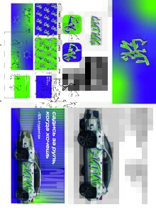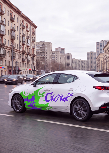
TASK
The project’s objective is to reimagine the visual identity of «Cityk» to resonate with the target audience of 18–30 years old, while simultaneously preserving the established recognizability of «CityDrive.»
IDEA
Looking at the company name «CityDrive,» I associate it with bright sparks and dynamism because the English word «drive» rhymes with the Russian slang term «drive,» which means to experience intense pleasure, excitement, and energy.
IDENTITY
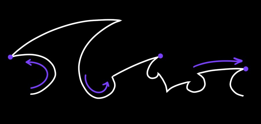
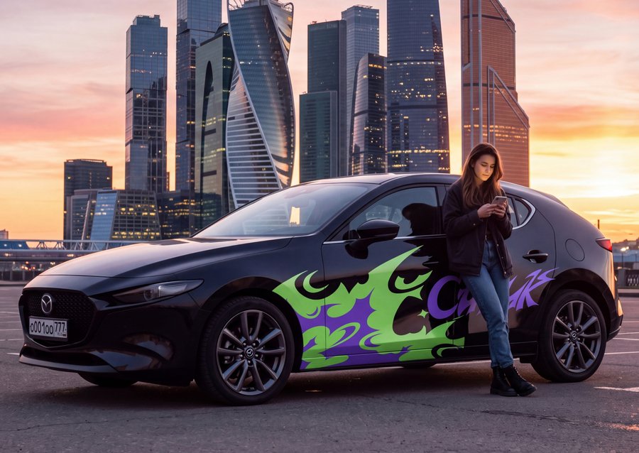
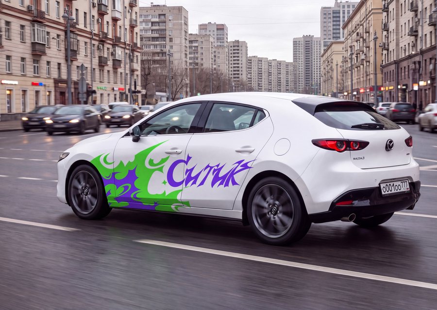
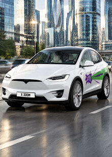
For the project’s identity, I chose dynamic shapes—those that possess both rounded and sharp angles, shifting in a chaotic pattern. They symbolize the vehicle’s gentle curves and its abrupt changes in trajectory.
COLORS
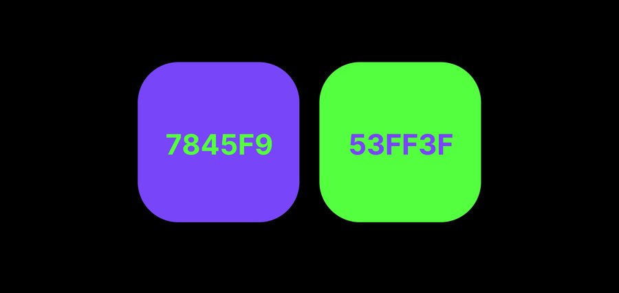
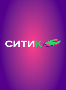
For my redesign, I selected colors similar to the original identity, but made them more saturated and vibrant, which reflects the boldness and energy I bring to the project.
In the transformation of the «Citica» spark, I made it more complex and added fiery bursts that symbolize sparks from the wheels.