CITYIC
CITIC — THE NEXT GENERATION OF CITYDRIVE
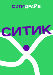
CITIC is an experimental direction of Citydrive, created for a young audience aged 18–30.
This is not a separate car-sharing service, nor is it simply a new name. CITIC is meant to be a bolder, more dynamic, and experimental extension of the existing brand while maintaining a connection to Citydrive.
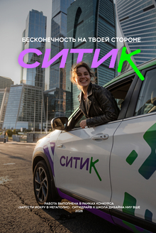
For a young audience, the car becomes not just a means of getting around the city, but also a part of a lifestyle, self-expression, and urban culture.
Therefore, CITIC’s visual language must convey motion, energy, freedom, and individuality, while remaining recognizably linked to Citydrive.
Identity

The initial form of «Spark» serves as the starting point for creating the Critic’s graphics. I altered its geometry: the individual elements elongated and gained a smoother, more dynamic shape. The static symbol now conveys a sense of movement, speed, and directed momentum.
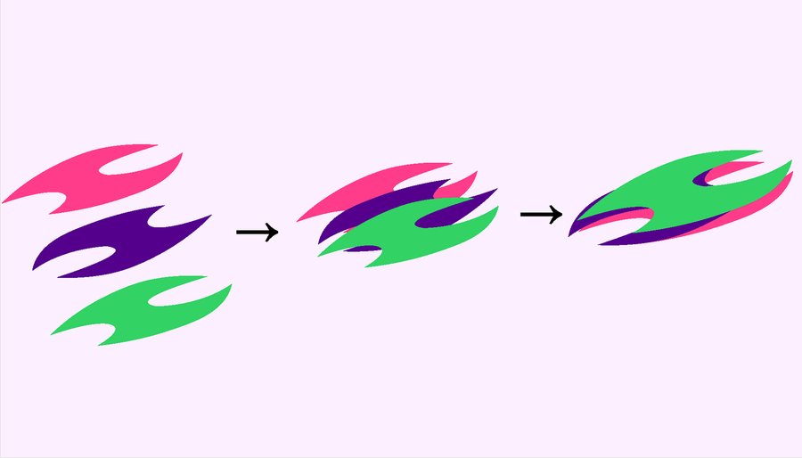
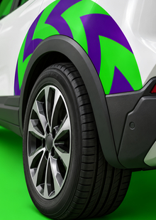
The next step involves combining individual shapes, which begin to interact with one another. This creates the new graphic element, the Citic—a dynamic form that can exist as a standalone symbol, repeat in a pattern, and be used at various scales.Crucially, the original form remains recognizable: the Citic does not abandon the visual heritage of the Citidrive but rather translates it into a different character.
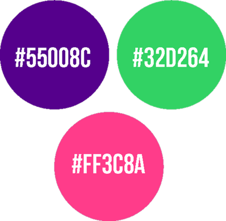
The CityDrive palette retains green and violet as its core colors. A bright pink is introduced, serving as a new accent for the Citytic.
Thus, the color system functions on the same principle as the graphic design: familiar → reinterpreted → new.
Green and violet connect the Citytic to CityDrive, while the pink adds more energy and independence to the visual system.