I believe design should be intelligent—not decoration for its own sake, but meaning carried through. A brand gains depth, concept, a point of view; the design shows that we thought.
But meaning never excuses missing the brief. I always build toward the task—reaching the right audience, making sales, getting noticed, sometimes riding a trend when that’s what the audience needs. Concept and commercial results aren’t a trade-off for me—I hold both.
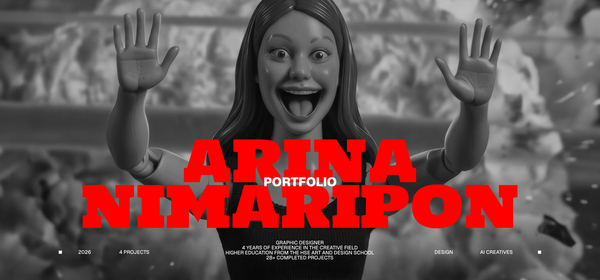
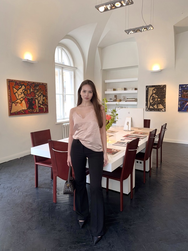
I’m Ann, a 4th-year communication design student at HSE St. Petersburg.
IT company (Apr–Dec 2025): led a full rebrand, built templates for commercial proposals and presentations, and produced social content. Branding agency, Sochi (Oct 2025–Feb 2026): fast-turnaround branding—an «emergency room» format for brands that needed a solution now. Lombart (Feb 2026–present): identity design for restaurants and hospitality brands—infusing each brand with meaning and carrying that meaning through the design. Work spans premium, high-ticket brands to simpler briefs, with clients including Legrand Group, Italy Group, Ginza Project, and Reka Group. I am also currently expanding into design for art and culture.
I also create short videos about design and art on social media at @asavoniaka.
Open for freelance collaboration with brands and cultural spaces—@annsavk (Telegram).
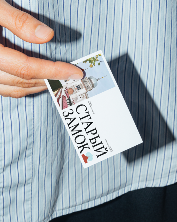
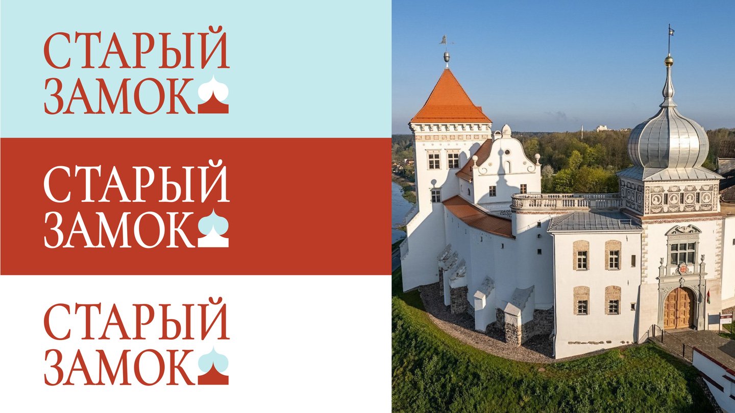
OLD CASTLE | Heritage Brand Identity
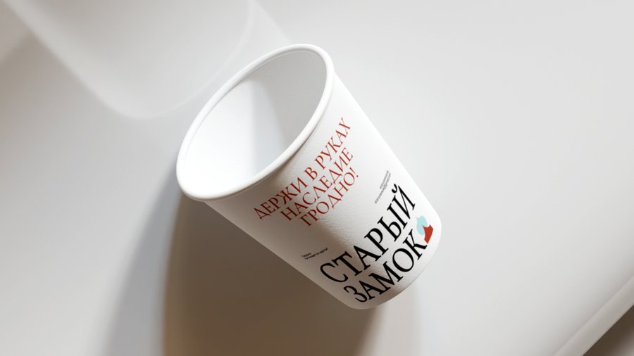
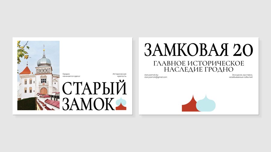
Branding | Identity System | Cultural HeritageBrief: The Old Castle in Grodno is a 14th–16th century fortress, once the residence of Lithuanian Grand Dukes and Polish Kings, now a museum. The problem: it reads as a monument, not a living place—and it must stand out among several competing castle museums in Belarus while speaking to very different visitors, from history teachers to students filming for social media.Idea: Don’t invent a color palette—take it straight from the building. The castle’s own red roof and silver-blue dome became the brand’s only two accents, carried on white. The positioning follows the same logic: not an artifact under glass, but a Guardian—a living symbol that keeps the thread between past and present.Solution: A logo built from the dome’s silhouette, and a strict two-color system extended across every touchpoint—staff and guide badges, a printed guide, a scarf patterned from the castle gate’s ironwork, packaging, signage, and the website.Result: A coherent, scalable identity that reads as alive rather than monumental—holding together across merchandise, staff branding, and digital, and standing apart from every other castle brand that still looks like a plain heritage site.
SVET CAFE | Rebrand
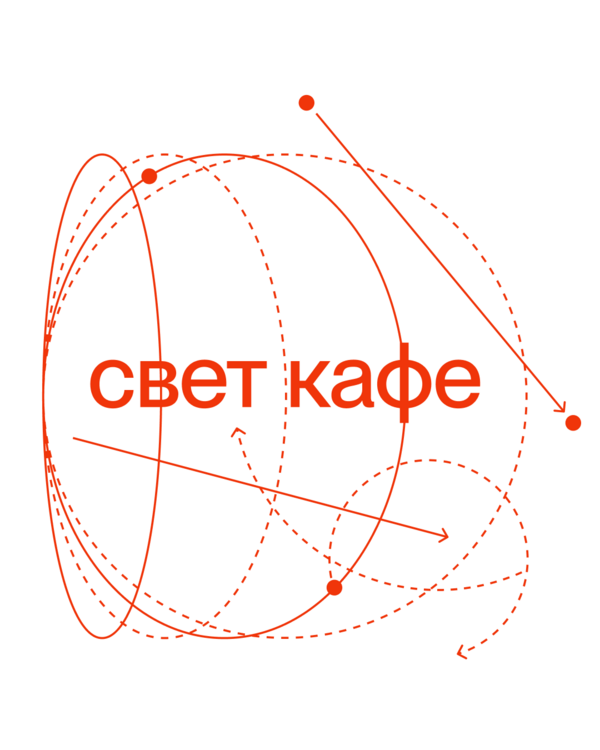
Branding | Identity System | Cultural SpaceBrief: Svet Cafe is an existing cultural café and exhibition space that opened in 2024 with a minimalist black-and-white identity—the name set in English, no color, a plain geometric wordmark. The brief: refresh it—translate the name into Russian and bring the brand up to date.Idea: Don’t just restyle the logo—go deeper into the concept the name already carries. «Svet» means light, so the idea was to explore light itself as a source of new meaning: its physics, its optics, its diagrams—and let that research surface something the original brand never used.Solution: Optics textbooks and lens diagrams became the visual source. A new logo in Russian, orange as the color of light and a trend-forward color, and circles pulled directly from optical diagrams as a recurring motif—standing for motion and the ongoing development of the space. This was backed by competitor research and a layer of meaning the first version lacked.Result: A Russian-language identity with its own color and its own symbol—a scalable design system and new touchpoints that read as contemporary, while still growing from what «Svet» has always meant.
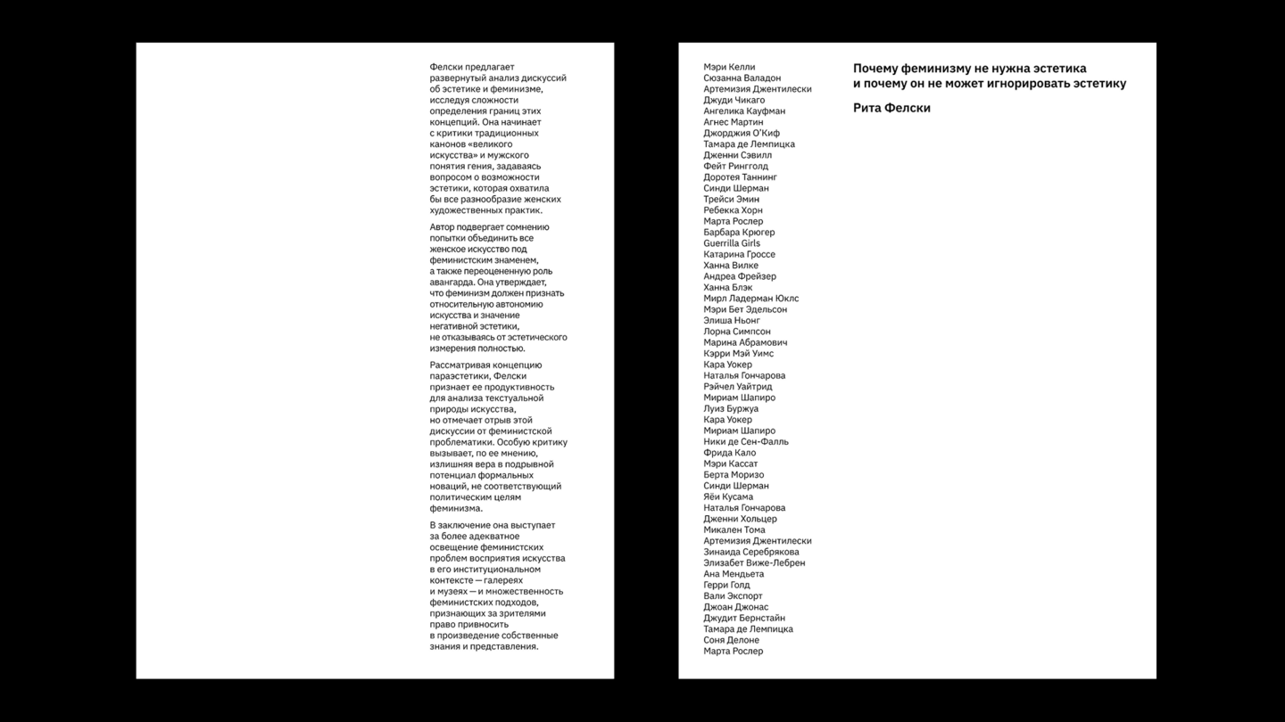
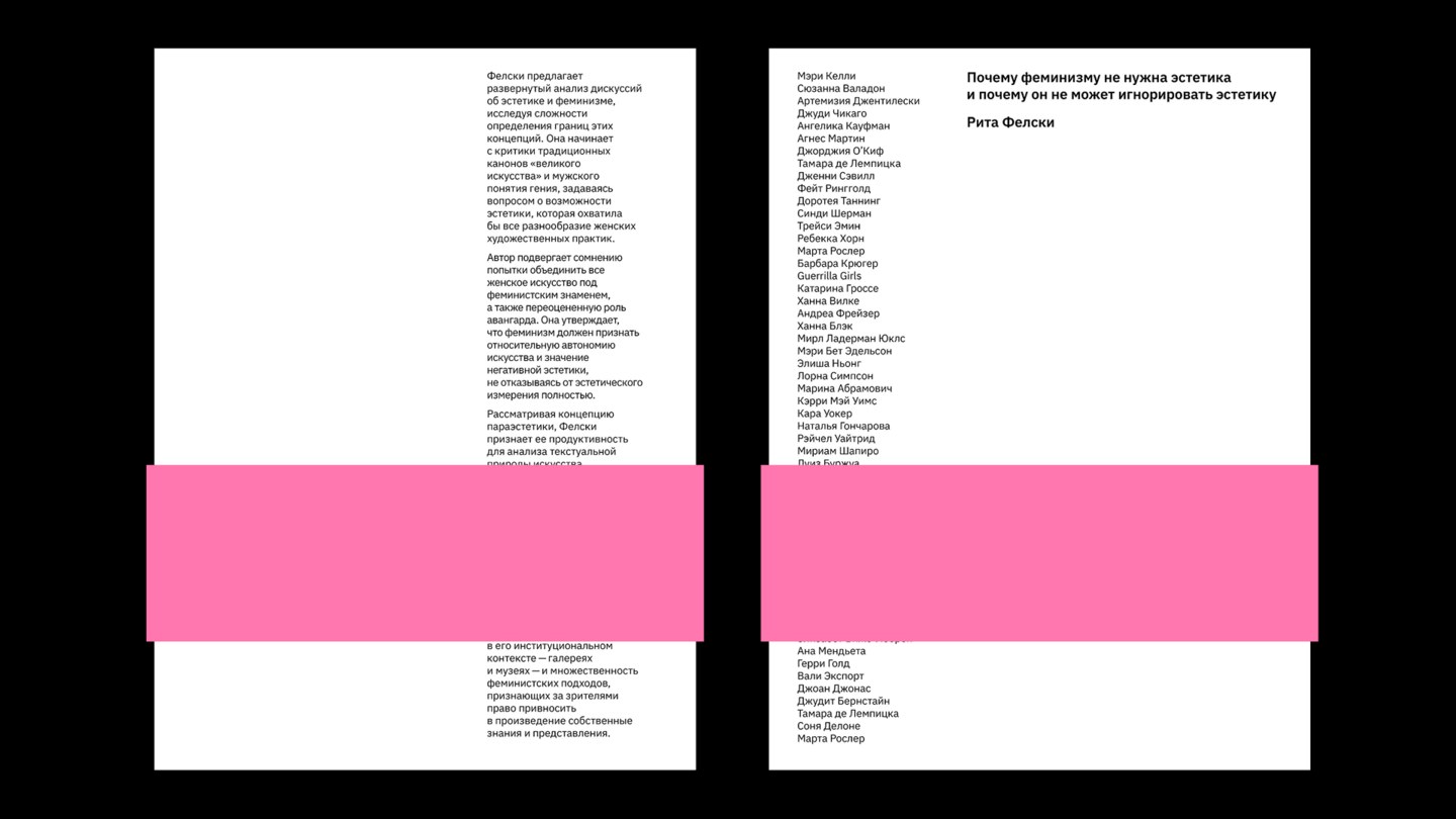
WHY FEMINISM DOESN’T NEED AESTHETICS | an editorial design for an essay on feminism and art
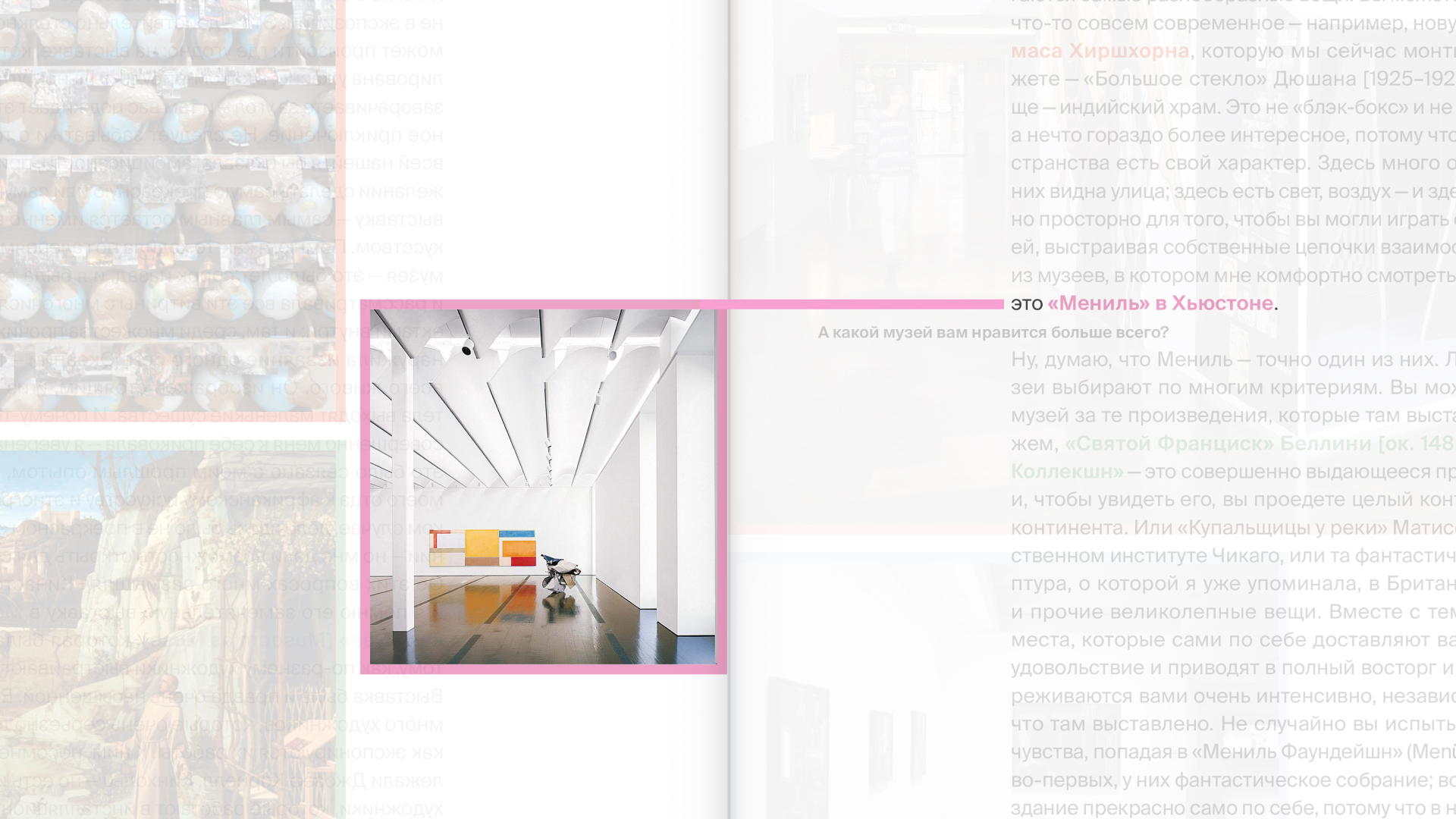
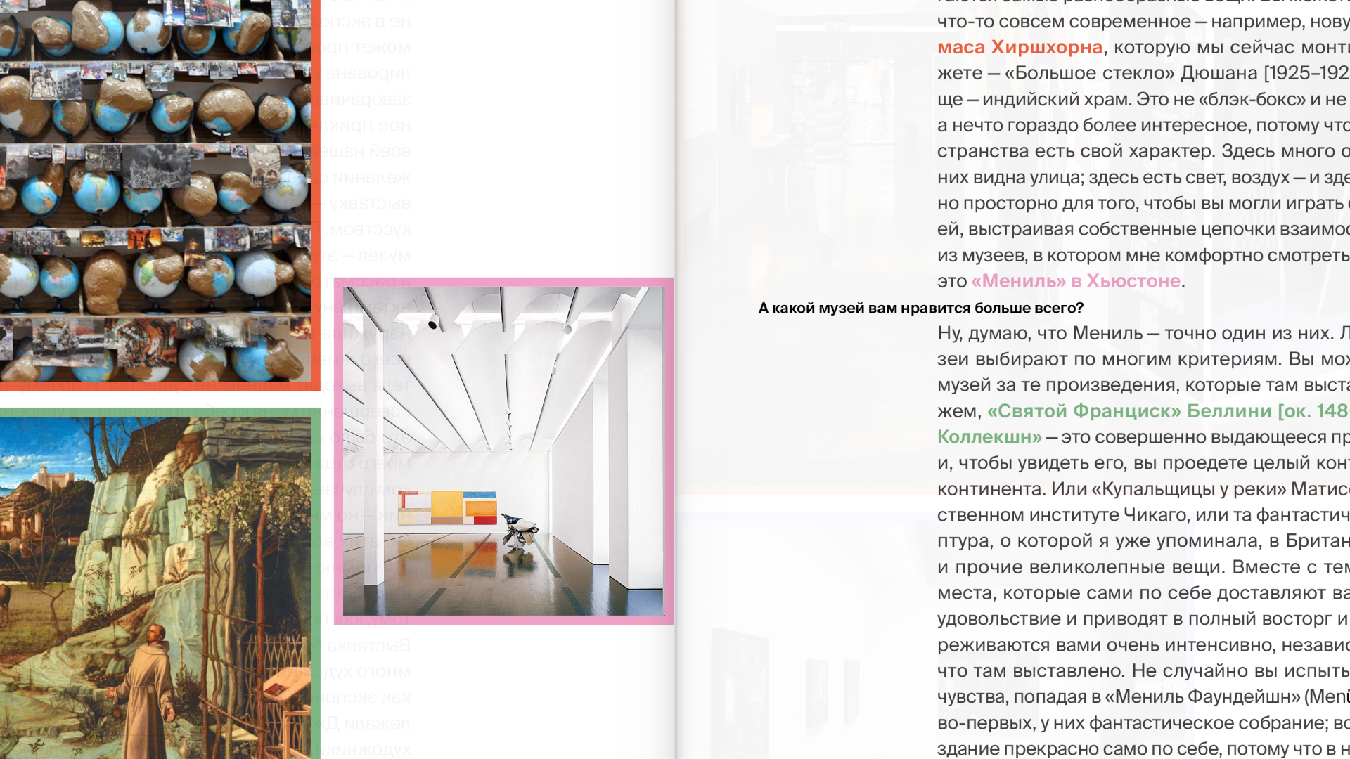
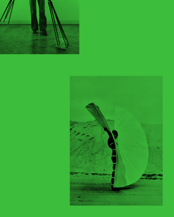
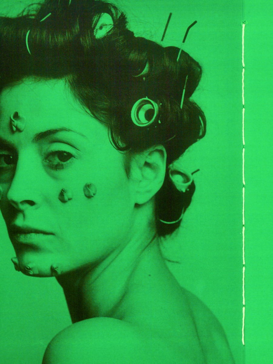
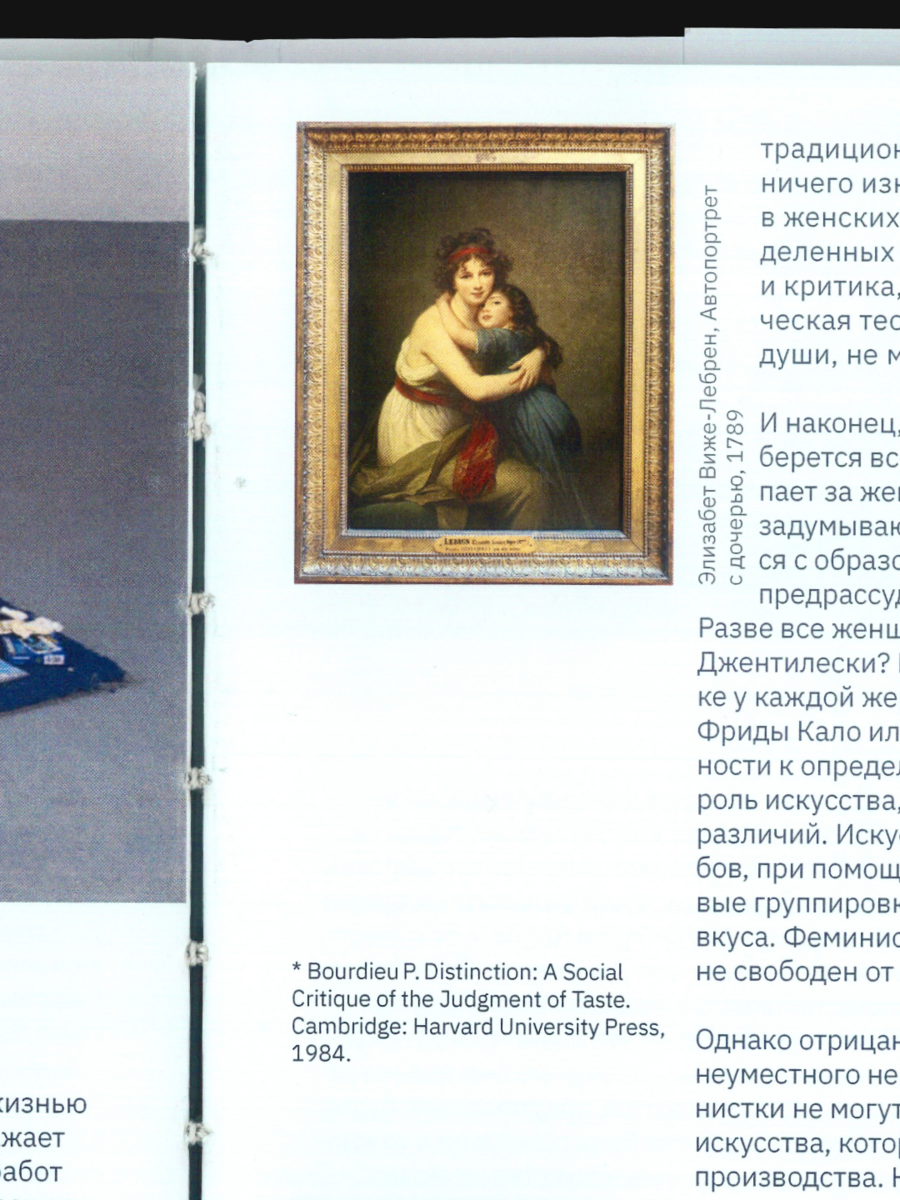
book design | typography | contemporary artBrief: design the layout for Rita Felski’s essay «Why Feminism Doesn’t Need Aesthetics”—a text exploring feminism’s internal contradiction: it critiques aesthetics for placing „male“ art on a pedestal for centuries while ignoring women, yet it still requires aesthetics because art is precisely what allows one to speak, express oneself, and push back against injustice. The task was to make the design embody this contradiction, not merely illustrate it.Idea: transform the physical book into an unfolding argument. The cover acts as a „pink wrapper”—a deliberate stereotype the reader must peel back to reach the core subject: the names of the women who changed art. The essay’s central question—a quote from Lyudmila Bredikhina’s Forbes interview—is positioned to greet the reader the moment they open the book.Solution: the layout guides the reader from the superficial wrapper to the substantial content. The pink „band“ cover maintains the stereotype on the exterior. Inside, green, text-free spreads create a deliberate pause for the reader’s own perception—a space to prepare before the genuine conversation about feminism and art begins. Captions are integrated directly onto the images rather than placed beside them; they break into the frame, disrupt the grid, and command space for themselves, because a woman artist’s name must be seen, not relegated to a caption line.Result: a book where the typography enacts the essay’s conflict rather than describing it: the reader physically sheds the cover’s stereotype, moves through the silent interlude of the green pages, and finally encounters the names the text insists on making visible. The book’s form becomes a second layer of Felski’s argument.
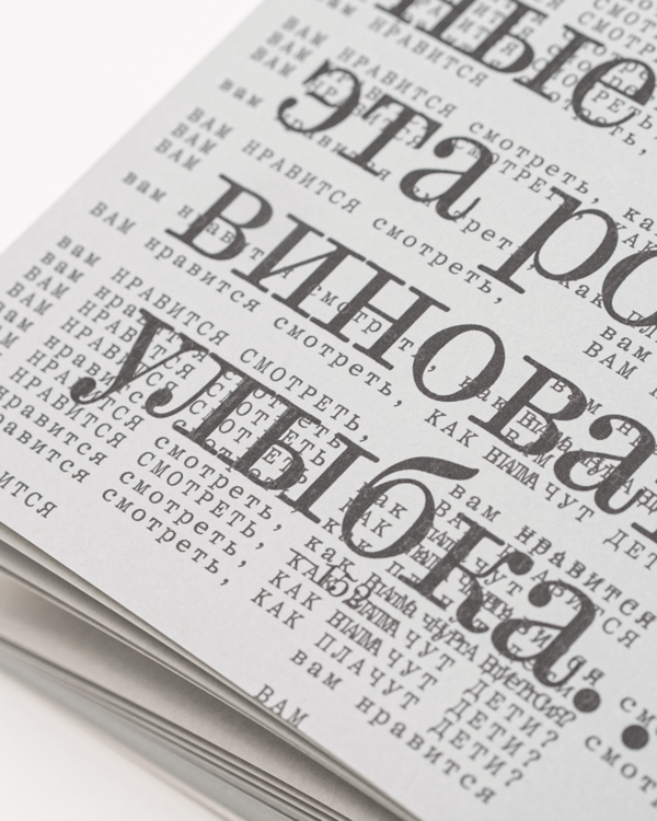
THE CREATURE | book for a play
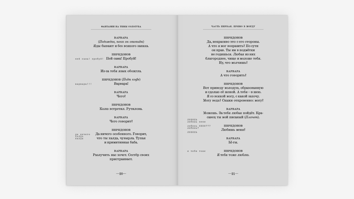
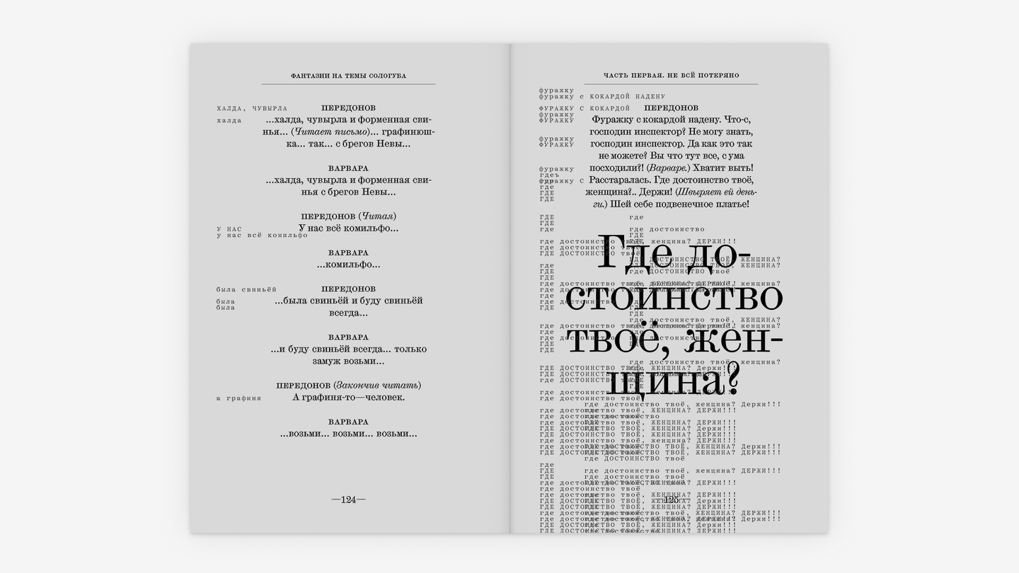
book design | typography | contemporary dramaBrief: «The Creature» is Valery Semenovsky’s dramatic fantasy, based on Fyodor Sologub’s novel *The Petty Demon*—a story about a literature teacher, Peredonov, who descends into madness as he obsesses over a promotion and begins seeing conspiracies everywhere. He is haunted by the Untouchable Thing—a small, grey, invented creature that his fear takes shape as. The brief was to make the layout itself perform Peredonov’s unraveling, not just to typeset the text that describes it.Idea: treat the creature not as a character to illustrate, but as a typographic event. It isn’t described separately—it intrudes directly into Peredonov’s speech: before each of his lines, a ghostly echo of his own words appears, as if it were feeding him the line a second before he says it. It follows no rules, grows as his madness grows, and by the climax takes over not just his mind but the page itself.Solution: the creature gets its own typeface, Kommuna—cold and mechanical against the body text’s classical Scotch Micro (stage directions are set in Scotch Modern italic). Its text is a shrunken, fragmentary pre-echo of Peredonov’s lines, breaking out of the six-column grid (the body text sits on four), spilling into running heads and the main text block. Peredonov’s most self-revealing, ugly lines—the ones he genuinely delights in—are set apart in the text, with the creature «rejoicing» in the background. Derzhavin’s ode «God, ” stripped of its original devotional meaning, is read not by Peredonov but by the creature—signaled purely by the typeface switch. In the second half, the creature’s echo multiplies and crowds out the main text more aggressively, building to the final scene—a murder, where the creature visibly wins.Result: a layout where the character’s psychological collapse is legible before the reader even parses what the lines say—just from how the type behaves on the page. The typography becomes a second voice running alongside Semenovsky’s text.