Concept
Nature as a Source of Motivation
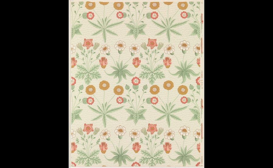
William Morris, «Daisy, ” 1864
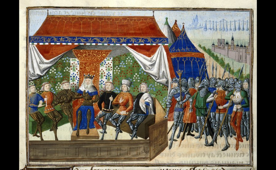
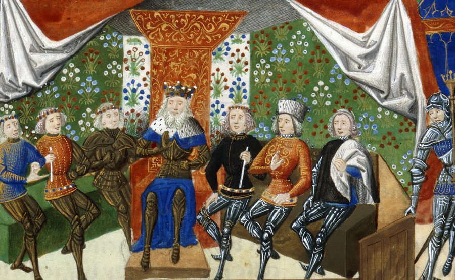
Jean Fouquet, «Chronicles, ” 1470–1475, folio 84, Harley MS 4380 manuscript, British Library
Morris’s first wallpaper design to enter production. In «Daisy,» various plants are arranged according to a pattern that the V&A catalog compares to brickwork, set against a background of green speckles reminiscent of grass. It is important here that the stems of adjacent plants do not touch, and nothing overlaps. Each plant stands separately, depicted frontally and two-dimensionally. The catalog notes that this flat, frontal motif was borrowed from a trellis depicted in an illuminated manuscript at the British Museum. This indicates that in his early ornamentation, Morris draws upon historical decorative examples. In «Daisy,» the plant has already been subordinated to the logic of flat ornamentation and is perceived primarily as an element of the design.
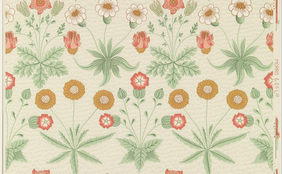
William Morris, «Daisy,» 1864 (fragment)
The situation changes fundamentally. This is the first wallpaper Morris designed: a thorny rosebush twining along a wooden trellis, with birds and insects among the foliage. According to the catalog, Phillip Webb illustrated the birds. The source of the motif is named explicitly: the image is inspired by the rose on the trellis in Red House’s garden. What happened to the geometry here? In «Daisy,» an invisible placement grid maintained the repetition. In «Trellis,» the grid is drawn: the lattice of slats becomes the subject of the image, and it has a natural justification because it is a garden structure upon which the bush grows. The plant is recognized not only by the flower; the V&A notes the thorns and red flowers, meaning a detail like the thorn was chosen—a detail that speaks to the manner of growth. The bush clings to and wraps around the slats, and it is depicted precisely as it is, not as a portrait of it. The Morris Museum describes this early style as a flat, abstracted pattern where layers create a sense of depth.
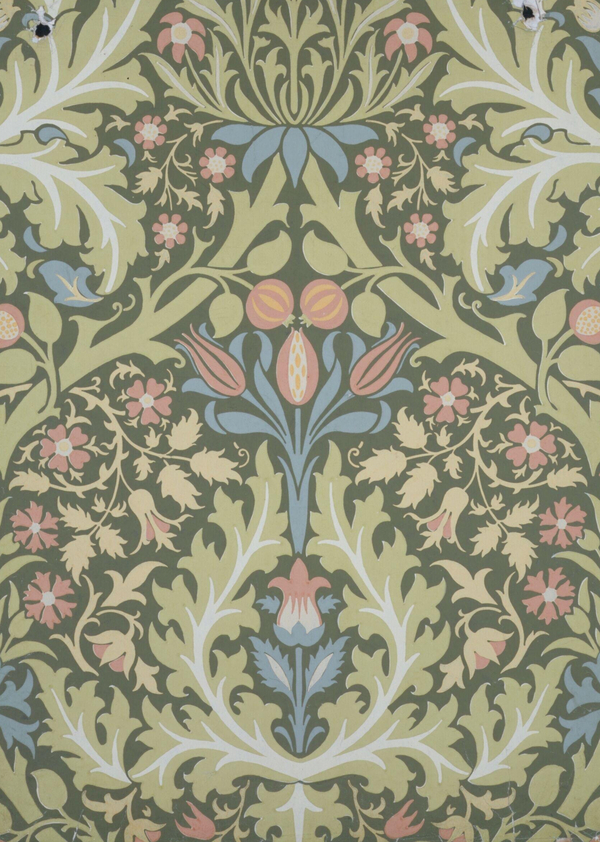
Here, the grid disappears—and that is a crucial step. According to the catalog, the wallpaper features branches of fruit trees laden with lemons, oranges, and pomegranates, and the approximate issue date is around 1866. (Precise dating is disputed: the printing journal places the pattern between «Daisy» and «Trellis,» but biographer Mackayl believed it was not created before 1865.) More importantly, the branch, which previously required support, now holds the surface on its own. The round fruits function as weighty accent spots against the winding trunk. The plant is no longer an object within a prescribed grid or a vine clinging to an external structure, but the pattern’s own framework. We also note the theme: the oranges and pomegranates are not from an English field. This is a cultural, «literary» motif that lives within textile and book ornamentation.
In the 1875 pattern, the principle was taken to its extreme. According to MET descriptions, large individual flowers rested among leafy scrolls above a background of small flowers; the forms reveal meticulous observation of local flora; the pattern was offered in a single color: blue, dark red, or light brown. Now, the plant is assigned roles, and each role is tied to scale: the large flower serves as an accent, the leafy scroll guides the eye, and the small flowers provide texture. The monochromatic nature adds a constraint: plant recognition relies solely on the contour and rhythm of the serrated forms; color cannot assist. Growth has transformed into line, and line into trajectory.
From «Daisy» to «Calendula, ” the plant ceases to be an object and becomes a direction: moving from a motif to a tendril on a lattice, then to a branch, and finally to the curl upon which all other forms are held. However, Morris does not reduce it to a mere symbol; in all four tapestries, the characteristic detail of the real plant remains (thorn, fruit shape, leaf serration). The preliminary observation is this: Morris translates not the appearance of the plant into ornament, but its syntax—that is, its method of branching, coiling, and filling space.
To test this conclusion, one must work with the opposite logic of stylization. «Unikko» (1964) was conceived for Marimekko, and Isoola rendered it in bold pink, red, and black on white. Her design is described as a flat, abstract form in vibrant colors, drawn by hand, and the classic version requires four printed templates. (This is a printed textile pattern, not wallpaper, so we are comparing the method, not the material.) What is visible is that the poppy is represented only as a flower—massive, almost disconnected from the stem or branch (check the image: stems and leaves are absent in the classic version). We identify it by its silhouette, scale, and color field. Morris’s gaze moves along the stem from one flower to the next, while Isoola’s transitions from one color spot to the next. In «Unikko, ” the plant became an emblem, not an organism.
This contrast clarifies Morris’s method. Its flatness does not equate to insignificance: it simplifies the contour while preserving the logic of growth, allowing the plant to remain legible as living. Isola retains only the flower, discarding the growth, and the pattern is built on a different principle—the power of the singular spot. The difference is not in the degree of «simplification,» but in what is retained from the plant.
The series demonstrates that Morris translates nature into ornamentation through the structure of growth, rather than through the visual form: the plant successively transforms from a pattern into a shoot, a branch, and a trajectory, while retaining one recognizable detail. Comparison with «Unikko» confirms that this is not an inevitable path of stylization; the other line reduces the plant to merely the flower’s emblem. This leads to the following question: if the plant becomes a trajectory, how does repetition hold these trajectories together, and how does Morris conceal the module’s boundaries?
Report and repetition
Color and Surface Perception
Conclusion