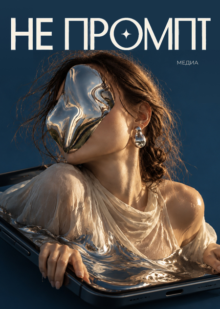
Media Concept
Generative AI allows for image creation faster and more easily than before. However, this brings new questions: how to distinguish an interesting solution from a visual template, what constitutes authorship, and why many generated images appear similar to one another.
«NO PROMPT» explores these changes through real-world examples, visual experiments, and editorial analyses.
The media’s goal is to help the audience not just use neural networks, but to consciously evaluate the results of their work.
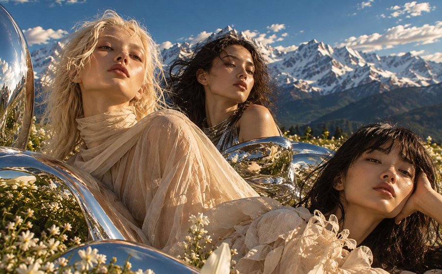
Audience
• Designers and students in creative fields
• Art Directors and Content Creators
• Individuals interested in photography, fashion, and contemporary art
• Brand specialists who use or plan to use generative AI
Formats and Distribution
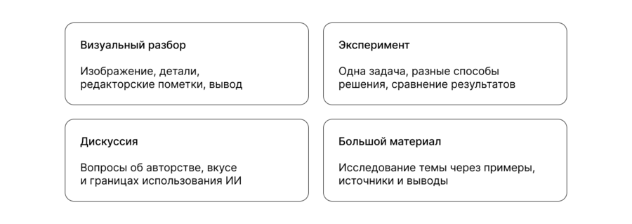
The main platform is Telegram. Full publications, images, videos, and polls are posted here. VK is used for adapted cards and short videos, while the website serves as an archive for larger materials. Publications are not literally duplicated—the format and scope are adjusted for each platform.
Half-Yearmatic Plan
Content Examples
01. Visual Analysis
Carousel: Why Do AI Images Look Similar to Each Other?
Why Do AI Images Resemble Each Other?We change faces, professions, and descriptions, yet the result often remains recognizable—soft lighting, smooth skin, a neutral background, and a polished composition. It seems that the neural networks have their own conception of what a good photograph should look like.By examining portraits of a banker, a doctor, and a lawyer, all generated in 2024, we can observe how a single visual approach repeats across different scenarios. The professions change, but the aesthetic remains consistent.It’s not just the AI itself. The training data, the user’s prompt, and preconceived notions of what looks professional, beautiful, or realistic all influence the outcome.When we ask AI to create something new, are we truly receiving a new visual language, or just a variation of something already familiar?Swipe through the carousel: we’ll dissect the recurring techniques and explore what makes these images look similar.Images are sourced from Aperture magazine.
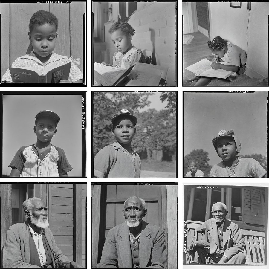
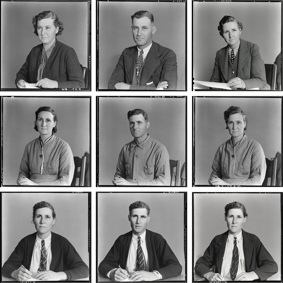
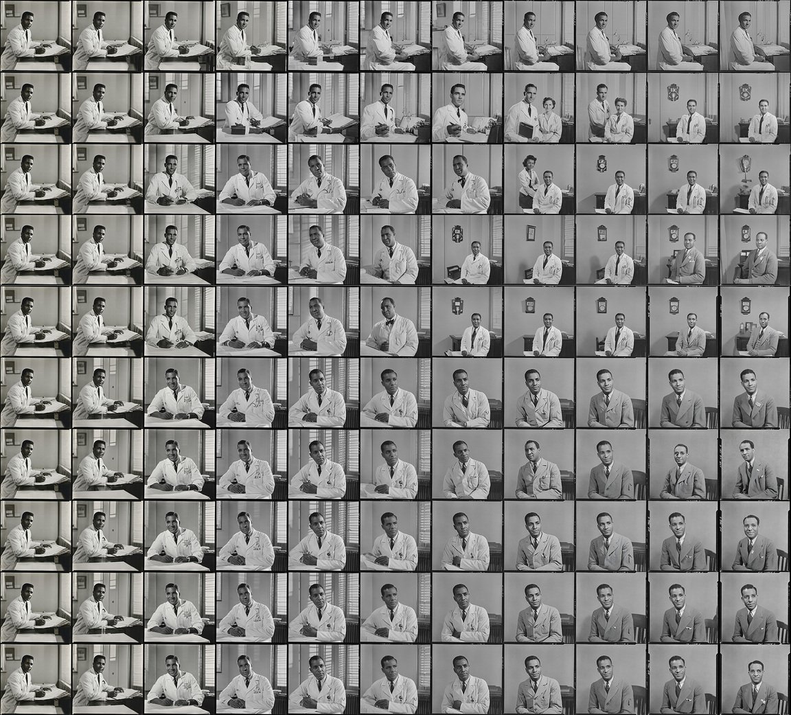
AI-generated images, Aperture
Publication. When the Perfect Image Looks Cheap
When the perfect image looks cheapSmooth surfaces, beautiful lighting, crisp details. An AI-generated image can look flawless, but for some reason, it fails as design. Everything seems to be in place, yet the picture feels artificial, overloaded, or simply unconvincing.The issue isn’t necessarily that the image was created by a neural network. The problem might lie in the visual solution itself.What to watch out for?— No hierarchy. All elements compete for attention, making it unclear where to focus.— Excessive detail. The decor complicates the image but communicates nothing about the product.— Unclear concept. The image attracts the eye but doesn’t explain what is actually being advertised.— Effect for effect’s sake. Sheen, volume, and perfect textures create an impression of quality but fail to convey meaning.These mistakes are found in human work as well. A neural network can generate an image, but generation alone does not guarantee thoughtful composition.Good design is not defined by the number of details or technical perfection. What matters is how the elements work together to solve the intended problem.If an image can be created in seconds, it is even more important to understand why it exists.#graphicdesign
#NEPROMPT
#artificialintelligence
#AI
02. Experiment
Test. Which design works better?
Article. When a perfect image looks cheap: why a beautiful picture isn’t yet design
When the perfect picture looks cheap: why a beautiful image isn’t always designNeural networks have learned to create images that look flawless at first glance. They feature realistic lighting, complex textures, meticulous details, and expressive colors. Sometimes, just a few words are enough to generate an image that is easily envisioned for a promotional poster, a magazine cover, or a brand’s feed.But why do some of these images, despite their technical perfection, look cheap? They might capture attention, but they fail to inspire trust, appear overloaded, or resemble hundreds of other images from the internet.The problem isn’t necessarily that the image was created by an AI. The issue lies in the difference between a beautiful picture and a thoughtful visual solution.When details obstruct the ideaOne characteristic of generative imagery is its ability to create a strong first impression. Unusual materials, reflections, intricate lighting, and numerous small elements make an image visually dense. However, density alone does not guarantee quality.Imagine an advertisement for a new beverage. It features a bottle with an immaculately smooth surface, surrounded by floating fruits, ice, and water droplets, with the background filled with highlights. The image looks striking, but the viewer struggles to understand the core message. Every element is simultaneously vying for attention.In graphic design, visual hierarchy is crucial: the viewer must know where to look first, what to notice second, and what message to retain. If every element claims the main role, the composition fails.Four signs to look out for1. Lack of visual hierarchyThe headline, the subject, the background, and the decorative elements compete with one another. As a result, the eye moves across the image but cannot find the focal point. Even high-quality details cannot save the composition if there are no clear relationships between them.2. Decoration over substanceSupplementary elements can create a sense of complexity without adding meaning. If you remove them, the image’s core idea does not change. This does not mean minimalism is always superior. It is vital that details support the concept, rather than simply filling space.
…
03. AI-Slop Detector
Video. «AI-Generated Slop: The Information Flow and Decline in Internet Quality»
In «NO PROMPT, ” we publish not only our own critical analyses but also collections of valuable resources—videos, articles, research, and tools—that help readers critically examine visual content and better understand the impact of AI on culture.#NOPROMPT
#neuralnetworks
#visualculture
Carousel. Zoom in on the image. What is wrong here?
At first glance, an image generated by a neural network can appear quite convincing. However, if you look closely at the details, you will sometimes discover oddities that betray the generation process.
1. Inconsistent Details
Fingers, hands, and other body parts may look plausible individually but fail to form a unified anatomy. Count the fingers, trace where the arm begins, and determine whose it belongs to.
2. Text That Means Nothing
Signage, labels, and small print may resemble actual text, but upon closer inspection, they devolve into random symbols. Pay special attention to packaging, books, and promotional mockups.
3. Light and Objects Follow Different Rules
A shadow may fall in the wrong place, a reflection may not match the object, or an object may subtly change its shape. The individual details look fine, but together they do not form a convincing space.
However, none of these errors alone prove that an image was created by AI. Similar issues can be found in regular photography or retouching, and high-quality generation may not contain obvious artifacts. It is important to consider the totality of the details, the context of the publication, and the source of the image.
#AI #AISlop #NOPROMPT
04. Neuroanalysis