Link to the old project
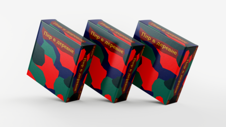
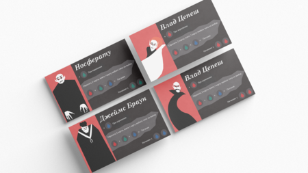
My old project was a tabletop game called «Feast in the Village»: a dark gothic strategy game about four vampires sharing one village, hunting across sectors, gathering blood, and playing cards.
The style features minimalist silhouettes, high contrast (black/white/red), yellow headers, and an abstract map of the districts.
Startup Name PIR (Full name: «Feast in the Village»)
We take the finished mechanic and visual language of a learning project and transform it into a complete product: a box, components, merchandise, brand space, and communication. The target audience is fans of modern euro-strategies with strong narrative and dark humor (ages 18–35). Key brand idea: «Four Vampires. One Village. Only One Survives.»
Product Examples
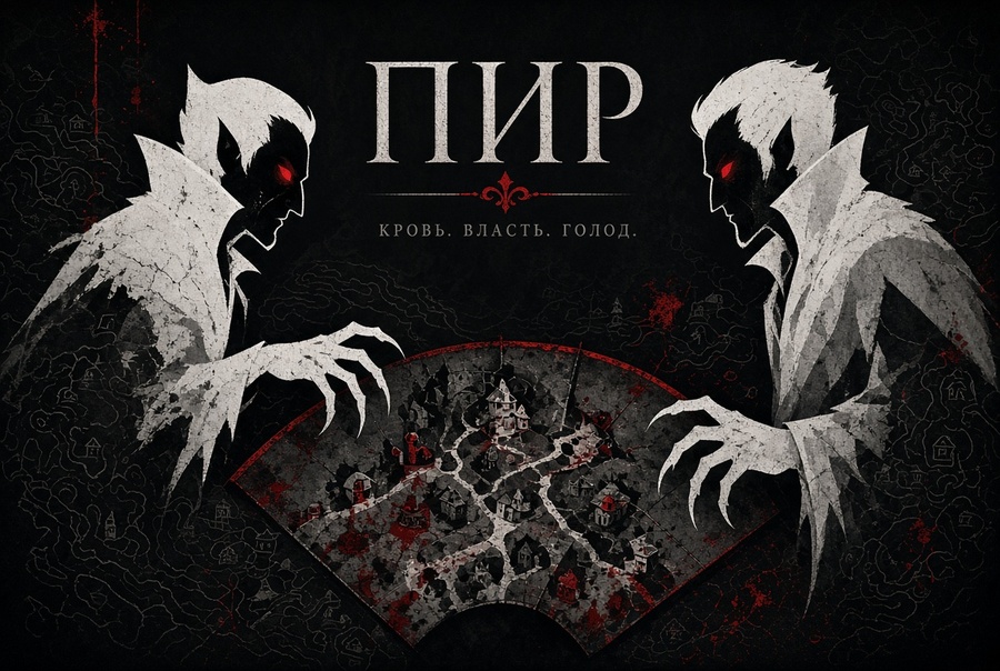
Key visual for the board game «Feast,» featuring two white silhouette vampires with red eyes confronting each other over a sector of an abstract village map—evoking dramatic tension. The background is black and dark grey, highlighting sharp claws, high-contrast minimalist gothic style, and blood-red accents within a cinematic composition.
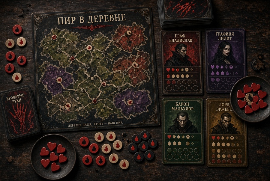
Overhead product shot of the complete board game «Feast in the Village» components on a dark wooden table: abstract colorful village map, four vampire player boards, stack of black cards with colored hands, blood tokens, plates with heart tokens, dramatic low lighting, high contrast, gothic atmosphere, realistic yet stylized
Close-up key visual of a vampire board game card in play—a black card featuring a red claw hand illustration, blue and green blood drop tokens, set against a dark table surface, rendered with atmospheric lighting in a minimalist gothic flat style for a premium product shot.
Close-up premium product photo of the «Nosferatu» player board from a vampire board game, featuring a white silhouette of a bald vampire with red eyes and long claws, a dark red and black design, blood drop icons, elegant serif text, high contrast, and a minimalist gothic style, captured under studio lighting.
Merchandise
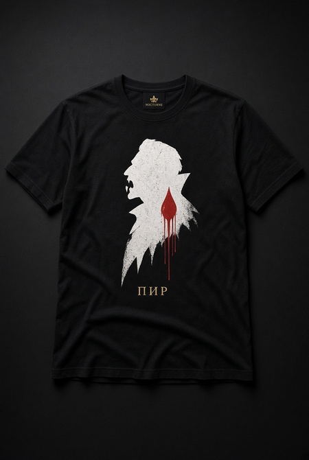
Black premium t-shirt mockup featuring a large white vampire silhouette and a red blood drop, with the small gold text «PIR» beneath. Clean studio shot on a dark background, high-quality apparel photography, gothic minimalist design.
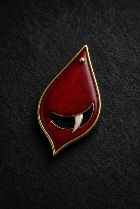
Enamel pin of a stylized blood drop with a small vampire fang, in deep crimson and black with a gold outline. Realistic product photography on a dark surface, high detail, premium merch.
Space
Dark, atmospheric board game store interior designed as a Gothic tavern—black walls, dim red lighting, wooden tables featuring open «Feast» game boxes, shelves stocked with merchandise, dramatic shadows, high contrast, cinematic photography, premium retail space.
Promotions / Posters
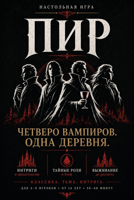
Large promotional poster for the board game «PIR,» black background, big white silhouette of four vampires, large yellow serif text «Four Vampires. One Village.», deep crimson accents, minimalist gothic style, high impact, vertical composition
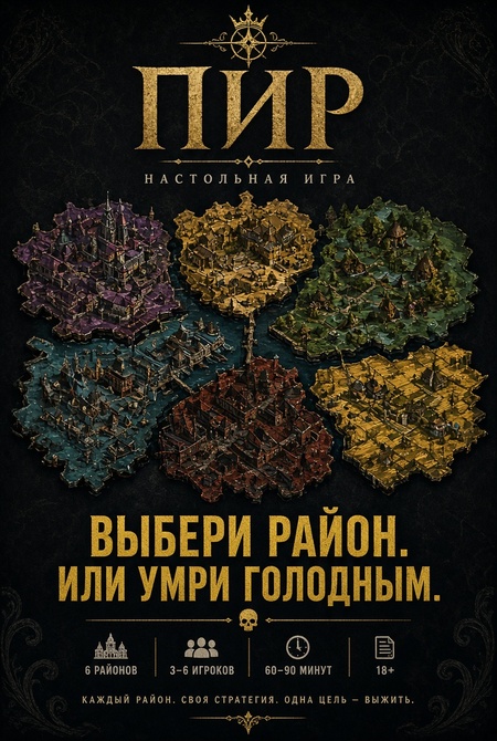
Promotional poster for the «PIR» board game, dark background, abstract colorful village map in the center, bold yellow text «Choose your district. Or starve.», high contrast, gothic minimalist design, cinematic
Project Cover
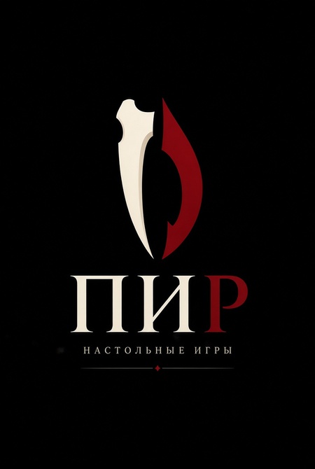
Minimalist premium logo for the board game brand «PIR,» black background, stylized sharp vampire fang combined with a single blood drop, elegant serif typography «PIR» in bone-white and deep crimson, clean geometric lines, high contrast, gothic but modern, vector style, centered composition, professional branding
Identity
Image Creation Method
It all began with analyzing the academic project, «Feast in the Village, ” and developing the name „PIR“ along with the overall startup concept. Based on the original visual language—minimalist vampire silhouettes, high contrast, bloody accents, and an abstract district map—the updated identity was formed. The first step in the Grok Imagine generator was creating the logo: a stylized fang with a drop of blood and the inscription „PIR.“ This logo became the brand’s main visual anchor. Subsequently, the logo and key elements of the original style were used as references for all subsequent generations. We systematically created: five product case studies (night hunt, clash, card shuffling, full component set, and the „Nosferatu“ tablet); merchandise items (t-shirt, enamel pin, mug); a dark Gothic tavern-style showroom space; and promotional posters. At every stage, the prompts were refined to maintain a consistent style, color palette (deep black, bone white, blood red), and the silhouette characteristics from the original project. Specific requests were used to adjust details (fang shape, card proportions, lighting) to ensure all images looked like part of one cohesive system.