
About the Project
«Moscow That Is No More”—an original illustrated book for children aged 7–10 dedicated to the city’s architecture and memory. Through a fairy tale, the book introduces young readers to Moscow’s vanished architectural landmarks and illustrates how the city’s appearance changes over time.
Idea
What if a regular map could show not just the streets, but also the past? The book is built on the idea of preserving urban memory through visual storytelling. Historical landmarks become part of an adventure, and studying architecture turns into a captivating journey.
Main character
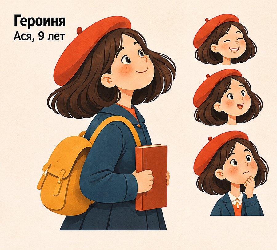
Asya is a nine-year-old girl who loves observing the city and drawing. One day, she finds a magical map that allows her to see Moscow across different eras. Together with her, the reader discovers vanished buildings and learns their stories.
Architecture as the Main Character
Visual Language
Illustrations are rendered in a contemporary graphic style with elements of retro aesthetics. Geometric architectural forms, a warm color palette, expressive silhouettes, and the texture of the paper create a cohesive atmosphere for the book.
Book Format and Structure
Format: 165 × 220 mm.
Volume: 28 pages.
Publication Type: illustrated printed book.
Binding: softcover.
Orientation: vertical.
Internal Design: illustrations, text pages, interactive exercises, and decorative elements.
Front and back covers


Inside front cover
The inside of the front cover features a stylized map of Moscow. Light-colored street lines against a muted blue background create a graphic urban pattern. This element serves as a visual introduction to the narrative, familiarizing the reader with the book’s central motif—the map as a means of exploring space and time.
Book spreads
The internal composition is built on an alternation of illustrative and text pages. Large architectural images allow viewers to examine the urban environment, while the text blocks sequentially unfold the history of Asi.
Interactive Elements
The book invites the reader to become an investigator. The «Find 5 Differences» activity focuses on comparing urban imagery. It prompts the reader to closely examine the architecture and notice the changes. On the «Draw Your Discovery!» page, the child can illustrate a place that interested them and imagine what it looked like previously. Thus, reading continues through observation, comparison, and personal creativity.
Interior of the back cover
The inner back cover continues the theme of the map. Architectural symbols, small trees, and dotted routes connecting historical landmarks appear against a blue background. If the first inner cover symbolizes the beginning of a journey, the last one becomes its visual culmination.