Navigation
Concept
Material
Surface
Synthesis with Nature
Space
Light
Object
Conclusion
References
Concept
In everyday understanding, typography is structured text presented in a two-dimensional format, whether it is printed on paper or projected onto device screens. However, over the last 100 years, typography has increasingly moved beyond its traditional definitions. Designers and artists are actively experimenting with the forms, carriers, and materials of text, creating new imagery and bringing it into the physical world—thereby «animating» it.
Historical Context
Some of the first typographic experiments emerged in the early 20th century as a reaction to global changes and a protest against traditional concepts of art. Dadaists used newspaper clippings in their work, thereby creating not only a striking visual image but also adding volume to the piece by combining different textures. In the 1960s, conceptual art began to integrate typography into its works. Joseph Kosuth and Sol LeWitt used text as part of their creations, emphasizing its significance as an independent conceptual element. Here, typography, although still presented in a two-dimensional form, begins to be equated with a material object and starts interacting with the surrounding world.
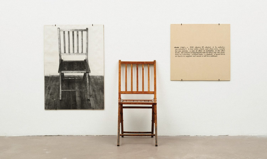
Joseph Kosuth, «One and Three Chairs, ” 1965
With the advancement of technology and the emergence of various graphic editors, new horizons for textual experimentation have opened up. The possibility of various distortions, «texturing, ” and the addition of effects has generated numerous interpretations of how typography can look. However, as the process became computerized and the screen established itself as a primary medium for text, interest and demand for new solutions grew increasingly. Consequently, contemporary designers are increasingly referencing the aspects and characteristics of the real world in their work. This can involve using alternative materials in the creation of fonts and lettering, interacting with space and light, or presenting text and glyphs as independent objects.
Landor Agency, identity design for Orchestra Sinfonica Di Milano, 2023
How are contemporary typographers and designers taking typography beyond flat perception? How does this influence communication?
In the modern world, typography constitutes a dynamic system that extends beyond being a mere carrier of information. Text has the capacity to convey tactile, audiovisual, and gustatory sensations through diverse textures and creation methods, to establish communication with the viewer, and to generate additional semantic contexts and visual metaphors. In my research, I analyze how contemporary typographers and designers utilize various methods and technologies to investigate text as a physical object imbued with qualities characteristic of the real world.
In my research, I define material typography as examples of how text adopts the properties of real-world objects or begins to interact with its environment—its phenomena—thus transcending flat perception to gain materiality and «life.»
The work is divided into six parts, each examining a different way of imbuing text with properties of the real world. Each section explores how a specific «experiment» influences the perception of text, what visual effect it creates, and how it impacts the work’s meaning. The research utilizes case studies related to typographic experiments created over the last 40 years by designers, typographers, and artists. The objective of this study is to identify how and through what means contemporary practitioners achieve this sense of «materiality» in typography and how this affects the viewer’s visual and sensory perception of the text. By analyzing works across various genres—from font glyphs to installations—we aim to understand the creative and semantic value of this aspect in modern design.
Material
Contemporary artists employ various unconventional materials in typography and lettering to create associations for the viewer. Here, letters are formed from real-world objects, lending the text their specific properties and generating the desired communication and feeling.
(1-3) Rodrigo Sanchez, Metropoli magazine covers, 2000s
One striking example of a creative practitioner who develops typographic projects using real-world objects is the Austrian graphic designer, Stephan Zagmeister. His work features numerous experimental solutions and an «playfulness» in how the material conveys the conceptual essence of the text.
Stefan Zagmeister, «Obsessions Make My Life Worse But My Work Better, ” 2000s
The monument made of coins featured the phrase: «Obsessions make my life worse, and my work better.» After the piece was completed, the coins were left unsecured and unguarded so the public could interact with them. Less than 20 hours after the grand unveiling, a local resident noticed someone collecting and taking the coins. Concerned for the artwork they had watched being created, they called the police. After detaining the «perpetrator, ” the police, seeking to „preserve the piece, ” collected all the remaining coins and took them away.
— Stefan Zagmeister on the project „Obsessions make my life worse, and my work better“ [5]
Stefan Zagmeister, «Having Guts Always Works Out for Me, ” 2000s
(1–2) Stefan Zagmeister, «Things I Have Learned in My Life So Far, ” 2000s
«A typeface, in a single moment, in a single form, tells the story of its creation and its evolution with great elegance and speed.»
— Stefan Zagmeister [5]
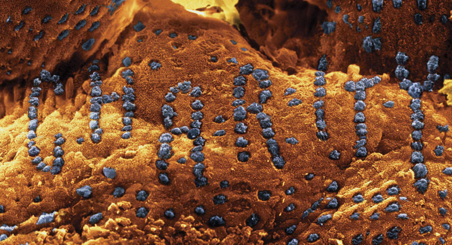
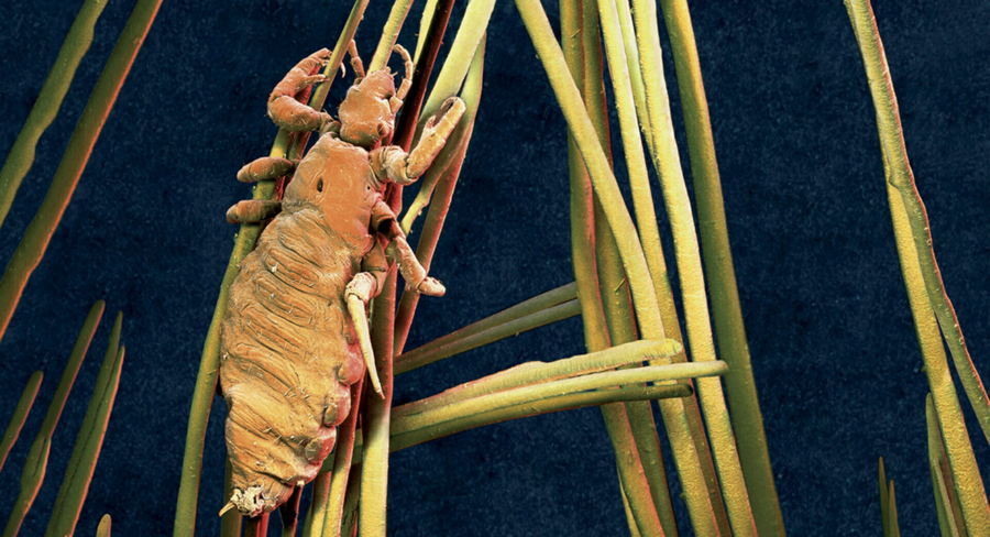
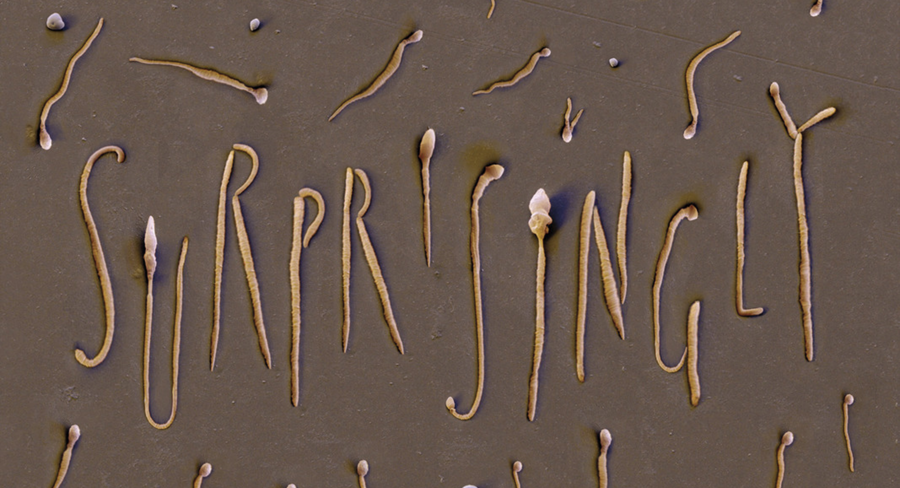
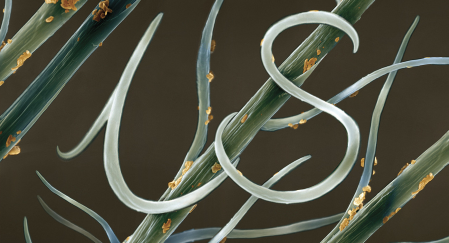
Stefan Zagmaister, «Things I have Learned in My Life So Far, ” 2000s
Lo Siento Studio, «Untouched Seed,» 2012
Among typeface designers, you can also find numerous examples of using real-world objects within glyphs. For instance, an entire typeface can be created without the use of a computer, which lends a palpable materiality to the font when it is vectorized.
Offset Studio, «Wood Type,» 2019
Monik Gossens, «Hair Type, ” 2020s
HandMadeFont Project, 2009
Surface