Ksenia Doshchik
Communication Designer · St. Petersburg
Design that works for your business, not just looks goodI serve as a B2B design partner for businesses and institutions in culture, social impact, fashion, and beyond. I handle full-cycle design projects—from brand and marketing strategy to visual identity and compelling business presentation.I create branding, corporate identity, packaging, merchandise and print materials, social media content, and presentations designed to promote your services, showcase your work, and report on outcomes.Tools: Adobe Creative Cloud, Figma, Blender
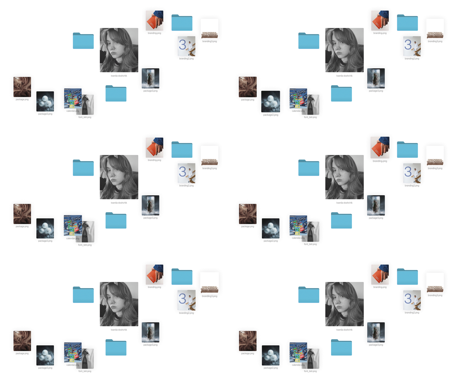
Whatever your field, together we can make your brand more visible, consistent, and relevant to today’s audience.Scroll to see five case studies from five different disciplines
How I Work
Every brand starts with a problem. Design is how we solve it. Most of my clients come to me with the same pain points: the brand is invisible, inconsistent, or no longer speaks to its audience. I don’t start with a logo. I start with the business—its mission, audience, competitors, and what it aims to communicate.Each case study below follows a single structure: Problem → Idea → Solution → Result. This allows you to see not only what I created, but precisely why it works.
Case (01)
Rebranding a medical center for women and children with HIV, Leningrad Region
Social Impact · Healthcare · March 2026
Problem
The center has served patients from across Russia for 40 years, and many of its patients were born there. However, its visual style resembled a typical state hospital and relied on common HIV symbols that exacerbated stigma. Furthermore, the brand needed to communicate with patients, families, doctors, and partners simultaneously.Idea
The center functions as a lifelong companion. Therefore, the brand focuses on themes of care and trust, steering clear of any mention of the diagnosis.
Solution
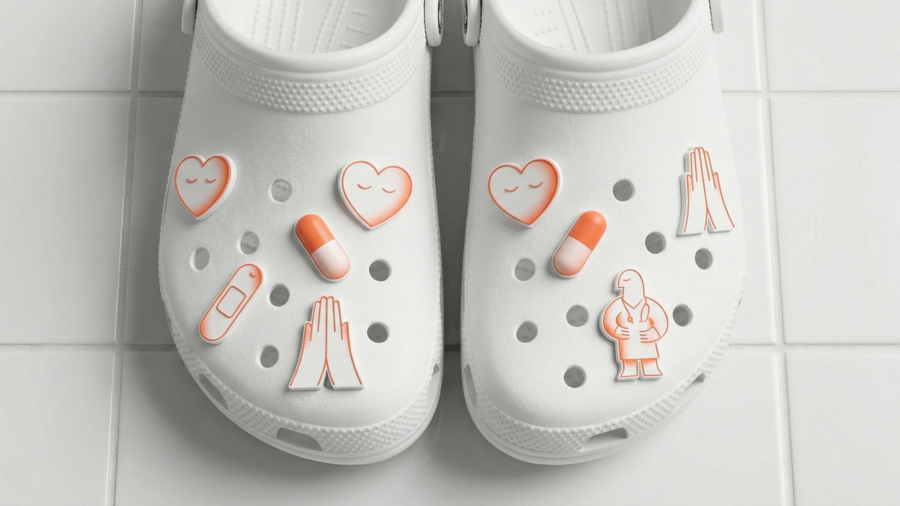
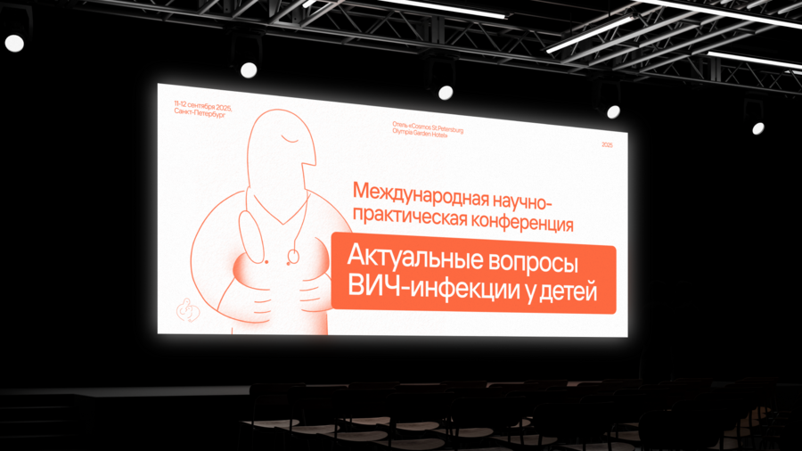
A brand platform and tone of voice tailored to each audience, developed using over 40 real patient reviews. This includes a soft blue and coral palette, a logo depicting a mother holding a child, and two distinct sets of line illustrations. This consistent style is applied across wayfinding signage, the website, social media, conference materials, uniforms, and merchandise.
Result
One calm, stigma-free identity across every touchpoint, complete with templates staff can use independently
Case (02)
Rebranding of the Fortuna Museum, Saint Petersburg
Culture · Museum · June 2024
Problem
The museum frames gambling as a subject for study—not recreation—and explains its inherent dangers. It is struggling to attract tourists who have already visited the main attractions, and its outdated identity failed to communicate what makes it unique.
Idea
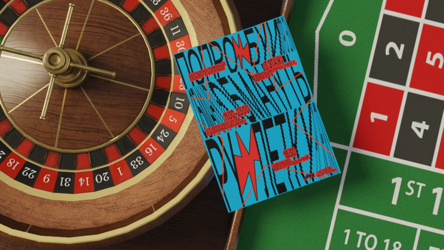
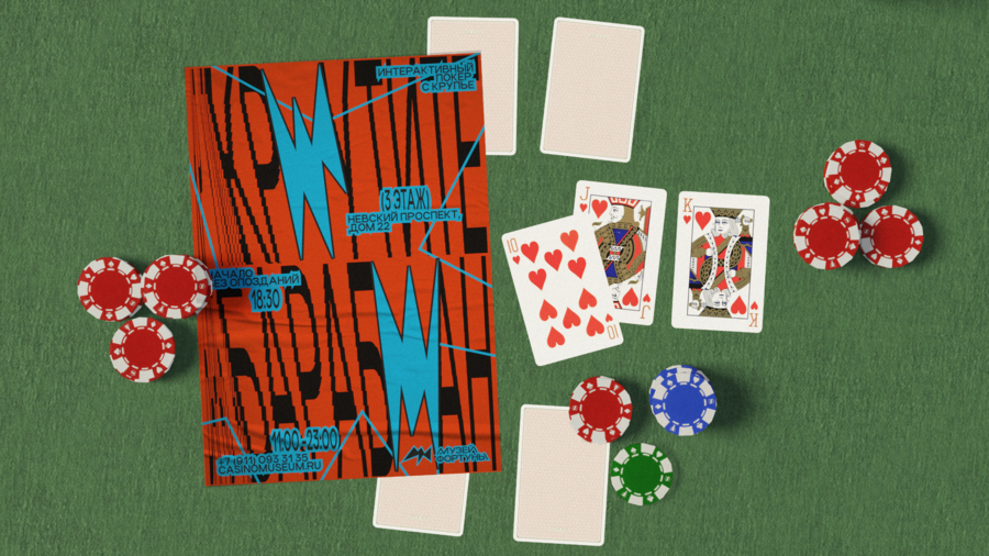
The identity functions like a casino: bright, loud, and slightly overwhelming, so the visitor experiences the thrill first and understands how it works later.
Solution
A brand platform developed through audience and competitor research. A logo that fuses a flash, the letter F, and the wings of the goddess Fortuna. Sharp, asymmetric stars, an orange palette, and stretched, shifted typography. Posters, exhibit labels, wayfinding, and merchandise inspired by card games.
Result
A bold identity that stands out among the city’s museums, supported by a style guide that ensures consistency across every new poster.
Case (03)
Poster and triptych for the «Confluences» exhibition, HSE University — Nizhny Novgorod (January 2026)
Culture · Education · January 2026
Problem
The exhibition celebrates the university’s 30th anniversary, focusing on lucky coincidences. The poster needed to translate this abstract theme into a clear visual connected to the city.Idea
The Strelka in Nizhny Novgorod, where the Oka meets the Volga. The confluence of two rivers symbolizes the meeting of people and ideas.