Katerina Sychevskaya | Portfolio
Communication Designer and Illustrator
I’m Katerina—a communication designer.
I am an emerging communication designer specializing in brand identity, visual concepts, and illustration. In my projects, I explore specific themes, develop visual languages, and craft graphic solutions that bridge the gap between concept and form. I am not confined to a single discipline and am comfortable working across a variety of formats.
My portfolio showcases my design approach, visual skills, and my style. In addition to developing my own art style, I am proficient in working within established styles and parameters.
Big Laundry | A Series of Illustrated Postcards
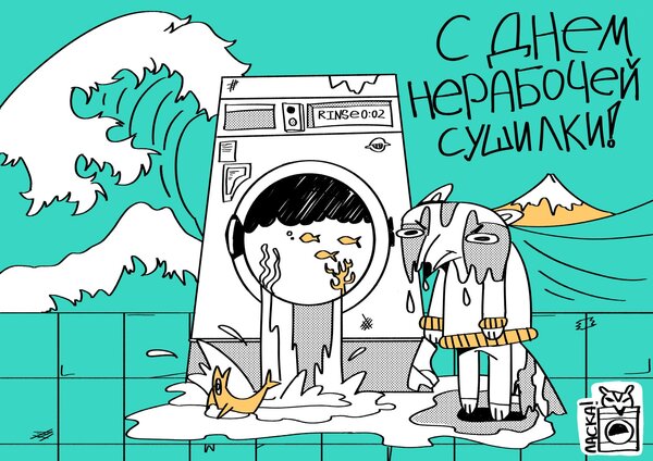
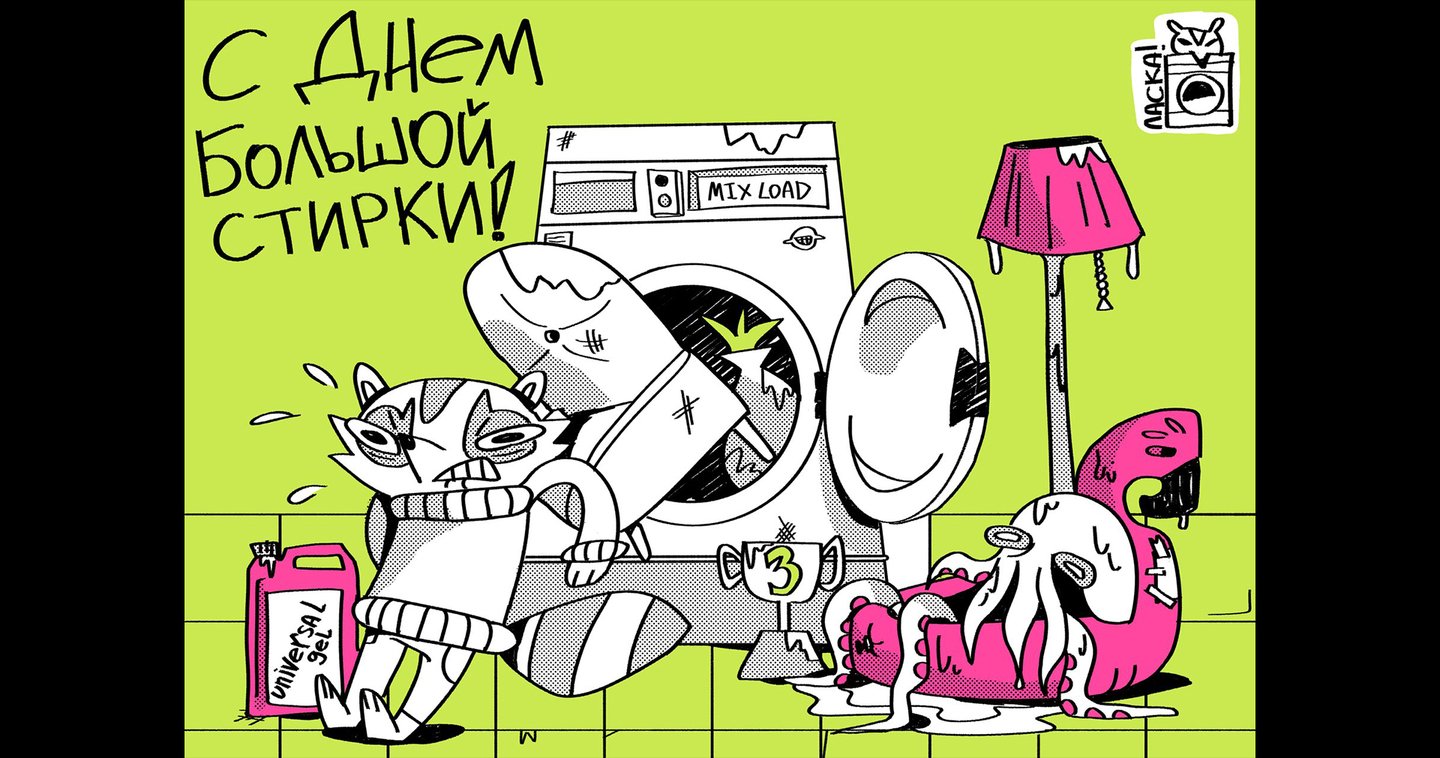
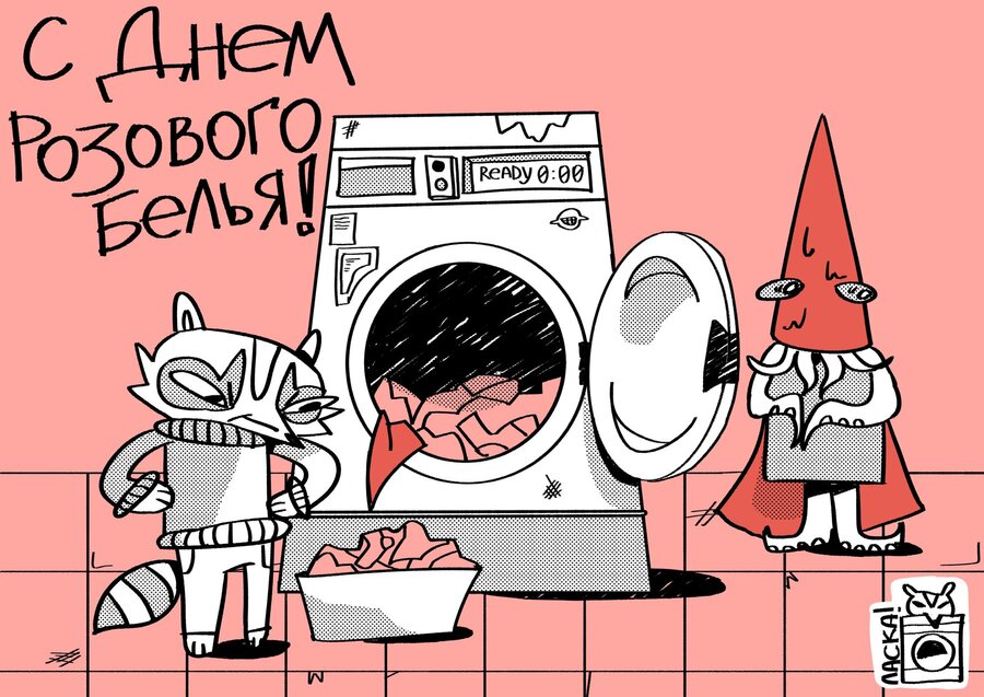
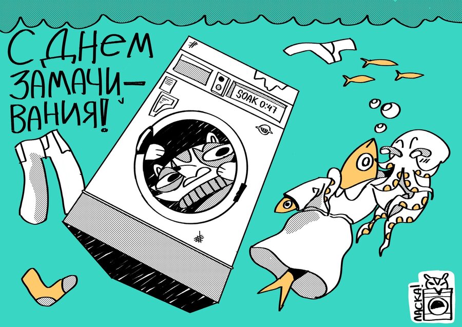
BIG LAUNDRY Illustration · Character Design · Visual Storytelling The Brief As part of the A Holiday Every Day illustration competition, I was challenged to create a series of greeting cards for fictional holidays celebrated in an imaginary place. The Idea Big Laundry is a series of greeting cards for Laska, a fictional laundromat that celebrates holidays dedicated to the art of washing. The characters bring the concept to life: an obsessive raccoon who takes cleanliness very seriously—even when it comes to his prickly sweater—and a clueless, chaotic octopus who has no idea how laundry works. The Solution I created a shared setting built around a washing machine that remains in the same place throughout the series—unless, of course, a flood or an earthquake hits the laundromat. I also developed a consistent cast of characters, bringing the fictional laundromat and its unusual holidays to life through humor and expressive illustrations.
Aquarium | Packaging Design
AQUARIUM
Illustration · Packaging · Character Design
The Brief
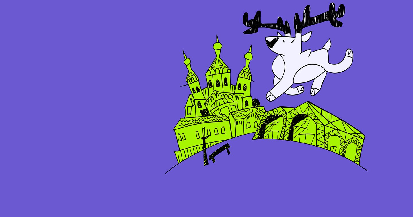
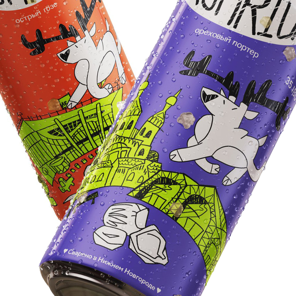
Aquarium is a craft beer brand based in Nizhny Novgorod. The assignment was to develop a series of illustrated labels that would establish a recognizable «local hero» for the brand. Each beer flavor was inspired by a location within the city, which needed to be reflected in the packaging.
The Idea
I created a deer mascot inspired by the deer on Nizhny Novgorod’s coat of arms. Running through the city’s landmarks, the deer takes tourists on a playful visual tour, sharing interesting facts about each location with both visitors and locals via the labels.
The Solution
By depicting the deer in various poses and combining stylized illustration with recognizable city locations, I created a sequence of labels that functions like an animation—the deer appears to run from one landmark to the next. Bright colors differentiate the various beer styles, helping to organize the range while giving each flavor its unique identity.
The Outcome
One of the illustrations was later featured on a collectible ticket for VK Fest in Nizhny Novgorod, extending the project beyond its original packaging.
Charity Fashion Flea Market | Branding
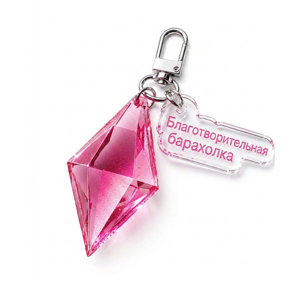
CHARITY FASHION FLEA MARKET Brand Identity · Illustration · Visual Concept The Brief The assignment was to develop a visual identity for a charity fashion flea market, merging the concepts of fashion and philanthropy. The client also requested that the brand’s signature pink color be preserved. The Idea I developed the concept around a treasure hunt. Every item at the flea market is a hidden treasure belonging to someone, waiting to be discovered by a new owner. The Solution I created a series of gemstone illustrations in various shapes, representing the unique value of each item. While every gem is distinct, each holds equal worth—much like the objects awaiting discovery at the flea market. These illustrations formed the foundation of the brand’s visual language, shaping its overall mood and how it communicates with its audience.
Dirty Middle Ages | Concept Art
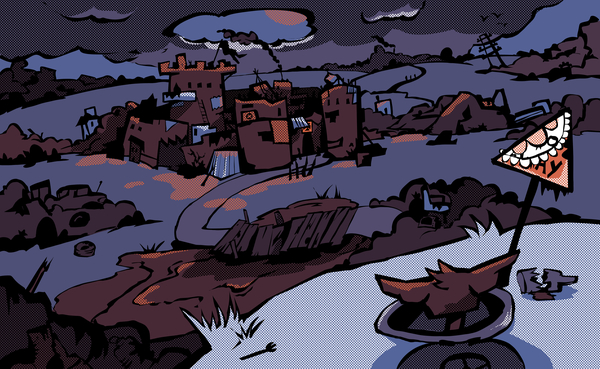
DIRTY MIDDLE AGES Concept Art · Character Design · Visual Development The Brief Develop a cast of animal characters for a comic concept set in a medieval post-apocalyptic world. The characters belong to two opposing factions—the Clean and the Dirty—and their allegiance must be visually recognizable. The Idea I explored the contrast between the two factions through character design. The main character is a borderline case: originally one of the Clean, he gradually becomes Dirty. Other characters have more explicit visual traits that identify their faction. A limited color palette and screen-tone textures add variety while maintaining a cohesive visual style. The Solution I developed a rough, sharp-edged illustration style to emphasize the conflict between the Clean and the Dirty. White and blue dominate the Clean characters’ palettes, while orange and brown distinguish the Dirty. A collage method was used to develop the characters. Animal features also help communicate each character’s personality and role within the fictional world.
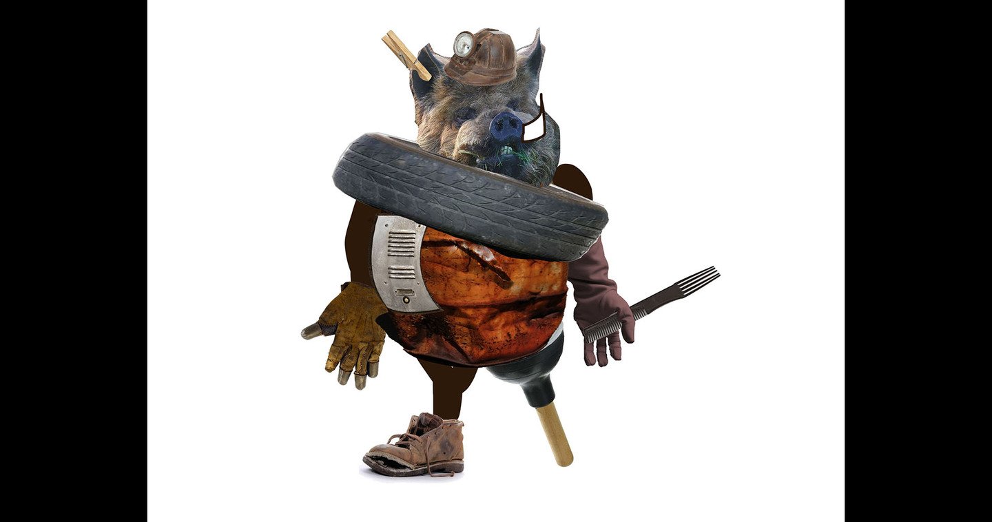
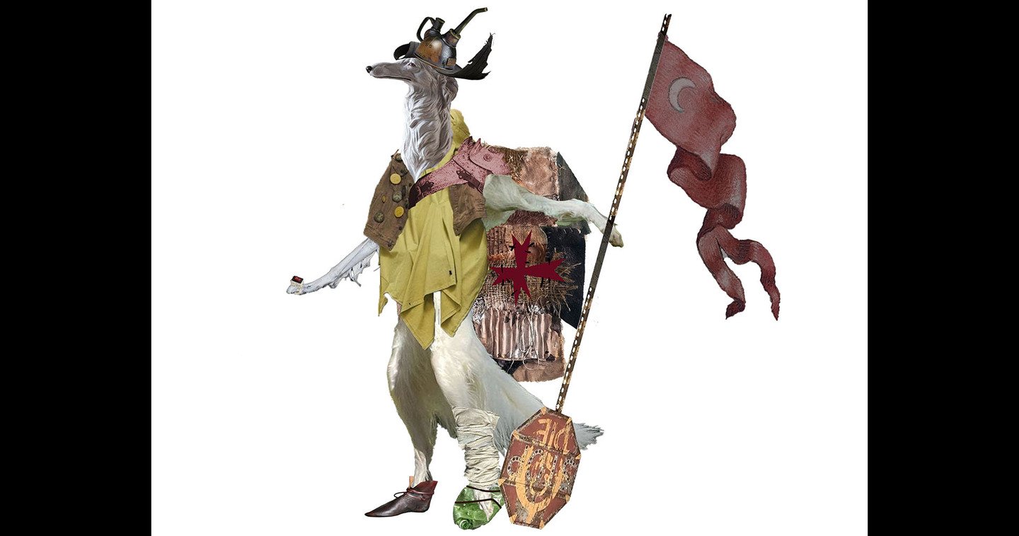
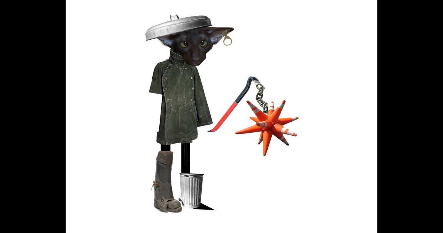
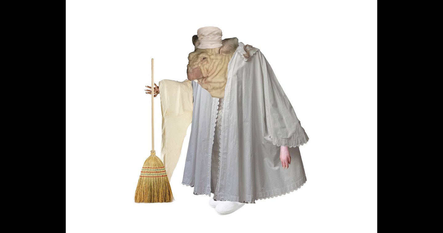
collage sketches
And that’s not all…
I’ve also worked on typeface design and printed books—you can see more on my page.
I have a lot of things to look at!
Let’s work together!
I’m open to new opportunities, collaborations, and illustration commissions.
Have a project in mind? I’d love to hear about it!
Email: katyasychvna@gmail.com
Telegram: @suchvnos