The Great Moscow Circus on Vernadsky Avenue is the largest circus in Europe. Over the years, generations of children and adults have loved this place and its incredible performers; this year, it celebrated its anniversary. However, its visual culture no longer matches the circus’s status or scale. The city has now begun construction on a new venue intended to transform the circus into a full-fledged urban public space, making the update of its graphic identity particularly timely.
What’s on now?
Currently, the circus’s communication is not connecting: the visual identity is aesthetically outdated and clearly doesn’t match the scale of the venue.
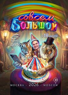
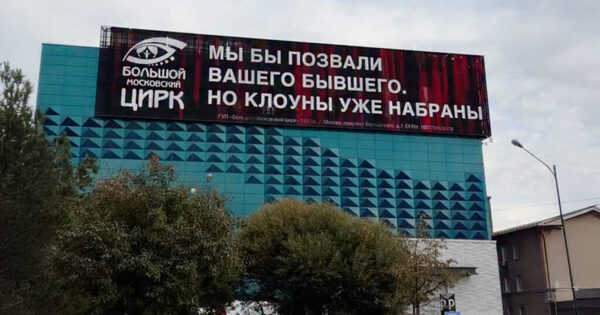
Currently, the circus communicates with flat, provocative jokes, interacting not with its primary audience—families with children—but, for example, with women who have just gone through difficult breakups.
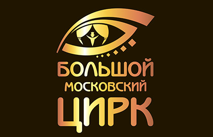
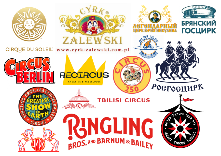
Designing circus logos is a distinct genre, rooted in Victorian aesthetics. In the current mark, little of that remains: the proportions are skewed, the composition tips to the left, and the word «Moscow» is awkwardly squeezed between «Great» and «Circus.» In my version, I removed the geographical tie-in, shortening the title to «Great Circus.»
Despite my love for my hometown, I followed the analogy of the Bolshoi Theater: the country’s premier circus does not need to state its territorial affiliation on the logo to be truly Moscow.
The Creation Process
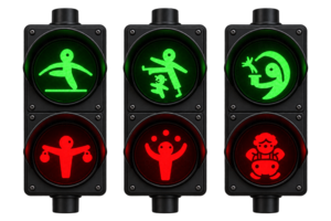
The core concept uniting the entire refreshed communication for the circus is the circle: the circus ring, the balls on the noses of seals, unicycles, hoops, popcorn buckets, and the clown nose.
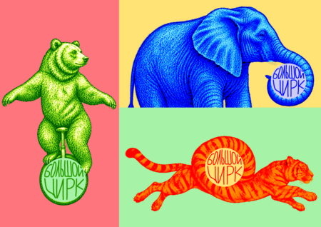
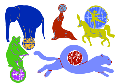
The logo serves a similar purpose—it needs to look good as a social media avatar and as a branding element—so I quickly settled on its form.
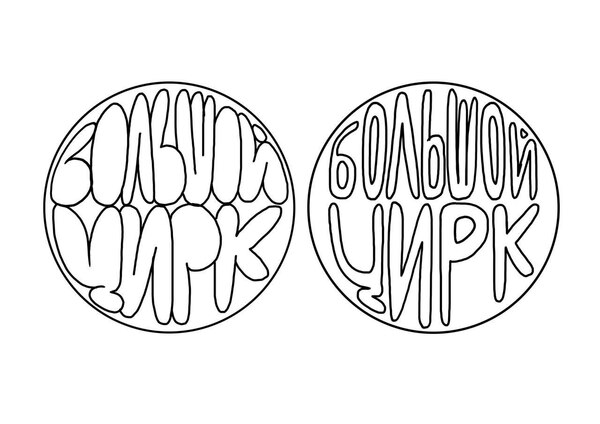
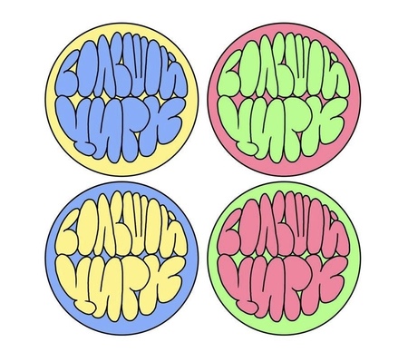
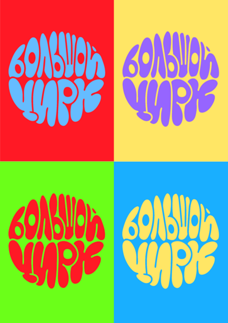
I designed a logo that needs to be vibrant and lively while remaining highly faithful to a very specific genre—one that practically no circus in the world deviates from. Circus art has deep continuity and tradition, so instead of an avant-garde experiment, I chose to incorporate more classical elements into the circus mark, giving it the appearance that it was designed back in 1971 and hasn’t changed since. This logo is perfect for an old modernist building because it has a strong Soviet sensibility, yet it is neutral enough to suit a new structure.
What was the final result?
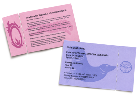
I paid close attention to the souvenir merchandise because it remains a pleasant memory for all the show’s viewers. If it is planned well enough, it has the potential to become free advertising. Currently, the circus does not utilize this opportunity at all, limiting the merchandise exclusively to utilitarian qualities.
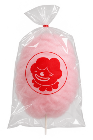
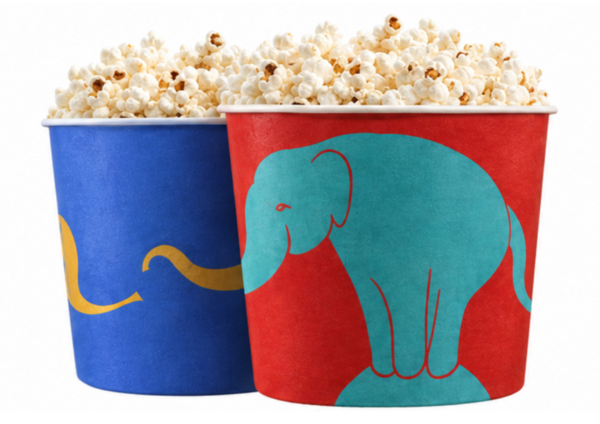
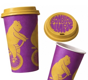
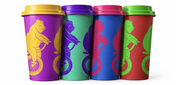
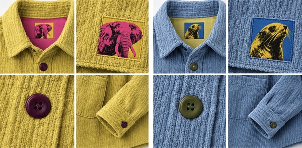
The first merchandise collection is inspired by artists, athletes, clowns, and the animals of the Big Top, as well as the creative genius of the world’s main trickster, Andy Warhol.
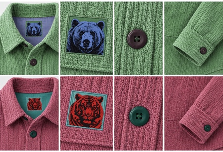
Our collection features shirts that are as vibrant, witty, and cheerful as our clowns. They will not only make a wonderful addition to your wardrobe and make a thoughtful gift, but they will also help a worthy cause: a percentage of the purchase price will go toward supporting the circus’s retired animal residents after they conclude their careers.
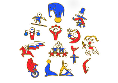
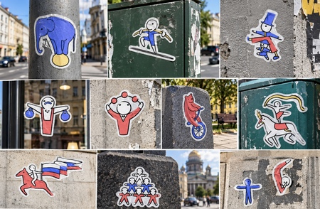
But the circus isn’t just about animals; it’s also about the incredible talent of people—and that’s what our stickers and pins are dedicated to.
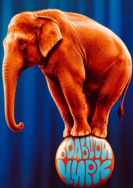
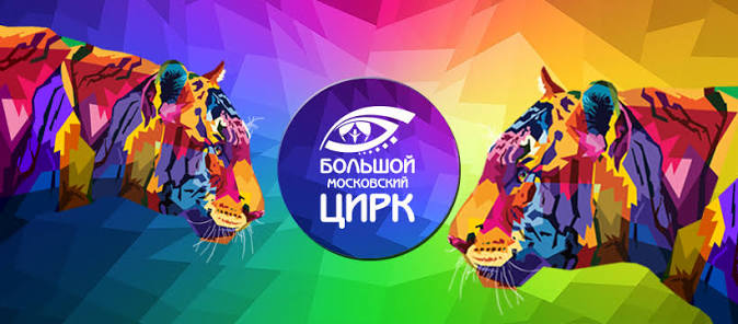
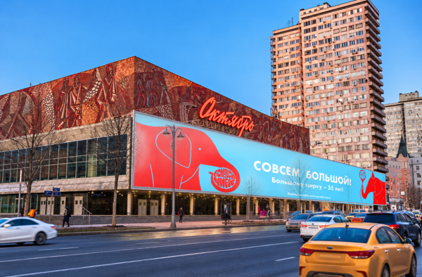
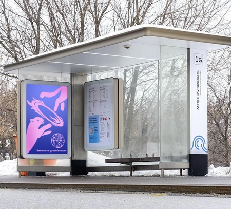
The new circus advertisement should be concise, charming, and simultaneously funny and vibrant, attracting the attention of both children and parents.
Development Prospects
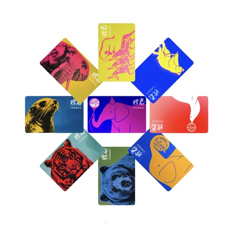
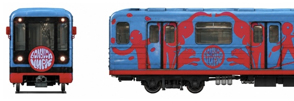
The Bolshoi Circus is owned by the Government of Moscow and its Department of Culture, which plans to actively develop it as a city’s «third place» with the launch of a new venue in Mnevnicheskaya Poyma.This opens up possibilities for a wide spectrum of events, ranging from collaborations with the metro to all sorts of city festivals and happenings.