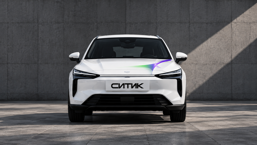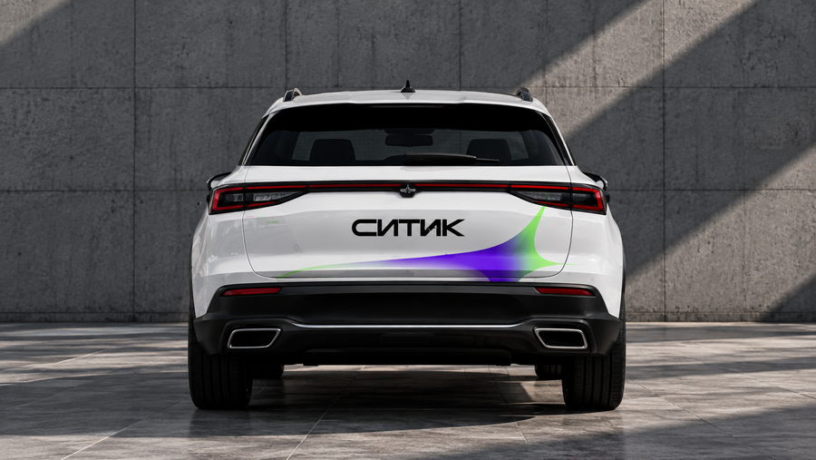
CityK — is not just a car-sharing service that helps you get from point A to point B. It is the opportunity to move freely around the city, spontaneously change plans, discover new places, and choose your own route every day.
The core idea behind the identity is the constant movement and variability of the city. Today you drive down a familiar road, and tomorrow you turn onto a path you’ve never taken. It is this feeling of freedom and unpredictability that I wanted to convey through the brand’s visual language.
CityK merges contemporary graphic design, technological precision, and minimalism, while remaining vibrant and recognizable.
Logo
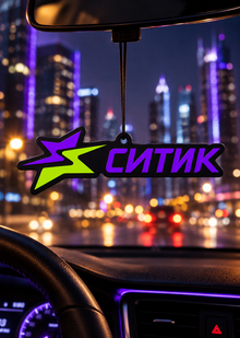
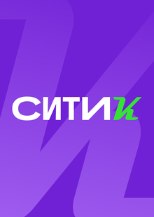
The logo is built upon a geometric rendering of «CITIC.» Broad proportions, sharp lines, and acute letter endings create a dynamic, modern character. A reinterpreted CityDrive «Spark» logo has been integrated into the typography, maintaining a connection to the core brand while lending the logo a new identity. This design allows the logo to be used across various media—from small digital elements to large-scale vehicle graphics.
ISKRA
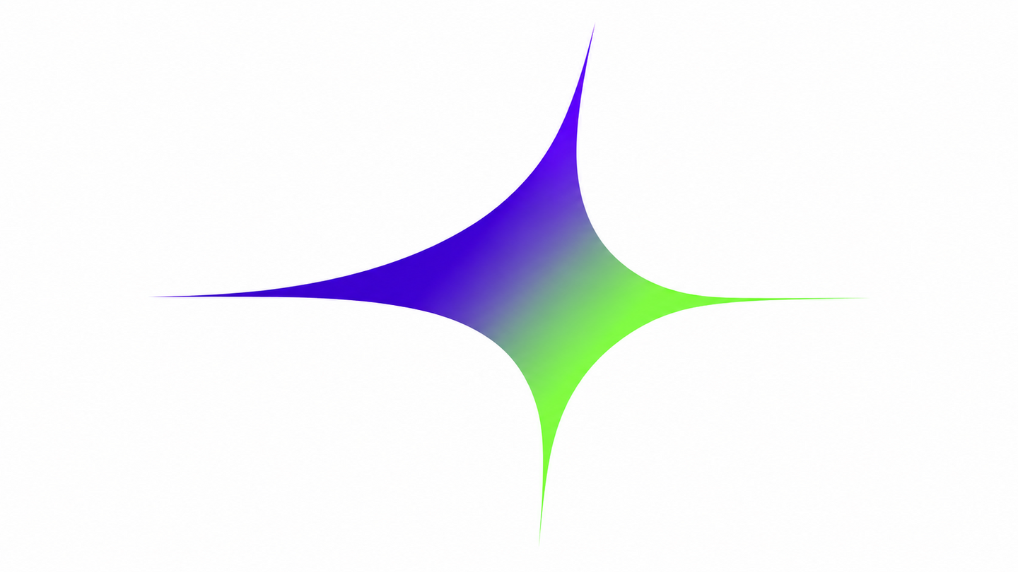
The primary graphic element is a new interpretation of CityDrive’s «Spark.» I maintained its recognizable four-ray form, but I made the rays more elongated and fluid. Now, the spark conveys not only energy but also movement in various directions. A special role is played by the gradient from purple to green. This smooth color transition reflects the city’s variability, moods, and changing plans. Like the journey itself, the color is not static—it gradually transforms, moving from one state to another. The spark becomes the foundation of the brand identity and can function as a standalone symbol, part of the logo, or a prominent graphic accent.
Graphics
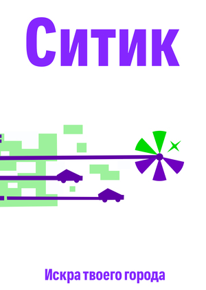
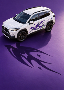
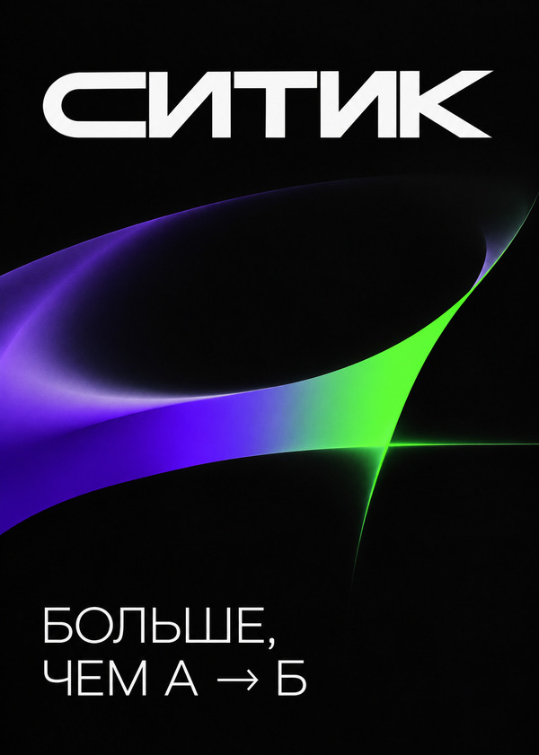
Supplementary graphics emerge from the form of a signature spark. Its rays stretch, curve, and transform into smooth lines, color gradients, and orbital trajectories. These elements convey a sense of speed, motion, and constantly shifting direction. The graphics can alter scale and composition, meaning each carrier looks slightly different, yet remains part of a unified system.
The palette is built around violet and green, colors that maintain a visual connection between Citytic and CityDrive. Violet establishes the brand’s character, green adds vibrancy and energy, and black and light gray help balance the composition. The key technique is the gradient blend of violet and green. This creates a sense of motion and change while making the signature graphics more dynamic.
Typography
For the identity, geometric sans-serif fonts were chosen. Large inscriptions in light weights create a contrast with the massive logo.
The typography remains simple and clear: short phrases, ample white space, and a distinct hierarchy allow information to be read quickly.
The communication employs questions and phrases close to the daily life of the young audience: «Where today?» and «More than A $\rightarrow$ B.»