
Citic is the youth division of «CityDrive,» a subsidiary brand within the existing ecosystem. Its purpose is to speak to a new audience in their language without breaking ties with the parent brand.
Analytics
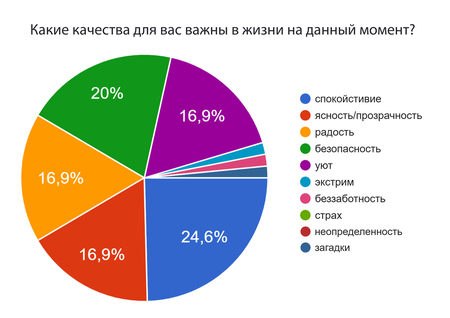
To gain a deep understanding of the target audience, a survey was conducted, and based on the collected responses, I completed an analytical review correlating the results. The survey of the 18–30 age demographic revealed that 68,8% of respondents consider themselves independent and ready to take responsibility, and 50% are capable of living separately or buying a car. For them, career, personal growth, and building a family are priorities, rather than carefree enjoyment (no one selected this option). Furthermore, 87,5% believe that subtle yet thoughtfully crafted visual design will be more noticeable, and they cite tranquility, clarity, joy, safety, and coziness as their most vital life values. These survey results influenced the brand’s character—its mission, values, color palette, stylistic elements, and illustrations.
The «Citic» identity is built on communicating safety, clarity, and transparency, blending geometry with gradients. Strict lines symbolize precision and charting a path toward goals, while soft transitions and smooth forms convey composure and reliability.
Identity
Logo
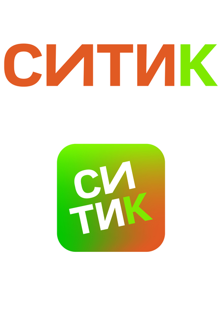
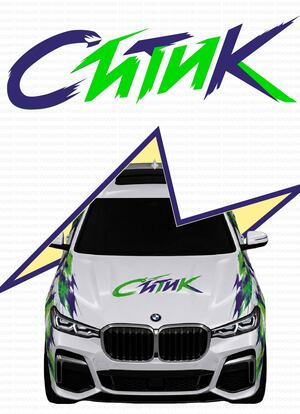
The «Citic» logo is a modern, minimalist design that resonates with the audience. Two primary versions of the logo ensure flexibility for use across different mediums.
The signature typeface used is «Citydrive,» Citymobil Sans Normal Regular.
The color palette complements the «Citydrive» identity, yet the brand presents itself as a distinct entity while maintaining ties to the broader ecosystem.

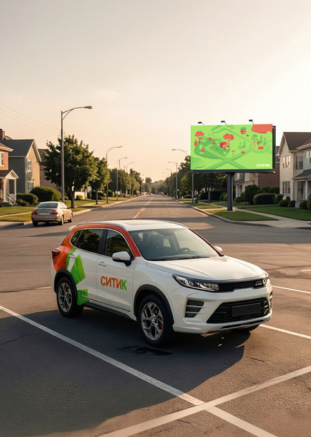
The logo’s color palette resonates with the expectations of the target audience: cheerful, clean, and clear hues do not cause anxiety; instead, they convey openness and reliability, fostering a positive emotional response.
Construction
The name «Sitik» uses the same typeface as «CityDrive.» In the icon, the interior scene is set to the size of the letters, and the letter slant matches the degree in the «CityDrive» logo—this provides instant identification of belonging to the ecosystem.In the logo, the first letter «I» is slightly stretched—an effect used in the «CityDrive» style. This is a subtle yet discernible marker of brand connection. To enhance this effect, only one letter «I» has been modified.
Stylistic Elements

The dynamic broken line is a key element of the corporate identity: the sharp angles symbolize the winding path and decision-making, while the curves represent the flexibility of the route.
This element symbolizes movement, determination, and the individual journey of each person.

Circles, soft blur, and gradient fill are interpreted as a visualization of the phased transition from task definition to its execution—a metaphor for a conscious journey: it represents contemplation, planning, and clearly structuring steps toward a goal.
The stylistic elements convey a balance of boldness and thoughtfulness. For the target audience of 18–30, this visual language is perceived as aligning with service expectations.
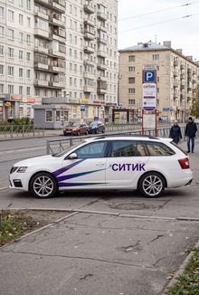
Connection with the «CityDrive» brand