Concept
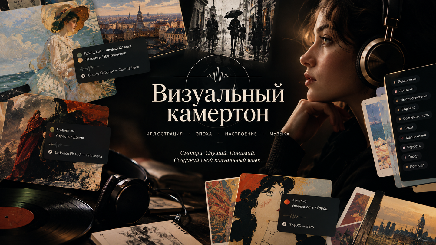
«Visual Tuning Fork» is the only illustration archive that sounds—every piece is accompanied by a track, becoming a starting point for understanding the era and mood. The goal is to make the study of illustration conscious and emotionally engaging, so that a novice artist can see connections, understand techniques, and form their own visual language. The format is a media archive of cards structured as «illustration + curatorial analysis + track + tags, ” featuring regular selections and audio releases: it is neither an encyclopedia nor a social network, but a calibrator for the eye and the ear.
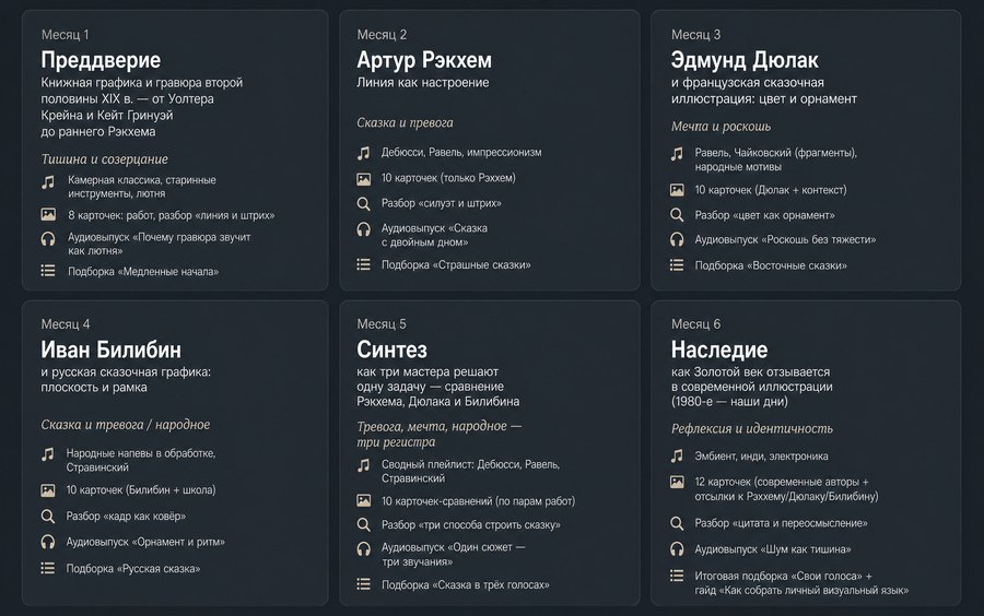
Six-Month Thematic Plan
Plan Logic: A progression from foundational eras to complex syntheses. Each month introduces one «setting» (era) combined with an overarching mood and a musical vector. Within the month, there are four weeks: archive cards, technique breakdown, an audio release, and a final curation.
Content Samples
1. Archive Card (text + image) — «One Piece — One Track» section
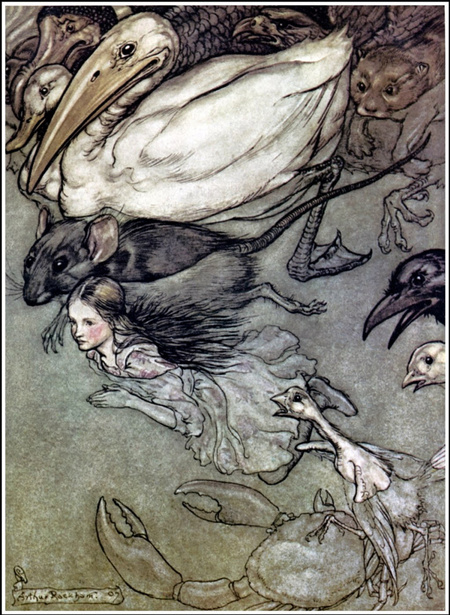
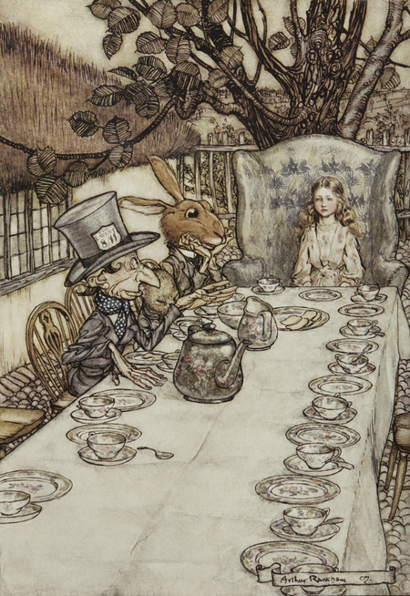
Illustrations by Arthur Rackham for Alice in Wonderland, 1907
Tags: Era — Golden Age of Illustration; Mood — Fairytale and Anxiety.
Track: Claude Debussy, «Clair de Lune» (or «Prélude à l’après-midi d’un faune»).Curatorial Commentary
Why is this piece a benchmark? Rackham builds an anxious fairytale through contrast: the finest pen strokes and nearly transparent watercolor create fragility, but the composition is skewed—the figures are leaning, and the space seems to drift. Technique: line as mood. Rackham’s line doesn’t describe form; it evokes emotion—the denser the network of lines, the greater the scene’s tension.What to Learn: not to fear emptiness and to build anxiety through the rhythm of line rather than through color.Why This Track: Debussy similarly «blurs» harmony the way Rackham blurs contour: the music and the illustration are tuned to the same frequency—a delicate, unstable, slightly eerie enchantment.
2. Archive Card (Text + Image) — «Close-Up Admissions» section
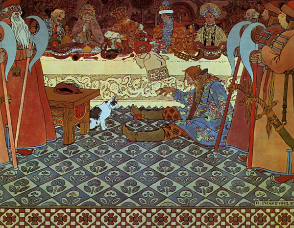
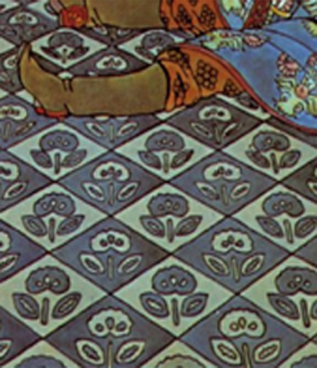
Ivan Bilibin. Illustration for «The Tale of Tsar Saltan» + excerpt. 1905
Tags: Era — The Golden Age of Illustration; Mood — Fairy Tale and Anxiety / Folk.
Track: «Wedding» Melody in Processing (or a fragment from Stravinsky’s «The Rite of Spring»).
Curatorial Comment: Bilibin is a master of planar ornamentation: black contours, localized colors, and a closed, frame-like composition. The technique: the frame acts as a carpet—the image is read as a pattern, not as a window into depth. This teaches conscious engagement with flatness and decorative quality.What to Learn: How to construct an illustration as an ornament, where every element holds the frame.Why This Track: A folk melody subjected to harsh rhythmic processing mirrors the logic of Bilibin’s contour—rhythm is more important than nuance.
3. «Tuning» Audio Episode (10–12 min) (Episode 1)
Title: «Why Engraving Sounds Like a Lute.»[0:00–0:40] Intro.
«Hello. This is ‘The Visual Tuning Fork’—an archive that speaks. Today, we are tuning our eye and ear to the 15th–16th century: a time when illustration was just learning how to be an illustration. And the first thing we will do is listen to the silence. Not a pause, but true silence—a silence as dense as paper.»[0:40–2:30] Work and Context.
«Before us is a wood engraving—a cut line, devoid of halftones. The master cannot ‘soften’—they can only draw a line or not draw one. From this comes extreme honesty: every stroke is a decision. This was an era where images were rare and precious, meaning everything was read slowly.»[2:30–5:00] The Technique.
«Look how volume is constructed: not through chiaroscuro, but through the density of the line. The denser the grid, the darker it becomes. This is precisely what a lute does: it doesn’t have volume in the modern sense; it has the density of touch. One finger—one line.»[5:00–8:00] Connection to Music.
«We are playing a fragment of a lute piece. Listen to how the sound fades—and watch how the line fades toward the edge of the page. It is the same technique: attenuation as a way to manage attention. Music teaches us how to read an engraving—and vice versa.»[8:00–10:30] What to Learn.
«Three things for your practice: first, constraint generates language; second, density matters more than detail; third, the slowness of reading is not a bug—it is an effect that can be designed.»[10:30–12:00] Conclusion.
«The tuning is complete. Next week—silhouette and ornament. But for now—keep this engraving in your mind and play the lute one more time.»
4. Audio Episode «Tuning In» (10–12 min) — Issue 2
Title: «Tale with a Double Bottom: Rackham and Debussy.»[0:00–0:50] Intro.
«Today, we are analyzing a troubling fairy tale. We have two touchstones: Rackham’s illustration for 'Alice' and Debussy’s 'Clair de Lune.' The goal is to understand how fragility transforms into tension.»[0:50–3:30] The Work.
«Rackham works with a pen: the finest linework, nearly transparent watercolor. But the composition is shifted—the figures lean, the horizon seems to drift. This is not a mistake—it is a technique: the world in Rackham’s fairy tale is unsafe.»[3:30–6:00] The Music.
«Debussy blurs the harmony just as Rackham blurs the contour. Listen: the chords do not resolve; they just 'hang.' That is anxiety—not loud, but tenuous.»[6:00–8:30] The Connection.
«Look at the hatching and listen to the decay—they operate on the same frequency. A fragile, elusive, slightly eerie charm. This is what an emotional hook is: not the plot, but the state of being.»[8:30–11:00] What to Learn.
«Do not fear emptiness; build anxiety through line rhythm; design for a 'slow reading' experience.»[11:00–12:00] Finale.
«The analysis is complete. The tuning fork rings.»
5. Video «Close-Up Shots» (script + shot examples, 3–4 min)
Title: «Geometry and Rhythm: Constructivist Poster»Script:Scene 1 (0:00–0:15). Close-up: the diagonal of El Lissitzky’s poster, «Red Wedge Beating Whites.» Voiceover: «One wedge. One diagonal. And all the energy of the era.»Scene 2 (0:15–0:50). Slow zoom onto the intersection of the figures, highlighting the red wedge. Voiceover: «Constructivism builds the image as a construction: there is no background, no depth—there is rhythm and direction.»Scene 3 (0:50–1:40). Split-screen: the poster alongside a highlighted Stravinsky score; a metronome ticks in time with the diagonals. Voiceover: «Listen: the accent on the weak beat—and the wedge striking along the diagonal. This is one technique—the displacement of expectation.»Scene 4 (1:40–2:40). Animation: the poster’s grid disassembles into modules. Voiceover: «Deconstruct the poster into modules—you will see the grid. The grid is the 'tuning fork' of Constructivism.»Scene 5 (2:40–3:30). Practice: three quick exercises on screen. Voiceover: «Construct a composition from three shapes, then shift one—feel how the energy changes.»Scene 6 (3:30–4:00). Final shot: poster + playlist cover.Visual examples: macro shots of the poster paper; an animated grid over the image; a metronome in the frame; a split-screen of «poster / score.»
6. Video «Portfolio Review» (script + example shots, 5 min)
Title: «Acid Eye: The Sound of Chaos (1965–1975)»Synopsis:0:00–0:30. A collage of psychedelic posters with fast-paced editing set to funk. Voiceover: «Chaos is not the absence of structure. It is a different kind of structure.»0:30–1:30. Analysis of a single poster: font deformation, flowing shapes. Highlight: «type as image.»1:30–2:30. Connection to music: funk groove, syncopation; a rhythmic grid is overlaid onto the poster on screen.2:30–3:30. Two more examples: underground comics, album covers.3:30–4:30. Practical exercise: «take a rigid typeface and ‘melt’ it—where is the limit of legibility?»4:30–5:00. Finale: a curated selection + playlist. «The tuning fork rings.»Shot Examples: macro shots of typography with «swimming» contours; an animated rhythm grid; archival album covers.
7. Analytical Text Article (Longread) — «Five Techniques Pinterest Won’t Explain»
Introduction. A reference is not an image; it is a solution. Here are five techniques that become apparent only upon slow reading. In the archive, for each, you will find a piece of work, a track, and an exercise.1. Line as Mood (Rakhshem)
In Rakhshem’s work, the stroke does not describe form—it establishes the pressure of the scene. The denser the network of lines, the more anxious the frame feels. Look at «Alice»: the contour is almost transparent, yet the composition is shifted, turning fragility into tension. What to learn: how to build emotion through the rhythm of the line, not through color.2. Frame as Tapestry (Bilibin)
Bilibin works with the plane: black contours, local colors, a closed border. The image reads like an ornament rather than a window into depth. What to learn: to consciously work with the flat plane—every element holds the frame together.3. Geometry and Rhythm (Constructivism)
A Constructivist poster is a structure: there is no background or depth, only direction and accent. The diagonal of the wedge hits a weak beat—like a syncopation in jazz. What to learn: to deconstruct the composition into modules and see the grid behind the image.4. Color as Character (Mid-century)
In Shashek’s work, the city is assembled from 3–4 local colors and free contours. Color here is not decoration; it is intonation: warm, light, hopeful. What to learn: a limited palette provides clarity of statement.5. Deformation and Flow (Psychedelia)
In a psychedelic poster, the typeface becomes an image, and readability becomes a managed resource—it can be stretched, melted, or lost. What to learn: deformation is a technique, not an error, if you control the limit of legibility.Conclusion. Each technique is a tuning fork: a starting point from which you can tune your own visual language. Take one technique, one piece of work, and one track—and complete the exercise. In this way, a reference transforms from an image into a solution.(A condensed version of the article)
8. Text Card «Admission + Exercise» (text)
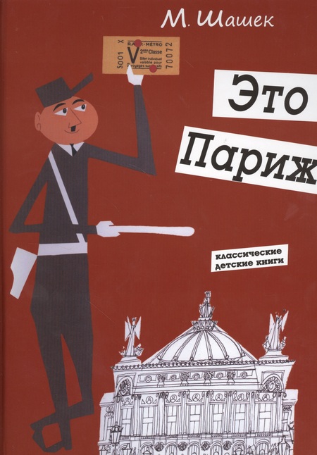
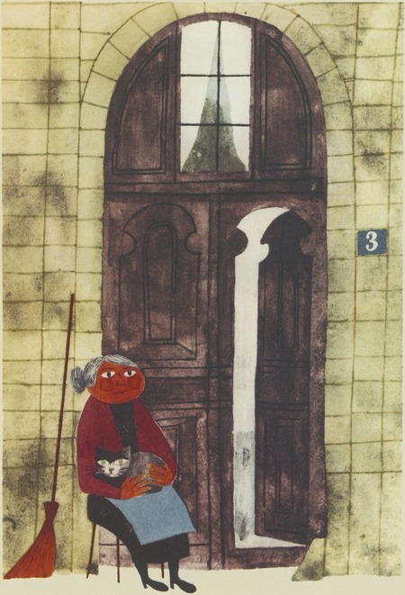
Miroslav Shashek. Illustrations for the book «This is Paris.» 1959.
Work: «Color as Character» (Mid-century, Miroslav Shashek).Commentary. Shashek constructs a city using 3–4 localized colors and free-form outlines: here, color is not ornamentation, but intonation—warm, light, hopeful.Soundtrack: early 1960s pop/beat.Exercise. Draw the same scene using three different palettes, each consisting of 3 colors: «hope, ” „anxiety, ” and „nostalgia.“ Compare how the reading of the work changes.
Example 9. Monthly Collection (text + images + playlist)
Selection: «Fairy Tales» (Month 2).
Composition: 6 works (Rakhhem, Dyulak, Bilibin, and others), each accompanied by a mood tag, a 2–3 sentence curator’s commentary, and a track.
Playlist: Debussy, Ravel, folk arrangements — 40 minutes.
10. Guide «Your Voice» (Text, Final Material for Month 6)
Title: «How to Stop Fearing Secondhand: 4 Steps»1. Gather 10 «tuning forks"—pieces that resonate with you (not the most popular ones, but your own).2. Analyze each one by technique—what specifically makes the work what it is: line, color, composition, rhythm.3. Consolidate these techniques into a personal set—3–5 techniques that you understand and can execute.4. Create a series of 5 works—using only your own techniques; references should only serve as a check, not as a source of form.Conclusion. «Secondhand stems from a lack of understanding. Understanding is your voice. The tuning fork rings.»