
ux-паттерны | медиа-стратегия
концепция, конкуренты, ца и утп
media about non-standard solutions in web interfaces that deconstructs real websites where authors intentionally deviated from conventional patterns
media objective
Each analysis addresses three parameters:→ Outcome
What common solution was moved away from and what that change achieved: memorability, brand character, or pleasure derived from exploring the site.→ Cost
— for the user (more difficult to find what is needed, longer to adapt)
— for the business (risk of lost conversion)
— for the team (deadlines, maintenance complexity, accessibility)
— for the studio (risk that the client will not accept the decision)→ Validity
Under what conditions the deviation works and under what conditions it breaks the scenario.
issues
Beginning designers see many impressive websites in collections (TGK, Awwwards, reference catalogs), but these collections only present a solution and judge it aesthetically. Rarely is it explained what the value is for unconventionality or when it is appropriate. As a result, the novice either transplants a technique into a context where it breaks the user flow, or they are too afraid to deviate from the template and cannot justify their decisions during a review or to a client.
author’s perspective
I consider myself not a «guru, ” but rather a researcher. Every conclusion I draw will be supported by a source (a study, an A/B test, or an interview with a practitioner) or will be explicitly marked as a hypothesis.
What the Reader Will Gain
After this analysis, the reader can assess any website’s unconventional solution using the «result → price → justification» checklist and apply it to their own project.
Themes
→ Segment
Students and emerging web designers (priority)→ Narrow Topic
Researching unconventional design solutions on websites→ Scope of Topic
— websites only, not mobile applications
— at the initial stage, three pattern groups: navigation, homepage structure, and conversion elements
— materials: design studio websites, promotional sites, niche e-commerce stores, and projects.
Topic research (and why it is truly narrow)
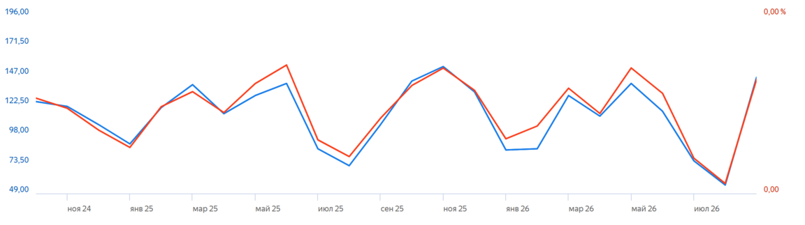
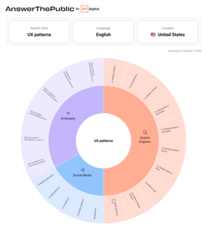
Wordstat, query «ux patterns» / AnswerThePublic, query «ux patterns»
→ Demand based on open data
— «ux patterns”—averages about 115 searches per month in Russia (range 56–154)
— „Jakob’s Law”—around 143 (range 23–308, peaking in the fall);
— „web brutalism”—around 56 (range 19–88)
— „site references”—around 2,600, which is more than 20 times higher
— In the USA (Google, KeywordTool): „ux patterns”—320, „ux design patterns”—210, „ux patterns library”—50, „ux navigation patterns”—40→ Conclusions
1. The topic is niche in both Russia and the US. This is a feature of the phrasing, not the Russian market.
2. The audience searches for „references, ” not „patterns.“ Therefore, it is better to use „references“ and „examples“ in titles and SEO, saving „pattern“ for describing the content’s scope.
3. Seasonality aligns with the academic year: peaks from September to December, dips from July to August and January to February. This is an indirect argument in favor of students and juniors as the priority segment.
4. Search will not be the main traffic source in the initial months. Accordingly, Telegram will be the primary distribution channel.
Competitive analysis
→ Competitor Selection Criteria
— Audience overlap (interface designers, primarily beginners)
— Content overlap (examples, breakdowns, web interface patterns)
— Activity in 2025–2026
Competition Criteria
1. Depth of Analysis Does the resource simply present a solution, or does it explain why it works and what value it commands? 2. Evidence Are the conclusions backed by data—research, A/B tests, interviews? 3. Interactivity Can the user try the mechanism, rather than just viewing a screenshot? 4. Beginner Accessibility Is the content understandable without relying on professional jargon? 5. Visual Presentation The quality of screenshots, video, animation, and the post’s overall structure. 6. Engagement Regularity, comments, polls, and user-submitted content.
direct competitors
1. «Visual Techniques» (@mozhno)
A channel by product designer Dasha Pochekueva (curated from the Unisender 2025 selection — Design Lead at Tinkoff Bank). No advertising.Scale (LiveDune): 17,092 subscribers; 5 posts per month; an average of 4,613 views per post (≈27% of subscribers) and 92 reactions.2. Now How Channel (@nowhow)
A curated collection of websites with excellent design from around the world, running since 2016. Contains sponsored content.
3. «Hellish UX» (@uxfromhell)
Examples of failed interfaces and the stories behind them. Monetized through advertising.Scale: Approximately 48–50K followers (across various aggregators); over 11.5K posts; typically 6–13K views per post (≈15–25% of followers), with some individual posts reaching up to 24K.
indirect competitors
Refero
An English-language library of real interfaces, featuring over 25,000 website pages and 24,000 iOS screens. You can search by page type or UI pattern. The presentation is neutral and catalog-like; the resource shows how others have done things without judging the design decisions or the effort behind them. For my audience, potential drawbacks include the English language and the lack of explanation regarding the «why.»UI Patterns
For each pattern, the underlying problem is formulated, its appropriate use cases are described, and examples are provided. The patterns themselves are grouped by user goals. This is closest to my concept of «when it’s justified,» but the resource analyzes standard solutions rather than deviations from them.GoodUI
This resource features data on 141 patterns derived from 644 A/B tests, publishing both winning and losing variations. The tone is evidence-based, focusing entirely on conversion, so it does not cover unconventional solutions from design studios. For me, it serves more as a source of cited evidence than a direct competitor.Potential Competitors
Design Schools and Studios with Their Own Media
For example, UPROCK: a studio, a school, a YouTube channel featuring error analysis and Behance projects, articles, and partnership announcements. They have an audience, a budget, and SEO.
AI Assistants
They explain any pattern upon request.
Review and Translation Channels
Figma, Webflow, and Creative Bloq write about «anti-design» and experimental navigation as a reaction to the homogeneity of AI-generated websites. Additionally, there are Telegram channels that translate foreign articles (such as UI/UX Designer). These channels can quickly address the topic of «originality versus usability.»