Visual Code:
The color palette signals authenticity. Soft hues of scalded milk, a sweet crust, and unroasted coffee evoke the feeling that the packaging just came out of the oven.
Typography:
By foregoing machine precision, a sense is created as if the baker quickly, yet soulfully, wrote the name with a pen dipped in strong tea.
Eco-Format:
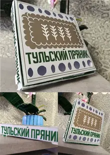
It is a clean sheet of paper, free from toxic plastic and PVC windows. The cardboard, imbued with a light texture, remains completely suitable for recycling. The twine breaks easily and does not harm the environment.
Impact on Audience:
The design operates at the intersection of generations. Young people will appreciate the «handmade» vibe. Middle-aged individuals will feel a sense of trust in a «homestyle» product. And older people will see that genuine warmth that has been lost in the world of sterile factories. This packaging does not shout about its premium price; it quietly stands on the shelf simply because it looks genuinely alive and warm.
Original size 2480x3508
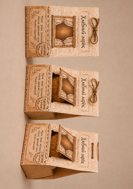
Packaging for fresh baked goods from «Bread Stand»
Longread translated automatically
More projects in packaging design