Impulse Trajectory
Citydrive Youth Program Identity
The city is constantly moving. And so are you.

01 / IDEA
Every movement leaves its own mark
CITYIC — an experimental visual direction from CityDrive aimed at audiences aged 18–30.
The concept is based on the city as a space of constant motion. Routes intersect, directions shift, and every journey becomes part of an individual rhythm.
This principle is reflected in the visual identity through two forms: the sharp flash of a Spark and the smooth trajectory of a tire tread.
One conveys the moment of impulse origin, the other—its continuation.
02 / CONCEPT
From Spark to Trajectory
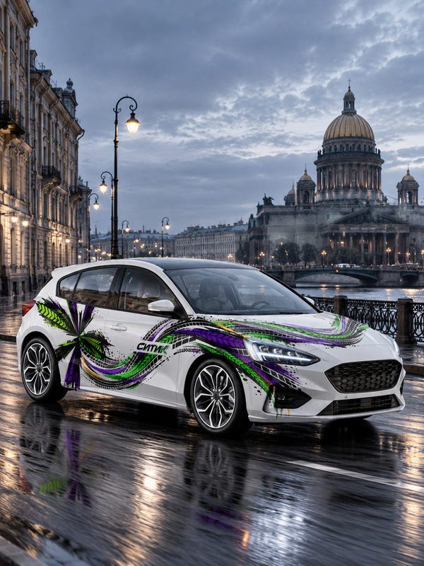
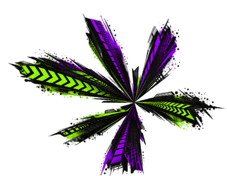
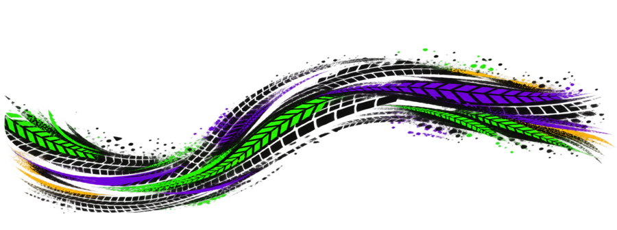
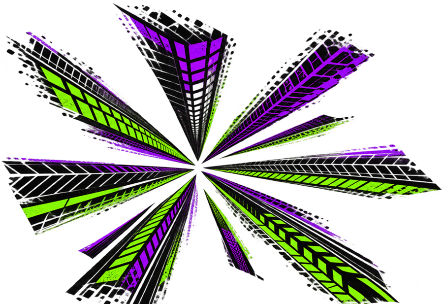
The starting point was the signature Spark Citydrive. In a new interpretation, it transforms into a multi-beam composition made of tire tread fragments.Sharp graphic elements radiate from its center, setting the direction of movement.One of these impulses continues beyond the Spark, evolving into a long, S-shaped trajectory. The lines interweave, change width, and form a continuous visual flow.The contrast between the sharp radial form and the smooth wave creates dynamism while maintaining a connection between the new direction and the original Citydrive identity.
03 / LOGOTYPE
Movement within letters
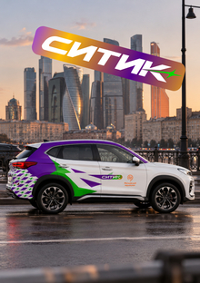
The CITIC logo is built upon a massive, slanted lettering style with a distinct horizontal dynamism. Sharp cuts, diagonal elements, and color shifts create a sense of acceleration. Individual fragments of the letters appear to extend beyond the main form, continuing the motion. Emphasis is placed on the letter «К»: its terminus breaks down into several directed strokes that resonate with the Spark graphics. Violet and green accents support the brand palette, integrating the logo into the overall visual system. Contrasting versions have been prepared for both light and dark surfaces.
04 / GRAPHIC SYSTEM
Two Sides of the Same Movement
The visual system is built upon a combination of two independent yet related elements.
Spark — Impulse.
A multi-lens composition featuring sharp edges and fragments of tire tread. Its asymmetry creates a sensation of a sharp burst of energy from a single point.
Trajectory — Movement.
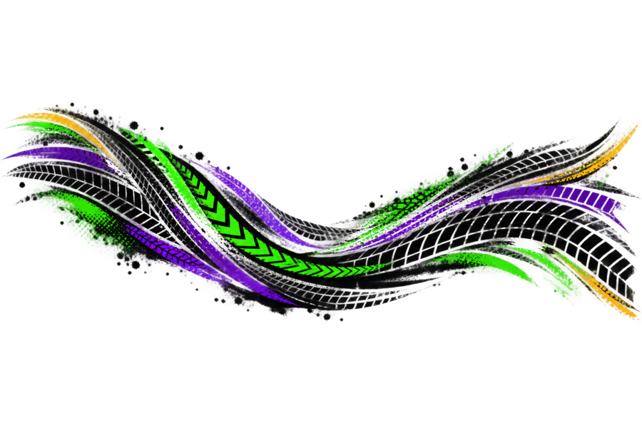
Several interwoven strips patterned with automotive tire designs. The wave-like form changes direction, compressing and expanding to fit the proportions of the medium.
The texture of scuffs, splashes, and intermittent tracks lends character to the graphics without undermining its underlying geometry.
Both elements can function independently or be combined into a cohesive composition.
The dynamic slant of the lettering and sharp graphic accents convey the logo’s sense of speed. The supporting typography remains neutral, maintaining the focus on the signature graphics.
05 / COLOR
Contrast in Motion
The color system is built upon the contrast between a neutral foundation and saturated, dynamic accents.
Black — #171717
The main structural color. It forms the protector’s design, unifies graphic elements, and creates contrast on the light bodywork.
Purple — #5F00A5
Conveys the experimental nature of the new direction. Used in the logo, Spark, and movement lines.
Green — #00D900
A vibrant, energetic accent. It highlights the direction, isolates specific fragments, and amplifies dynamism.
Yellow — #FFBE00
An auxiliary color used sparingly. It appears in small sections of trajectories, adding contrast without competing with the main palette.
White remains as the composition’s foundation, ensuring visual space between the saturated graphic elements.
06 / AUTOMOBILE
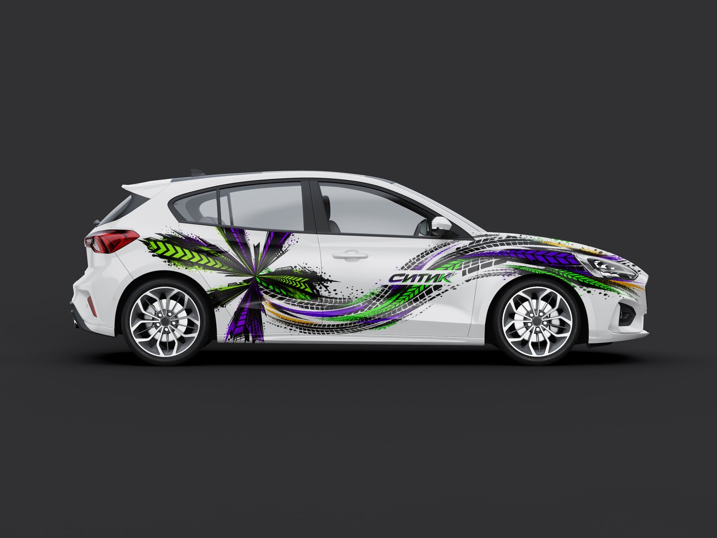
Graphic that follows form
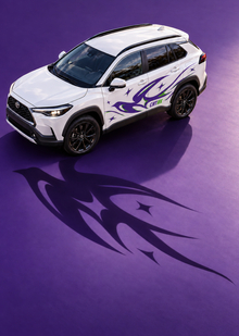
The primary carrier of the identity is a city car-sharing vehicle.The composition was developed taking into account the body’s proportions and its structural elements.The spark is placed on the rear portion of the side profile, becoming the main visual focal point. From it, a wave-like trajectory develops along the body, unifying the side panels with the front fender.In the front section, the lines interact with the geometry of the wheel arch, headlight, and hood. Thanks to the curves, the design is perceived as an extension of the car’s form rather than a flat decorative layer.The white body surface maintains an important role: it forms pauses between the graphic elements, allowing the composition to remain expressive and legible.The logo is integrated into the graphic system and highlighted by negative space for better recognition.