The Table — a platform for shared dinners with strangers
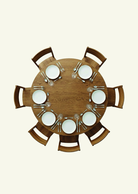
Common Table — a service for thematic dinners connecting strangers united by a shared interest in meaningful conversation. The project addresses the issues of social isolation and superficial communication by creating a space for thoughtful dialogue. Through metaphors of navigation, constellations, and time, the brand explores how chance encounters evolve into significant human experiences.
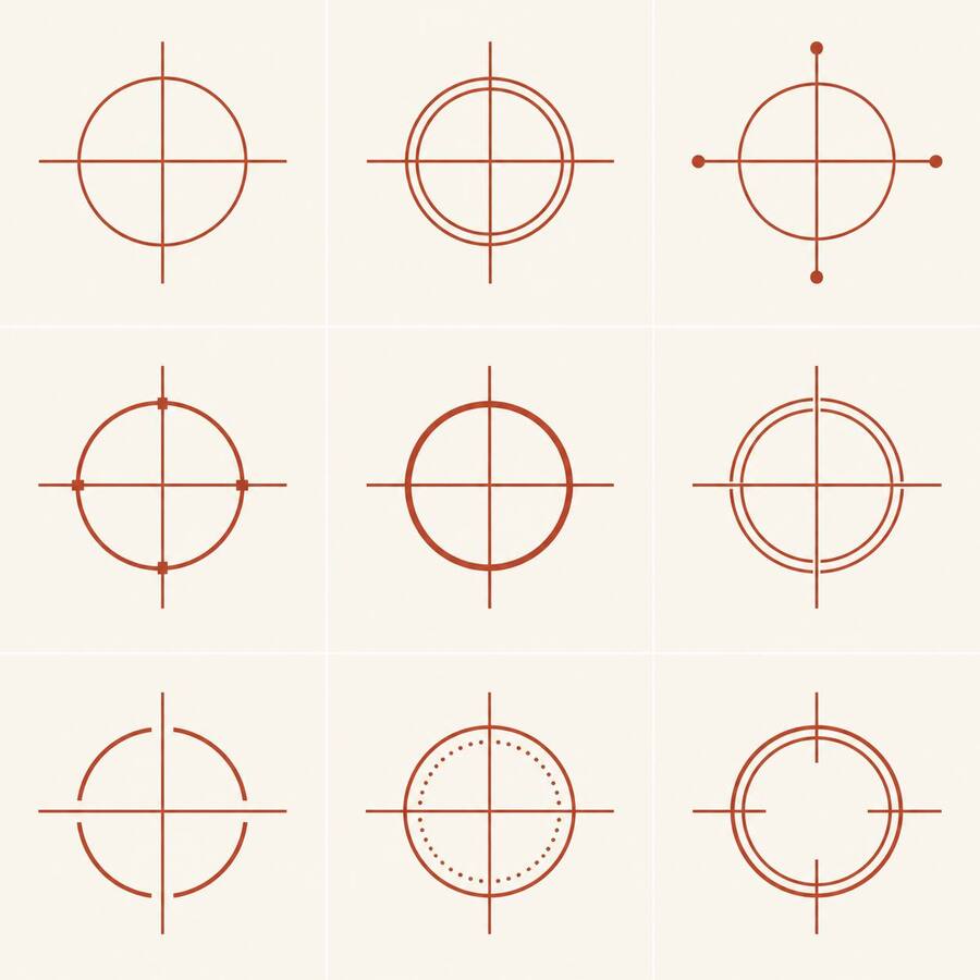
Logo

posters
space
carriers
The model GPT and Nano Banana was used for generation.
Prompts for Generations:Create a refined minimalist identity mark for an independent urban dining and conversation brand called THE TABLE.CORE CONCEPT:
A geometric circle representing a shared table, intersected by a precise crosshair that extends beyond the circle’s outer boundary. The crosshair signifies a meeting coordinate and a point of orientation. The circle must remain the dominant form.DESIGN DIRECTION:
Swiss graphic design, modernist editorial identity, precise geometric construction, restrained intellectual character, archival cartographic notation, institutional clarity.GEOMETRY:
A perfect circular outline. A thin, consistent stroke. One horizontal and one vertical axis intersecting at the exact center of the circle. Both axes must visibly extend beyond the circular boundary. The extensions must be deliberate and balanced. No perspective, no three-dimensional effects, no shadows.COLOR:
Terracotta symbol on a warm off-white background. Use a restrained palette based on terracotta, warm white, deep navy, and charcoal. Do not introduce additional colors.COMPOSITION:
One symbol centered on a blank square artboard. Large negative space. No decorative objects. No mockups. No paper texture. No gradients.The symbol should evoke a coordinate marker from an architectural drawing or an astronomical atlas, while still remaining recognizable as a table-related sign.Generate several subtly different geometric refinements of the same concept. Do not invent unrelated logo concepts.