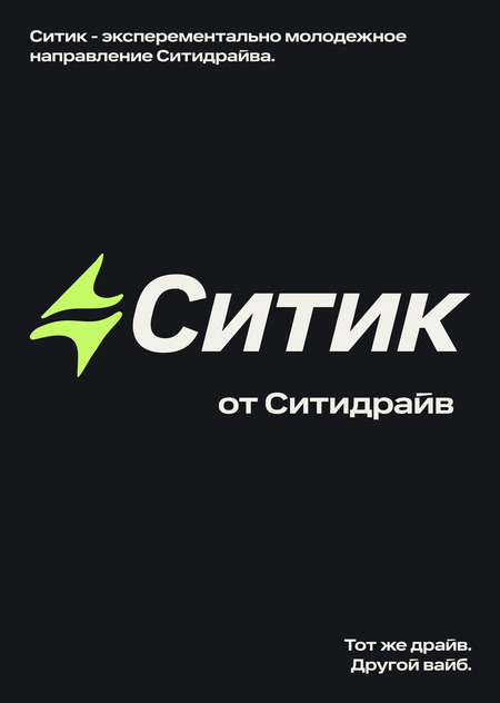
THE SAME DRIVE. A DIFFERENT VIBE.
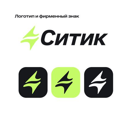
CITIC — THE SAME DRIVE. A DIFFERENT VIBE.
The concept is built on the idea of continuing the visual DNA of CityDrive, but giving it a freer, more experimental resonance for an audience aged 18–30.
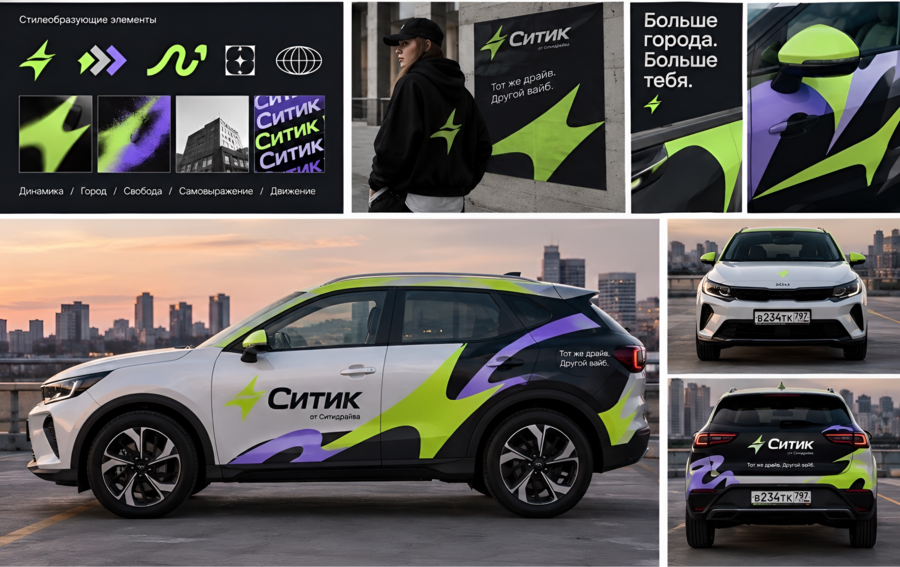
I preserved the key elements of CityDrive—the signature «Spark, ” the existing color palette, and the typographic foundation. However, I changed the principle of their use: the „Spark“ is no longer solely a symbol but becomes an independent graphic element that can stretch, change scale, transform into a trajectory, and create a sense of movement.
Based on this, the new graphic language of Citic emerged—dynamic forms, high-contrast combinations, and large, asymmetrical elements that convey speed, freedom, and individuality. Green and purple are not new brand colors here—they are colors already familiar from CityDrive, but in Citic, they are used more boldly and actively.
The nature of the logo itself has also changed: it maintains a recognizable connection to CityDrive but gains a more independent visual expression. The tagline „from CityDrive“ further emphasizes that Citic is not a separate brand, but a new direction within the existing system.
The car wrapping is an extension of this idea: the graphic elements are not just placed on the body, but create a sense of motion, as if the „Spark“ is leaving a visual trail behind the vehicle.
Thus, Citic is not an attempt to make CityDrive simply „younger.“ It is an experiment with an already existing identity: the same recognizable elements, but with more freedom, motion, and self-expression.