Citic is an experimental car-sharing venture tailored for a younger demographic that perceives the city not merely as a space for transit, but as an environment for self-expression, discovery, and new experiences.

The core of the visual identity is based on the metaphor of dynamic motion: the city is in constant flux, and the individual chooses their own route, tempo, and direction.
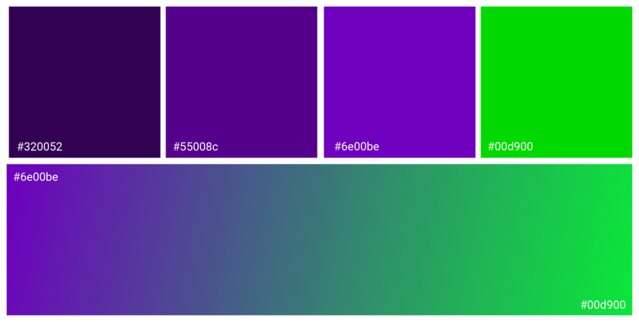
The visual system is built on the contrast between a saturated violet and neon green. The violet establishes brand identity and conveys the brand’s character, while the green serves as a visual impulse—a symbol of acceleration, energy, and forward momentum.

The primary graphic element is a reimagined CityDrive «Spark, ” elongated into a dynamic sweep. It cuts across the space, sets the direction, and creates a sense of continuous motion.
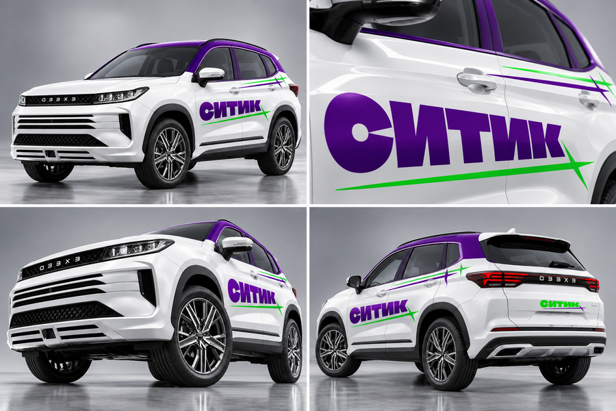
The «Citytic» logo retains a connection to the main brand through the plastic signature «Spark, ” but takes on a bolder, more massive, and autonomous character. On a car, the graphic doesn’t simply decorate the body; it visually accentuates its form, creates a sense of speed, and transforms the vehicle into a noticeable element of the urban environment.
The identity adapts to different vehicle types while maintaining visual language consistency. In this version, green becomes the dominant color, and the purple line serves as a contrasting accent. Diagonal stripes on the hood and roof emphasize the direction of movement, and the logo placement ensures brand recognition from various angles.
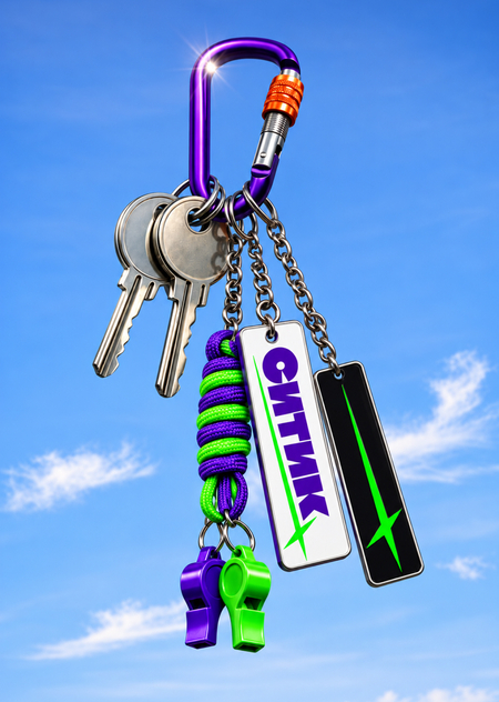
Identity extends beyond automobiles and digital interfaces, becoming part of the audience’s everyday style. Merch supports the brand’s more informal character and forges an emotional connection with the young audience.
Citytics—each trip sets its own rhythm and reveals the city in a new light.