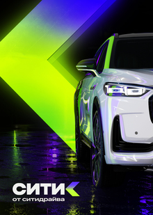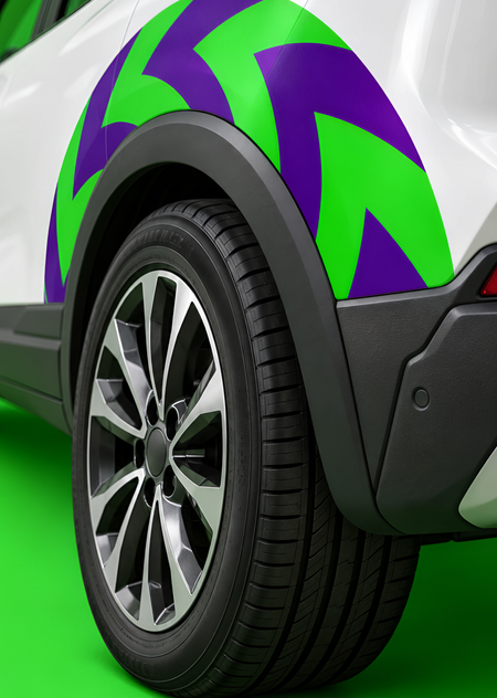
CityDrive—a urban mobility platform integrating car-sharing, vehicle subscription services, and sales of certified used cars. In collaboration with HSE Art and Design School, the company launched the «Spark the Metropol» contest, inviting participants to develop the visual identity for «Citica"—an experimental program designed for a young audience. This new system needed to retain a recognizable link to CityDrive while becoming bolder, more visible, and more liberated—covering everything from the logo and graphic language to potential vehicle wraps and communication collateral.
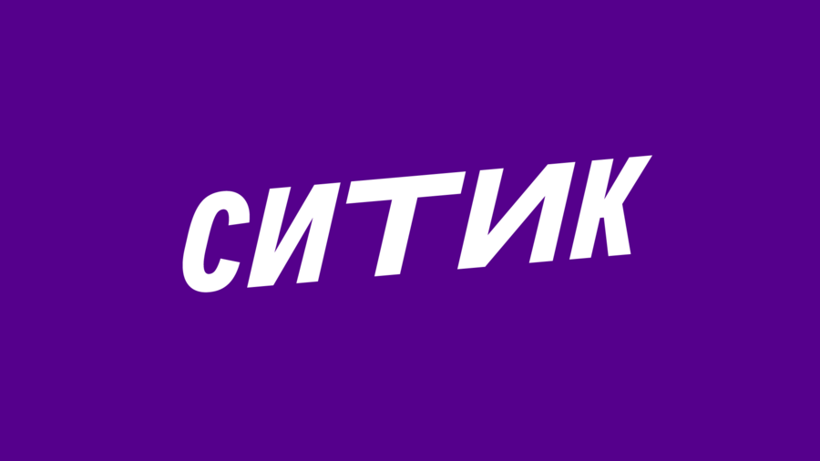
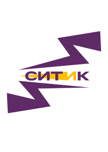
In the logo, the letterforms vary in width, mirroring the pace of the journey itself: some sections pass quickly, while others unfold more slowly. The alternation between compressed and elongated forms creates an internal movement, assembling the word into a vibrant rhythm.
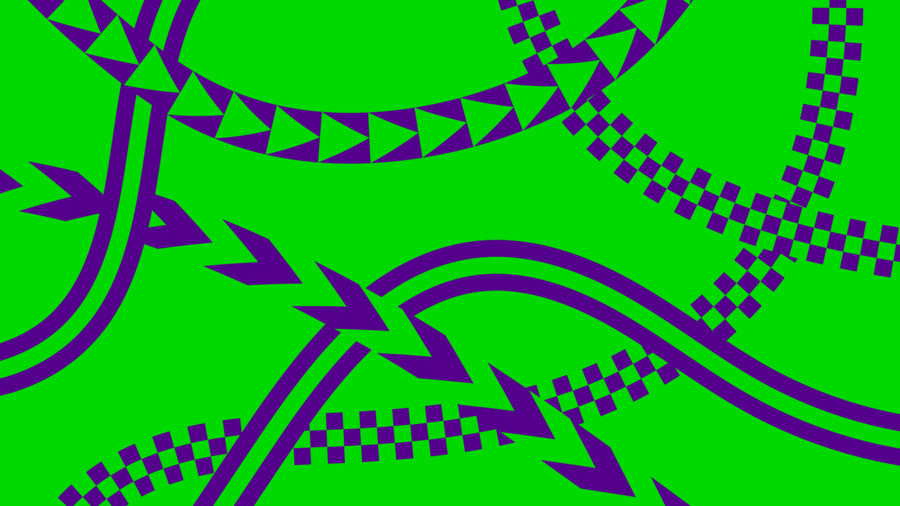
The starting point was the signature spark of Citydrive. In the new system, its rays transform into trajectories resembling highways and road interchanges: they intersect, change direction, and form the rhythm of urban movement. Each line has its own plasticity and structure, just as every driver has their own pace and driving style. Together, these various routes form a singular visual language for the City.
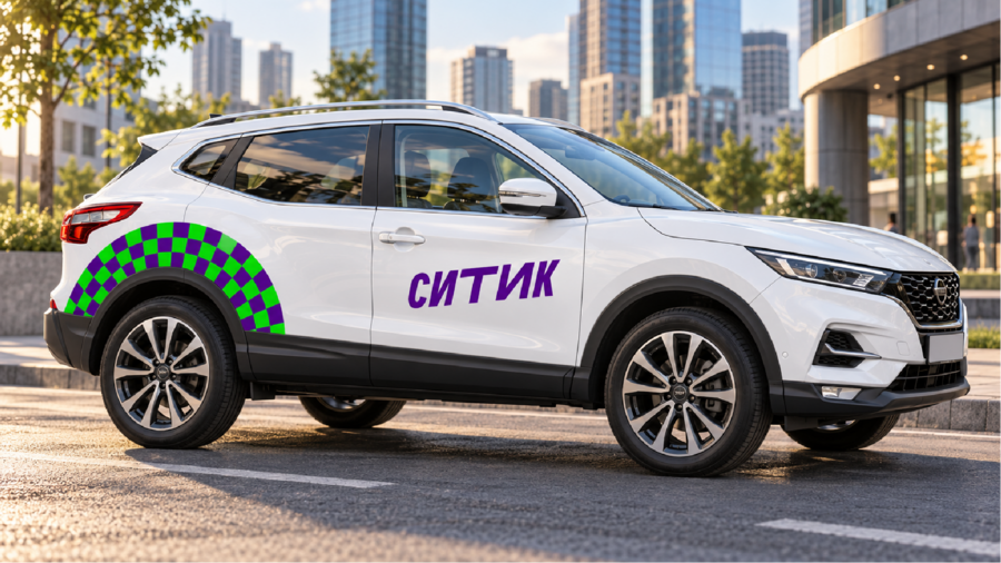
The typography is based on the signature Citymobil Sans VF typeface, which maintains a connection to the CityDrive visual system. In the headings, the width of individual characters varies to control reading pace, transforming text into an extension of the graphics. The readable Extended Italic 18 is used for text blocks.