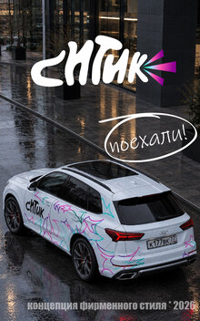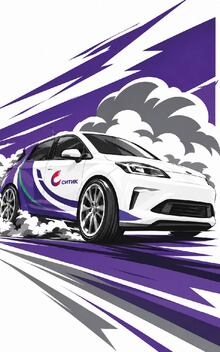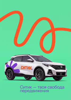
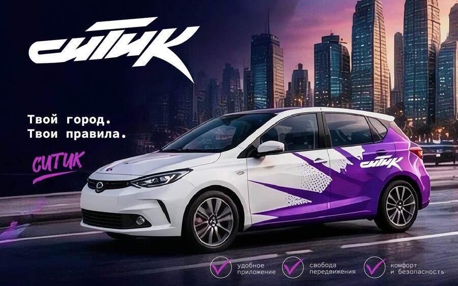
Logo Concept — To reflect the rhythm of the city and the energy of movement: the aggressive geometry of the letters mimics the vector of speed, the hand-drawn rendering adds individuality, and the gradient background intensifies the sense of modernity.
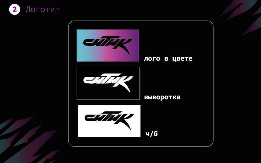
Geometry symbolizes motion and precision, while contrasting colors make the brand noticeable even within the chaotic urban flow. This is a visual code for speed, efficiency, and confidence.
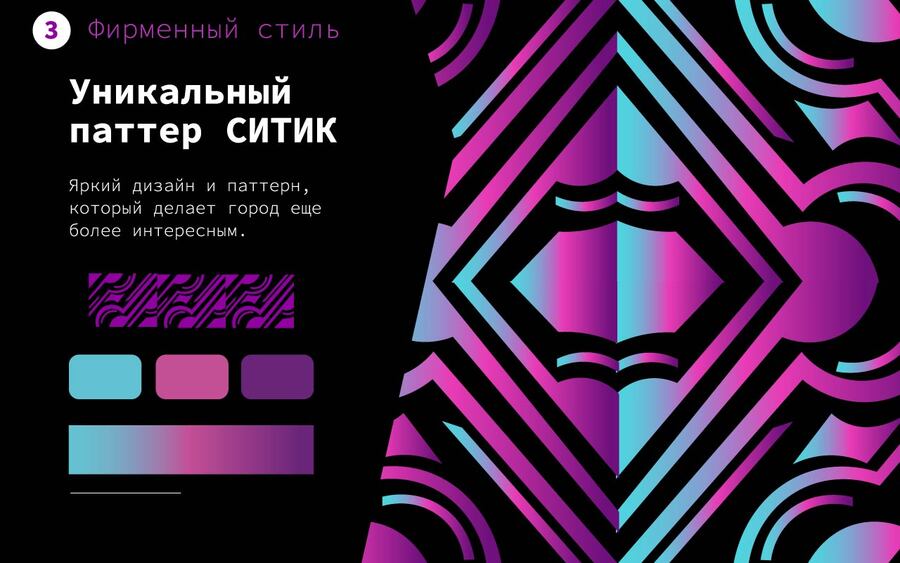
Form Dynamics: Sharp angles and the inclination of a graphic element are subconsciously associated with speed and forward motion. For carsharing, whose primary value is rapid transit, this visual message is highly effective. Memorability: Despite its simplicity, the symbol possesses a unique silhouette. It is not overloaded with elements, which facilitates brand recall.