EDGE OF THE WORLD
A mystical game observing celestial anomalies
Indie release and collector’s edition concept based on an academic project.
SOURCE PROJECT
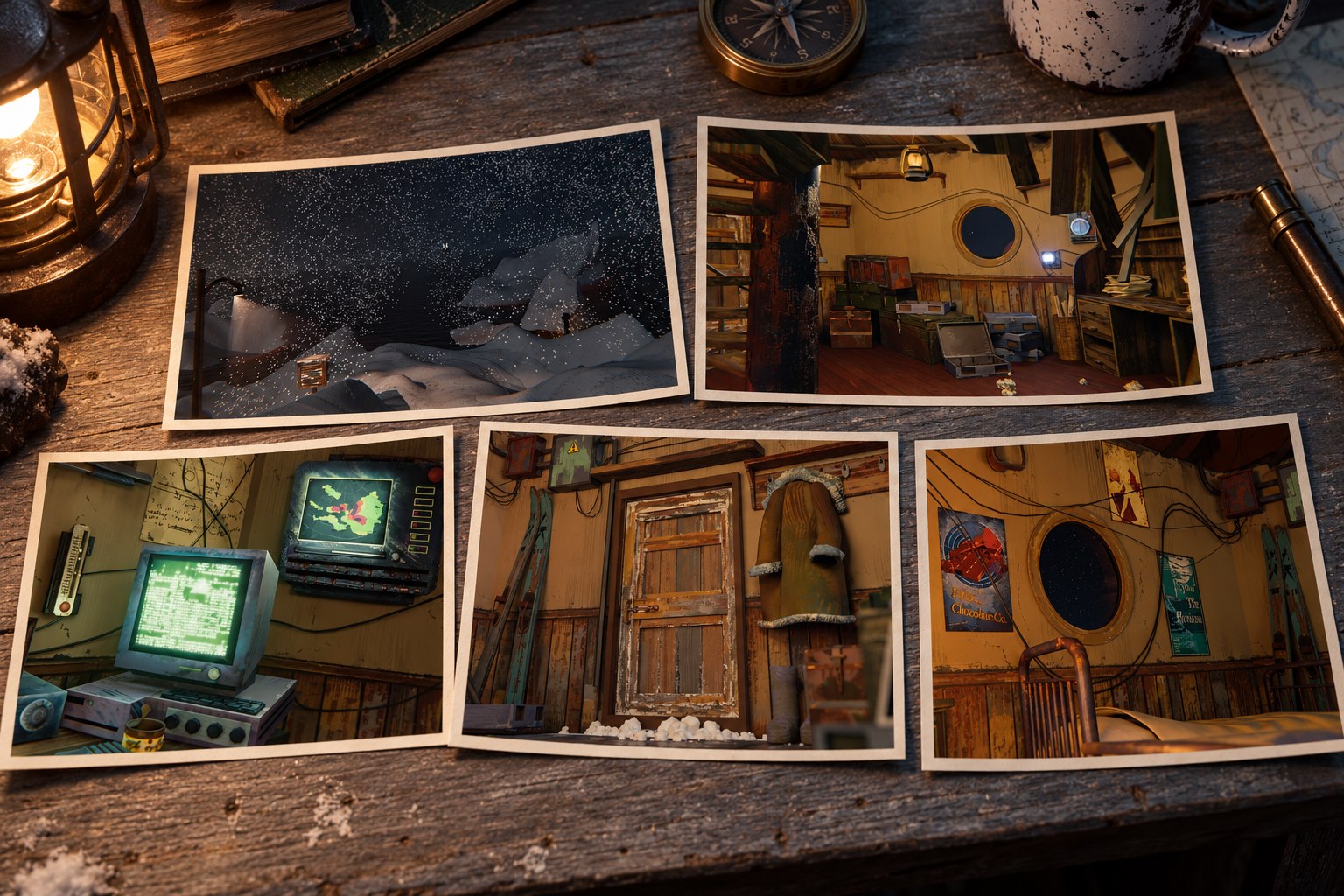
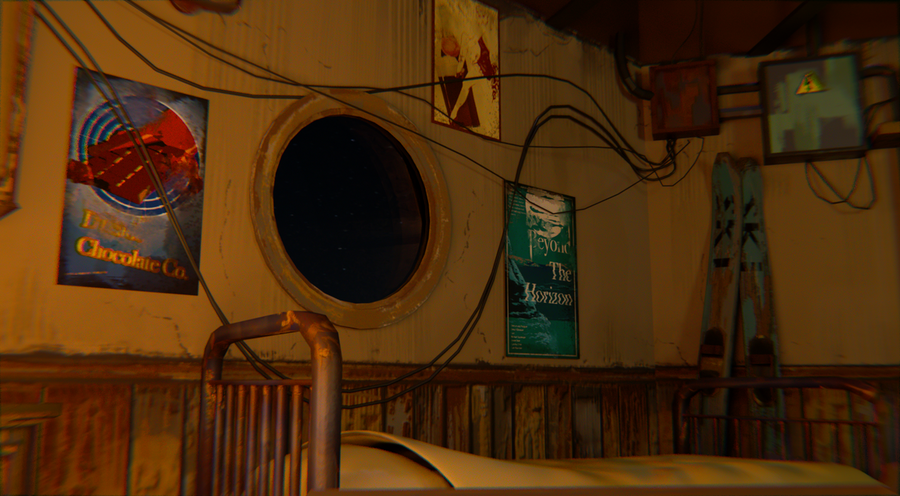
In EDGE OF THE WORLD, the protagonist arrives at the edge of the world to find proof of celestial anomalies. A semi-ruined lighthouse becomes his home, repurposed as a meteorological station. Elements from the original project have been preserved—the round porthole, vintage analog gauges, the green glow of the screens, wiring, paper logs, and the red anomaly visible outside the window. The cold island contrasts with the warm, confined interior, establishing the foundation of the new visual system.
FROM GAME WORLD TO PUBLICATION
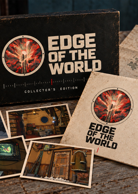
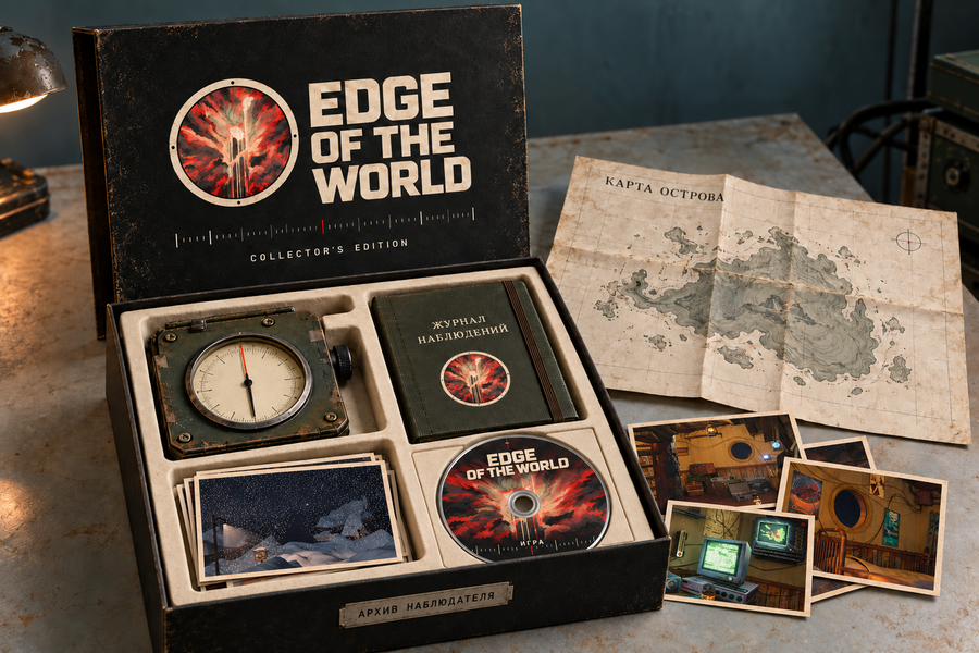
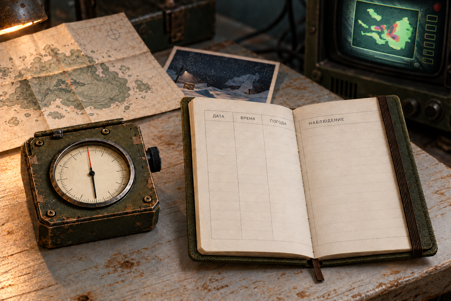
The project is developing into the concept for an independent game release accompanied by a physical collector’s edition. The main product is the video game itself, while the supplementary kit translates its narrative beyond the screen. The contents of the edition correspond to the hero’s actions: observing the sky, checking instruments, making entries, and publishing discovered data. The edition includes the game disc, an observation journal, an island map, art cards featuring in-game graphics, a station patch, and a decorative replica of a gauge. The redesign objective is to unify these items with a consistent visual language and demonstrate how they appear in tangible materials.
IDENTITY | COLOR | TYPOGRAPHY | LOGO |
The title EDGE OF THE WORLD remains unchanged. The new logo connects the circle of the porthole with the recognizable red-and-white pattern of the celestial anomaly from the original design. Its graphic version retains the central rupture, the branching light lines, and the uneven red masses. The original pattern itself is used on the portholes.
The color palette is built around charcoal, paper white, cool turquoise, grayish-olive, and red. Red is used as an anomaly signal; cream paper and dark device casings maintain a connection to the source’s interior aesthetic.
For the typographic system, Space Grotesk and IBM Plex Mono were chosen: the first typeface is used in headings, while the second resembles entries in a field journal. Their character has been established in the generations; exact typeface files embedded within the raster images have not been included.
KEYVIS I: STATION AT THE EDGE OF LIGHT
The first concept centers on the image of a solitary lighthouse in the snow. A warm window suggests human presence, while the vast expanse of dark sky establishes the scale of the unknown.
The message «Station on the Edge of the World» establishes the setting. The packaging design and the game title link the atmospheric image to the product.
KEYWISE II: FIX THE ANOMALY
In the second scenario, the instrument becomes the central focus: the needle, the dial, the wires, and the red indicator light. It references the hero’s work, who monitors the equipment while anticipating a celestial event. The prompt, «Record the anomaly,» reveals the game’s action. The large object and short phrase have been adapted for a vertical advertising medium.
KEYVIS III: OBSERVATION JOURNAL
The third key-viz displays the journal, map, and cards as evidence from a single expedition. The printed borders, anomaly symbol, and signal mark maintain the overall publication system.The prompt, «Record what you see, ” translates the theme of observation into an actionable directive. The narrative is suitable for a printed poster or a collectible edition banner.
KEYVIS IV: THE BEACON BECOMES A HOME
The fourth scene unveils the domestic aspect of the game. Instruments and an old screen are visible through the porthole, with a magazine and a lamp nearby. The warm interior light is contrasted with the cold night outside.The phrase, «Your home is a polar station, ” links the exploration to habitation. In the original game, logging observations provides resources for food, fuel, and clothing—this link between daily life and survival has been maintained in the product description.