Previously
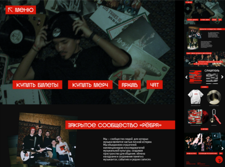
The «REBER» identity was built on the aesthetics of the underground: dark photography, red overlays, archival cards, and experimental typography. It conveyed the atmosphere of an independent scene, but the primary visual message remained the theme of censorship. Mashups and collecting were less prominent.
Now
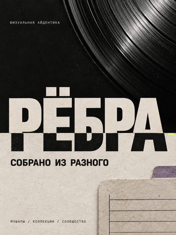
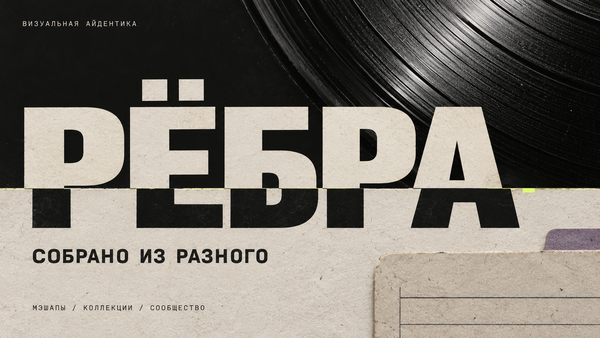
The foundation of the new visual identity is the idea of «Assembled from diverse sources.» The montage seam connects images, letters, and materials just as a mashup connects musical sources. An archival palette with a lime accent, legible typography, and catalog numbering unify releases, merchandise, the website, and the community space.
was/became
Keyvis
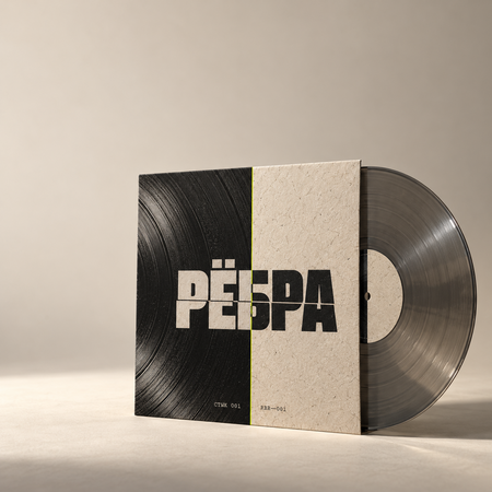
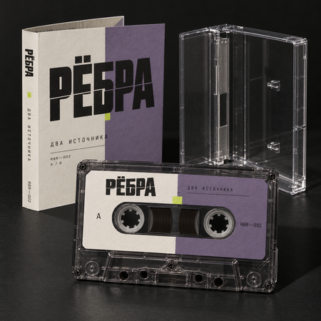
musical media
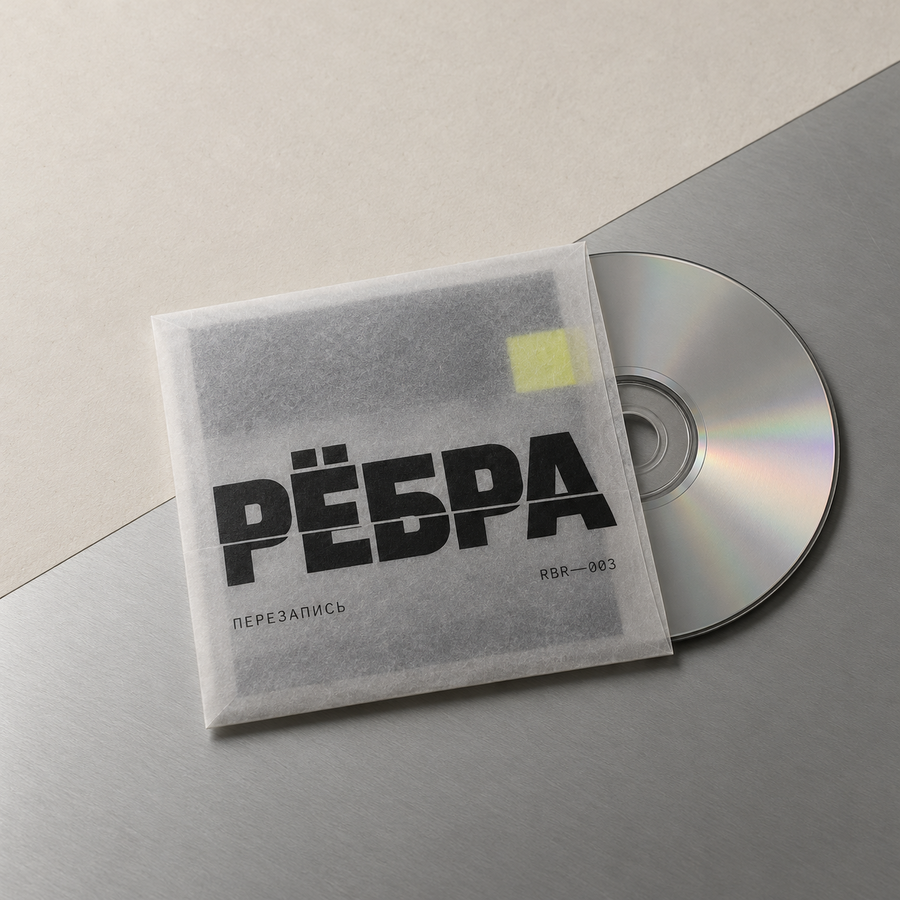
musical media
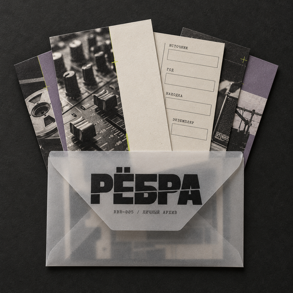
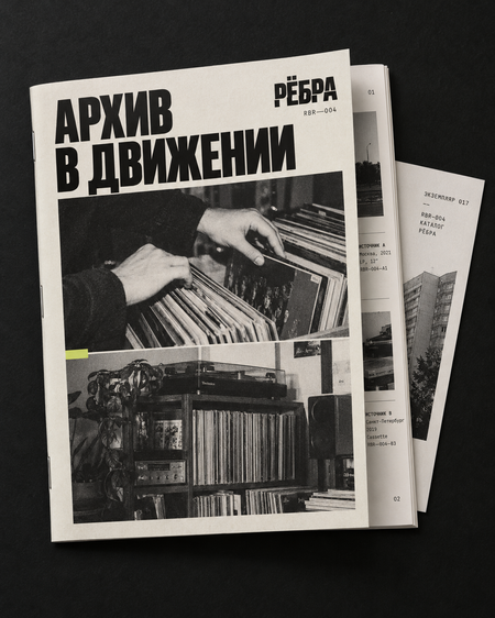
paper products
Merchandise
keychain
bag
T-shirt
space
exterior of the space
the interior of the space
Promotional materials
posters
posters
Identity
website
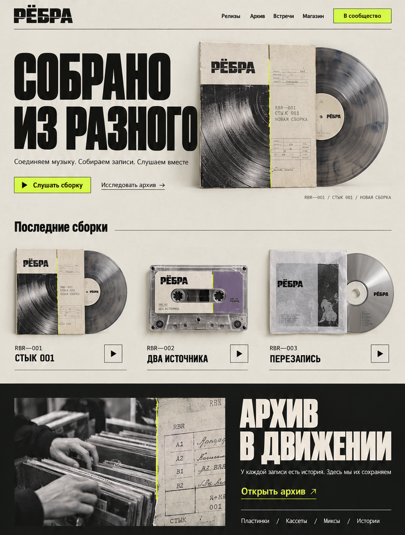
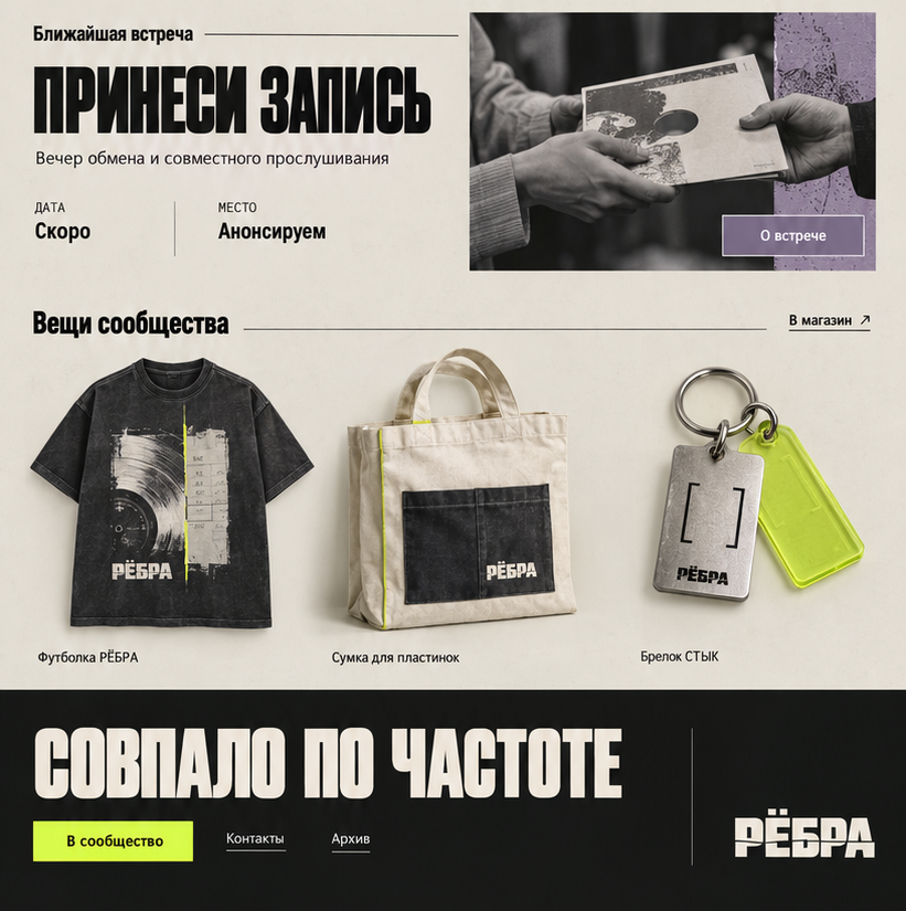
website
GPT was used for all generations.
Prompts: I propose redesigning «REBRA» around the concept of «ASSEMBLED FROM DIVERSE ELEMENTS.» Mashup connects recordings, the collector compiles musical history, and the community unites people. This single principle will form the foundation for both the positioning and the visual identity.
The current aesthetic most effectively conveys archival quality, physical media, collectible cards, and the feeling of an independent scene. The red overlays on the photographs are primarily perceived as censorship. In the new system, the core action will be splicing: two different sources connect to create a third.
Below is the brand concept, followed by a separate, standalone prompt for each element. Repeating descriptions within the prompts are necessary so that they can be used individually.
Brand Concept
Name: REBRA Latin Version for catalog codes and addresses: REBRA Descriptor: A community of mashups and musical collections. Tagline: «Assembled from diverse elements.» Secondary Phrases: «Frequency Match, ” „Archive in Motion, ” „Listen Between.“
We are retaining the name; it already connects music, the physical sensation of bass, and the history of recordings „on the ribs.“ The last association can remain a cultural layer of the brand, without literal skeletons on every medium.
Character: Enthusiastic, independent, tactile, slightly eccentric. The community member is someone who has found a recording and wants to share it.
Communication Tone: Short, lively phrases detailing the findings:
„Two sources. One new track.“ „Found. Digitized. Reassembled.“ „Bring a recording. Tell us where it’s from.“ „Specimen 017. Yours next.“
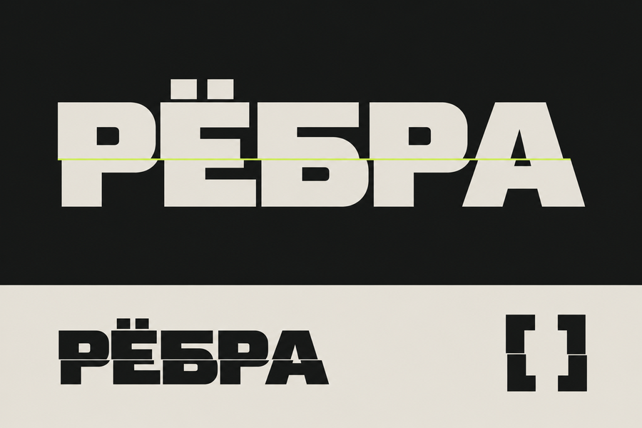
Logo: A dense, Cyrillic rendering of „REBRA.“ A thin splicing seam runs horizontally across all letters, and the bottom portion is slightly offset. The word must remain legible. Two square dots above the „Ё“ denote the two original sources.
Symbol: Two brackets facing each other, slightly offset vertically. A space remains between them—the point of connection. A simplified version of the symbol, without fine detail, is used for smaller sizes.
Graphic Technique—The Splice: Two images or materials join along a single line. For example, a vinyl groove transitioning into fabric, a paper label transitioning into aluminum, or a dance floor photo transitioning into a catalog card. One expressive connection is sufficient per mockup.
Palette:Color HEX Role
Charcoal #171817 Primary dark background, text
Archival Paper #E7E2D8 Primary light background
Acid Lime #D6F34A Editing seam, markers, accents
Dusty Violet #81748F Secondary series color
Aluminum #A9ADAA Neutral gray; metal or silver paint in production
Proportion guide: 80% neutral surfaces, 15% imagery and secondary color, 5% lime. Lime predominantly works against the charcoal background; small text on light backgrounds is charcoal.Typography: custom dense grotesque for the logo and short headlines; calm grotesque with Cyrillic for informational text; monospace font for numbers, durations, A/B sides, and sources. Narrow experimental letters are not used in long texts.Release System: RBR—001, RBR—002, and so on. Additional fields: SOURCE A, SOURCE B, ASSEMBLY, COPY. Numbering helps connect releases, tickets, merchandise, and community archives.Photography: hands, home collections, players, shelves, participants' faces, interior details. Direct flash, natural grain, close distance. Texture emerges from real materials—paper, fabric, plastic, print.Motion: two fragments converge, briefly shift, and lock together at the editing seam. This gesture can be used in release intros, announcements, and website transitions.Digital Environment: The first screen features the current build and a playback button. Following that: releases, archive, events, exchange, shop. Cards resemble a catalog; each entry has a number, author, sources, and discovery story.
Develop a logo concept for the independent music collective «RYOBRA». Present one cohesive version on a clean white background: a large primary logo, a separate compact mark, and a reduced application. The primary logo is the authorial, dense Cyrillic word «РЁБРА, ” a geometric grotesque with slightly narrow proportions. A single thin horizontal seam intersects all letters; the lower section is shifted slightly to the right by approximately one stroke width, making the word easily readable. Two distinct square dots are placed above the letter Yo. The separate mark consists of two inward-facing corner brackets, slightly offset vertically, with an open space between them. The mark expresses the connection between two sources. Use only charcoal #171817 and archival paper background #E7E2D8. The aesthetic should be flat vector, with clean contours, suitable for single-color printing and embroidery. No gradients, shadows, mockups, skulls, bones, headphones, or equalizer imagery.
Create an advertising keyvisual for the «STYK 001» vinyl pressing from the independent music collective «REBRA.» A square 1:1 format, photorealistic product photography with a strong graphic composition. A single paper record sleeve is placed at a slight angle, with the vinyl record partially emerging from it. The sleeve design merges two macro shots: concentric grooves of the record and the fibers of rough paper, joined along a single vertical line. At the junction point, there is a thin, acid-lime stripe (D6F34A). The name «REBRA» is set in a bold Cyrillic grotesque typeface, while the inscriptions «STYK 001» and «RBR—001» are in a monospaced font. Color palette: charcoal (#171817), archival paper (#E7E2D8), lime accent. The background should be paper, with directional side lighting, a crisp natural shadow, visible paper fibers, and vinyl grooves. Leave empty space in the upper left corner for a promotional headline. No red stripes, no celebrities, no extraneous objects, and no decorative neon.
Create a separate promotional keyvisual for the cassette release «TWO SOURCES» by the «RIBS» community, dedicated to music mashups and collecting. Square 1:1 format. One audio cassette, made of translucent smoky plastic, should be placed next to an open transparent case and a folded paper insert. The cassette label is divided by a single seam: the left half is the color of archival paper E7E2D8, and the right half is dusty violet 81748F; a small lime marker D6F34A crosses the seam. The insert features the large Cyrillic word «RIBS, ” along with smaller inscriptions „TWO SOURCES, ” „RBR—002, ” and „A / B.“ The background is charcoal 171817, illuminated by direct, hard light, with expressive highlights on the transparent plastic, ensuring the cassette construction is physically plausible. The composition should evoke a modern collectible music release. Avoid retrowave grids, palms, pink-blue neon, or random props.
Create a promotional keyvisual for the limited edition CD release «PEREZAPIS» by the music collective «RYOBRA.» Square 1:1, still-life studio photography. One compact disc is partially protruding from a square envelope made of translucent vellum. Through the vellum, a charcoal inner card and a small lime green rectangle are visible. The front of the envelope features a large charcoal «RYOBRA» logo with a single thin seam, small catalog notations «PEREZAPIS» and «RBR—003.» The envelope rests on a matte aluminum sheet, which meets the archival paper surface along a single straight line. The color palette is #171817, #A9ADAA, and a small accent of #D6F34A. Soft reflections on the disc, realistic translucency of the vellum, precise paper edges, and expressive negative space. No excessive holography, mirrored chrome surroundings, or futuristic interfaces.
Create a promotional key visual for the collectible set «PERSONAL ARCHIVE» for the independent music community «REBRA.» Square format, 1:1, overhead shot. The main object is a neat, semi-transparent archival envelope with a flap; five rectangular cards with sharp corners are partially pulled out of it. One card is shown face-up: a black-and-white fragment of musical equipment juxtaposed against a large area of archival paper. The second card is shown from the reverse side, featuring the structured fields: «SOURCE,» «YEAR,» «FINDING,» «ITEM.» The remaining cards are partially visible. Overall color palette: 171817, 81748F, with small accents of D6F34A. The «REBRA» logo and the marking «RBR—005 / PERSONAL ARCHIVE» are on the flap. Thin mounting seams unify the design. Realistic paper texture, matte transparent material, natural shadows—the feeling of an object one wants to collect and trade. No fake QR codes, game characters, or distracting red overlay bars.
Create a realistic product mockup of one t-shirt from the «RERBRA» music community. Display the front and back views side-by-side. Horizontal format 3:2. Heavy cotton in faded charcoal color 171817, loose straight fit, thick neckline. On the chest, a small monochrome mark consisting of two inverted, staggered brackets, in archival paper color E7E2D8. On the back, a large rectangular print: a macro photograph of vinyl grooves transitions into a scan of a paper catalog card via a single horizontal seam. At the junction, there is a thin lime-green line #D6F34A. Below the print, the text «RERBRA» and «ASSEMBLED FROM VARIOUS SOURCES,» with a small tag «RBR / WEAR—001.» The print should look like genuine two-color screen printing, with moderate detail and a noticeable fabric texture. Neutral, bright background, studio lighting. No models, no extra props, no anatomical ribs, and no imitation of another music group.