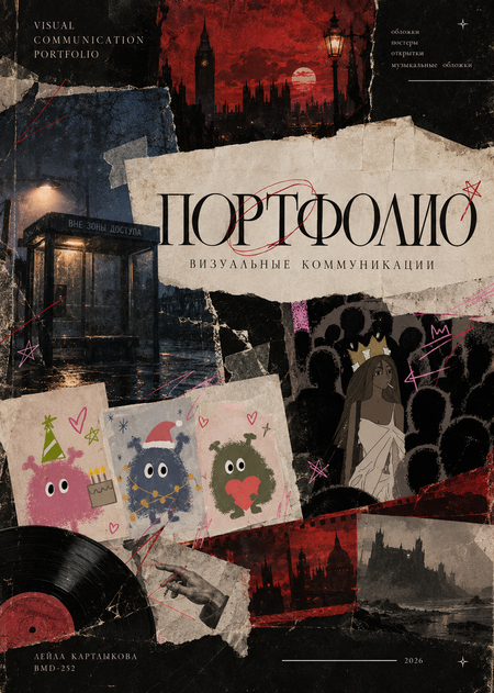
The postcard series is built around an original character—a small, fluffy creature with expressive eyes and a simple, easily recognizable silhouette. This character serves as the visual protagonist throughout the entire series: it maintains its distinctiveness while changing color, mood, pose, and attributes depending on the holiday. Pastel color palettes, imitation fluffy textures, naive graphics, and small decorative elements—such as stars, hearts, snowflakes, and flowers—are used in the design. Irregular contours and a hand-drawn effect evoke a sense of immediacy, making the postcards feel like a personal message rather than standard printed material.


The second block showcases works inspired by musical pieces and artists. Here, the visual image functions as an extension of the music—it conveys the mood, genre associations, and emotional content without literally retellling the song’s lyrics.
«Man–Hour» in this work transforms photography of the everyday urban environment into a surface for original graphic design. The image of a metro carriage and moving people creates a sense of anonymity, bustle, and impersonality in a big city. Pink lines, arrows, annotations, and symbols are overlaid onto the photograph. These resemble personal marginalia, diagrams, or an emotional mapping of reality. This intervention renders the photograph subjective—we see not just the surrounding world, but how the author perceives it. Visual technique: a combination of photography and drawn graphics, the annotation effect, and the contrast between a neutral urban frame and bright lines.
«Out of Range» poster features the group against the backdrop of a bus stop in a cold, foggy urban environment. The twilight glow of the lamppost, the wet street surface, and the muted tones create an atmosphere of isolation and distance. The bus stop itself becomes a symbol of waiting and lack of connection. A red inscription, «CITY 312, ” at the bottom of the composition sharply contrasts with the cold background. This contrast ensures the band name is easily readable and serves as the main graphic focal point. This visual approach echoes the themes of inaccessibility and disconnection inherent in the name, „Out of Range.“ Visual techniques include: atmospheric photography, a cool color palette, high-contrast typography, and the symbolic use of the urban environment.
The work is built around a deliberately raw, almost comic-book depiction of a queen in a crown. The central character is highlighted against a backdrop of dark silhouettes, while the pink inscriptions, stars, and arrows appear like spontaneous, handwritten annotations. The contrast between the crown as a symbol of status and the word «lame» creates an ironic effect. The protagonist simultaneously appears distinguished from the crowd and trapped within it. The uneven lines and schematic figures reinforce the feeling of a teen’s diary, an alternative subculture, and a deliberate rejection of perfect, polished graphics. Visual devices include naïve illustration, the contrast between the central figure and the masses, handwritten annotations, and intentional visual imperfection.
The Rolling Stones' music is intertwined with rock and roll, blues, and the feeling of a free, somewhat chaotic lifestyle. The design utilizes a road landscape, and the word EXILE becomes the central compositional element. The road symbolizes movement, distance from familiar spaces, and a state of exile inherent in the album’s title. The image does not illustrate a specific song; rather, it creates an emotional association with travel and solitude. Visual techniques include large typography, a symbolic landscape, and the contrast between the sky and the ground. It is important to note that the title functions not just as text, but also as a graphic form.
Four posters, created inspired by famous film works. Each poster is built around a specific principle: a recognizable image, character contrast, metaphor, or characteristic atmosphere. This allows the viewer to recognize the original work while also seeing the author’s interpretation.
The poster utilizes a dark blue-purple palette and features the image of an ajar door, behind which another world is hidden. The door serves as a central symbol of transition between familiar reality and a space where external attractiveness conceals danger. The yellow title stands out against the dark background, creating a striking contrast. Small details, such as buttons and eyes, reinforce the work’s recognizable aesthetic and amplify the sense of a cautionary tale. The composition is built on ambiguity: the viewer is only shown a portion of the space beyond the door, prompting the imagination to complete the hidden parts. Visual techniques employed include: symbolism, contrast between the dark background and the bright headline, and the manipulation of secrecy and limited visual space.
The poster employs a black-and-white photographic aesthetic, presenting Moscow as a historical and social space. Figures are positioned in the foreground, while the urban architecture forms the background, linking the characters' personal stories to the life of a large city. The red title serves as the primary color accent, standing out against the monochromatic image and establishing a clear visual hierarchy. The contrast between the photography and the vibrant typography gives the poster a concise feel, while the vintage styling connects it to the film’s era. Semantic focus: personal destiny against the backdrop of a metropolis—maturation, love, and life transitions. Visual techniques: black-and-white photography, a single accent color, large typography, and historical stylization.
The poster draws upon Tim Burton’s signature aesthetic: elongated forms, cool blue-violet hues, Gothic silhouettes, and expressive character design. The central bridal figure is perceived as both eerie and poignant. The interplay between dark contours and luminous areas helps the characters stand out against the background. The serif typography adds a sense of fairytale Gothic while balancing the moodiness with a romantic tone. The visual concept reflects one of the film’s central themes—the fusion of death with humor, love, and fantastical whimsy. Visual elements include: a restricted cool color palette, expressive silhouettes, contrast in scale, and Gothic typography.
In the composition, the interaction between two hands becomes central: a mechanical hand from Edward with long blades and a human hand reaching toward it. This gesture conveys the conflict between the desire for closeness and the impossibility of touch. The muted gray-beige tones evoke the feeling of an old fairy tale, while the misty castle in the background underscores the protagonist’s alienation from the familiar world. The red line or trace between the hands intensifies the emotional focus and can be perceived as a symbol of vulnerability and danger. Thematic emphasis: loneliness, difference, and the yearning to be accepted. Visual techniques: metaphorical composition, minimalist palette, directed gesture, and the contrast between the mechanical and the human.
In the following block are covers for Arthur Conan Doyle’s Sherlock Holmes works. The primary design objective is to convey the atmosphere of a classic detective story—one where the investigation is tied not only to the search for clues but also to the city’s mysteries, psychological tension, and a sense of the unknown. The visual concept is built around the image of Victorian London: narrow streets, antique buildings, fog, gaslights, and dark silhouettes. Black, brown, gray, and burgundy tones predominate, creating a dramatic mood and emphasizing the historical context of the stories. All four covers share a unified style, yet each utilizes its own distinct visual narrative.
The cover features a rich red background, dark silhouettes of trees and architecture, and the perspective of a city street. The red color lends a more anxious and dramatic quality to the image, as if forewarning the reader of the mysteries and dangers hidden behind the seemingly familiar urban space. The composition is built on depth: the viewer’s gaze moves from the foreground toward distant buildings and lamplight. This creates an immersive effect into the city. Visual techniques include: the contrast of red and black, silhouette graphics, and atmospheric perspective.
Here, a more muted brown-gray palette is employed. The architecture, lanterns, and wet cobblestones evoke the atmosphere of old London, where every detail might hold significance. Compared to the first cover, the image appears more subdued and tranquil, fitting the tone of memories and a retrospective look at the investigations. The perspective of the street guides the viewer’s eye into the depth of the image, while the warm light from the lanterns serves as a subtle visual accent against the darkness. Visual techniques: muted palette, interplay of light and shadow, deep perspective.
Unlike urban settings, the hazy landscape dominates this space. The silhouette of a dog on a rocky outcrop evokes the Gothic tradition of detective fiction and creates a sense of threat. The cool grays and blacks render the image nearly monochromatic.
The abundance of dark areas and fog conceals details, reinforcing the theme of the unknown. Since the landscape occupies the majority of the cover, the title and text are placed over it without disrupting the atmosphere.
Visual device: silhouette, foggy depth, minimalist palette, and contrast in scale.