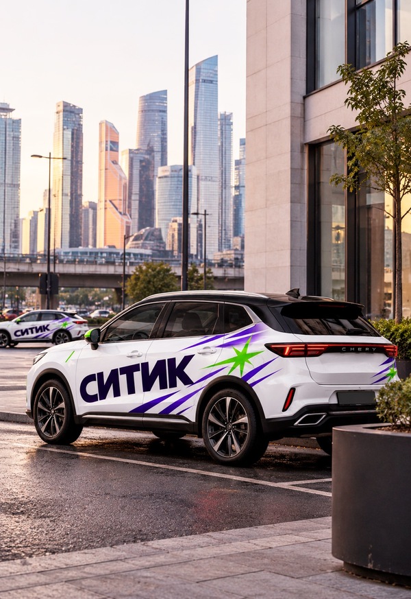
CITIC is a youth urban car-sharing service centered on movement, freedom, and the ability to choose your own route.
At the core of CITiK lies the concept of the city as a constantly evolving system of movement. Each day, a person moves between different points, changes plans, selects new routes, and independently sets the pace of their journey. In this system, carsharing ceases to be merely a means of transportation from one point to another; it becomes a tool that grants the individual greater freedom within the city.
Therefore, the central idea of the project is that movement begins with the user. It is the user who chooses the direction and initiates a new route. From this concept came the slogan «Move the City, ” which emphasizes the active role of the individual and links the functional aspect of carsharing to the visual concept of the project.
CITIC’s identity is not built around an image of a car, a road, or a city map. Instead, I work with a more universal concept—the impulse of motion. Its visual embodiment becomes the signature Spark.
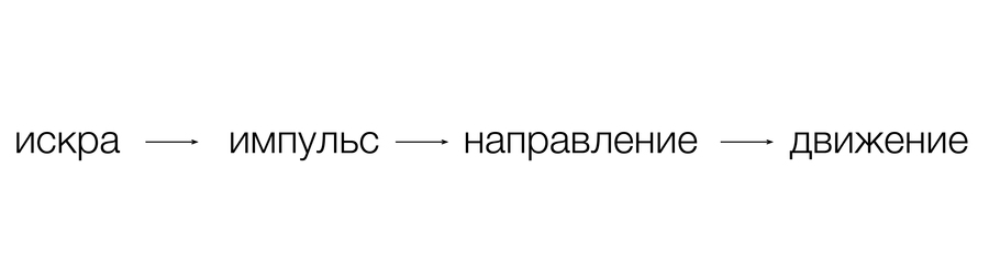
Spark is the starting moment. It can be perceived as a flash, energy, a decision to begin moving, or to change direction. From it, the rest of the brand’s graphics gradually evolve. Thus, the foundation of the system can be described by a simple sequence:
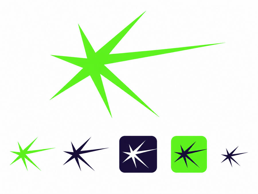
The primary logo for CITIK is an asymmetrical, seven-rayed Spark. Its rays vary in length and direction, so it is not perceived as a typical static star. The design already conveys the sense that energy radiates from a single point and continues moving beyond the symbol itself.
One of the rays is more strongly elongated horizontally. This gives Spark a direction that is then used throughout the entire system. The shape of the mark remains constant. It can be scaled up, scaled down, used independently, or alongside the logo, but its geometry is always preserved. This is crucial for recognition: even if the user sees only Spark, it must be associated with CITIC. At a small scale, Spark functions on its own—for example, as an app icon. On larger carriers, its geometry begins to unfold and transform into a complete graphic system.
How Graphics Emerge from Iskra
A core feature of our identity is that the brand elements do not exist in isolation. We take one of the Spark rays and visually extend it. The ray begins to stretch and morph into a long, sharp shape. Then, other rays of varying lengths and thicknesses appear nearby. Together, they form a directed impulse. These very elements are utilized in patterns, promotional graphics, and especially in vehicle wraps. Therefore, the purple lines on the car are not merely stripes added for a sense of speed. They originate directly from the brand mark. If we mentally trace them back to the initial point, they coalesce into the Spark. This establishes a logical connection across all levels of the system:
The more extensive the carrier, the more powerfully this principle can unfold. On a small icon, a single Spark suffices. On a digital banner, one or two rays are added to it. The composition becomes larger on a poster. On a car, the impulse can stretch almost the entire length of the body. The system scales, but its logic remains unchanged.
The second vital element of the identity is the prominent word «SITIK.» We consciously avoid using the logo as a small signature placed in a corner. The name becomes a complete graphic object that interacts with the shape of the car and the beams of Iskra.
In official communications, the primary, calmer version of the logo is used. This is necessary where brand stability and quick recognition are important—in the application, presentations, documentation, interfaces, and general advertising.
A more dynamic version of the typography is used on the vehicles. It is more horizontally elongated and better complements the long surface of the bodywork. The letters visually support the direction of the beams, so the word is perceived not as a sticker placed on the car, but as an integral part of the overall compositional movement.
Furthermore, the rays must not completely obscure the logo. They can run alongside it, begin before it, or continue after it. There is always clear space between them. This ensures the name remains legible, and the graphics do not devolve into visual noise. The typographic system is built by combining Geologica Bold and Onest Regular. Geologica is used for large headings and short messages. It is robust enough to stand alongside active graphics. Onest is used for body copy, descriptions, and interface information. It is calmer and establishes balance within the system. This results in a clear division: the CITIC brand lettering is responsible for identity, Geologica for expressive communication, and Onest for information.
Color does not operate in isolation; rather, it supports the established system of movement. Deep violet serves as the primary color, establishing the brand’s visual foundation. It is used in the logo, light rays, and major graphic elements. Bright green is used far less frequently. Its function is to signify the moment an impulse occurs, so the Spark is primarily rendered in green. This is crucial: if half of the vehicle were colored green, it would lose its perception as a flash. Therefore, the green appears in discrete spots, drawing immediate attention through contrast. Visually, the composition functions as follows:
Two options for covering
The project features two versions of the decal, but it is fundamentally important to understand that these are not two different designs. They represent two states of a single system.
Version One—a lighter design intended for the main portion of the vehicle fleet. Here, much of the car’s original factory paint remains exposed. The large word CITIC is placed on the doors, and Iskra appears closer to the rear quarter panel. Several violet rays emanate from it, traveling along the side of the vehicle but gradually dissolving into the free surface of the bodywork. This option looks lighter and calmer. It works well in everyday urban environments and allows the car to retain its inherent form.
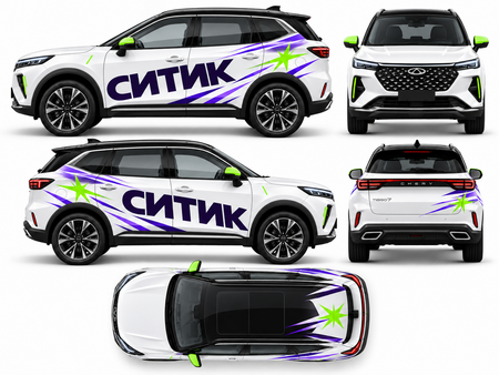
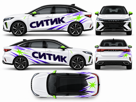
Version two is richer. It incorporates more rays, their arrangement becomes denser, creating a stronger sense of momentum and speed. However, we avoid the massive solid purple fill seen in the early experiments. Instead, density is achieved through individual directed shapes and the spaces between them. This is precisely why both versions continue to satisfy the technical requirement: the original car color must cover more than half of the body surface.
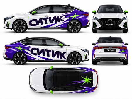
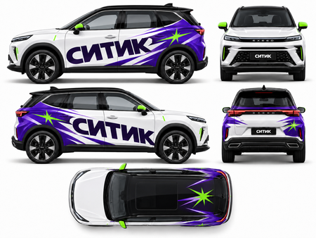
For the main version, we intentionally allow for a noticeable buffer, aiming for approximately 65–70% open-air cabin. In the second, more aggressive version, there is more graphics, but the factory color still remains dominant. The difference between the two options is only in intensity. If we visualize the system as a scale, it looks something like this: