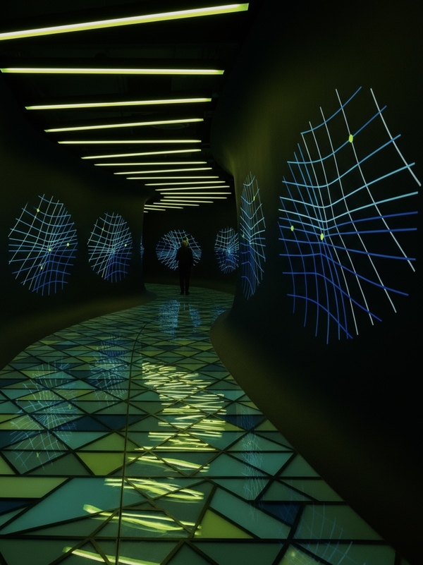
The project reimagines the work from Module 1 of the 1st Year (https://portfolio.hse.ru/Project/284348) of the «SHUM» exhibition, which explores the creative output of the Italian futurist Luigi Russolo, within the design bureau of the exhibition space.
ChatGPT suggested developing a brand identity and concept, focusing not on the visual language or the style of one specific artist, but on their approach to conveying sensations and emotions through color and form. A unique quality was highlighted—the ability to make the ephemeral tangible and allow the viewer to feel it.
Concept
An authorship design bureau for spatial narratives that unites research, architecture, visual communication, and interactive experience into a cohesive exhibition system.
The bureau, which translates ideas into environment, operates at the intersection of exhibition design, scenography, graphic design, and perception research. It doesn’t merely display exhibits; it develops a unique way for people to interact with a theme. History transforms into a journey, sound into a spatial structure, a scientific concept into an installation, and artistic style into a system of forms, materials, light, and graphics. The core idea is that we design not exhibitions about ideas, but spaces where ideas can be felt. This approach allows us to unite projects like «NOISE, ” even if their themes are completely different. The bureau’s mission is to create exhibition spaces that allow people not only to learn something new but also to feel, explore, and experience the theme through personal engagement.
GPT Generation Prompt:
Develop a concept for a startup design bureau specializing in exhibition spaces. This bureau will handle the organization and design of spaces, with a thematic and conceptual connection to the projects linked below. Propose key distinctive features and elements of its identity and design aesthetic. Hypothesize what might set this bureau’s style apart.
https://hsedesign.ru/project/d597543509db4a118d11e5d38cb20380
https://hsedesign.ru/project/4cbc1d9d40c14a158fb3571660c2b562
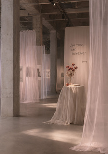
Old Project
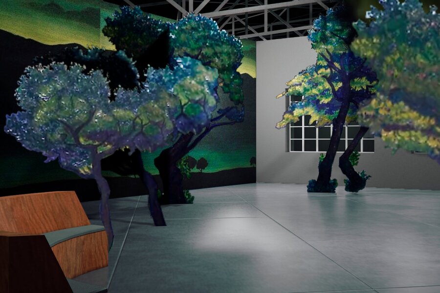
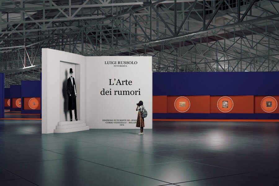
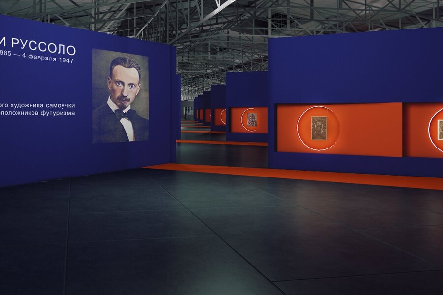
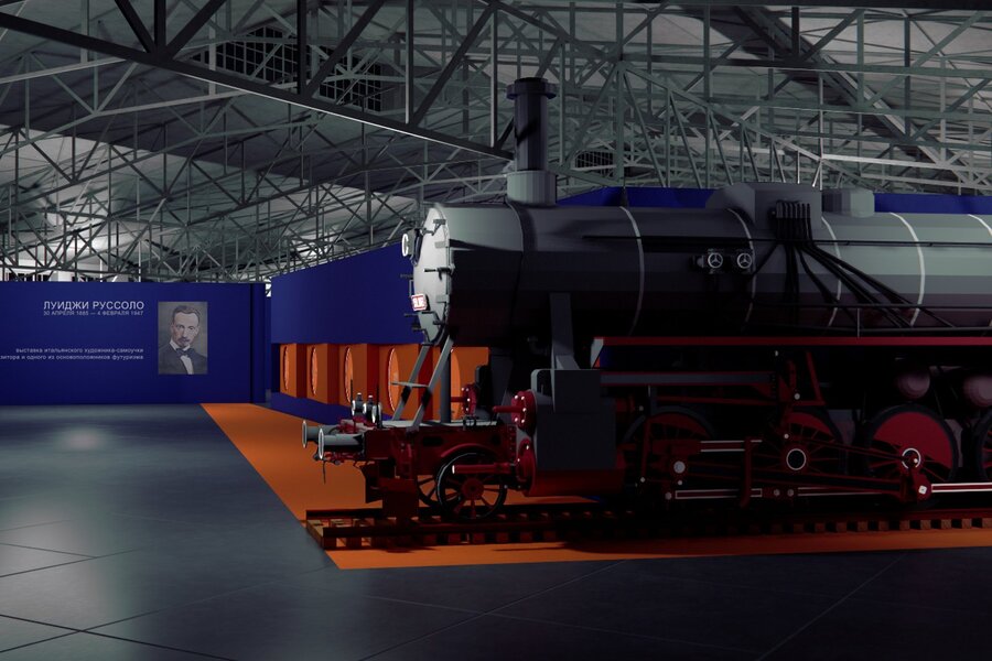
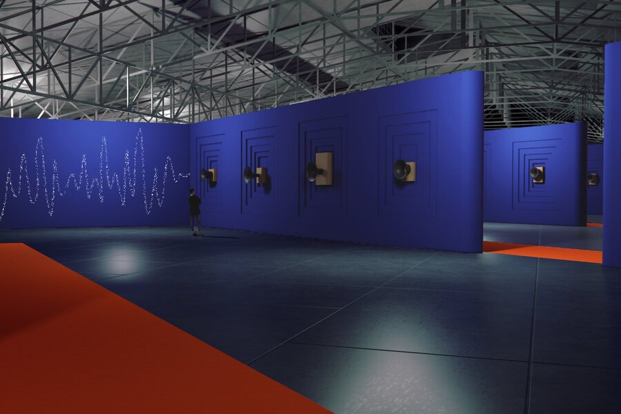
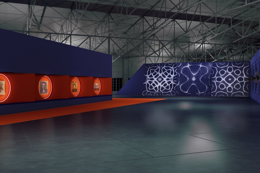
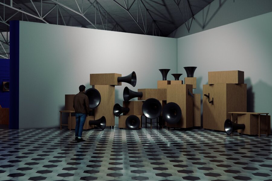
Photo from the original «HUM» exhibition project
Neural Network Rebranding
AI-generated zoning
A linear path through four rooms: from the dark entrance to the bright finale. The visitor traverses Rossolo’s journey—from futuristic painting through the manifesto of noise to color as an independent substance. Red dots on the map indicate the placement of works. Room 1 Rossolo began with the idea that movement is not an object, but a state. The object disintegrates into force lines. Fragment Portal: A fractured polygonal arch composed of planes, like a motion frame sliced into phases. The smooth floor is stitched with diagonal brass lines—vectors of force.
Hall 2
Cubism taught how to deconstruct form. Futurism took this further: to show multiple moments simultaneously, within a single frame.
The walls are fractured into large, diagonal planes; the main canvas hangs precariously and reads like a flat pattern viewed from several angles. A screen of vertical steel slats acts as a kinetic curtain, fragmenting the silhouette of someone passing by.
Hall 3
Russolo wrote the «Art of Noise» manifesto and built the intonarumori—machines that make noise. This hall is his primary invention, not a painting. The walls have been transformed into an acoustic relief: concentric waves that gather at the center. The floor is molded with a thin wave texture—sound as a relief.
Hall 4
Later Russolo painted abstractions where color exists as an accord unto itself. The exhibition culminates in a grand reveal.
Long Hall: the walls are composed of vertical diagonal panels arranged in a chromatic scale, moving from lime through cyan and cobalt to deep blue. Suspended beneath the ceiling is a light installation of thin, curved lines—a floating wave.
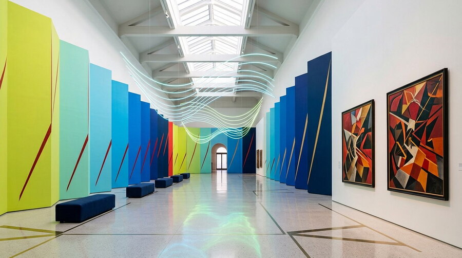
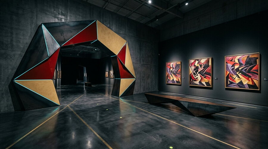
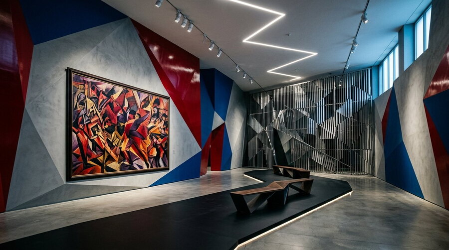
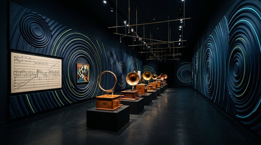
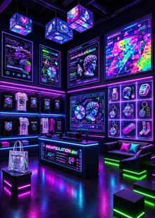
Studio visualizations
Prompt: Generate a space for an exhibition of works by the Italian futurist Luigi Russolo. The set design must be inspired by the artist’s work and contain references to his creative output. Focus on conveying the underlying ideas through the forms, materials, and colors of the space. Be sure to show the placement of several of Russolo’s works.
Identity
Title suggestion from GPT, presented with the concept: «The Field»
A mark composed of lines that gather into a structure, intersect, and change density. It symbolizes the field of research, the connections between objects, and the formation of a spatial system.
Character: exploratory, flexible, intellectual.
For the favicon and small print—the same lines, but there are 10 instead of 22, the thickness is increased, and there is one point. At 32 px, the symbol is still recognizable as a cross over a field.
SIGN LOGIC
Two families of straight lines intersect at an acute angle. Towards the center, the lines intensify according to an exponential function; toward the periphery, they dissipate and are cropped by a soft, oval contour. This generates a sense of space rather than flatness—a field of study with a center of gravity.
Three lime dots are precisely placed at the intersections of the lines—these are the objects between which a connection has emerged. This is not decoration: the nodes are calculated based on the sign’s geometry and always sit at true intersections.
Color functions as layers of depth: the white lines form the foreground, cyan is the middle ground, and cobalt and dark blue represent the background. This creates volume without gradients, shadows, or luminescence.
Color palette
Font from the logo, identified using WhatTheFont
Prompt for creating a logo and digital palette in Arena Agent:
Generate three color logo options for the exhibition space design bureau «Pole.» The bureau’s concept is to create exhibition spaces that help people not only learn something new but also feel, explore, and experience a theme through personal engagement. Logo requirements: a mark made of lines that assemble into a structure, intersect, and change density. It symbolizes a field of inquiry, the connections between objects, and the formation of a spatial system; the logo should be in a futurist style.Edit prompt: Take the first option, keep the color palette, but make it simpler and more minimalist—thinning and smoothing the lines.
Key Points
The carriers are built upon two elements: the «Field» mark—intersecting lines that coalesce into a structure and shift in density—and free, fluid lines that echo its plasticity. The mark does not dominate the carrier anywhere; it is small, and the lines create the space.
Flag Signage
Club
Banner
Pen
mobile interface