I turn brand ideas into visual systems that feel alive
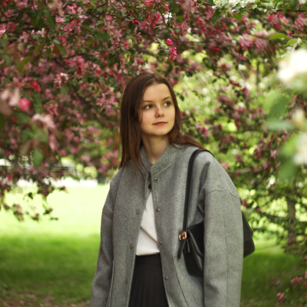
I’m Ekaterina, a communication designer with a background in graphic design and illustration.
Four years at college and now my fourth year at HSE Art and Design School. I’ve been freelancing since 2023, working with museums, charities, and an international online radio. I care about color, systemic thinking, and the one unexpected detail that makes a project stick.I like observing, drawing, making things by hand, and printing — and I stay curious about new experiences. Open to studio roles and collaborations.What I do
Identity · Branding · Packaging · Posters · Typography
Process
Research I dig into the brand’s context, audience, and visual codes, looking for the unexpected detail.Idea I turn that detail into a single visual metaphor that can drive the whole project.System I build a flexible system — logo, color, type, patterns that works across media and scales.
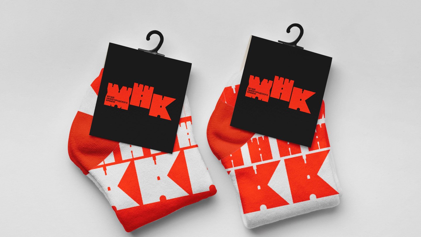
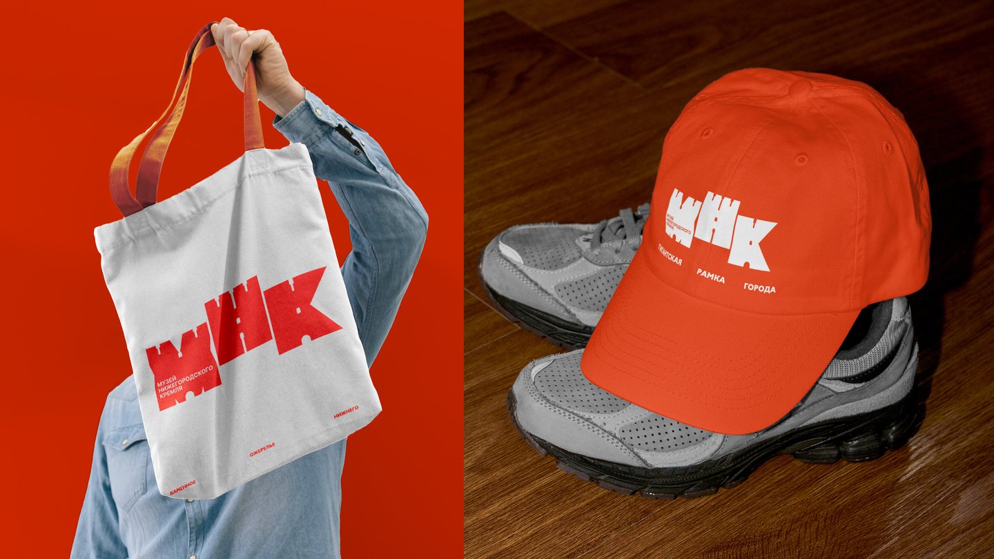
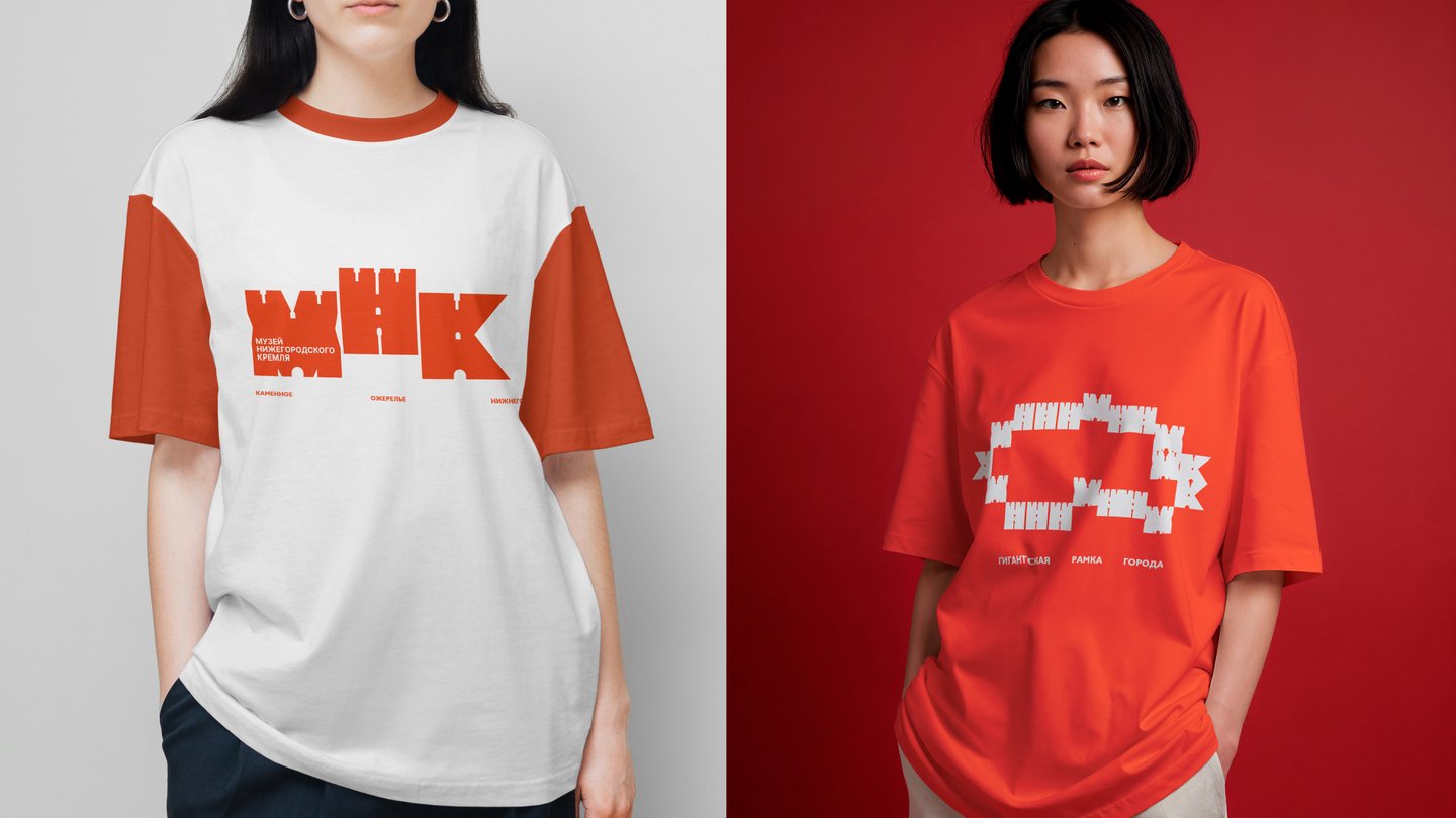
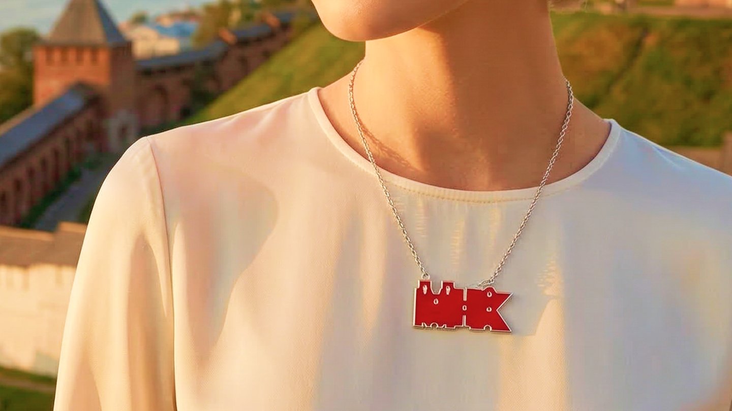
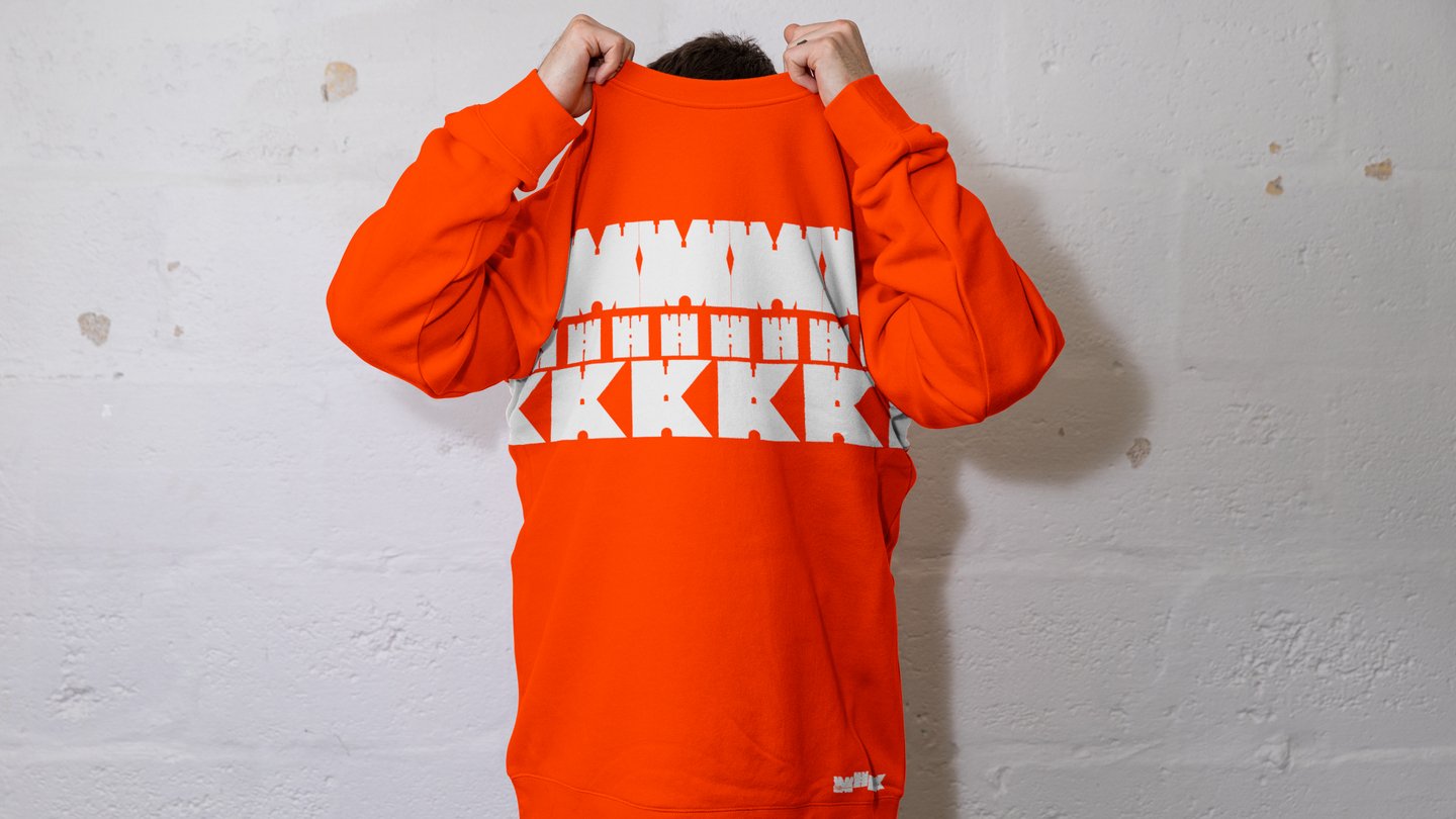
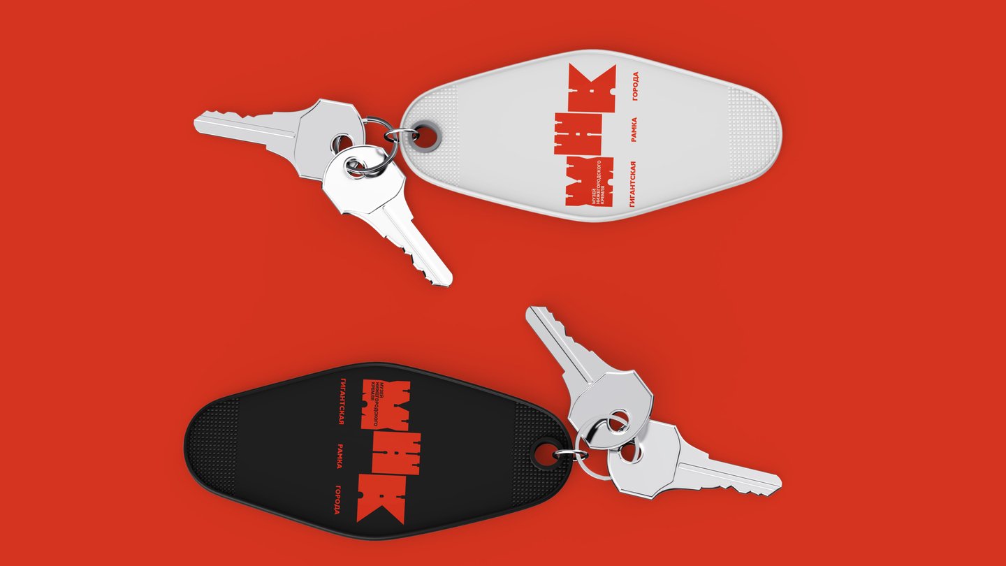
Nizhny Novgorod Kremlin Museum
How do you make a 16th‑century fortress feel like a contemporary brand?
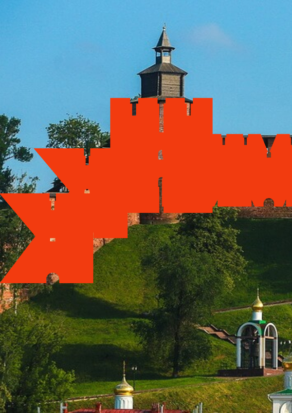
Task The museum needed a souvenir line and a visual language that could feel contemporary without losing its historical character.Solution A modular system built from the Kremlin’s architecture: a reduced logo, patterns, and clear rules for merch. The identity works across hoodies, shoppers, pendants, notebooks, and postcards — and the museum can scale it without losing style.
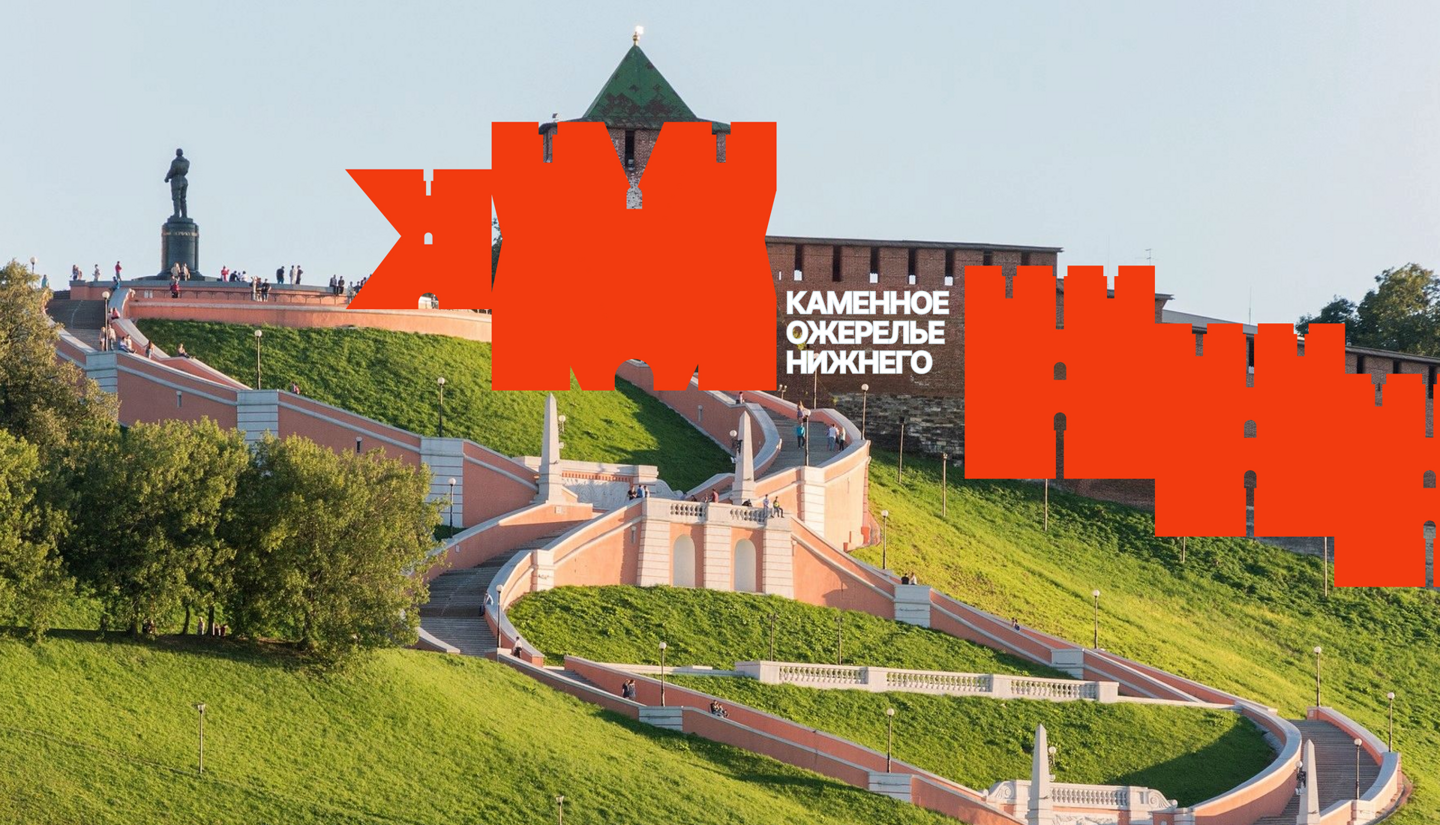
Result The museum can now launch new merch positions without losing style, and the visual language feels both contemporary and rooted in the Kremlin’s history.
Giving Bookstore
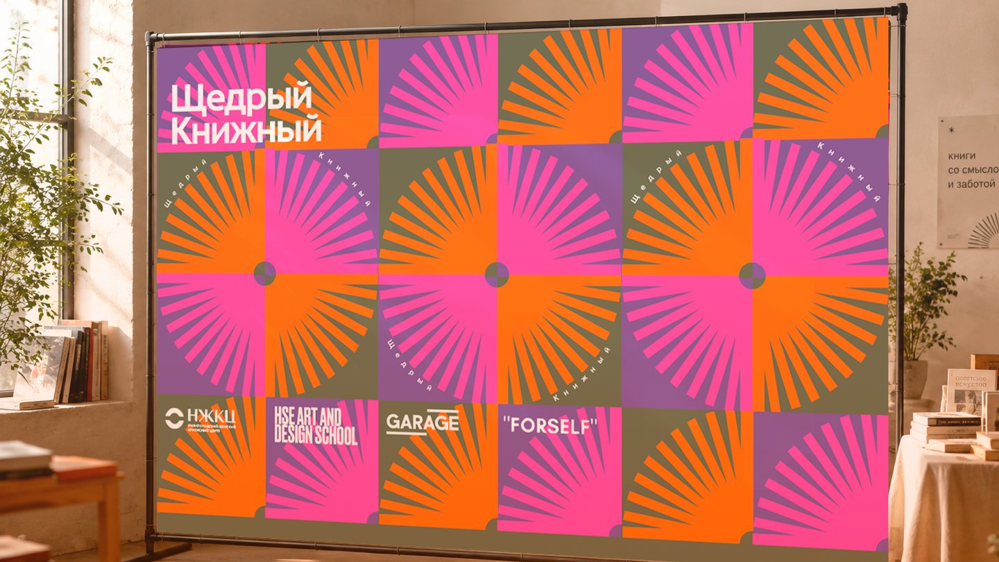
Can a charity event feel like a celebration without losing its serious message?
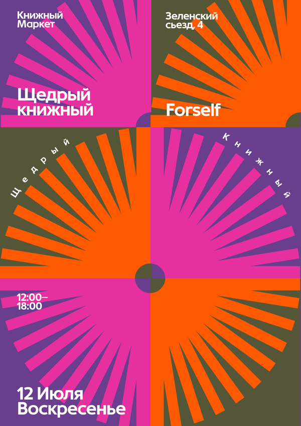
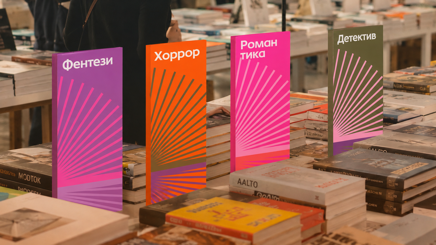
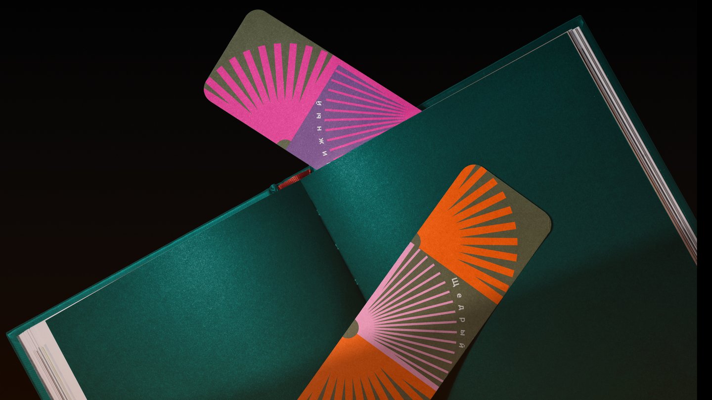
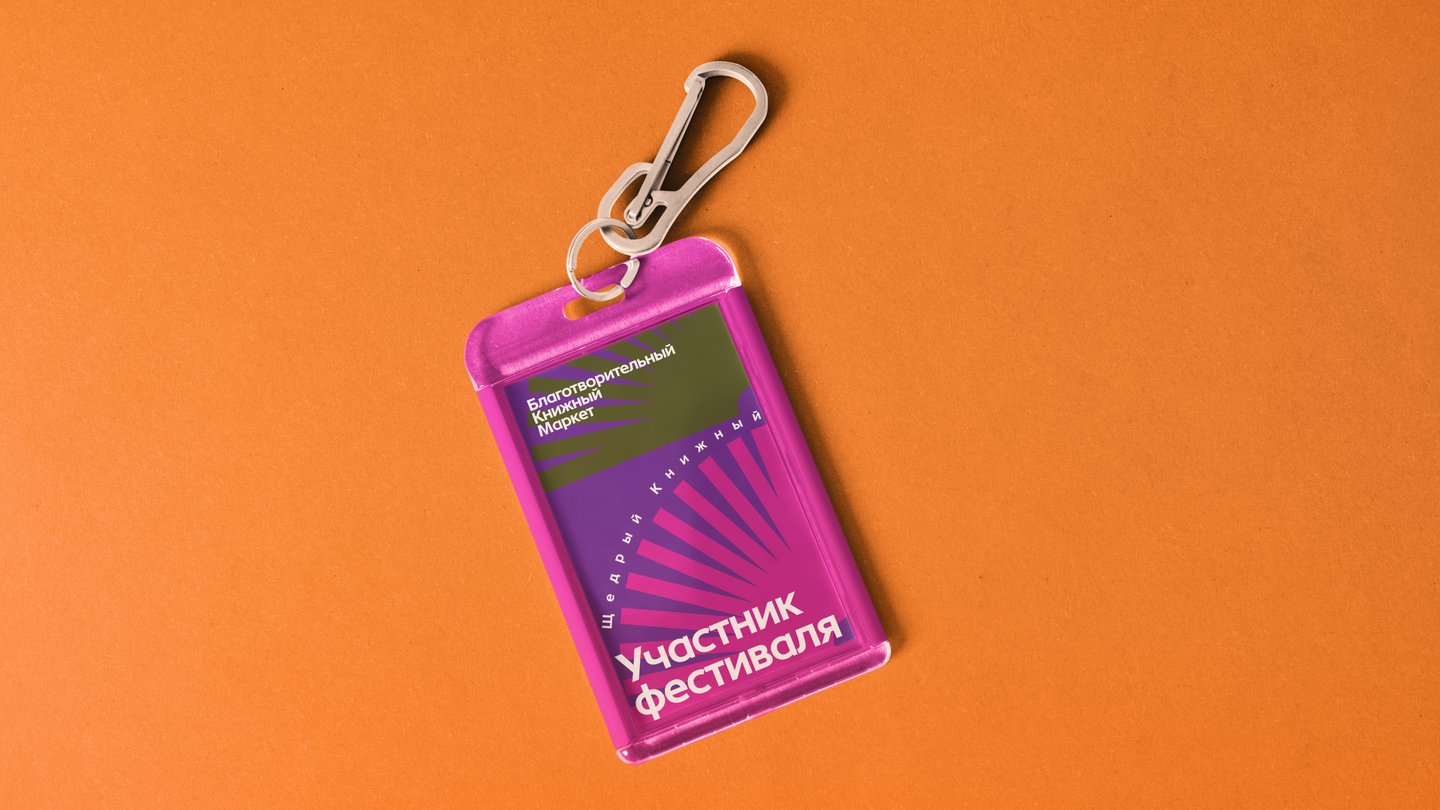
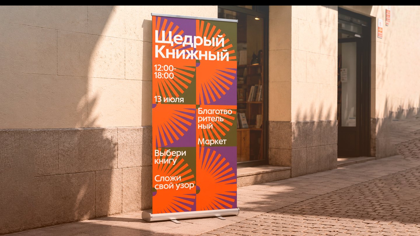
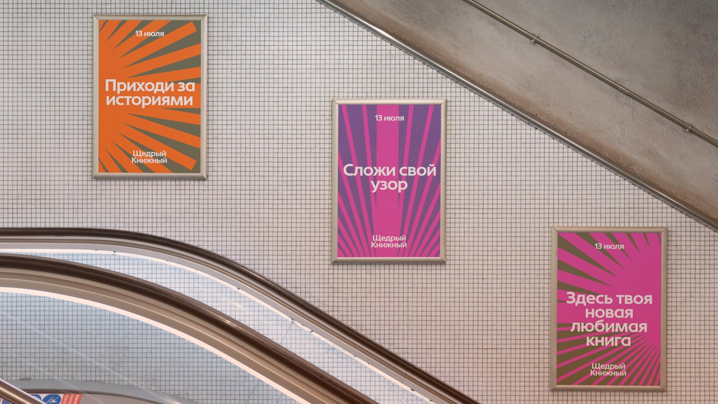
Task The festival needed an identity for a book market in support of women affected by domestic violence. The cause had to be present without making the event feel heavy.Solution A kaleidoscope metaphor: fragmented shapes coming together into something bright and whole. Logo, patterns, posters, and navigation turn charity into a visible city ritual.
Result The market became a visible city ritual, and the charity’s message reached a wider audience through a bright, recognizable identity.
MCK
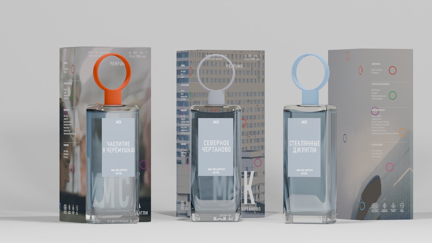
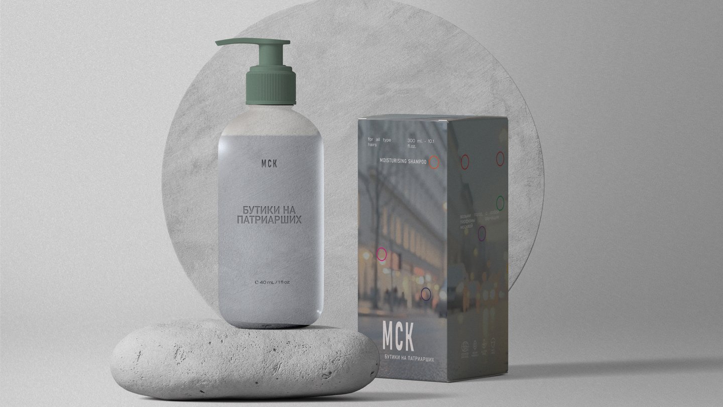
How do you make a new perfume brand feel luxurious without falling into clichés?
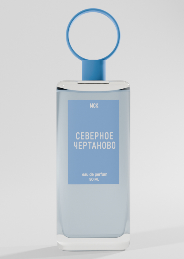
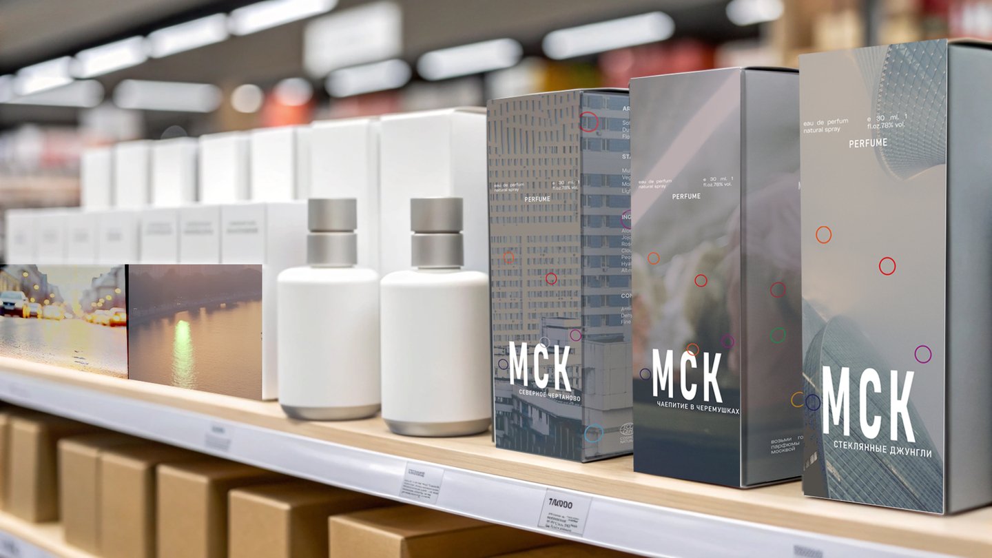
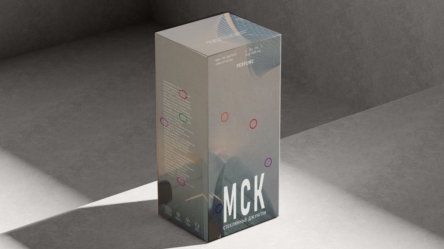
Task A new perfume brand needed branding and packaging from scratch, with a luxury feel that avoids clichés.Solution A minimalist, tactile brand world with the bottle as the hero. I built the identity, packaging, and 3D renders around a quiet, sculptural form and a single bold accent.
Result The brand entered the market with a coherent luxury image that stood out on the shelf.
I Want to Believe
How do you make a 120-page visual research zine feel like a page-turner?
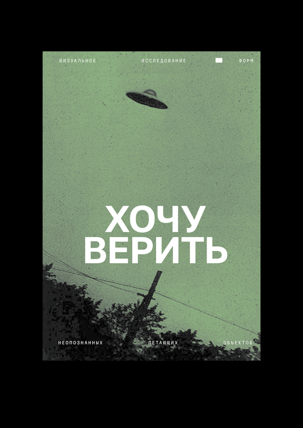
Task A 120-page zine built around visual research on the shapes of UFOs. The challenge was to make a dense, image-heavy publication readable and coherent — not just a collection of material.Solution I designed the zine around typography and hierarchy: a clear grid, strong typographic contrast, and a rhythm that guides the reader through the research. The layout keeps the visual material expressive while making the structure easy to follow.