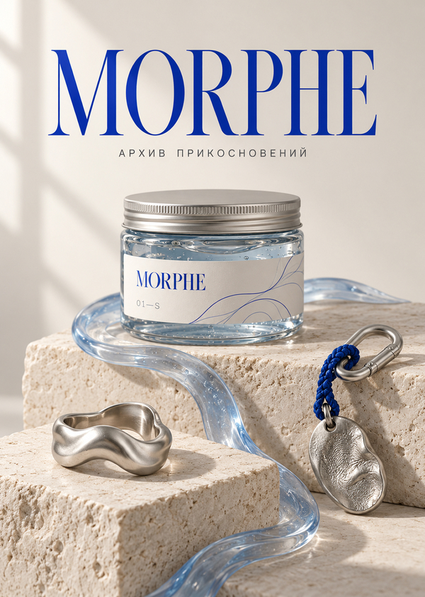
MORPHE — a conceptual brand of collectible slimes and jewelry. Each collection embodies a distinct micro-universe with its own colors, textures, and imagery.The slime conveys it through touch, while the jewelry allows you to keep and wear that form with you.
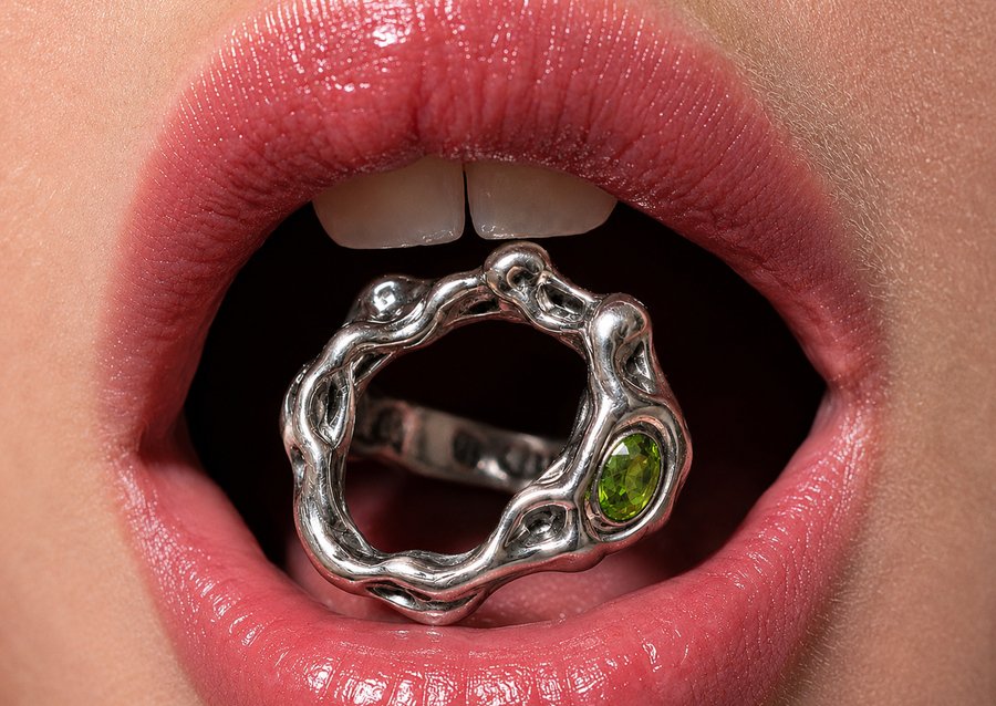
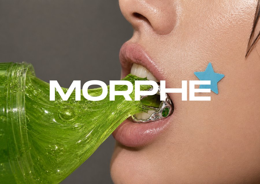
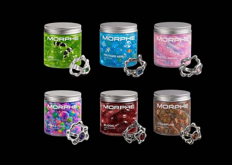
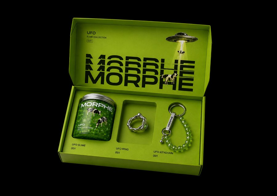
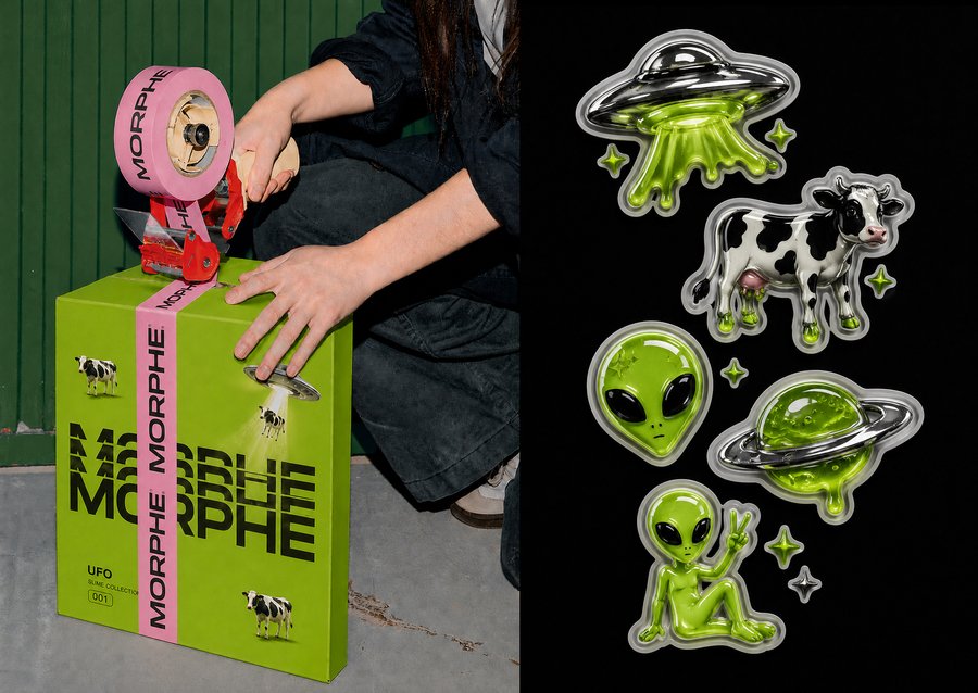
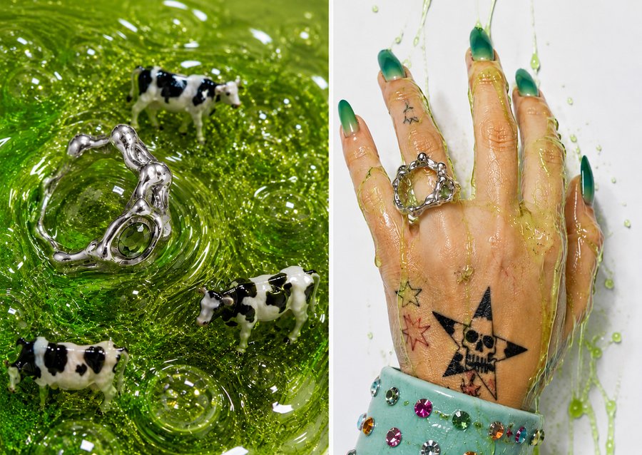
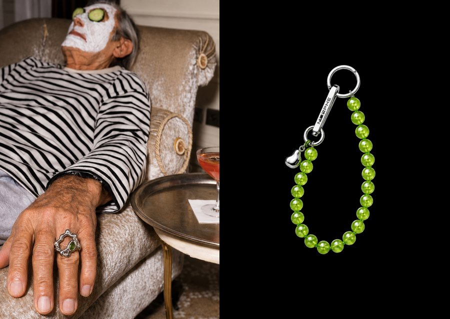
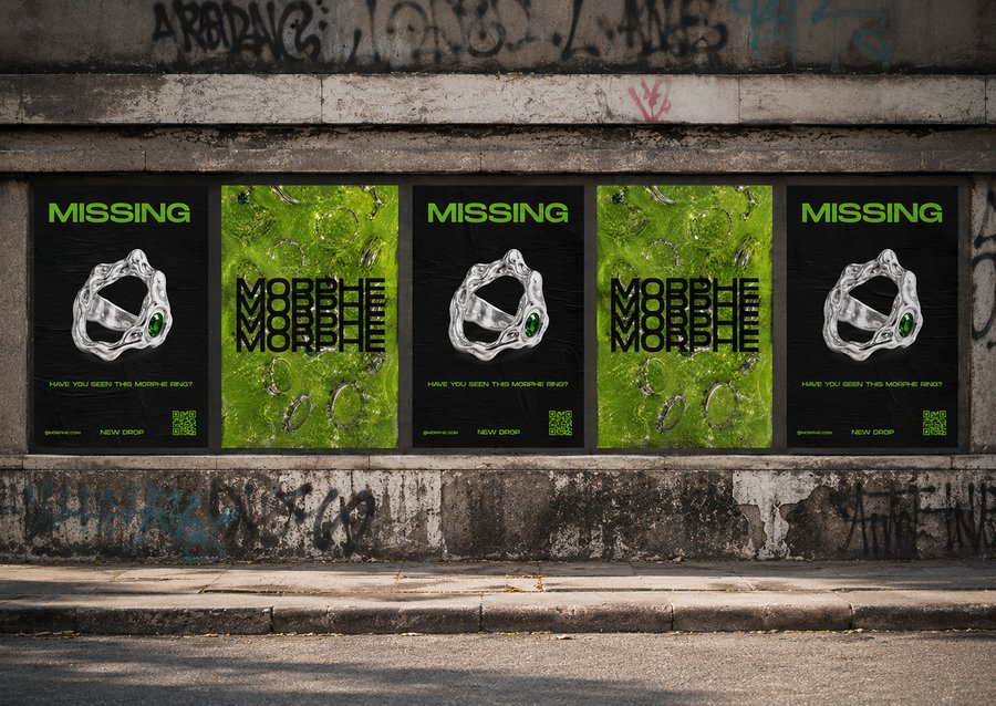
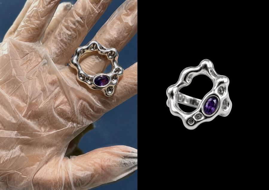
REBRANDING
MORPHE — ARCHIVE OF TOUCHESA new interpretation of MORPHE—a collection of material states. In each pair, the slime demonstrates form in motion, while the decoration preserves it as a frozen imprint. The objects are numbered and compiled into an archive that can be explored through touch.The visual system is inspired by sculptural galleries and sample catalogs: milky surfaces, cobalt accents, delicate typography, and free-flowing compositions. Soft light emphasizes the material’s viscosity, translucency, folds, and irregularities.Using generative tools for the brand, a new identity, product imagery, packaging, merchandise, and a space where visitors can curate their own collection of forms are created.
NEW LOGO
The new MORPHE logo features elongated letters with fine serifs and contrasting strokes. Smooth curves connect the typography to a sculptural form, while the negative space reinforces the gallery’s aesthetic. Cobalt blue against a milky background establishes the foundation for the new visual language of the «Archive of Touches.»
Create a new logo for Morphe in the aesthetic of a sculptural gallery: elongated letters with fine serifs and smooth curves. Cobalt lettering on a milky background, centered, with ample negative space. No symbols, effects, or additional text. 16:9 format.
COLOR PALETTE
The milk and grayish-beige tones evoke paper and plaster, creating a calm backdrop for the objects. Cobalt highlights the logo and accents, while graphite is used for the text. Light blue supports transparency and the cool shades of the materials.
Create a minimalist palette for Morphe: five swatches in a row on an off-white background —
#F3F0E8,
#2448C7,
#28282C,
#B9B3A9,
#C8D5EB.
Place the hex code beneath each. Strict grid, ample white space, no textures or extra text. 16:9 aspect ratio.TYPOGRAPHY
Cormorant Garamond has been chosen for the headings: its contrasting strokes and fluid curves support the brand’s sculptural nature. For descriptions, object numbering, and navigation, we use Inter. Their combination is reminiscent of exhibition catalog design.
Create a typography screen for Morphe: use Cormorant Garamond on the left for headings and Inter on the right for body text. Display Cyrillic, Latin, and numerals. Use a milky background, cobalt blue headings, charcoal text, plenty of white space, and a museum catalog aesthetic. Format 16:9.
BRAND IDENTITY
The fluid contours resemble a flowing material, and the embedded lines suggest the trace of a touch. Semitransparent layers convey overlapping and shifting forms. These elements unify the packaging, object cards, and promotional materials.
Create a signature graphic for Morphe: contours of spreading forms, abstract imprints from nested lines, and semi-transparent organic layers. Cobalt and light blue on a milky background, fine lines, museum catalog aesthetic. No text or mockups, 16:9 format.
NUMBERING SYSTEM
Each collection is assigned a number and a material state name. The first is «01 / Fluidity.»The code 01—S designates slime, while 01—R refers to its associated ring. The overall number links the mutable form and its solidified imprint. These codes are repeated on labels, packaging, and object cards.
Create a numbering screen for the morphe collection: «01 / Flow, ” featuring two objects—“01–S / Slime» and «01–R / Ring.» Incorporate subtle, organic contours. Use a milky background with cobalt accents, incorporating antiquing and a simple grotesque typeface, evoking the aesthetic of an archival catalog. Aspect ratio 16:9.
LABEL
The label is designed as an archival specimen marking: it features the logo, code 01—S, and the title «Fluidity.» Delicate outline lines convey the material’s movement, while the milky paper emphasizes the transparency of the contents.
Create a mockup for the Morphe label on a transparent jar containing slightly bluish slime and a silver lid. Use milk paper, a cobalt serif logo, the code «01—S, ” the title „Flow, ” and printing lines. Soft daylight, a milky background, and an archived sample aesthetic. Format 16:9.
SLIME PACKAGING