IDEA
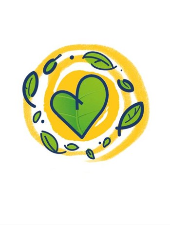
«Life goes on.» Heart-shaped leaves detach from the hospice logo and scatter like in a light breeze. Each leaf carries a piece of warmth and care, filling the image with movement, joy, and life every day.
T-shirts
IMAGE
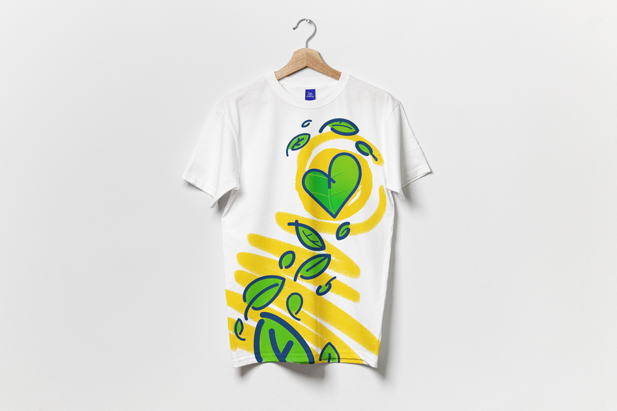
The yellow lines resemble a child’s crayon drawing: scribbles, sketches, sun rays. They are a reminder that a child remains a child, and creativity, play, and warmth are always by their side. This gives the image a light, bright, and vibrant quality.
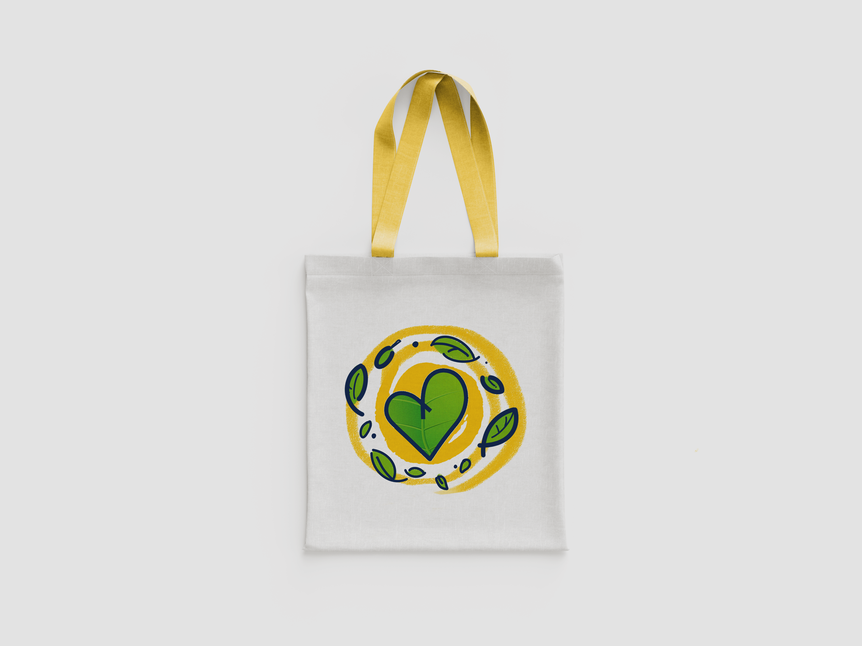
Shopper
IDENTITY ELEMENTS
The hospice logo—a leaf-heart—remains the centerpiece and is unchanging. Around it live leaves of varying sizes, inspired by the logo itself: they establish a rhythm and form a pattern. A yellow «sunburst» accent adds a bright highlight and the feeling of a human touch. All of this is anchored by the logo’s color palette: green, yellow, and dark blue outline.
Roll-up
APPLICATION
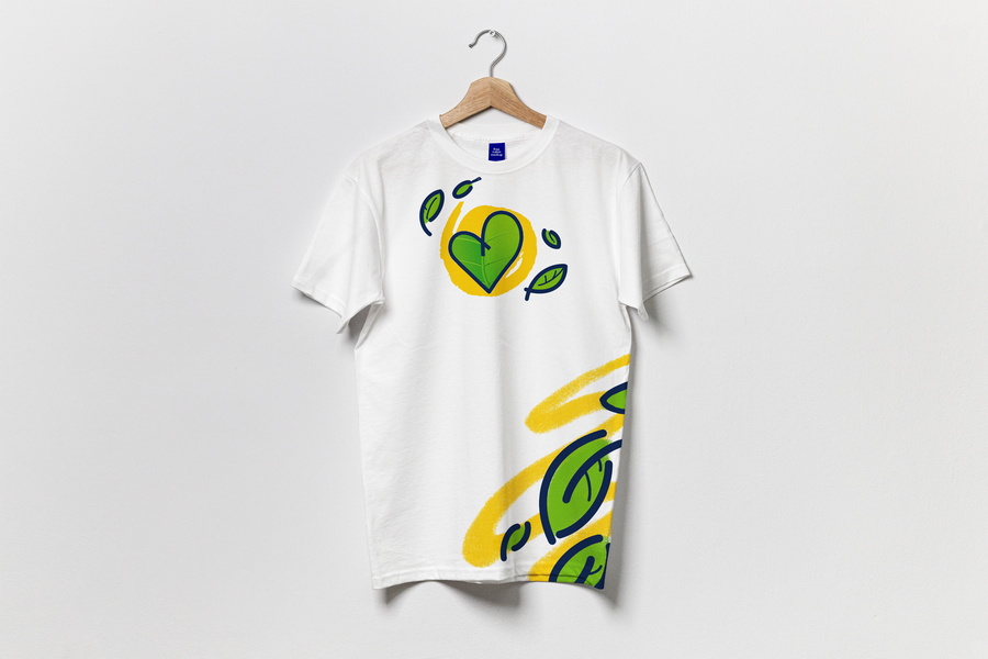
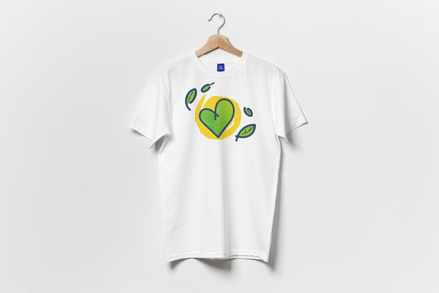
On the shopper, the logo is centered in a yellow «sun,» surrounded by swirling leaves. On the t-shirt, the leaves fly downward from a leaf-heart, caught by yellow streaks. Stickers, badges, postcards, and sticker packs are assembled from individual leaves, the logo with its «halo,» and yellow swirls.
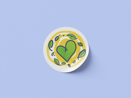
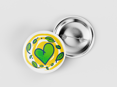
Sticker and Icon
WHY IT WORKS
The design turned out bright, warm, and uplifting, with its imagery built around nature, the sun, and children’s drawings. This cohesive style scales easily from a small sticker to a rollup banner or a thank-you note, and the simple shapes and limited color palette are perfect for printing on textiles and any other medium. The drawn texture gives the merchandise a personal and vibrant feel.
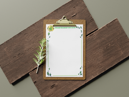
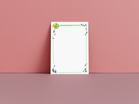
Letters of Appreciation
CONCLUSION
Each page is a warmth we give. Together, they compose a life full of love, joy, and care.