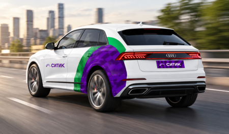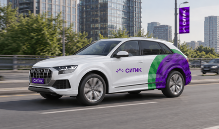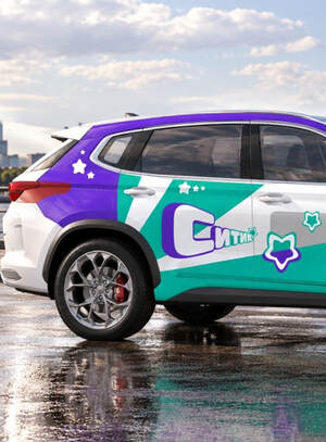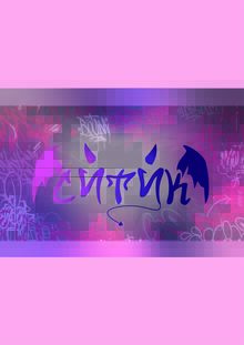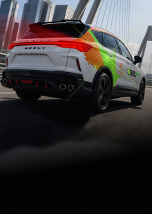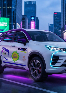
CityTick is a new youth branch of the CityDrive carsharing service, created for a younger audience and their fast-paced urban life. The project involves developing a modern visual identity that conveys the energy of the metropolis, the dynamism of movement, and the brand’s character through visual solutions—from advertising collateral and merchandise to the vehicles themselves. At the same time, CityTick maintains a recognizable connection with CityDrive while establishing its own distinct visual language.
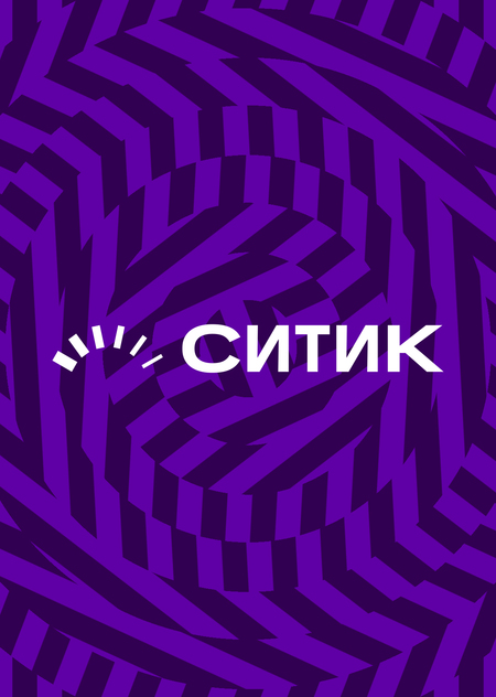
The concept is rooted in the metaphor of impulse, conveyed through the rotation of a car wheel. Impulse becomes the source of motion, symbolizing energy that constantly propagates and dictates direction. The graphics capture this rotation through rhythmic stripes, creating a sense of acceleration and dynamism. Thus, impulse transforms into Citik’s visual language—a reflection of the continuous movement and energy of the metropolis.
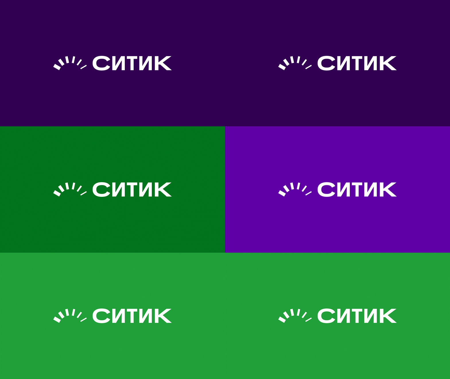
The logo consists of six lines of varying thicknesses arranged along the curve of an arc, forming a rotational shape. Their composition conveys momentum—the core visual concept of CityDrive. The number of lines symbolizes the six cities where CityDrive carsharing operates. Each letter of the typographic logo is set in different weights of the CityMobile Sans typeface, lending the logo a sense of dynamism and energy.
The visual system employs two primary colors—green and purple. These colors can be applied to backgrounds, text, and most layouts, shaping the visual identity of the City. The color combination is moderately vibrant and expressive while maintaining visual balance. For headlines, the CityMobile Sans font is used in two weight variations: Regular and Italic. The italic style highlights key terms, supporting the identity’s dynamic character.
The key elements of the decals are placed according to established brand guidelines, which helps preserve CityDrive’s recognizability while integrating the new Citic visual concept into the existing identity.