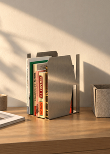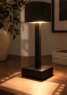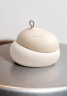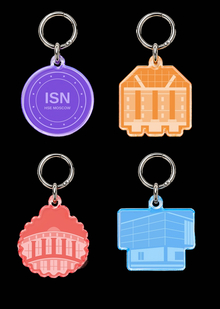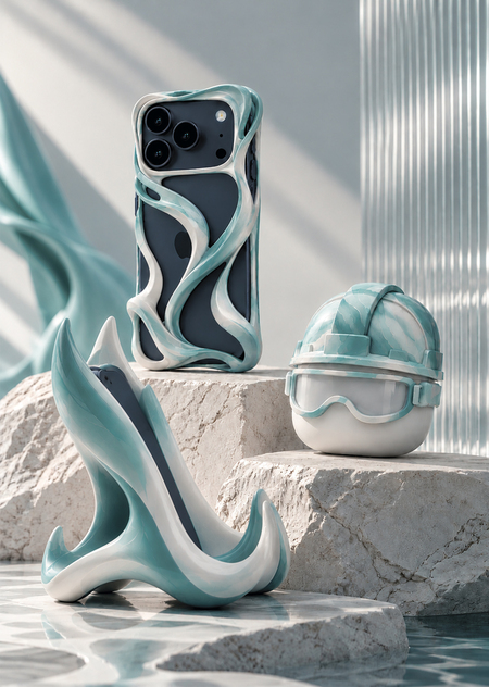
A collection of everyday items inspired by Catalyst—Sibur’s mascot. The project explores the possibilities of polymer materials, transforming the character’s essence into functional accessories.
EXECUTIVE SUMMARY
«Catalyst: Flow. The Form of the Future.» showcases the combination of cutting-edge technology and ecological consciousness in the design of future devices. The longread outlines the project’s goals and the brand’s ideology (the mission of the Catalyst mascot), describes the device’s form factor and ergonomics, provides technical specifications (dimensions, camera placement, buttons, and connectors), details the materials (specifically, Sibex 3DF polymer for 3D printing), and covers manufacturing features. Special attention is paid to the environmental aspect: the project highlights SIBUR’s circular model, plastic recycling, and commitment to sustainable development.
01. PROJECT OBJECTIVE
CHALLENGE: FROM CORPORATE SYMBOL TO EVERYDAY OBJECT
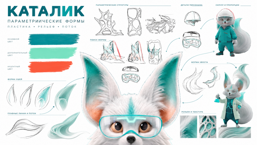
Develop a collection of functional accessories for Sibur where the polymer moves beyond being a mere manufacturing material to become a tool for shaping recognizable form. Instead of standard corporate merchandise, the proposal is to create items that possess inherent practical value. The connection to the brand is revealed through the plasticity of the objects, the character of the surfaces, and recognizable catalyst details, rather than solely through a printed logo.
PROJECT CRITERIA:
• FUNCTIONALITY IN DAILY USE;
• A UNIFIED VISUAL LANGUAGE ACROSS THREE ITEMS;
• FEASIBILITY OF LOCAL MANUFACTURING IN RUSSIA;
• ADAPTABILITY OF THE DESIGN FOR 3D PRINTING;
• COST ANALYSIS AND VIABILITY FOR A LIMITED-RUN PRODUCTION
GOAL: MAKE THE FUTURE TANGIBLE
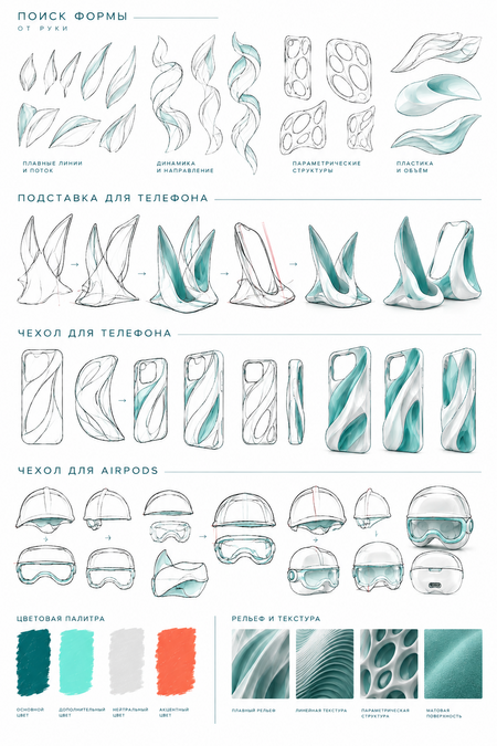
Develop a collection of three functional accessories that explore the potential of polymer materials through expressive geometry and digital manufacturing. The collection must simultaneously solve everyday user tasks, support Sybu’s brand recognition, and demonstrate how the corporate character can become a source of a new object language. Key principle: do not depict the future—shape it.
KATALIK — A CHARACTER AT THE INTERSECTION OF SCIENCE AND IMAGINATION
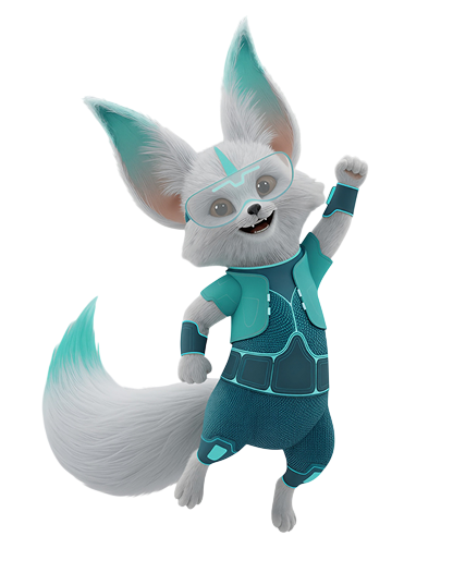
According to the official Sibur brand guide, Katalik emerged in an experimental reactor where next-generation plastic was being created. His image unites scientific curiosity, the energy of light, and a drop of oil—a symbol of the past and the future. The character’s mission is to explain complex processes simply, inspire environmental care, and symbolize the balance between technology and nature. In this project, these qualities become the foundation for a formal investigation: curiosity transforms into a geometry experiment, energy into the directional movement of lines, and the connection to material into a physically existing object.
02. DESIGN PROBLEM
HOW TO MAKE A BRAND MEMORABLE WITHOUT LITERALLY COPYING A MASCOT?
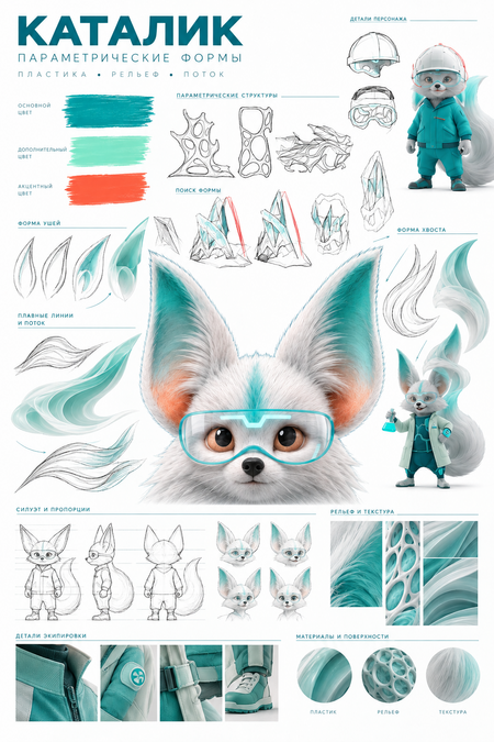
A direct image of a character on an accessory is quickly recognizable, but it limits the design to a decorative function. Conversely, a completely abstract object risks losing its connection to the brand.
THEREFORE, THE PROJECT UTILIZES TWO LEVELS OF FAMILIARITY:
Abstract level. The character of Katalik is conveyed through elongated, smooth lines, curves, and relief in the phone stand and case. Direct level. Recognizable details—the helmet and goggles—are preserved in the AirPods case. These make the object the most obvious reference to the character.
THIS WAY THE COLLECTION REMAINS A WHOLE, BUT DOES NOT BECOME A REPETITION OF THE SAME FORM.
03. CONCEPT
THREE PRINCIPLES OF SHAPE FORMATION:
Directionality
Elongated elements create a sense of movement and visually link the designs to Katelik’s plasticity.
Continuity
The curves are perceived as a single, unified line that forms the body, support, or relief, rather than a collection of random decorative details.
Functional Plasticity
Every expressive element must have a purpose: to support a smartphone, enhance grip, protect a surface, or create a recognizable aesthetic.
SHAPE THAT CONTINUES IN MOTION: Flow is a principle of form creation based on the sensation of continuous movement. The line does not halt on a decorative detail but transitions into a support, relief, or protective element of the object.
The elongated curves allude to the ears and tail of Catalik, but they do not form a literal animal silhouette. Because of this, the shape remains autonomous and functional.
Polymer allows for the exploration of a unique plasticity: creating intricate contours, expressive reliefs, and details that might be more challenging to achieve using traditional fabrication methods.
04. COLOR AND SURFACE MATERIAL
Sibur’s Corporate Palette as Part of Design
The color palette is built around Sibur’s signature colors: dark green, mint, and white. Orange is used sparingly—as a small accent to emphasize a specific detail rather than compete with the form.
PROPOSED COLOR PALETTE:
• Dark green — the primary, most subdued option;
• Mint green — a lighter, more technical option;
• White — emphasizes geometry and texture;
• Orange — a limited accent for a detail or a specific collection element.
The surface should be predominantly matte: this allows the curves to be perceived more subtly, and the texture to be appreciated through light and shadow.
If a logo is used, it should be placed separately without altering its proportions or typeface. The brand graphic should not be transformed into a decorative pattern that competes with the product’s form.