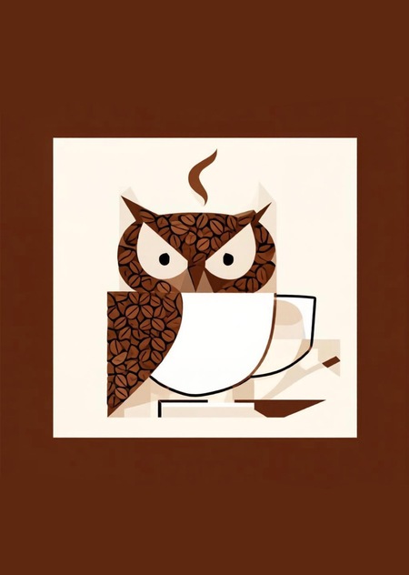
Project Idea
For the infographic subject, I conceived a coffee shop chain called «Cinnamon Owl.» The main visual characteristic of this chain is its focus on natural, wooden textures and a color palette composed of earthy tones—without bright, jarring signage, visual noise, or other elements that often fatigue and overwhelm the eye and mind of a modern person living in a relatively large city.
Concept
I plan to realize the core characteristics of the «Cinnamon Owl» brand using a tightly limited palette of colors (beige, brown, black, and white) to evoke associations with both coffee beverages and naturalness, referencing colors frequently found in nature. I will also employ a minimalist, near-vector style because this aesthetic generates minimal visual noise, is highly intuitive, and is ideal for promotional posters, café merchandise, and so on.
Source Data
For this project, I chose not to rely on previous coursework from earlier modules, opting instead to develop an original concept from scratch. To realize my vision, I utilized two AI models: Gigachat and AliceAI. I did not use specific style references because the aesthetic of commercial vector illustrations is already quite common in infographic design, so I decided to simply use the most analogous prompts.
Infographic
As an object to demonstrate the «Cinnamon Owl» infographic, I chose the poster format. An image will be attached next—the one I felt was the most suitable among all the generations developed during the process. To better suit the poster’s objectives, I made minor refinements in Procreate, specifically by adding text and adjusting the image format to the corresponding A2 size.
Final Generation
Final Poster Version
Mockups
Development Process
As previously mentioned, to develop infographics—specifically posters for decorating the coffee shop space and for outdoor advertising in the fictional «Cinnamon Owl» coffee chain—we utilized Gigachat and AliceAI. Below, I will attach examples of the infographics generated during the style development process, along with the prompts used to realize them.
An approximate plan I followed during the image generation process: - Select the most appropriate model for the work. - Test each model and determine the necessary level of prompt detail for an acceptable result. - Choose the most suitable prompt and generate several different image variations. - Select the generation that best meets the project goals and objectives from all the results. - Create a poster for the «Cinnamon Owl» coffee chain based on this image.
Initially, «Cinnamon Owl» was planned as a network of libraries; however, during development, it became clear that the brand name would work better when associated with a coffee shop. That is why the initial versions might feature books and library-themed elements.
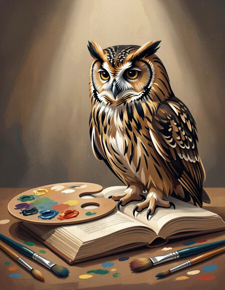
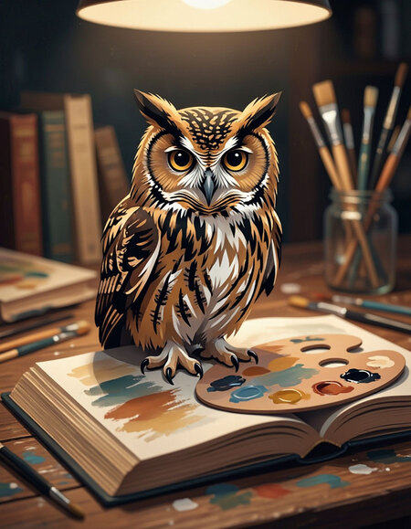
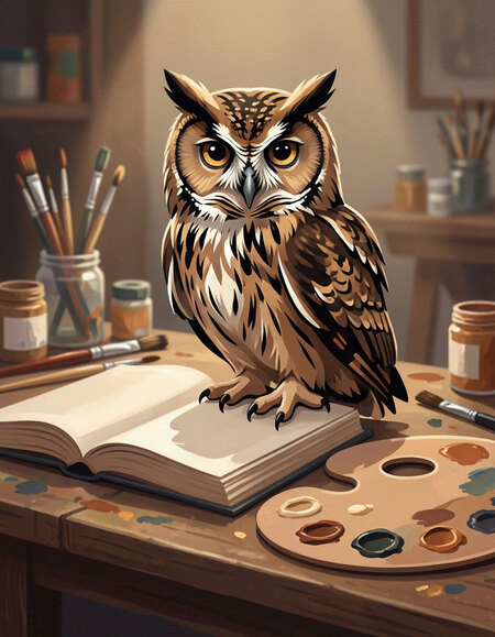
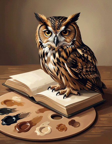
Draw a few options of an owl sitting on a book, with a color palette of burgundy, beige, and black, using medium detail.
Despite competent execution, these generated examples do not meet the core requirements for brand infographic design—minimalism and a restricted color palette. While an overall color scheme is evident, these versions are unsuitable both thematically and visually.
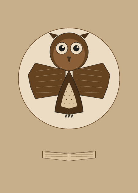
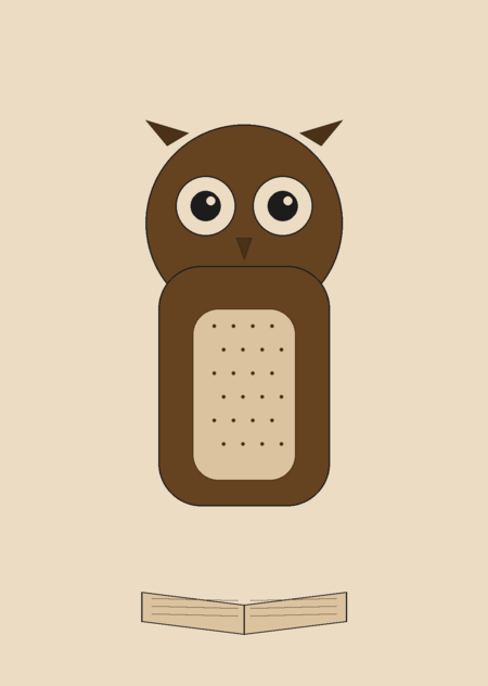
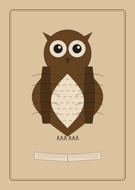
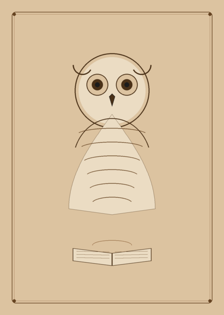
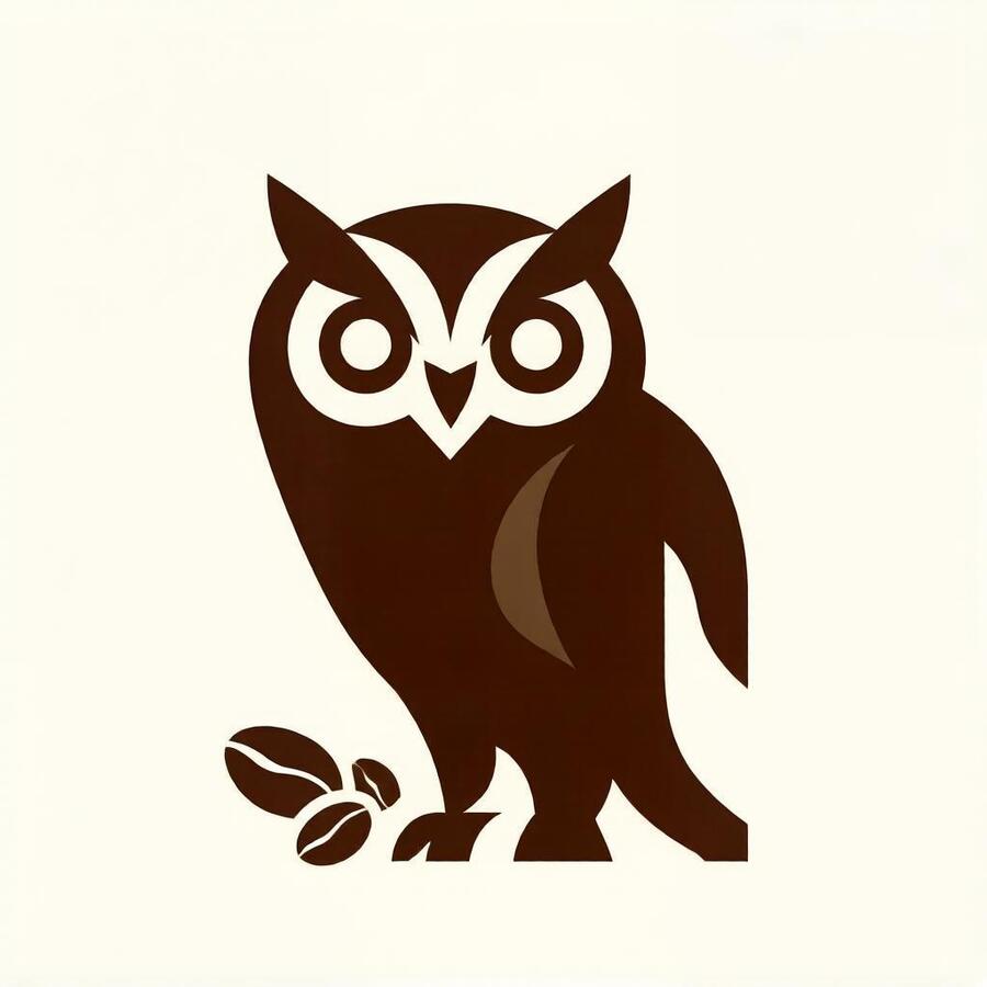
Design a minimalist owl logo in vector style, using a palette of beige, brown, and black, on a beige background.
Next, I attempted to specify the stylistic nuances that needed to be adhered to in the prompt so that the poster image would meet the requirements. It didn’t succeed on the first try—the model interpreted the mention of minimalism too literally, resulting in images that resembled drawings made by a child. This is why these specific generations were also unsuitable.
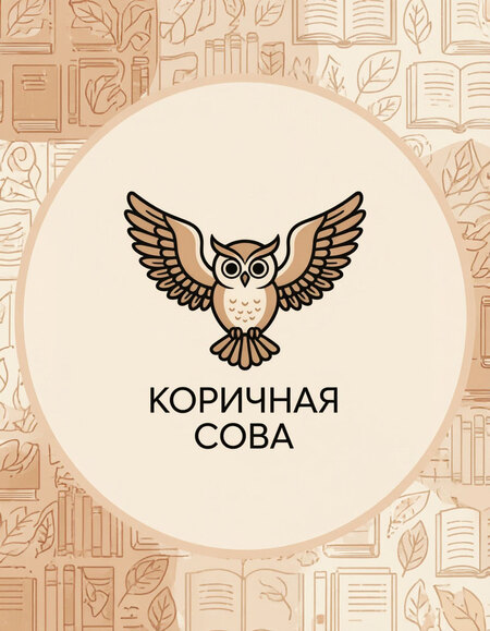

Design an infographic for a library named «Cinnamon Owl,» using a palette of beige, brown, and black.
At this point, after reviewing the most successful options from my previous work, I concluded that I should abandon the library theme and switch to something more relevant—infographics for a coffee shop.
Minimalist poster for the «Cinnamon Owl» coffee shop chain, color palette: brown, beige, black, white, vector illustration
Next, I switched to Gigachat because during the process, I found that it responds to my requests slightly better than АлисаAI. I selected the most successful generations, and ultimately, for the project, I chose one specific image that can be viewed in the mockups section.