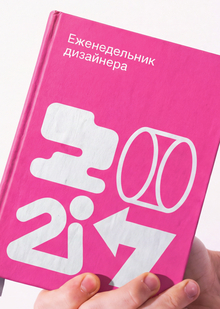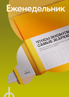
For my graduation project, I am developing an agency that bridges art and business. Managing this diploma work while simultaneously launching the agency demands significant discipline and constant planning. In the process, countless thoughts, tasks, and ideas accumulate, all of which I have to keep track of in my head. I wanted to create a tool that would allow me to externalize this stream of consciousness, free up my mental capacity, and focus directly on the work itself.
This is how my team’s planner came to be—a working object where the presence of art is felt, yet does not interfere with its primary function.
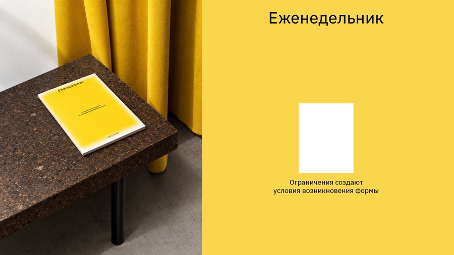
The frame becomes the primary visual element. In art, it signifies the boundary of a work—separating it from its surroundings, focusing attention, and defining its form. In the planner, the frame acquires another meaning—it becomes a metaphor for planning. Any plan, in a sense, imposes limits, but it is precisely this limitation that allows one to highlight what is important, organize chaos, and transform a stream of thoughts into a functioning system.
The frame here is not a symbol of prohibition, but a condition for the emergence of form.
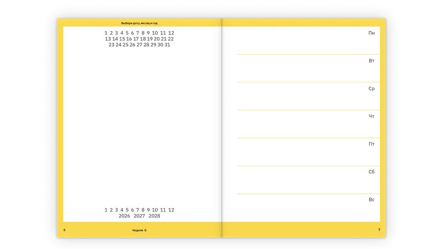
The weekly planner deliberately omits dates, months, and years. This reflects the authentic way a creative person works: the need to meticulously plan life does not always arrive in a uniform fashion. You can actively use the planner for several weeks or even a month, then put it aside and return to it in six months—for instance, during the launch of a new project or an especially demanding work period.
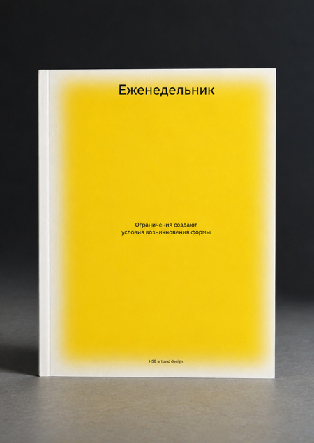
The cover remains only a silhouette of a frame. It denotes the possibility of structure, yet it does not yet fill it—the true content and order arise only within, during use.
The yellow border color is associated with energy, impulse, and the emergence of an idea.