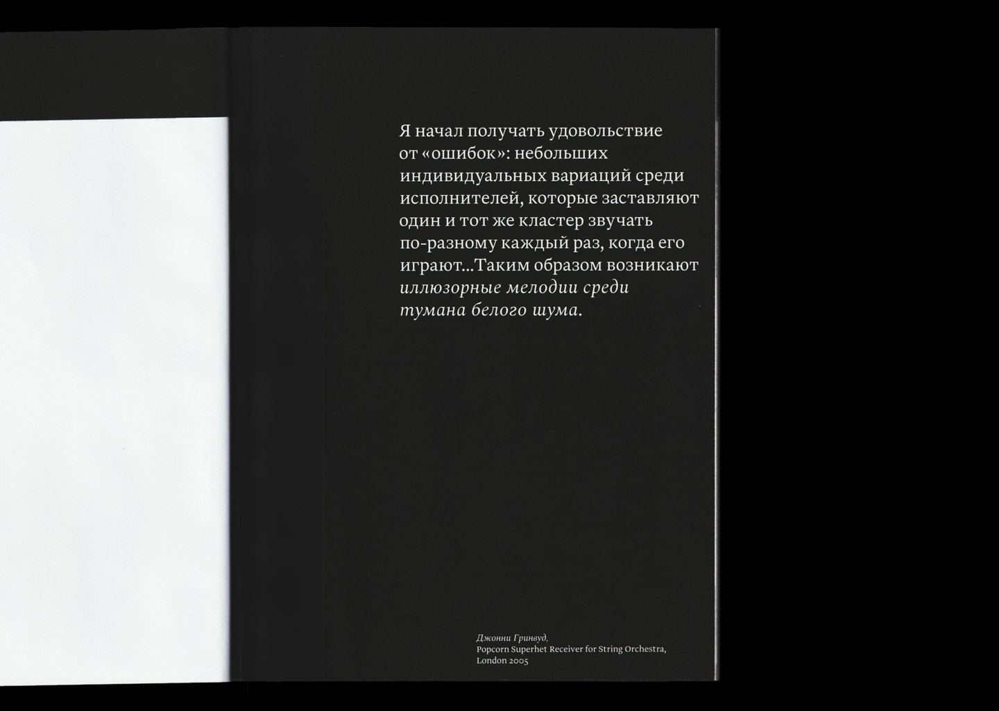
Epiograph
Au son de la presse is a visual study of the evolution of the 19th-century printing image of French newspapers, a period of radical transformation in both politics and mass culture and in press technology.
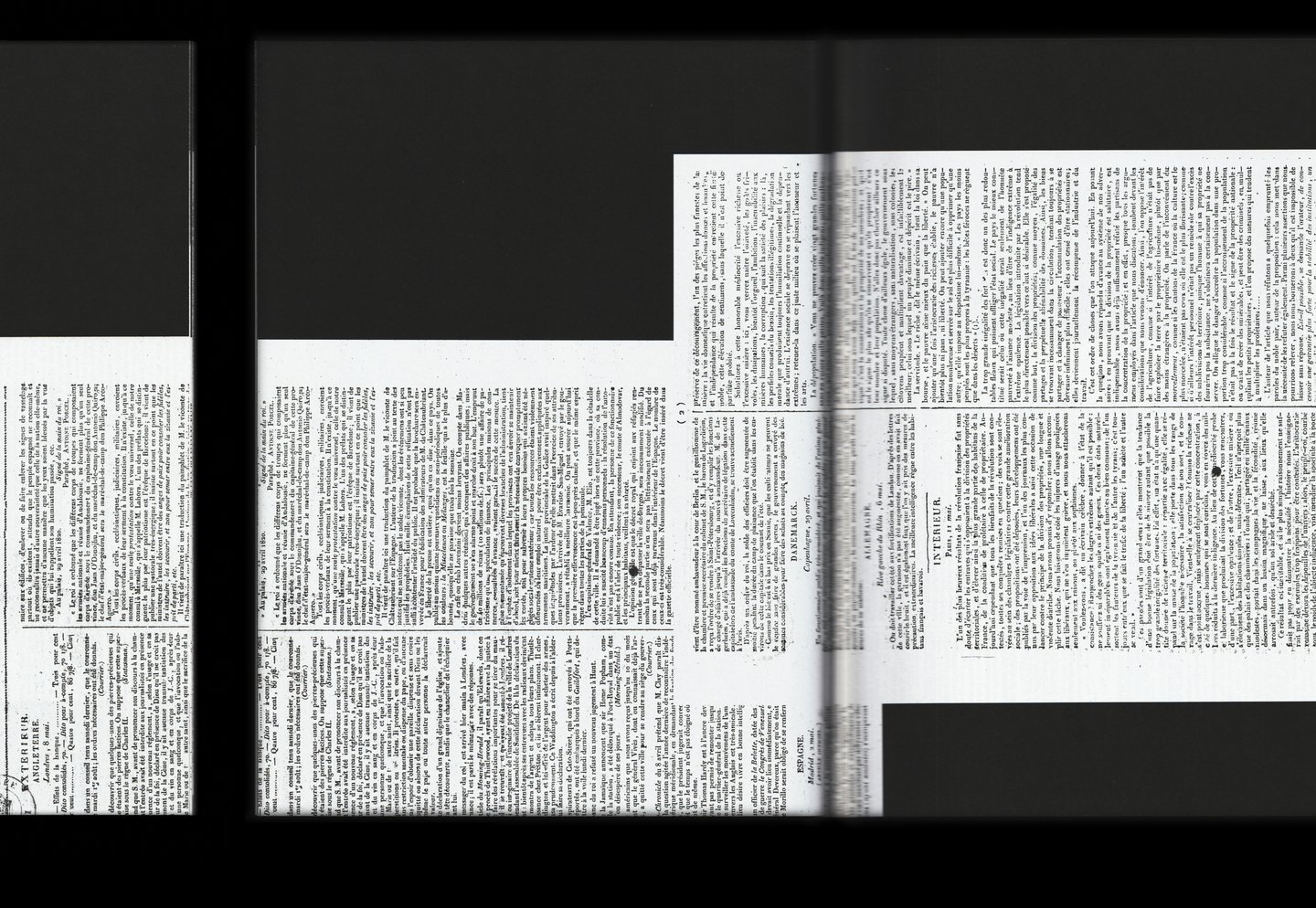
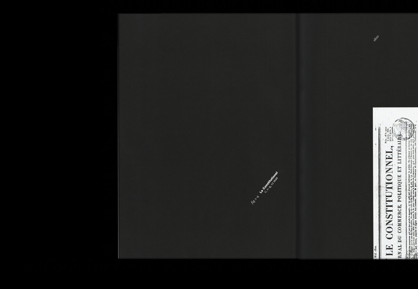
The book is opened by a catalogue section that shows unaltered newspapers analysed in the following sections.
The opening section contains all four pages of newspapers. For the study, various issues were taken from 12 May.
Concept
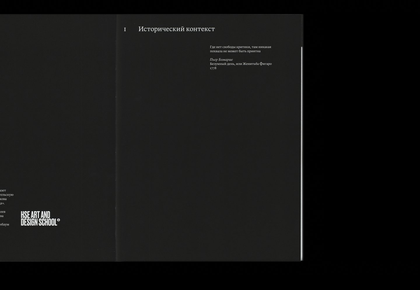
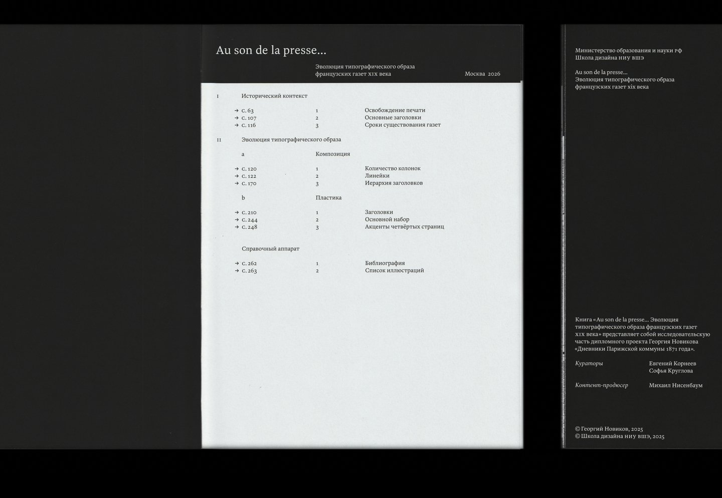
Cover sheet combined with table of contents / Title turnover input (L) and Schmuztite of chapter 1 (R)
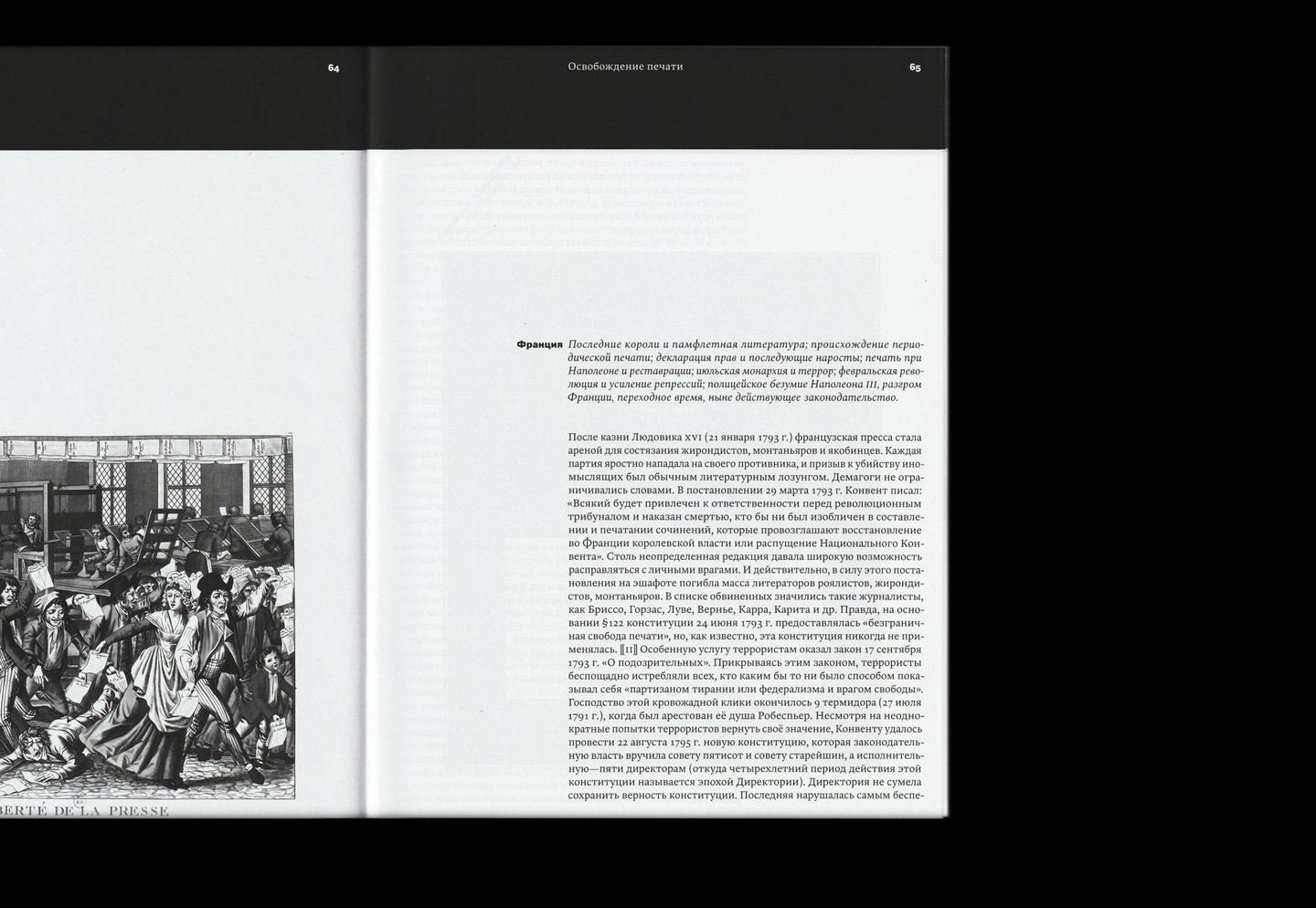
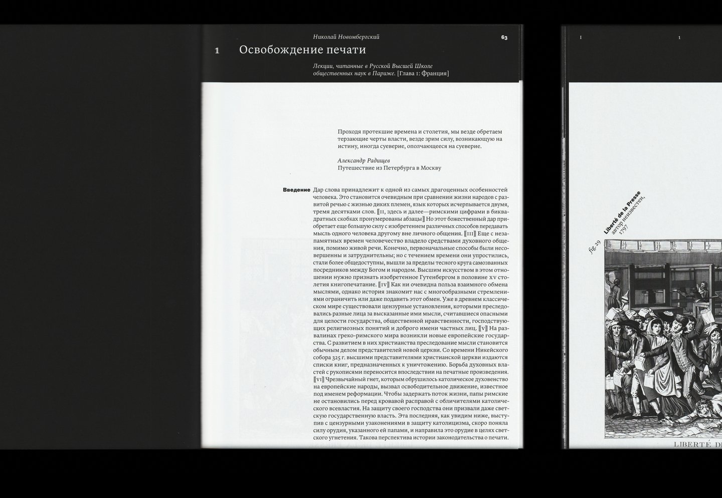
To be introduced into the historical context, a chapter on journalism in France was selected from the book Nicholas of Novomberg, «The History of the Press».
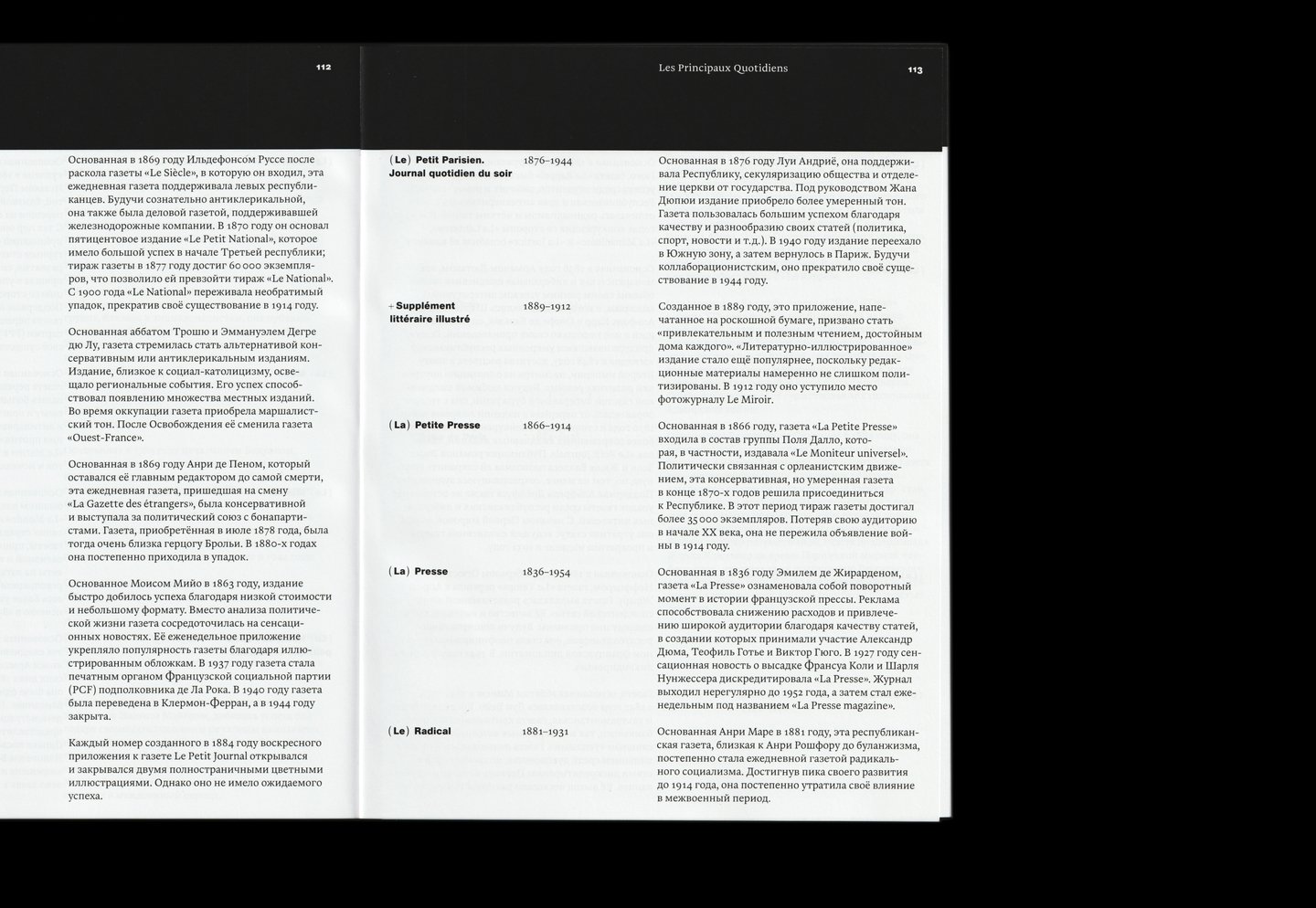
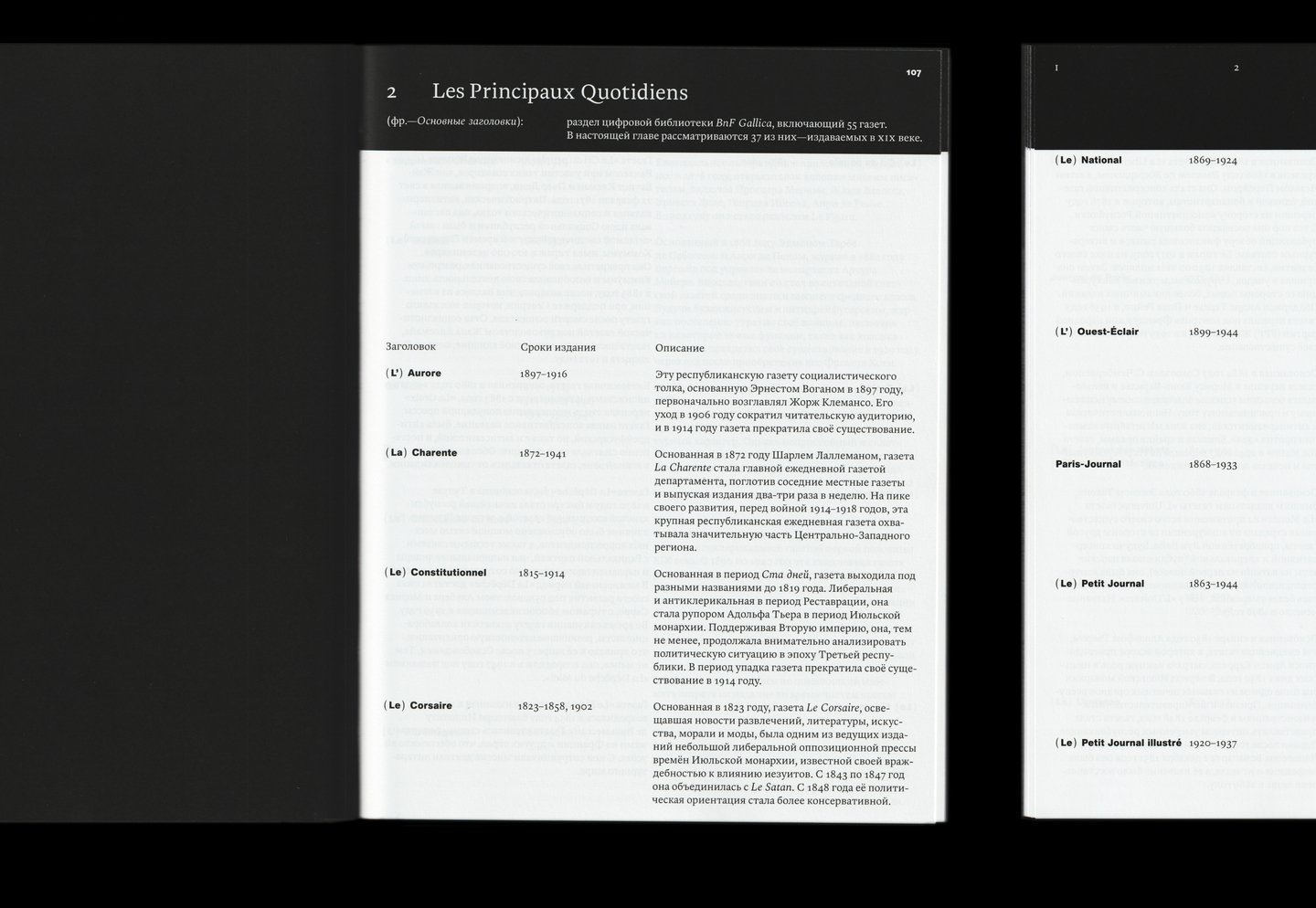
The second chapter of the «historical context» section describes the main French newspapers of the Gallica online library. Of the 55 headings selected, 37 were published in the nineteenth century
The dates of these newspapers were shown in the graph
Analytical part: Evolution of the printing image
Number of columns. Crusades indicate that the newspaper was either not published or no digital version was available during this period.
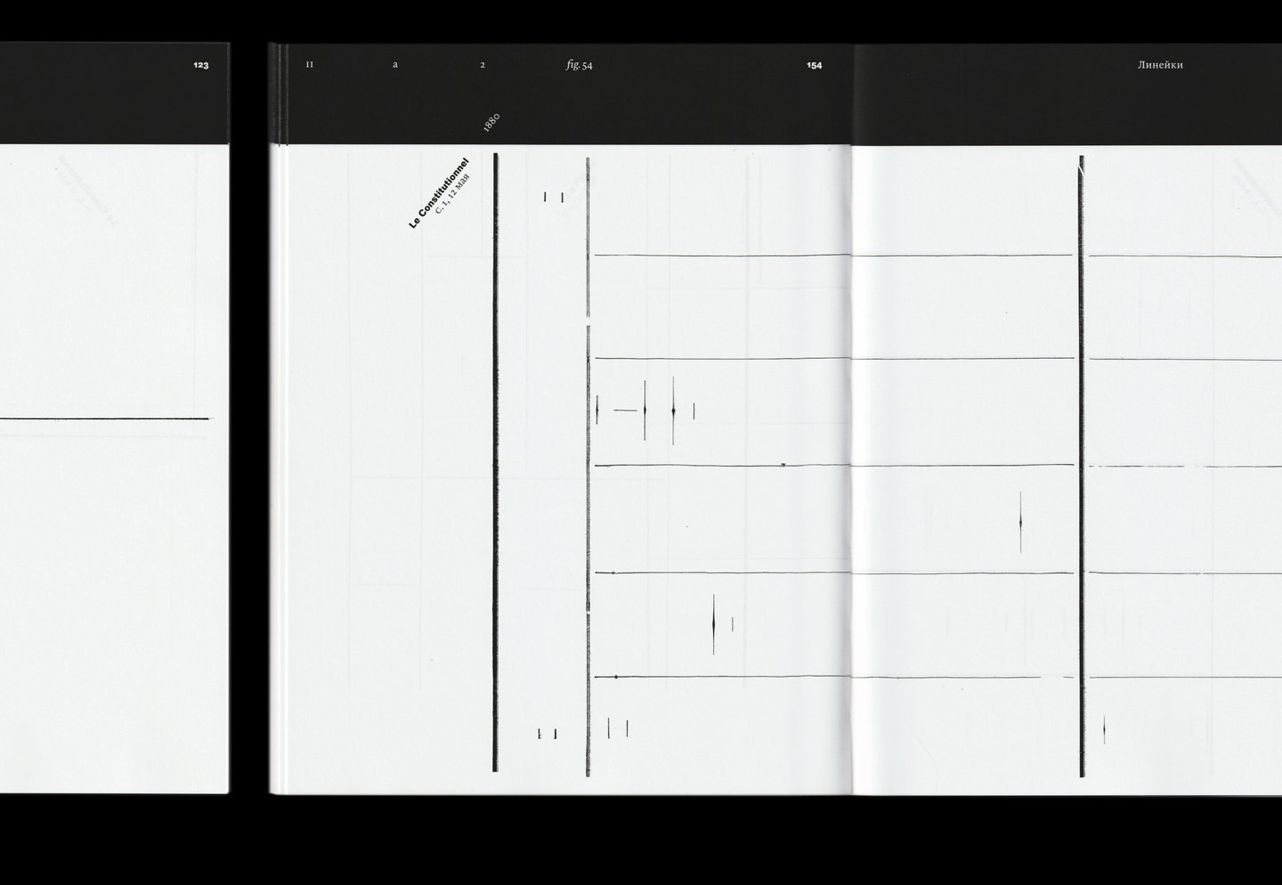
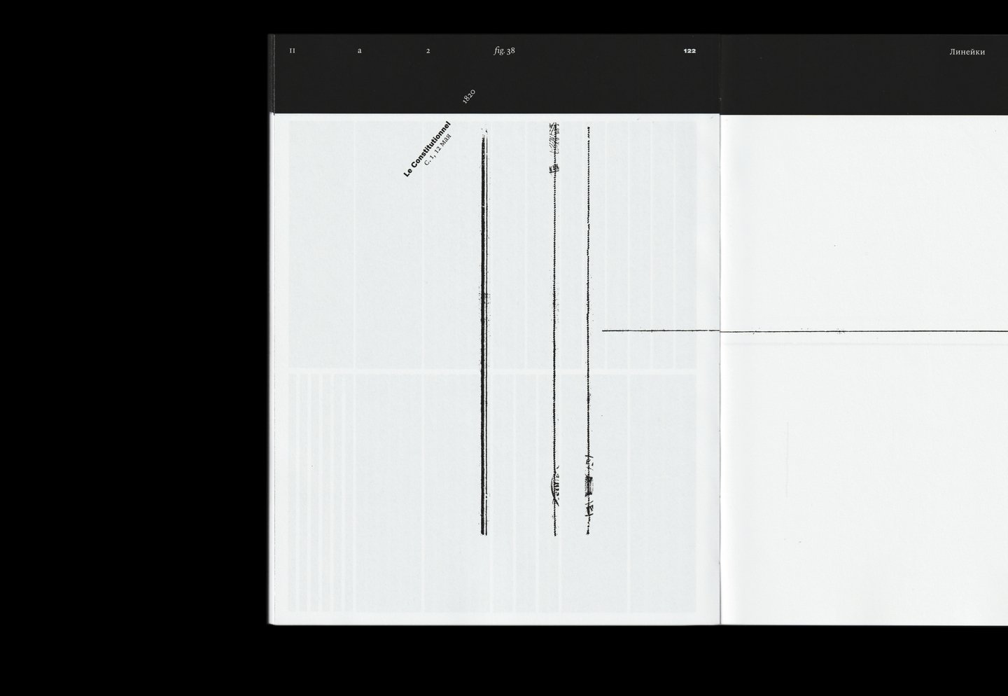
Lines
Heading hierarchy
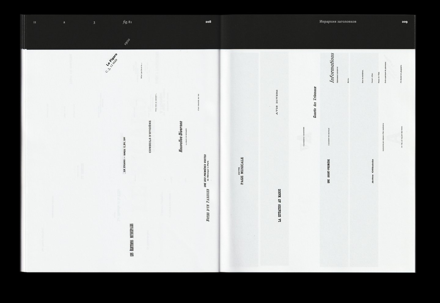
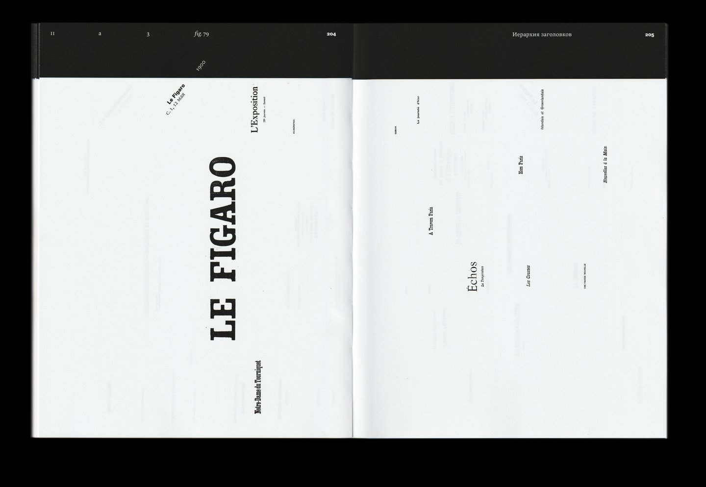
The fonts are in the headlines. Each letter keeps its position in the title line
Main set fonts
Focus on page four. In this section, the whole set was cut from the newspaper, different from the main combination of direct and italics.
The book closes the second half of the catalog section, focusing on its structure. This part contains newspaper issues from the second half of the 19th century.