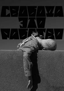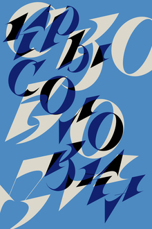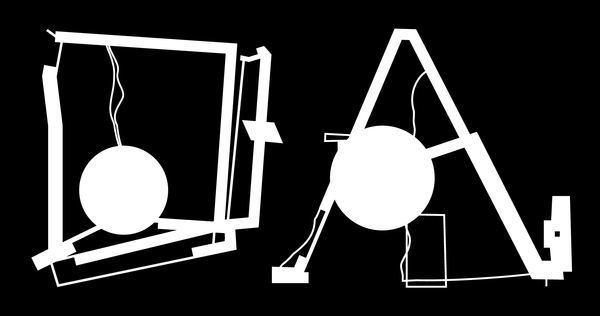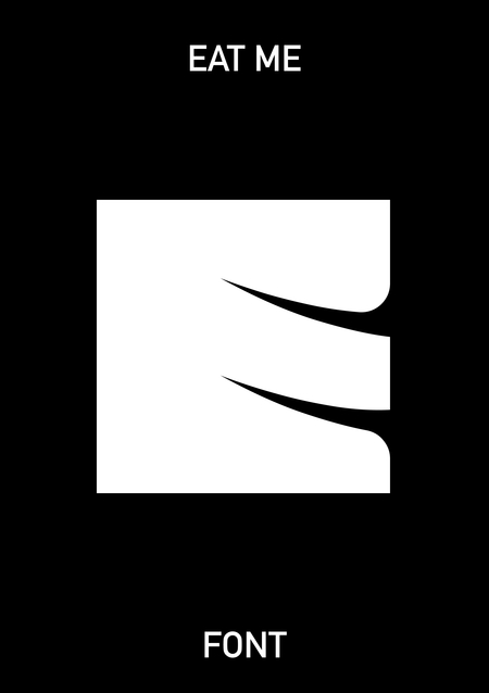
Accident font inspired by Lewis Carroll’s «Alice’s Adventures in Wonderland.»
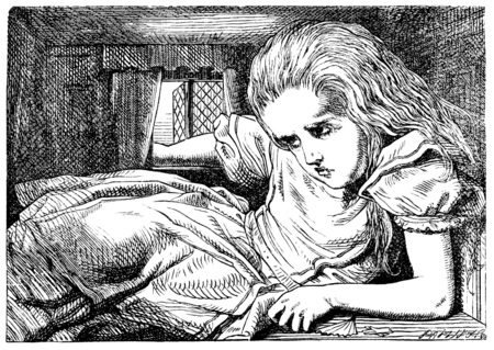
The core concept of the typeface is based on the theme of Alice’s constantly changing size in the book and the disruption of conventional spatial perception.
Title
The font name refers to the cookie from the story that helped Alice grow up. The cookie had the inscription «EAT ME».
Font Features
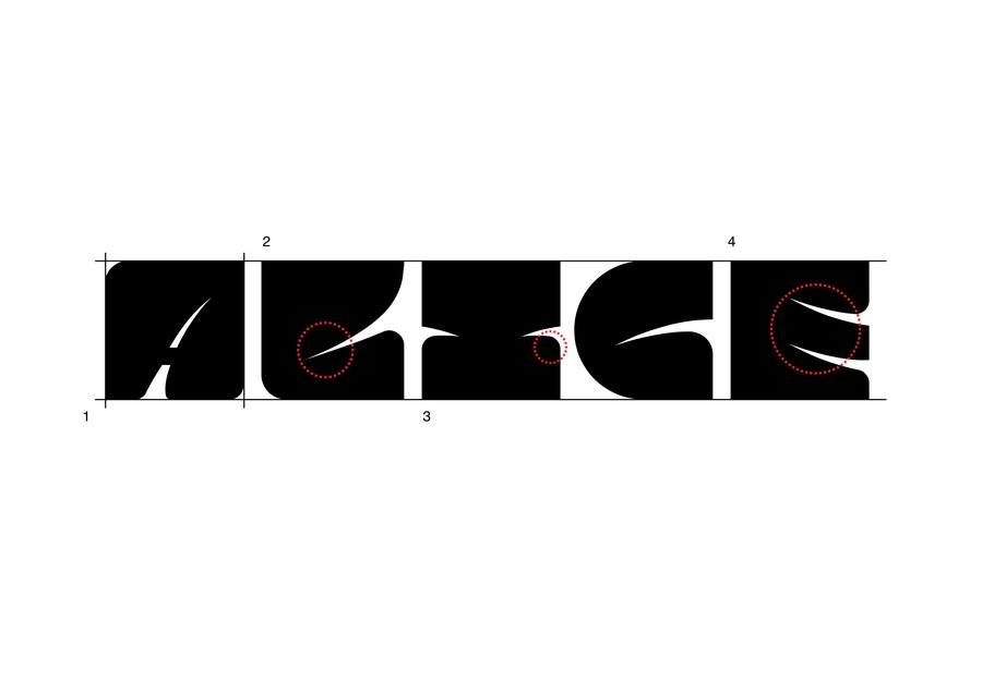
1. Large, thick-stroked letters almost completely fill the allocated space;
2. Narrow diagonal slits create a contrast with the dense forms and give the letters a distinctive silhouette;
3. Soft outer contours combine with sharp incisions, creating a balance of roundness and sharpness;
4. The incisions create a sense of movement, as if the letters are compressing and extending beyond the boundaries
Latin Alphabet
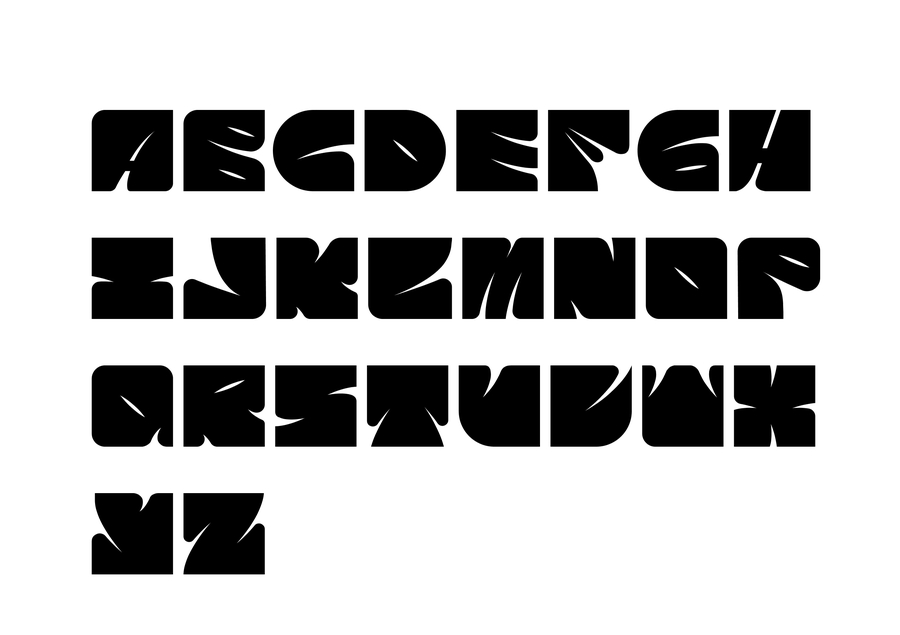
Cyrillic
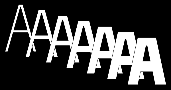
Alteration
Alteration is based on the compression effect: the letters are deformed, their individual elements draw closer together, and the internal spaces decrease. Crucially, the distinctive shapes and sharp cuts of the original typeface are preserved.