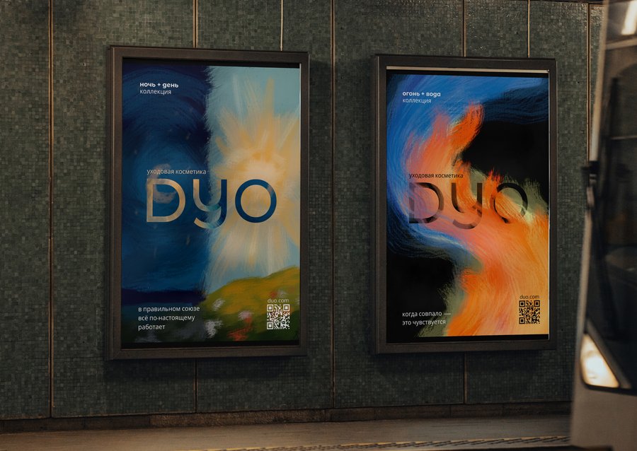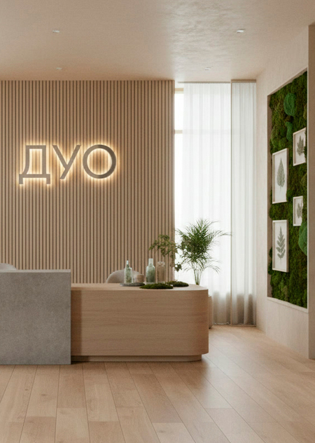
DUO — a skincare brand founded on the philosophy of perfect combinations.
We create product pairings that amplify each other, transforming daily care into a harmonious ritual. Inspired by natural dualities, we help the skin achieve balance because everything reveals itself best in the right combination.
I began the redesign process by generating the logo.
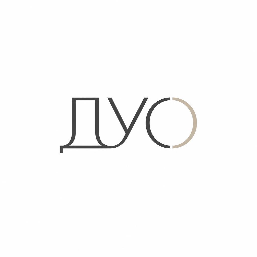
Minimalist logo design for a skincare brand. The wordmark «ДУО» in clean geometric Cyrillic sans-serif typography. The logo concept is based on duality and perfect pairing: two identical or mirrored abstract elements (two dots, two arcs, or two mirrored letters) forming a balanced composition. The letters «Д» and «О» subtly interact or mirror each other to symbolize union and harmony. Monochrome or dual-tone palette (soft beige + deep charcoal, or warm sand + sage green). Flat vector style, ultra-minimal, elegant, premium cosmetics aesthetic. White background, centered composition, logo presentation mockup. No extra text, no slogans, no English letters.